LG's (Sprite) Freebies

Everything of mine in the first post of this thread is free to use (unless noted otherwise*). Credit for items used is appreciated, though. :slight_smile:

(I will try and remember to crosspost anything posted later in the thread back to the first post if it is free to use.)

(*If you want to edit an original work, please contact me first, but any tileset modifications are fair game since they’re not my creations to begin with.)
(You can credit me either as Lord Glenn or Grefyrvos - I use both monikers online.)

Working on new stuff (slowlyyyy) and figured that, since I’m going to be posting that stuff up for anyone to use (once I finish them or at least chunk-able sections), might as well lump everything of mine that falls into that category in one place.

UI Elements:
  • Battle Frames:

JoshPersonalTemplateWPalettesFinal-A

I posted this original creation for one of the graphics blitzes, but I never saw if it was able to be turned into something insertable into an actual ROM. It’s still open and available for anyone to have dibs on attempting to - if it turns out that it’s over the tile limit and you’ve attempted to make it work, give me a ping and I’ll see what I can do to modify it once I know how much I would need to tone it down by. It might take me a little while since I usually only sprite 1-2 times a week (at most - some weeks I don’t do any at all), but I’ll endeavor to make it work.


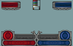
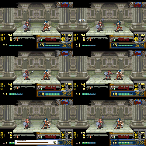
Remastered EB Battle Frame:

Master with palette and Enemy/Player/NPC/Other/Ally palette colors
EternalBondBattleFrameRemaster-MasterWPalette

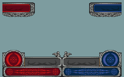
Without palette legend in the image:
EternalBondBattleFrameRemaster-RBwCloseAngels

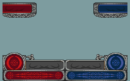
Far Angels variant:
EternalBondBattleFrameRemaster-RBwFarAngels

See this post here for the details!

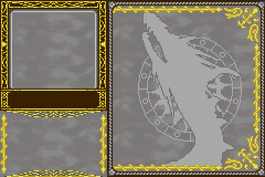
  • Old Jugdral-themed Stat Frame:

OldFE45Template

Again, this was posted to one of the blitzes - an old stat frame that I whipped up for a hack that was cancelled which was bringing in elements of FE4/5. I’m working on a spiritual successor of sorts to this, applying what skills and such I’ve learned in the years since I made this to make a new one (which is still a work in progress but will eventually be posted).

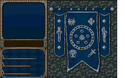
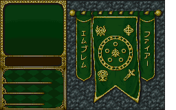
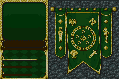
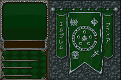
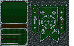
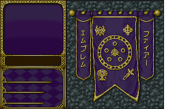
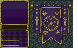
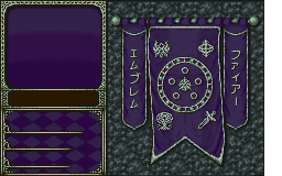
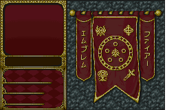
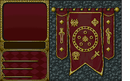
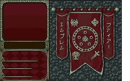
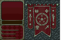
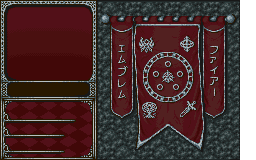
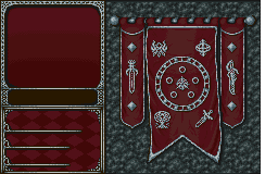
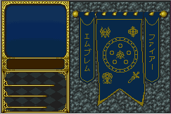
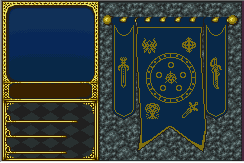
  • New 30th Anniversary Stat Screen BG:

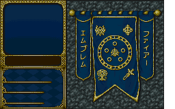
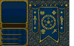
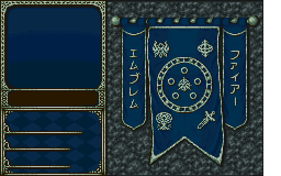
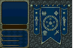
Has faction palettes for all four armies as well.

Katakana Swords
30thAnniversaryStatscreenUI-Blue_Kana-F256x160 30thAnniversaryStatscreenUI-Blue_Swords-F256x160
30thAnniversaryStatscreenUI-Blue_Kana-SilverA-F256x160 30thAnniversaryStatscreenUI-Blue_Swords-SilverA-F256x160
30thAnniversaryStatscreenUI-Blue_Kana-SilverB-F256x160 30thAnniversaryStatscreenUI-Blue_Swords-SilverB-F256x160
30thAnniversaryStatscreenUI-Green_Kana-F256x160 30thAnniversaryStatscreenUI-Green_Swords-F256x160
30thAnniversaryStatscreenUI-Green_Kana-SilverA-F256x160 30thAnniversaryStatscreenUI-Green_Swords-SilverA-F256x160
30thAnniversaryStatscreenUI-Green_Kana-SilverB-F256x160 30thAnniversaryStatscreenUI-Green_Swords-SilverB-F256x160
30thAnniversaryStatscreenUI-Purple_Kana-F256x160 30thAnniversaryStatscreenUI-Purple_Swords-F256x160
30thAnniversaryStatscreenUI-Purple_Kana-SilverA-F256x160 30thAnniversaryStatscreenUI-Purple_Swords-SilverA-F256x160
30thAnniversaryStatscreenUI-Purple_Kana-SilverB-F256x160 30thAnniversaryStatscreenUI-Purple_Swords-SilverB-F256x160
30thAnniversaryStatscreenUI-Red_Kana-F256x160 30thAnniversaryStatscreenUI-Red_Swords-F256x160
30thAnniversaryStatscreenUI-Red_Kana-SilverA-F256x160 30thAnniversaryStatscreenUI-Red_Swords-SilverA-F256x160
30thAnniversaryStatscreenUI-Red_Kana-SilverB-F256x160 30thAnniversaryStatscreenUI-Red_Swords-SilverB-F256x160
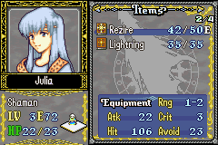
  • FE10-Style Affinity and Weapon Level Icons (unsure of compatibility with Horse/Pegasus/Wyvern indicators):

FE10GBAAffinityWeaponLevels

These are pretty old (and have effectively been replaced by the Cipher set below), but if you have a hankering for UI elements based on FE10, this would be for you.

Originally made for an old revision for MageKnight404’s A Sacred Dawn, back when he was still making it. As noted above, since I think I changed the palette on these from the default, the Horse/Pegasus/Wyvern icons that appear in the stat screen near the Aid stat might get messed up - you should be able to just do a quick edit of those icons to make sure they use the colors in this palette for them to look fine.

(As mentioned, I’m working on something that will basically replace this, otherwise I’d do the fix for those icons myself now. What I’m working on is already taking care of that for the new sheet, so no real sense to go back and do extra work on this set. :/)

  • FE10-style Affinity Icons + Cipher-based Weapon Level Icons (UPDATED Sept 26, 2019):

CipherWL_FE10Affin-Final

See this post for all of the details!

Custom Weapon Level and Affinity Icons (2022):
image

See this post for other images and details!

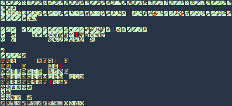
Weapon Icons:
  • Old sheet of freebie Weapon Icons:

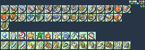
FreeForUseIcons2015

(Description below shamelessly copy and pasted from the Repository topic)
(Background color legend:
Green = adaptation of existing FE weapons/icons (mostly FE9/10 stuff, but some come from other games)
Yellow = icons made for Arch for Elibean Nights (that are completely new and not versions of things like the Rusty Coin) that he has allowed to be free to use
Blue = icons that I’ve done over the years either for myself or defunct projects (some of which may have been appropriated by Arch or other projects since)
)

(Aug 16, 2018 - I updated a couple of the icons on this sheet the other day when I was fiddling around, nothing really major outside of the Bronze Axe, which got a heavier refurbishing.)

  • FE Heroes Book 1 Weapon Icons:

FEHeroesBook1Icons

I modified these after I posted the previous revision of them in the Icon Repository, but these are the up-to-date versions of all five. Can’t guarantee I’ll do any of the other unique weapons Heroes has added since I stopped caring about it like a year ago, but it’s a minor possibility. I know some of them seemed like things I might want to tackle, but it’s going to be a “when I’m in the mindset and have the urge to sprite them” kind of thing.

Also, I’ve included palette circles of my new background color (easier on the eyes) as well as the standard light pastel green that the image straight from the ROM uses in the bottom corner so that it’s just a matter of swapping the colors if you want to insert a specific icon into a ROM.

  • Shadow Dragon “Regalia”/unique Item Icons:

FE11SpecialIcons

Seeing @Kirb’s newest screens for GFE1R inspired me to get off of my duff and finish this set… well, almost finish. Aum is a placeholder - may or may not get back to doing it. (I went over the Shadow Dragon item pages and I think that’s everything that falls under the Regalia/unique category of note, barring the extra addition of the Broadsword for Ogma (which is an icon that I have had completed for a while now and it could easily be fit in as something Caeda got for him).)

(EDIT 11/3/18 - Added a new variant of Starlight.)

< Rapier, Broadsword (Ogma), Mercurius, Falchion, Wing Spear, Gradivus, Hauteclere, Parthia, Excalibur, Aura, Imhullu (Based on the old TCG art, the FE World art minus the lock binding the tome, and the FE World art with the lock added on, respectively), Starlight (Based on the old TCG art, the FE World art, and one of Linde’s Cipher arts, respectively)
< (Aum when it’s finished), Firestone, Earthstone, Magestone, Divinestone, Fire Emblem, Lightsphere, Starsphere, Geosphere

  • Genealogy of the Holy War “Regalia”/unique Item Icons:

FE4SpecialIcons

See this post for more details!

< Lustrous Sword (Sigurd’s Silver Sword), Balmung, Mystletainn, Tyrfing, Gáe Bolg, Gungnir, Helswath, Yewfelle
< Valflame, Mjölnir, Forseti, Naga, Loptous, Valkyrie, Deirdre’s Circlet

Maps and Tilesets:
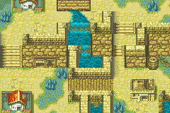
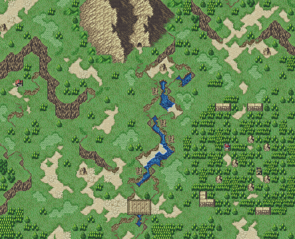
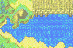
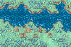
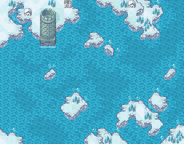
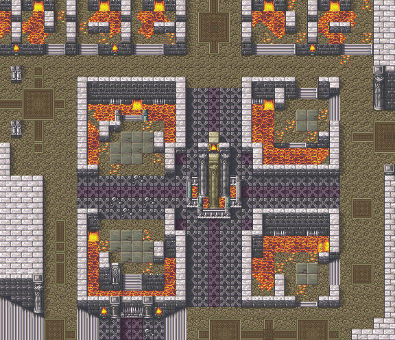
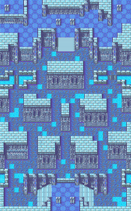
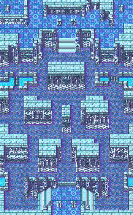
  • The Cistern:

Made for a blitz, now with added waterless version (if the water was a turn off / why you wouldn’t want to use it)! The ZIP includes the tileset (with its modified palette), TMX files for both versions, as well as the PNG screenshots for both versions: Dropbox

Uses a modified tileset, see below.

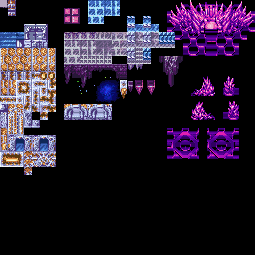
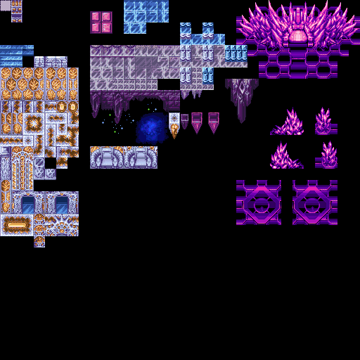
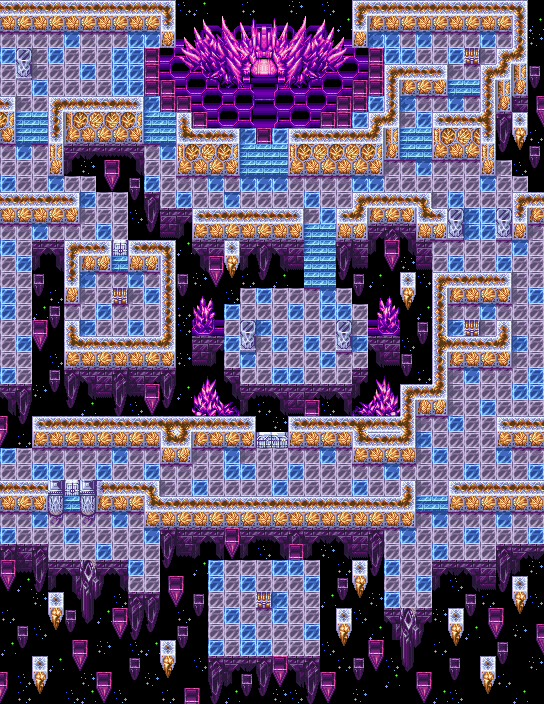
  • Loptous Altar… in Space! (TMX here):

Uses a modified tileset of Wave’s FF2 Pandemonium tileset, see below.

  • 1 Screen Mapping Blitz Map (TMX here):

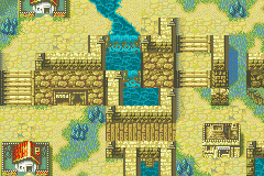
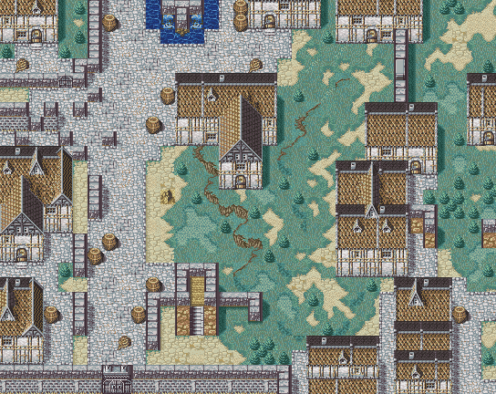
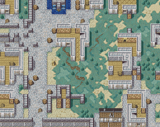
Garlan Village - N426 Updated Village Garlan Village 2 - N426 Updated Village Garlan Village 3 - N426 Updated Village

Uses the edited Village Tileset by N426, Zoramine, and Venno and comes with the tile changes showcased.

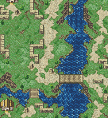
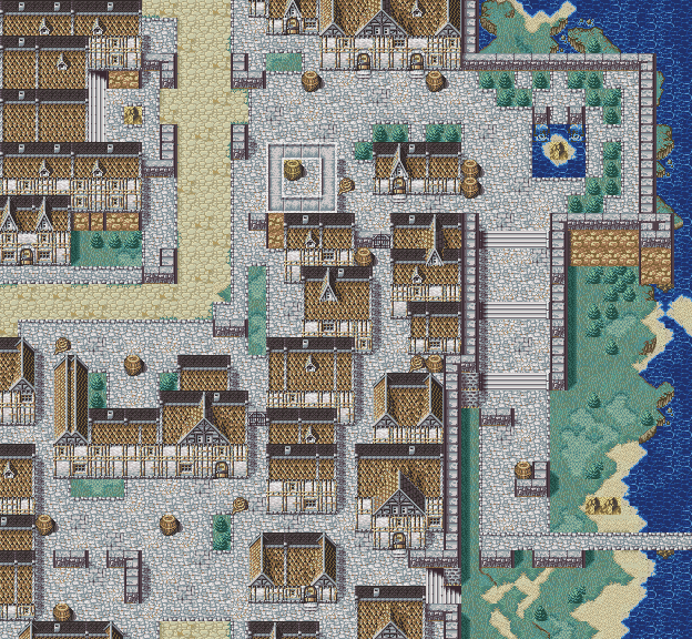
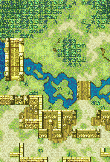
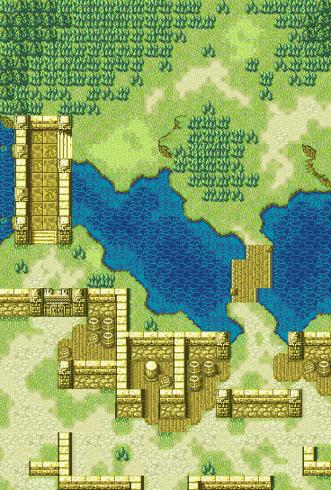
  • Encounter at Bruhl (Valkyria Chronicles) (TMX here):

EncounterAtBruhl-a

Uses ZoramineFae’s Revamped Fields Village tileset.

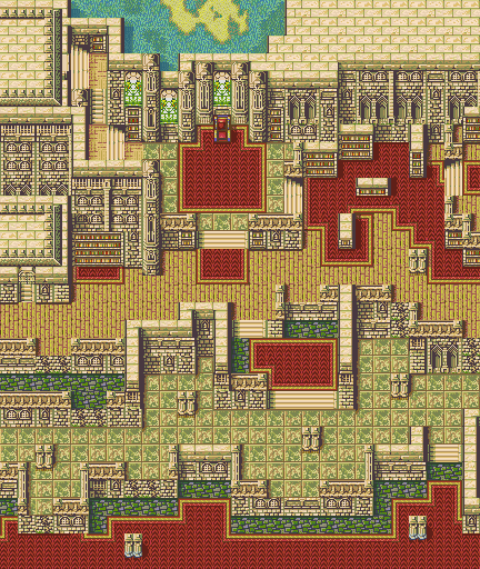
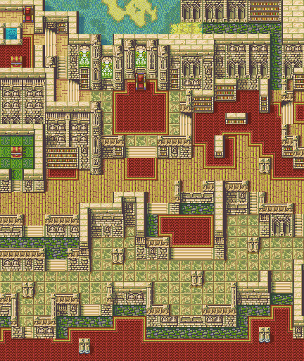
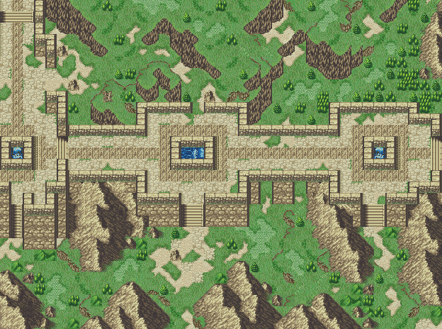
  • Revelations (Radiant Dawn 4-4) Redux (TMX here):

Uses N426’s Improved Castle Tileset (“Palette 1”).

Retreat From Bruhl 1

Retreat From Bruhl 2

See this post here for more information about the maps and tileset.

  • Vasel Urban Warfare (Valkyria Chronicles) (TMX here):

Uses the same tileset as Escape from Bruhl right above.

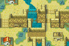
  • Osaka Bay (Samurai Warriors 2) (TMX here)


Uses Village v2 - Standard Tileset.png from the Repo.

  • Reisan Pilgrimage Across the Way (Tactics Ogre Reborn, Grandia II) (TMX here)

image

Uses ZoramineFae’s Revamped Fields tileset from this post.


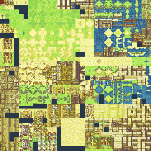
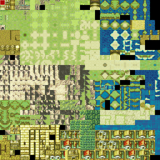
  • Desert Tileset Expansion [Image Only] (Credit to Sme for the original base and Dancer_A for collaborating):

  • FE8 01003803 Modified with town and ruins elements plus a gate:

  • FF2 Pandemonium tileset (by WAve) modified and with new palette:

UPDATE 6/23/21: Palette applied to WAve’s original tileset and shouldn’t cause issues if you try to use it in-game?:

My old (Weapon) Icon spriting tutorial (and inquiry for a potential Version 3?)

Update Log (previous updates in spoiler):
  • May 18, 2018: Posted topic, Shadow Dragon Regalia/Unique Icons are new.
  • June 16, 2018: Radiant Dawn-style Affinity Icon update & Cipher-based Weapon Level Icons are new.
  • August 16, 2018: Genealogy of the Holy War Regalia/Unique Icons are new, made a note about a minor update to the “Old sheet of freebie Weapon Icons” bullet point.
  • September 26, 2019: Final (?) update posted for FE Cipher Weapon Level graphics (+FE10 Affinities).
  • November 15, 2019: Added the Desert Tileset Expansion to the top post.
  • March 29, 2020: Added map “Encampment in Gallia”, modified FE8 01003803 tileset to top post.
  • April 20, 2020: Added 30th Anniversary Stat Screen BG, added some other stuff that I missed previously adding to main post.
  • July 12, 2020: Modified usage note at top of post in regards to edits, realized I forgot to put the FF2 Pandemonium Edit and FE5 Ch 24x redux map that used it in the first post.
  • August 25, 2020: Organized the first post to include dropdowns to be less of a pain to scroll through.
  • November 13, 2020: Added non-Dropbox images to the main post and added the 1 Screen Mapping Blitz map to the first post.
  • December 26, 2020: New map (“Encounter at Bruhl”) added!
  • January 22, 2021: New battle frame added!
  • February 27, 2021: New map (“Revelations (Redux)”) added!
  • March 23, 2021: New map (“Retreat from Bruhl”) added!
  • June 23, 2021: Added FF2 Pandemonium palette version that should be game use-friendly (but doesn’t have the extra tiles).
  • June 11, 2022 (Added Sept 18, 2022): Custom Weapon Level and Affinity Icons added!
  • Sept 18, 2022: New map (“Vasel Urban Warfare”) added!
  • Nov 20, 2022: New map (“Osaka Bay”) added!
31 Likes

I was already using your Fe4 style background I found on Klok’s repository, but without credit. Glad to know who made it.

2 Likes

Good stuff, these look great. Just making sure, did you mean that they were made for GFE1R, or do I have to ask for permissions?

I made them so that they’re free for anyone to use, but I poked you so you’d notice them so you could use them. ;’)

1 Like

Ah, I see, Nice, I’ll be sure to use them then.

Wow, it’s been 3 weeks already? Kiiiiinda lost motivation to work on Aum. And the other stuff that I have in progress. >_>

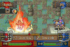
I did feel in the mood to waste use my evening doing a mock up with my battle frame that’s in the top post though, since it came up in the “what brought you to FEU” topic. NOTE: Outside of the battle frame (as it was posted above with the intent to be used), the other graphics in the mockup are NOT free to use.
(This basically applies to only the two weapon icons and the Sol skill icon as the map’s tiles, the base Cavalier sprite, the Sniper sprite (duh, it has no changes), the fonts/numbers/HP bars, and the skill activation aura are using assets that I didn’t create myself. I did stitch together the map itself and make the edits to the Cavalier, though.)

Mock Up:

(The skill aura was pieced together through frames of two RPG Maker spell sheets, along with copious layers, duplicates, blending modes, and opacity slider changes on them. I’m not skilled enough to sprite up an effect like that from scratch! XD)

I dunno why I’m bothering to post this since it’s not really a freebie - mainly just did it for fun and so you can see a rough idea of what the frame would ideally look like in use. Maybe it’ll spur some ideas for presentation with all of the wizardry around here, I dunno.

9 Likes

Okay, new (cool) stuff!

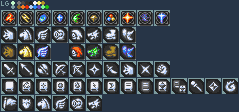
After looking at pictures of some of the Cipher cards for a while, it struck me that how they do their icons (black non-regular polygon background with white symbol on top) was pretty visually appealing, so I set about building a set of GBA-insertable ones to use as Weapon Level icons. (I’ll eventually be doing graphics to replace the Horse/Pegasus/Wyvern icons as well, but more on that later.)

To go along with having a black background, I decided to reuse and spruce up my old FE10 Affinity Icons a little since they used darker shades for their backgrounds and would make it easier to have a shared palette work out. If Cipher actually had something more along the lines of character affinities, I would have done those, but the best it has are the faction symbols (Red Falchion, Blue Mark of Naga, White Hoshidan Symbol, Black Nohrian Symbol, etc.), and I didn’t really think those would fit as substitutions… (I mean, I could have made something new too, but that takes effort to think up/design a bunch of them!)

I want to stress that this is technically a WIP as I might decide to change/tweak things later and I do have more to do with it, but it’s in a state of completion where I can post it, so…

Row 1:
Affinities:

  • Fire
  • Thunder
  • Water
  • Ice
  • Wind
  • Earth
  • Anima
  • Light
  • Dark
  • Heaven

Placeholder Horse, Pegasus, and Wyvern icons

Row 2:
Weapon Levels:

  • Sword
  • Lance
  • Axe
  • Bow
  • Crossbow (if you would ever want one…)
  • Shuriken/Hidden Weapon
  • Dagger/Knife (Variant for Shuriken)
  • Fang (used for Laguz, Taguel, etc.)
  • Strike (Variant for Fang)

Row 3:
Weapon Levels:

  • Tome (Generic)
  • Anima
  • Light
  • Dark
  • Fire
  • Thunder
  • Wind
  • Staff
  • Stone (used for Manaketes and you could use it for the Beaststone units if you wanted to)
  • Breath (for the non-Stone using Dragon enemies)

(If you’re not familiar with what the Cipher symbols look like on the cards: https://www.dropbox.com/s/nfde5dyh2klqjts/CipherWLReference.png?dl=0)
(The Crossbow icon is custom, using the Bow icon as a starting base. The Dagger icon is wholly custom. Strike icon is based on FE10’s. The Tome variants are all custom, using the Generic Tome as the starting base. The Breath icon is based on a combination of the Fates Breath icon, White Breath from FE10, and the Heroes Breath icon.)

As with my other posts, I’ve included the standard “light green” color in the palette to swap the grey to for insertion - the grey is just easier on the eyes for viewing. I have also adjusted the colors on the temporary Horse/Pegasus/Wyvern icons to go along with the new palette.

The next phase that I’m going to work on is going to involve replacing the Horse/Pegasus/Wyvern icons, doing icons based on the various Attribute “affinities” that Cipher uses for their cards (Horse, Wing, Dragon, Armored, Monster) - I’m planning on going overboard to make virtually any combination of those that make sense (Pegasi are Horse and Wing in Cipher, for example) - I don’t know if it’s possible to change the total number of attributes in the GBA titles, but on the off chance it is or ever ends up being something that becomes a thing down the road, I’d like to cover all of the bases someone might be considering. (And, as such, it’s going to be a while before I finish them.)

EDIT (1/18/19) - I noticed the other day that the Affinity icons on Serenes Forest’s FE10 Supports page are not the ones that are actually used for the characters’ stat panels (nor are they the Map Affinity graphics, so I’m not sure where they actually got them from) - luckily, this only caused two Affinity graphics to need to be changed, Wind and Dark. I also took the opportunity to make icons for Water and Anima so that you can choose between GBA (Ice and Anima) or Tellius (Water and Earth) without being locked to the weird mishmash between the two of only Ice and Earth.

NOTE: I changed the palette slightly, to make Water and Dark fit a bit better, so be aware of the change. Also, I missed a few stray pixels in the Fire Affinity icon on the previous version that caused it to have an extra color, but this has also been fixed.

9 Likes

moar freebiesssssssss 4 u allllll

(No, seriously, more fun stuff to play around with!)

This is probably the… 4th iteration I’ve done of these as a full set - I can’t help wanting to make them better after a year or two of looking at them and then finding something that I now think I could do better. But, on the plus side, they almost always seem to improve between iterations and that’s the main goal.

Genealogy of the Holy War Regalia

(Lustrous Sword (Sigurd’s Silver Sword), Balmung, Mystletainn, Tyrfing, Gáe Bolg, Gungnir, Helswath, Yewfelle)
(Valflame, Mjölnir, Forseti, Naga, Loptous, Valkyrie, Deirdre’s Circlet)

  • (You just know that they’ll make Sigurd’s Silver Sword a Prf if they get around to doing an Echoes of Genealogy, so might as well get ahead of the curve on that front.)

As always of late, I’ve included two little palette swatches to easily have the standard light green used on the sheets from the game data applied to replace the working grey that I use.

I also realize that I never really addressed it when I posted the updated Heroes icon set, but I do use my own customized tome border design that I did from scratch (yet based on the normal GBAFE one), mainly just so I could say that it’s my own original work and not using anything that IS’s staff had done, beyond the palette. If for some reason you would want to conform to the regular design, it’s pretty easy to do a rectangle select on the design on the tome and paste it over an icon that uses the regular border. (You would end up missing out on the minor amounts of detail that I put along the tomes’ spines, though.)

Hit the blurb below if you want detail in what each icon was pulled from or any other thoughts from my work process:

Info dump

Most of the icons I do these days are usually derived from either 1) the old FE TCG artwork, 2) any thing that shows up amongst any of the new FE Cipher artworks, or 3) other official art, be it old artbooks or even Heroes (art or in-game models). Usually in that descending order, unless it’s something specific that I need to go to a specific well to get image sources for.

Sigurd’s Silver Sword, for instance, is based primarily on the two Cost 4/3 Sigurd artworks that Mayo did for Cipher Series 12, since I felt that the one personally given to him by His Majesty (via Arvis) shouldn’t just be an ordinary Silver Sword.

Most of the other Regalia started as their old FE TCG components and then had bits molded in from other sources as it felt right to do so (or if there was any to pull in to begin with - the Circlet basically has nothing outside of the FE TCG artwork, for instance) - Balmung had its blade turned blue-ish and the crossguard be more gold-colored as reference to Shanan’s Cost 4/3 Cipher artworks, while the handle was redesigned to match the Awakening redesign and include a little tassel off of the end. Mystletainn started with the old FE TCG and then I used the Heroes battle model to get a better idea of how to do the crossguard. And so on and so forth.

Yewfelle and Loptous were probably the hardest to do - Yewfelle just by the “complexity” of its design with the added components on the front of the bow (and the Cipher artwork is of no help due to angles shown and how even more complex and machinery like the artists designed it), while Loptous was difficult due to the fact that the official FE World artwork (basically the only usable reference) has it with predominantly dark colors - dark purple, black, magenta, red - all colors where you don’t have a lot of options in FE’s default palette and ones that tend to not contrast very well with each other when used at the same time. Honestly, this one’s final state just kind of resulted from trial and error while mirroring Naga’s tome and finally hitting on a color combination and balance that seemed to work better than anything else I had tried.

Maybe one of these days I’ll get around to doing a new version of my old Weapon Icon Tutorial, given that it’s like 7-8 years old at this point and I’ve learned a lot more since then. While the overall idea is still the same (load up an image off to the side and mentally translate colors and pixel locations to get an approximate recreation at a smaller scale), I feel like I could articulate my process better now, while also incorporating more detail into the designs at the same time. (I mean, look at the icons in the “Old sheet of freebie Weapon Icons” image in the top post and compare the quality level and amount of detail in the icons.) Just as long as it isn’t some of the Heroes tome designs with their overuse of flat colors… >:[

11 Likes

It’s been a while since I posted an update - mainly have been on a hiatus to recharge my spriting batteries as well as working on non-graphics projects a bunch - but I come bearing a WIP that I never posted as well as an update to an existing post on the page.

I have updated this post on the thread containing my updated FE10 Affinity and FE Cipher Weapon Level icons. Added two new graphics options, replaced two others, tweaked the palette slightly, and fixed some stray pixels that weren’t “in the palette” from the last one. You can read more in the edit at the bottom of that post.


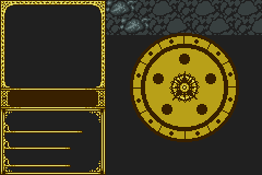
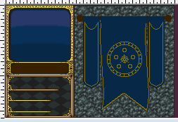
I started working on this back when one of the Statscreen Blitzes was going on and I just haven’t had the motivation to work on it since. I might get back to it at some point, though having to shade and then tile the rocks and eventually shade the golden piece in the middle was off-putting to said motivation.

The idea was to make a less FE4/5-styled version of my old statscreen while keeping its overall color palette and still having it feel representative of the franchise. The golden piece is a blend of the Holy Blood circle, the Shield of Seals, and Lehran’s Medallion, and the idea was to shade it as if it was a shield with a curved, convex look to it. Was planning on adding some kind of top and side adornments over top of the rock - something curtain-like, that would change palette based on the unit’s faction, but cloth shading might be yet another demotivating factor for me. (And, it’s been so long that I don’t even remember what I was going to do for the backgrounds behind the portrait and Class/Level box…)

If this statscreen calls out to anyone that you just have to use it, please post - perhaps the notion that people want it will help motivate me to get back to it. (And, if anyone has suggestions/thoughts/comments/critiques on the backgrounds for the panels, it would be help to know them now before I want to slam my head into a wall repeatedly when doing them in the future.)

14 Likes

I’d love to see it used in practice, it looks pretty good so far.

~6 months later and I’m finally back to working on this… kinda ended up taking it in a tiny bit of a different direction.

(WIP)

Not done yet, but getting there - gotta do the shading on the tapestry-like pieces and add shadows from them to the rock wall. Still have two colors left, but I don’t know if I’ll need them for the detailing and shading or not… Maybe I’ll put a field of vision-like shadow around the corners and sides of the rock wall too?

Not sold on the background for the portrait box either, might end up changing it - was the best I could think of to do with it for the time being.

16 Likes

Thanks for all of the love on the most recent WIP!

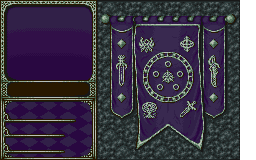
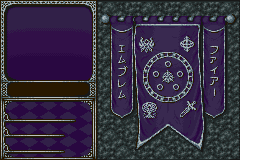
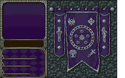
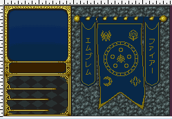
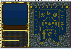
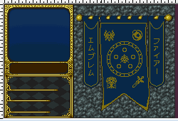
I’ve got some more updates to it, and, since this is going to be something I intend to be usable by the community, I would like opinions and suggestions on which direction to take the banner designs in, as I don’t want to do the shading more than once on this, but I’m undecided as to which seems to fit the best.

Version 1:

Ended up a little too 3H-influenced, but looks clean.

Version 2:

Too much going on / too busy, but incorporates more nods to the series.

Version 3:

Tried to take the placement from Version 1 and incorporate some of the designs/items from Version 2 in place of the symbols.

The idea was to keep this semi-generically referential to the series as a whole without being too specific, which is why I’m leaning towards something like Version 3, but it just doesn’t feel as clean as Version 1…

(Depending on feedback, I could end up going for a Version 4 if someone has a better idea than what I’ve done thus far.)

Best suggestion I’ve gotten for the bottom two corners of stone areas is to sprite little stone pedestals in front of them, though I’m not really looking forward to that idea, despite the fact that those areas feel like they stand out and need something done to break up the stone background.

Please let me know your thoughts!

5 Likes

It looks good, but in game my personal opinion I would take out the two banners on the left and right it’s kinda alot of clutter because it’s behind the Str/Skl/Spd and the Con etc… Also the japanese? characters is kinda odd place when everything else is symbols

I agree. I think Glenn should use Banner 3, but erase the japanese symbols and add the swords from Banner 2 onto those side banners.

Edit: Decided to try doing it myself.

4 Likes

For reference, the Japanese characters read as “Fire Emblem” (top-to-bottom, right-to-left). :wink:

The banners are on the side because it needed something - otherwise, there would be just as much stone down the sides looking… plain as in the bottom corners right now.

Gonna be out of town today and will probably take a needed break on this for a few days to recharge as well as think about how I want to proceed and will consider the feedback left in here when I jump back in next.

4 Likes

Super cool Glenn, giving me some inspiration on designs of my own.

Okay, didn’t have any time to to any shading, but I did decide what approach to take. Swapped the Solar Brace-inspired item on the flag for a 3DS-style (ish) Master Seal and did a second version that has taller swords on the smaller banners that way people will be able to pick which version they prefer.

Regular:

Variant:

12 Likes

I like those a lot. Nice work!

Per the “request” in FEier’s thread, here’s the FE11 Regalia sheet with a Shadows of Valentia-ized Mercurius design to it instead (I’d post just the icon by itself, but it was easier to edit the sheet and paste whole while on mobile, so):

(EDIT 10/4/19 - Accidentally broke the link, so here’s the combined version which has both Mercuriuses on it.)

(Normally, I only do the main (old) TCG design unless there’s something radically different with a later OA, but Mercurius’s SoV OA is kinda sexy, so I’m okay with making a variant of it that’s only slightly different in the hilt and lower part of the blade.)

Still gotta finish the shading on the tapestries for the statscreen, and have the final update to the Cipher Weapon Level Icons set in the wings, as well as a tileset edit that I’m (finally) nearing the end of cleaning up (I tend to take very long breaks it seems…) which should be posted “soon” (ish). (Depending on schedule and drive, may be a month or so to finalize.)

8 Likes

May I attempt to mess with your old castle-thingy stat screen, to try and make it insertable? I’m not an expert on how stuff like this works, but I feel like I could try and pull it together.

Inserting it so far made, uh, this happen, so I definitely need to fix it up.
ezgif-1-f4b4d23482fa

1 Like