LG's (Sprite) Freebies

I mainly stick to the graphics side of things. I know the battle UI has a tile limit (and the tiles are 8x8, if I remember that much) and that Jubby was able to figure out years ago how to slightly expand the number that could be used, but beyond that, the actual insertion aspect is not something I’ve had direct experience with (which is why I posted it here for anyone to try and use).

Given that I cared more about the completed picture than factoring in the tiles, I’m 99% certain that it’ll need some kind of modification to remove some complexity to get it under the tile limit. If you can let me know just how much it’s over by, I can make adjustments to try and simplify it in a way that doesn’t make it look like trash due to lack of shading, etc.

Alright. So I tried inserting a palette-fixed version in through FEBuilder, and it’s improving.
emulator
altbattlescreen
Aside from some of the detail on the shield things, the name-header towers, and the banners below, it turned out pretty well overall! (I have no idea what’s changing the weapon name color. Aside from that.)

I’m not sure exactly how much detail you need to remove, but it shouldn’t be that much. Thanks for making this custom stat screen!

1 Like

In the palette, the first three colors are used for the text.

2 Likes

Alright. Fixed that, and it looks a bit better. Thanks for your help!

Hm, there’s still a lot that I wouldn’t be happy with when looking at how it is currently - the bottom of the castles are cropped off, the top of the flags have extra pieces that they shouldn’t have, the shields have lost basically everything, and the HP boxes look bad with the tiling that’s applied. I’ll see what I can cut out or simplify so that it at least looks a little more correct to the original.

I’m not sure what you’re meaning by “palette-fixed”, though, unless you’re simply meaning the order that they’re sequenced in in-game? (Which the palette at the top is not ordered in any particular way, with the exception of the faction colors on the left and the common colors on the right.)

Okay, as promised, new, potentially final update to the Cipher Weapon Level sheet:

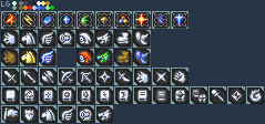
Row 1: The FE10 Affinity icons are still the same after the edit from January.

Rows 2 and 3: Gone are the placeholder Horse, Pegasus, and Wyvern “Con/Aid” icons. There are now icon options (both in Cipher “monochrome” style or colorized, with the exception of Armored, since it can stay the same and be “white” for the colorized one) for: Laguz/Beast (recycling the Cipher “Fang” unit icon), Horse/Beast, Flying/Pegasus, Armored, Monster, Dragon/Wyvern/Manakete, Infantry (for things like the Swordslayer), and Mage.
> I don’t know if anyone has attempted or figured out creating new structs of these to expand them beyond what’s in the sprite sheet, but I figured it might incentivize it or be great if someone simply wanted options for now or the future. (Or if anyone has or will want to figure out how to have and display multiple, a la 3DS FE and forward (Horse + Flying for Pegasus, Dragon + Flying for Wyvern, etc.)…)

Row 4: Only thing new is Three Houses’ Brawling as an option for Strikes. (Thanks, Cipher, for including Raphael in the first set and giving him this.)

Row 5: New additions of Tome variants for Faith, Reason (Black Magic), Reason (Dark Magic), and Reason (Combined Black and Dark Magic).

Row 6: New additions of Authority (Flag) and Shields (a la Berwick Saga), along with copies of the Horse, Flying, Armor, and Dragon icons in the event anyone in the future wanted a way to somehow have levels for tracking proficiency on mount types and requiring certain levels for class promotion options, reclassing, or whatever.

If anyone can think of any possible weapon levels I might have missed or has good suggestions for other things to consider adding, I’m open to the idea of requests, though I cannot guarantee I’ll do them or when I might have them done if I think it’s a good idea that I do want to include.


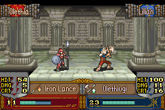
EDIT @RandomWizard - Made some simplifications, don’t know if it will result in removing enough tiles. Next step would be changing the shading on the shields on my end, but wanted to see if this was enough first. I changed the flags and simplified the shading to some of the gold elements along with the big change to the HP bar area (which should save a bunch of tiles with things being able to be reused, I hope).

15 Likes

alt
emulator
It’s getting closer, but still has issues with the same areas (shields, tower banners, HP-bar boxes). The shields in particular are completely broken. Simplifying the shields/towers would probably be the next big step towards fixing this. (Also, the little flower things near the middle disappeared, but that’s not that high of a priority.)

By “palette-fixed”, I mean the actual palette order of the image. I basically adjusted colors on the vanilla battle screen and copy-pasted yours on top of it, using Usenti to make sure the colors matched up. (It turns out I messed something up with the text colors, but that’s fixed now, as you can see in the screenshot.)

The issue with those areas is the fact that they all need to be the same tile. I doubt you’ll be able to make the shields at all.

I was able to change those areas in FEBuilder to use a different tile, though. So unless there’s something weird about the import process itself, it should work fine?

Is FE7 just better about what you can do with the TSA than FE8 in this instance? Or is FEBuilder’s implementation just not that good? Because back in like 2011, this was possible, so long as you stayed within the tile limit. (Example: https://www.youtube.com/watch?v=muhGTCkDBoA) Unfortunately, the tutorial for the old method on SF is full of broken links and images, so it’s effectively useless.

(I’m fully aware that the tile limit is one of the big problems at the moment, but this should still work since the old tech was able to do it.)

EDIT - I’m noticing that the font colors in that last screenshot are wrong and are using the lightest faction shade instead of white. Each faction gets 15 colors plus a background right? Are the 3 font colors included in that palette then, kicking me over by 1 color?

1 Like

I haven’t really worked with FE7 before. It might have some capabilities for TSA stuff that FE8 doesn’t, but I wouldn’t know. The Eternal Bond one does look slightly more condensed than yours, but I feel like something is definitely odd with this whole situation.

The lightest font color thing was completely intentional. I thought it would be a neat detail to make the text look a bit more interesting, but it can easily be changed back if it looks bad. There’s actually one extra color slot, that currently isn’t getting used for anything.

I suggest using white for the text color instead of the faction color so it’s more even across both sides and is easier to see.

1 Like

Alright. I’ll change it back. Thanks for the advice!

I mean, I did that template too; that’s how I knew its Hit/Dmg/Crt area wasn’t a single tile multiplied across. And, yeah, it is less complex, and I can try to address that later today somehow.

But, I’m seriously wondering if FEBuilder is simplifying/skipping some of what can be done on these for the ease of making it more tool-and-user-friendly in insertion. Maybe someone on the discord has the tutorials (https://forums.serenesforest.net/index.php?/topic/25045-inserting-custom-battle-frames/, https://forums.serenesforest.net/index.php?/topic/30002-battle-frames-part-2/) saved and can pass them along. (And maybe 7743 could incorporate them into FEBuilder to improve the tool if it works…) (Heck, an early “prototype” version of this template was one of the examples used in the first tutorial - it had problems with having too many tiles originally, but the second tutorial came a year later and opened up a ton more tiles, so…)

Alright, I think I almost understand some of the tutorial, but there’s some stuff that I absolutely can’t figure out with the GBAGE method. I really just have no idea what I’m doing.

@dancer_A and I started this expansion of Sme’s Desert Tileset last year and I’ve finally hit the point that I’m burned out on it after lots of time on and off working on it (mostly off). Was going to do two palettes for a more arid, less saturated version and a more verdant, FE6-like oasis-y color scheme, but I don’t feel like changing all of the grass colors. Apologies on the cluttered nature, but had to shift and squeeze things to fit it all in. (Some tiles are not in the same place as Sme’s, so I you’ll probably have to redo maps if using this.)

As I mainly just do the graphics end of things (don’t even have Builder on my PC), this is just the image. Someone will need to do the object map stuff, etc. that’s needed to actually insert it, provided the object map is feasible with how little empty space there is on the full image). Has the same total color count as Sme’s does, but I don’t know if how the game uses the palette banks (Discord was saying each 8x8 quarter per tile uses 1 palette) is actually preserved.

17 Likes

This will be extremely useful not just to me but to many others, greatly appreciate this!

Was just wondering how I could make a desert chapter more spicy. This will do quite nicely.

With FEE3 coming to a close and my motivation to continue working on this waning, I think it’s time that I just release it to the wild. It’s been years in the making (literally like 3 and a half years since the folders were created) and I was going to wait until FE’s anniversary in April in the hopes that I’d add more or improve some old ones in the time in between, but I haven’t truly had the spark to work on it in months beyond minor tweaks to things already on it. (Various projects dying or being cancelled did not help with motivational aspects, either.)

I may feel the urge to go back and add to it down the line, who knows. My drive to work on projects changes all of the time. I present the Archanea / Ylisse, Valentia / Valm, Jugdral, “Outrealms” Icon Project:

Originally started to do all of the old FE TCG (pre-Cipher) card arts as icons for a Thracia remake years ago, it slowly evolved into a much larger project to do anything I could get art of as my own GBA-style icons of the weapons, at least as though it would fit into the one setting where all of those stories occurred in the same world (along with notable Outrealm-type gear). I was attempting to focus on finishing groups before moving on to another, which is why there are so many more swords than other types, but as inspiration struck, I had to jump around to what I was feeling or what would (try to) complete a smaller set.

You can find a log of what all of the color codes and boxes mean and what every icon is in this text file.

And, to make lives easy with all of the different background colors, here’s a version with all of the icons in the standard color from the default graphics (and the blank placeholders removed):

22 Likes

awesome