[Fire Emblem: the Blazing Blade Graphical Overhaul]
The goal of this project is to create the definitive version of FE7 by looking over and updating every graphical element possible.
If you have a good eye for sprites and are interested in getting involved, please send me a PM! I’m looking for a partner to look over the updated portraits/ do another pass on them. I’m a beginner pixel artist, and it would be a huge relief to have a partner to look over or update the graphics with me.
[Order of Operations]
Portraits (In progress)
Tileset Palettes
Battle Animations
Map Sprites
Item Icons
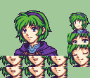
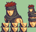
[PORTRAITS]
EVERY PORTRAIT IS F2U AND F2E WITH CREDIT. SOME MAY HAVE BROKEN FRAMES. ALL ARE WIP.
Skin Tones and Hair Colors by Blade
These colors were super useful for making the portraits’ colors match their artwork! These are an amazing resource, and I would recommend them to anyone!
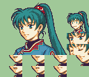
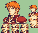
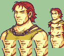
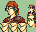
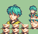
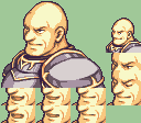
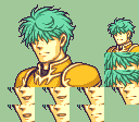
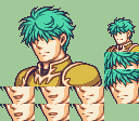
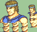
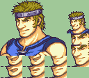
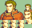
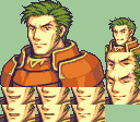
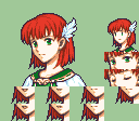
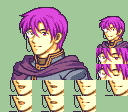
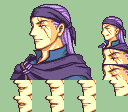
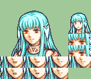
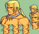
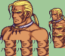
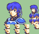
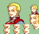
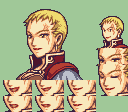
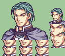
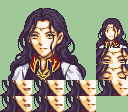
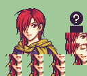
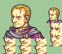
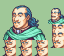
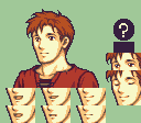
Hector Portrait by BuskHusker
This beautiful portrait by BuskHusker was perfect for splicing into my Hector portrait! I used the eyes and part of the back hair.
@AlemOwl for looking over my portraits! They have a very discerning eye, and catch things that I overlook, which is invaluable for making the best work I can.
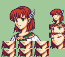
these are looking great so far! i like how their features are more defined and the color palettes look really nice
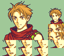
as a certified matthew-lover, id love to see how you’d do matthew whenever you get around to him
Out of curiosity, would you be open to including this in your QOL patch? I love the changes you’ve made in that patch and I think the full on graphical remaster would benefit greatly from it!
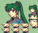
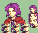
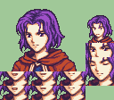
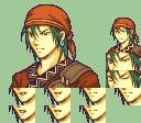
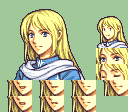
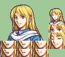
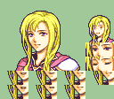
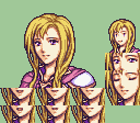
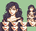
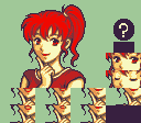
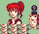
So far the teasers of the portraits are awesome! I can’t wait to see how Hawkeye and Sonia would look!
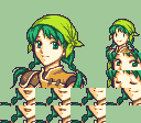
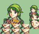
These portraits will be released as a patch when I’m finished with them, which may take a long time.
Most likely there will be a patch for just the graphics, and another patch with both graphics and QOL
I’m super glad you like the teasers, and Hawkeye and Sonia are on the way
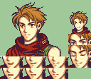
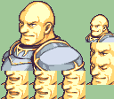
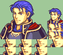
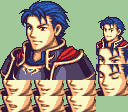
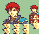
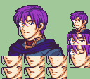
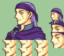
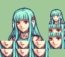
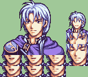
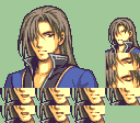
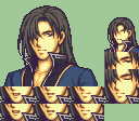
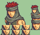
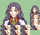
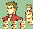
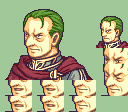
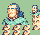
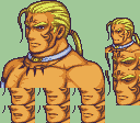
This one is honestly much more subtle, mostly color changes, and slightly more definition in the ears, muscles, and jaw. His necklace (?) is more accurate to his official art.
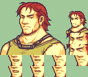
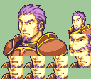
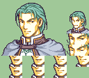
Hawkeye definitely looks more tanned from being the Defender of the Nabata Desert. I love it!
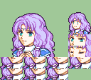
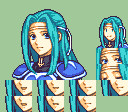
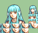
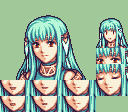
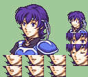
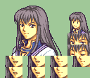
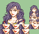
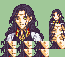
Man Sonia looks even more cunning and dangerous.
It may be subtle changes but the they’re definitely noticeable in the best way! Great job man!
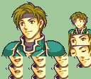
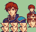
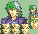
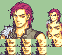
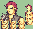
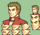
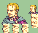
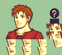
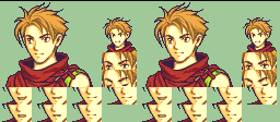
His face still looks a little bit weird, but I think he generally looks better. His eyes might be a little worse, but I’m not sure. This one will need to be revisited.
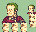
I like how you put some more outline color into the folds on his collar. Gives it a bit more texture and makes it look more 3d.
I prefer the original more downward facing angle of his eyes over your version. Would probably copy the right eye one to one from the original and keep your version of the left eye except making pixels 27,38 and 28,37 his third brightest skin color, otherwise his upper eye lid looks a little heavy.
The additional shading on the sides of his face and neck and using the outline color on his chin makes him look a little skinnier, which is fine if that’s what you’re going for. I like how you muted the super saturated green part of his getup.
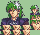
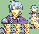
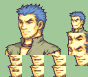
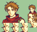
Fire Emblem, and anime in general, has a really bad habit of not following proper human facial proportions. I’m not really talking about the oversized cartoon eyes (though “eyes way too big” is sometimes a problem) but also things like brows/nose not aligning with the ears, or the face overall being too long.
For Matthew specifically, his face might be a smidge too long (or his ears just a bit too small) since the bottom of his nose extends past his earlobe. But I think his bigger problem is he looks like he’s giving massive side-eye. And I think his eyes were overall more proportionate in his official portrait; it looks like you widened both by ~1px but that makes the eye on the left touch the side of his face which ends up feeling “wrong” since he’s mostly looking forward.
Here’s a quick edit to show what I mean, comparing the official Matthew portrait to one that has a slightly shorter face (tip of nose, mouth, chin moved 1px up) and with the side-eye removed (eye on the left had pupil moved 1px to the right):
It’s not perfect and there are still some other things I might change (namely that his hair always felt stiff or like it sits oddly on his forehead to me) but hopefully this helps you figure out what you might want to change on your portrait
Sure, changing facial proportions does necessarily change the underlying “vibes” of a character. But could also keep the face length and experiment with extending the ear downward by ~1px if you prefer, would help with proportions without altering the shape of his nose.
Moved ear to be more proportional, (with feedback from @kildario) updated eyes. cheek shading, and neck shading (with the great advice from @OCL)
Overall even better! I’ll update his hair and do frames, and he’ll be done!


/Hector%20%7BBuskHusker%7D%20%5BF2E%5D.png)
/Anna%20(Enhanced%20Shopkeeper)%20%7BAlice%2C%20Plant%20Academy%7D%20%5BF2E%5D.png)