In FE7, some of the graphics haven’t aged super well. I’m hoping to make the definitive graphics overhaul of FE7 that will include portraits, combat sprites, backgrounds, and maps. Stay tuned for WIP images!
That makes sense. I’ll keep that in mind, and make some changes! I’ll also do some testing on other maps. She looks fine on the plains, but she might not look great on different backgrounds
I would say it is! But I’m also very tech savvy and good at learning new software, so it might’ve been easier for me than it was for you. What were you trying to use it for?
Sure. I haven’t really tried animation in Aseprite yet, so I don’t think I have any tips or advice. I just import the spritesheet, and edit each frame by hand. Then I can import it into FEBuilder to test it.
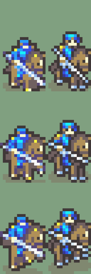
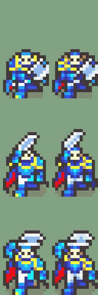
The gallery has been updated with Eliwood, Hector, Assassin, and Cleric! Next up is Archsage (Athos), Bard, Brigand, Cavalier, Dancer, and Pegasus Knight. (My order is a bit arbitrary, but they’ll all get done at some point!)
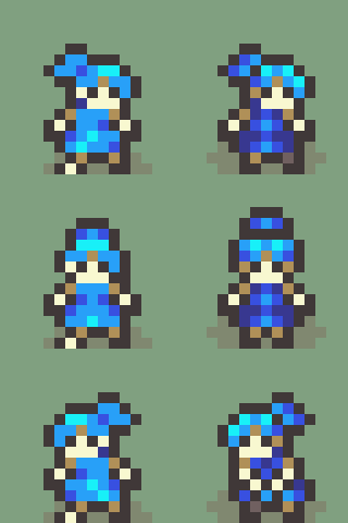
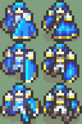
What you should be really careful about when editing map sprites like this is that you want them to maintain good readability.
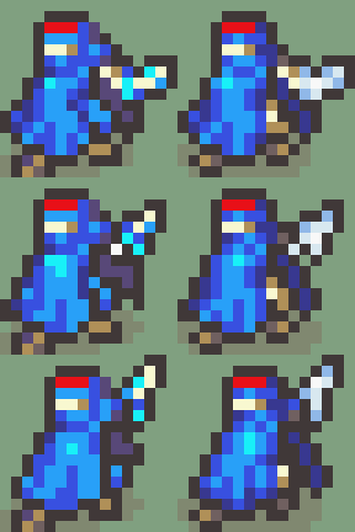
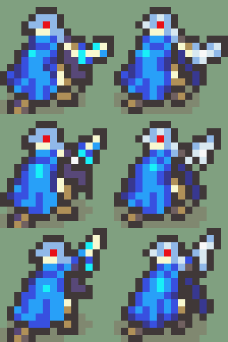
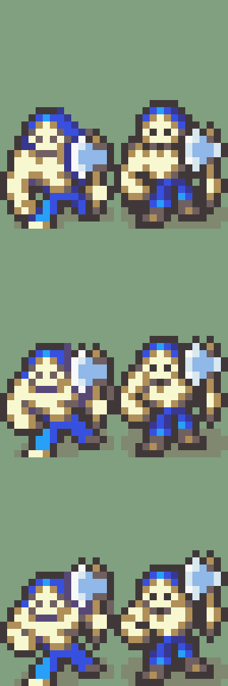
Putting a ton of detail on the sprites this small can make it hard to see what each parts are supposed to be at a distance.
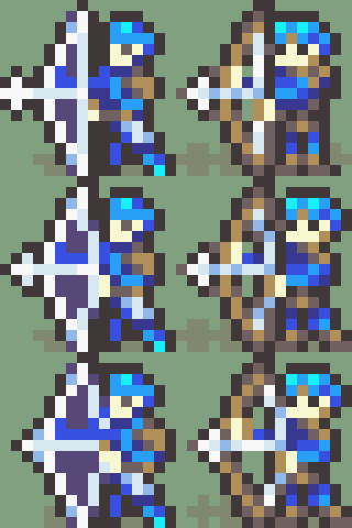
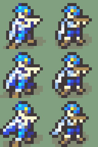
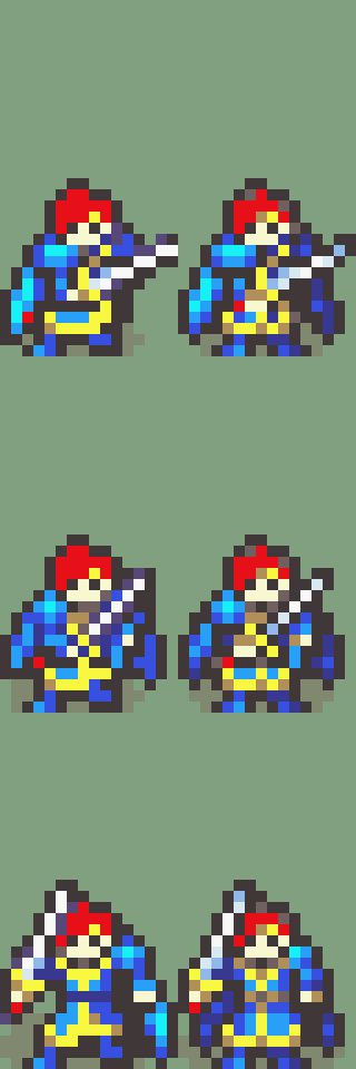
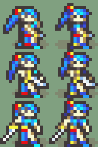
The edit on Eliwood’s sprite for example shrinks his head and changes the overall shape of it in a way that doesn’t represent how his actual head looks
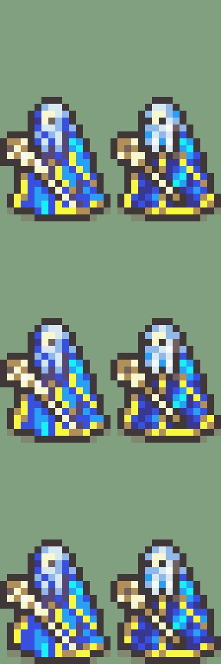
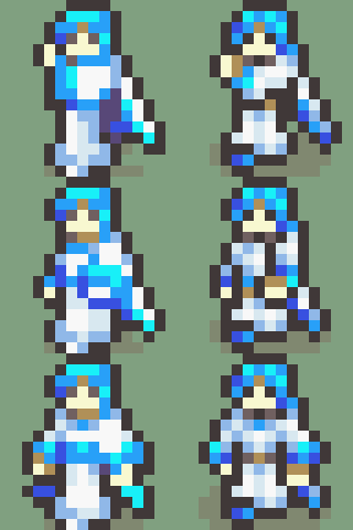
Similar deal with Lyn, moving her head down makes her feel a bit squished and the added detail to her arm makes it harder to read the pose, especially from a distance.
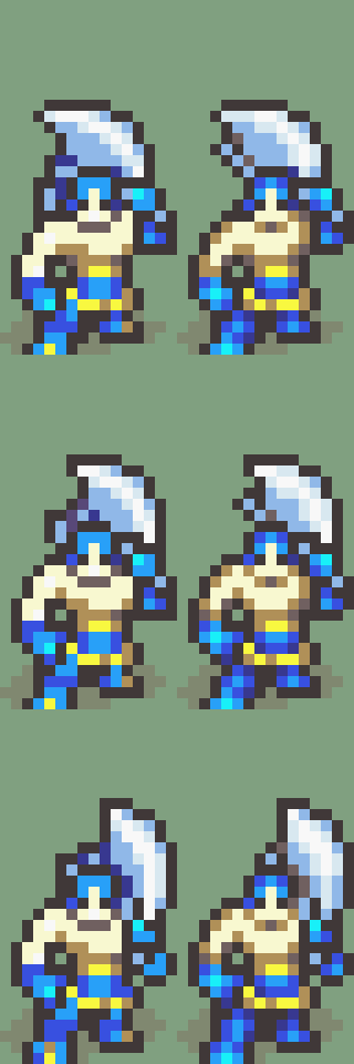
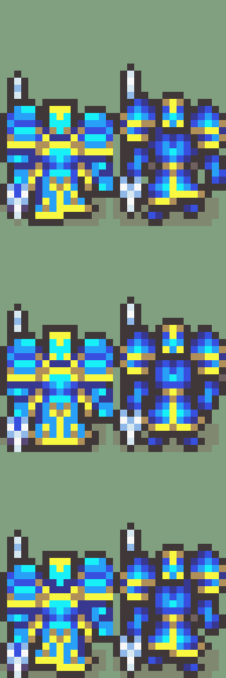
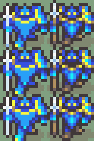
With Hector’s sprite you wouldn’t want to change the axe handle to be brown/skintoned because then it makes it harder to discern where the axe starts compared to Hector’s body and the roundness of the blade makes it less sharp than the smaller sprite
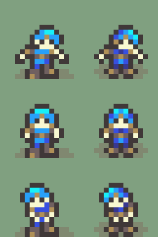
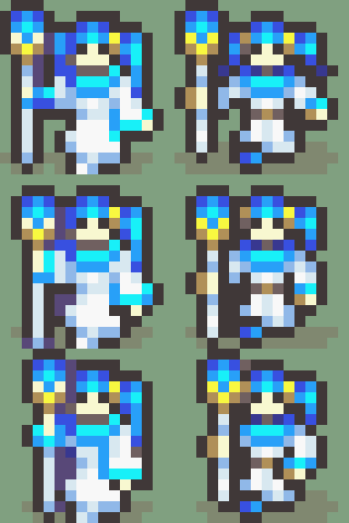
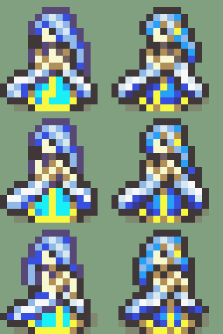
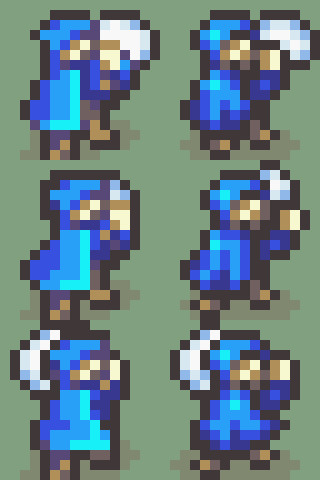
I think it’s a good start for revamping the map sprites, there’s definitely room to add more details to the sprites and breathe new life into them. I think the male archer and the cleric are off to a really good start, but you’ll just want to try to cut back a bit on the shading details so you don’t remove the basic design or make things harder to read.
Like with the Cleric you might want to cut back on the neck area so the scarf is more visible and can be read from a distance.
I’m a high school student and a beginner at pixel art, so I really appreciate any advice I can get! I agree with most of your points, and really appreciate it.
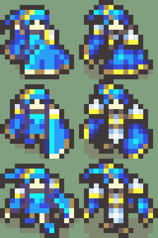
I’m definitely struggling a bit with the readability, which I’ll work on. I use a large monitor, and zoom in a lot, so I get a bit caught up in the details. I’ll work on adjusting the sprites I’ve finished and nailing down a specific style for the project. Thank you again!
I updated the imgur with sprites adjusted with your critiques! It’s definitely not as big a change, but I think they preserve the readability of the originals.