Welcome! This is a list of tutorials and general advice I’ve created to help newcomers step into the world of custom portraiting, as well as hopefully provide some new insight to other spriters!
Below are the completed categories, though there are more to come!

Colors and Paletting
The palette always the first thing I start with when I’m making a portrait.
You have 16 colors to work with, including the mandatory outline and transparent background color. 99% of portraits also use 5 skin shades. This leaves you with 9 shades to do whatever else you want with.
Make sure these colors are not darker than the outline color. The outline color should be your darkest color.
Using 3 colors with 3 shades each is a fairly safe option with some fair flexibility, while also being easy to recolor.
However, you can get pretty creative with your palettes through different techniques.
Palette Techniques and Color Theory
Ramping
This is a fairly recent palette of mine. On the left, it appears to have far more than 16 colors. However, on the right, shows the ramps of each of the colors, and how they intersect and share shades, saving colors. On top of the 3 sets of 3, I have another set of 4.

This ramping works because of another color technique called hue shifting.
Hue Shifting
This green palette has one consistent hue throughout. It looks fine and is certainly functional. However, what if we shifted the hue?
![]()
Here is that same green palette with hue shifting (and some edits to saturation and brightness for the sake of value consistency, which I’ll touch on later.)
It looks much more vibrant and natural, and ultimately more interesting to look at.
![]()
This is achieved by pushing your darker shades’ hues closer to purple and your brighter shades being farther away from it. This results in your darker shades appearing “cooler”, as shadows would. This color bar shows the dynamic range of the hues in the second palette.
![]()
This is a crude diagram, but these are essential how you want to shift your hues. If it is yellow or anything clockwise from it, shift to purple through orange and red. If it is green or anything counter-clockwise, shift to purple through teal and blue. Either way, you want to always shift your darker shades to purple.
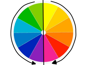
Looking back to the palette I used to explain ramping, the green and blue meet at and share the 3rd shade. Both of them ramp down to it because their hues shifted in the same direction, albeit, the green shifted much more. In regards to the brown I used for the skin, I needed to shift the darkest skin shades pretty extremely to make room for red hair. Fortunately, because skin is orange in hue, it shifts naturally through red to purple, which worked perfectly for sharing shades to make the red hair.
Value
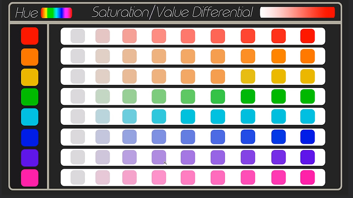
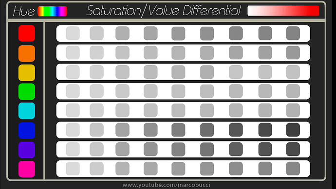
Value is one more bit of color theory that is helpful in creating balanced palettes. Value is how bright or dark a color appears. This is not the same thing as brightness, though it is affected by it, along with hue and saturation. Unfortunately, many programs don’t support a proper way to view the value of your colors, mine included, so this is a bit of a crash course based on my personal experience and knowledge.
The more saturated the color, the darker the value is and vice versa.
The lower the brightness of the color, the darker value is and vice versa.
Blue, purple, magenta, and red have darker values.
Orange, yellow, green, and teal have lighter values.
These diagrams help visualize this a bit.
These diagrams are from this video, which explores this topic in depth: Something strange you should know about color | QUICK ESSENTIALS - YouTube
Some helpful general tips for colors:
Yellows used for blonde hair or for golden trims can often use skin colors for the darker shades to save colors, especially because many yellow unique yellow shades may be too similar to the skin shades and make anti-aliasing, especially around the bangs, very messy and difficult to work with.
Bright colors can make use of an extra shade if you have room in your palette. I often make 5 shade white-to-black palettes in my portraits to get extra detail in things like armor. Hair is often very detailed, and can make great use of a fourth shade for extra detail.
5 shades is realistically the most you will need for a single color from top to bottom. If you have more room in your palette or you want to challenge yourself, feel free to do more if you’re comfortable with it, but don’t feel pressured to do so. Most of the time, 3 shades works perfectly fine.
If you are trying to make something very dark, like black hair or clothes, using 2 shades and then outline as a third shade still gives you enough shades for detailing and can save you a whole color to allocate somewhere else.
Useful Links
Hue Shifting and Ramping: Hue Shifting in Pixel Art (Color Tutorial) - YouTube
General Color Theory: Understanding Color - YouTube
Value: Something strange you should know about color | QUICK ESSENTIALS - YouTube

Starting Your Portrait and Shapes
This entry will be about shaping, blocking, and just generally starting your portrait! This one will be a bit more subjective and is much more dependent on individual artists, so please don’t take anything here I say as a be-all-end-all, and more just some ideas to get the ball rolling.
There are two common ways of starting out a portrait; Blocking and Lining. Both are pretty different in execution, but neither is better than the other. It all boils down to personal preference/comfort. If you aren’t sure which is right for you, I’ll include some pros and cons for each to get a better idea of which is a better fit, but keep in mind they are subjective.
Note that you are not limited to just one of these techniques. You are more than free to mix them around and use them both for different parts of a portrait. These also aren’t the only two techniques, just the two most common/easily-applicable ones.
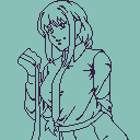
Blocking
Blocking is a technique where you lay out flat colors in the rough, general shapes of all the major aspects and details, later laying details on top using different shades.
Pros of Blocking:
- Incredibly flexible; because of the roughness of the shapes and flat colors, it’s very easy to make adjustments as you go along without worry too much about messing up your established details.
- Gives a good idea of the colors you’re using and how they interact with one another; You immediately see the flat colors and can make changes to your palette before you get into the nitty-gritties of the portrait.
Cons of Blocking:
- Sometimes the roughness and lack of detail can bite you in the butt; having a big flat sheet of a color can sometimes make it a little confusing and even overwhelming to further define and detail, especially if you struggle to envision what you would like the final product to look like.
- If you Block on top of outline color like I do, sometimes the outer edges of the portrait will end up larger than intended because of the extra pixel of outline once you’ve added in the background.
Tips for Blocking:
- There’s different ways to detail your flat shapes; Some people start with a middle tone and add the lighter shades on top of the shaded parts. Some people start with the brightest shade and work down. I personally use a mix of both, depending on the part I’m shading or detailing. Experiment and find out what works best for you!
- You can incorporate a little bit of linework into your Blocking; as you can see in my blocking example, there’s a lot of outline inside the portrait to define smaller details like cloth folds. If this helps you envision the final product better like it does for me, go for it!
- I’m not a painter myself, but conceptually Blocking is a bit similar to painting, where you lay rough shapes with flat colors and fill in the details by laying more and more shades on top of those shapes, so if you have experience with painting, you might find this intuitive.
- I recommend Blocking if you like to go with the flow and/or if you work best with vague ideas and want something flexible that you can easily adjust as you go along.
- Blocking is for cool kids like me. (Citation needed)
Lining
Lining is exactly what it sounds like; defining shapes and details using lines, later filling in the colors and details.
Pros of Lining:
- Lining lays a very solid framework for your portrait; the edges and such are all clearly defined from the start, and from there it’s just a matter of filling in the details and making it look natural.
- More intuitive and straightforward for most people; using clear defined lines to express perceived edges just makes sense to most people, especially if they work with lined digital art already.
Cons of Lining:
- While still decently flexible, Lining isn’t quite as flexible as Blocking when it comes to making adjustments as you go along. Shifting sections with finer lines and details especially can become a little messy and confusing.
Tips for Lining:
- I’ve seen some artists that do Lining use different colored lines to help differentiate what the lines are defining, which could definitely help with some of the confusion I mentioned in the cons.
- If you’re a traditional or digital artist, especially the latter, who is already familiar with lineart, this is probably a comfortable direction for you to take.
- If you like planning ahead and having a stable groundwork to build off of, this is also probably a more comfortable direction to take.
If you have experience with sketching, you can make a sketch to lay your blocking and/or lines on top of. I often do this for halfbodies or fullbodies, as it helps realize the pose a bit easier for me.
Using a Sketch
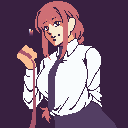
For example, here is the sketch I used for the Makima portrait I used as an example above.
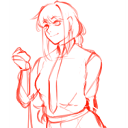
Here you can get an idea of how I layed my blocking on top of the sketch above, as well as some of the slight adjustments I made to the piece as I blocked it out.
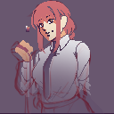
If you do a sketch beforehand, make sure it is roughly to scale with other portraits when resizing it, otherwise you risk the head being too large or small. Don’t worry, it doesn’t have to be 1:1, just within the ball park, as you can always make adjustments as you go along.
These techniques lay the groundwork for when you start your sprite, but are both still reliant on your skill and knowledge of general shapes of different objects and anatomy. I know that might sound a bit daunting, but it just boils down to learning and practicing, which isn’t as hard as it might seem. You just have to go for it and experiment!
That being said, I will try to give some general advice for shapes in pixel art. Understanding how to make smooth and clean edges is key to good shaping. Anti-aliasing plays a large part in that as well, but the rough shapes/lines themselves alone can still express a lot. I’ll save anti-aliasing for another entry.
Slopes, Curves, and Corners
This is probably pretty self-explanatory, but here are what different slopes look like depending on the pixel length.
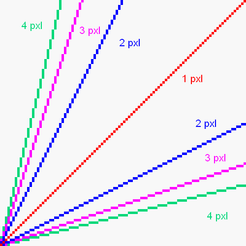
You can combine these different lengths to make curves, more specific slope angles, or do both to get some really flexible and/or subtle curves.
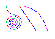
Experiment and get a feel for what pixel lengths create what kinds of curves!
Note: When making curves, if you’re combining different pixel length slopes like the 2nd and 3rd example, only use two different length slopes. Alternating anymore than that will give a much more wavy or jagged feel. You can alternate two slopes in a 2:1 pattern like the two on the left in the examples below to get similarly angled slopes with a much straighter edge. Also try to avoid alternating two lengths that are more than one pixel in difference. The green and blue slope is quite jagged, and the same slope can be achieved by simply using a 3 pixel steep slope.
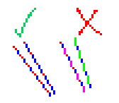
This knowledge of slopes can also help you define sharp corners, both straight and curved. There’s no 100% universal technique for this kind of stuff, but here’s some common corners/points, a lot of which can be seen in hair and clothes, but also sometimes extends to things like armor/clothing trim and scars. The single pixel at the end of a few of these really sells the point of those shapes. Corners and triangles like this are a bit more situational and case-by-case than general curves, so you’ll once again have to experiment with it more to get a better feel and understanding of it.

Below I have an example of me blocking out a portrait, explaining all the major steps as I go along the way, so you can see the technique in action. I’ll be spriting Laegjarn from FEH for this example. I’ll be using her to help explain anti-aliasing in the next entry as well.
A Walkthrough of my Blocking (Along With Miscellaneous Tips)
Just a disclaimer, my blocking is very thorough and deliberate. Your blocking does not have to be this refined. If you can make sense of messy blobs of color and work well with it, that’s a good thing, roll with it! I’m just a perfectionist lmao-
When I start blocking a sprite, whether I’m using a sketch or not, I always begin with the head. The head, specifically the face, will be where people usually look first and the most, so its good to make sure that focal point is solid. It also acts as a good sense of scale for the rest or your sprite, especially in regards to anatomy.


As you can see, I don’t bother with the top of the head or anything the hair will be be covering since I have the sketch to rely on. If you aren’t using a sketch though, I recommend drawing the top of the skull to make sure the scale is right, especially if you’re not experienced yet at anatomy. You can also see that I’ve already made some slight alterations to the face to get it to look right as pixel art.


Most of these steps will be pretty straightforward, but I’ll give insight where I can. After the face, I generally move onto the hair. Notice the use of some of those corners I showed before in the hair to give some nicely defined points and tips to the strands, both big and small. The top of the hair makes use of those different slopes to get natural looking curves. I also defined some of the neck and shoulders since we’ll be moving onto the body next.
Note: If your program allows for layers, they’re useful here!
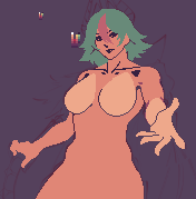
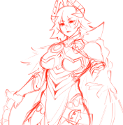
I know this is a big jump, but that’s mostly to get the base out of the way. I plan on making some of her alts, so a base makes that bit easier, though if you’re working without a sketch, it will help a lot with anatomy before you add on the clothes/armor. The main thing to note here is you can use different shades to block out major shapes that normally would be colored with the same shades to help differentiate them without the shading and anti-aliasing. I did it to shape the breasts and near arm here, but it can be used in hair, armor, clothes, etc., not just boobs. I also incorporated some lining to help define various things to help make better sense of the details and depth.


Her crown(?) is very geometric, so using sharp edges and making sure the angles are consistent is very important. However, some of these seemingly straight edges actually are very slightly curved. Sometimes giving straight edges the slightest curve can help them look a little more realistic/natural, especially with very geometric shapes like this. This is applicable to things like swords and even trim as well.
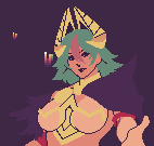
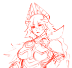
From here on, I’ll just focus on the upper torso for presentation sake.
When working on the major details of an outfit, I focus on the details with the biggest shapes (in her case, the cape and the feathers on the far side), and the details that break up the shapes the most (in her case, and most cases, the trim/golden bits). These two cover the most ground with the least amount of work since the details are usually a bit simpler.
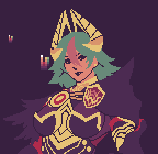
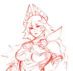
After filling in those smaller details, everything should be blocked out! Since there’s so many intricate details in this design, I’m not going to try to cover all of them, but small details aren’t as important when it comes to blocking anyways, as most of the work for them will be in the shading and anti-aliasing. Some things to note though, I’m once more using multiple shades to help differentiate shapes on the pin/emblem on her cape and the strings connected to it. Things like the lines in the golden arm guard make a lot of use of the slopes and curves I covered in earlier.
And now that everything is blocked out, you are ready to start hammering away at the rendering, which I will cover in the near future!

Shading and Lighting
Once you have your sprite started, whether that be through blocking or lining, it’s time to render it, starting with shading. Shading is generally pretty straightforward, but is reliant on artist’s understanding of the 3D shape and depth of objects and how light interacts with said objects. I won’t cover the fundamentals of lighting and how it interacts with objects here, but I will show how to portray light in pixel art even with limited understanding of it, as well as show what to avoid.
Rendering: The process of refining and detailing a piece, using shading and other techniques to realize the final piece.
Shading: The process of adding variety in value to express light, shape, and space in a piece.
(Note: Remember from the color tutorial that value is the perceived brightness or darkness of a color.)
Shading
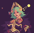
In GBA Fire Emblem portraits specifically, the light source is almost always in the top right, generally hitting around 1/2 to 2/3 of the portrait. An easy rule of thumb is if the light is hitting an area, use your 1st shade; if its not hitting an area, use your 2nd shade.

The #1 thing to keep in mind when shading is the 3D space of the objects in your mind. Their shape, the angle of their faces, and their positioning and depth all have an impact of how the light interacts with it them and the objects around them.
If the light would not be directly hitting a spot, that part will be shaded. Likewise, if an object is obstructing the light source, it casts a shadow on the objects behind it. In both of these cases, use a darker shade to convey the shadowed parts. In my example below, it’s most easily seen on the underside of the hair and the underside of the collar of the cape.
Round Objects/Curved Surfaces
In real life, round objects gradually obstruct light along their curvature, creating a gradient-like shadow; with the limited number of colors we can use, smooth gradients aren’t possible. There are techniques to achieve gradients without looking flat or choppy, but vanilla portraits do not make use of them. I won’t cover them here, but if you’re interested in gradients, look into dithering.
So how do we portray round shapes without gradients? You simply use a flat shade somewhere in the middle of where the gradient theoretically would be. Try to think binary with it. If most of the light is hitting it, use a lighter shade, and if most of the light isn’t hitting it, use a darker shade. That sounds a bit questionable in theory, but in practice, it works just fine. In from before, you can see it everywhere; The top of the hair, the underside of the crown, the emblem on her cape, her breasts, and her hand. It’s simply a matter of consistency.
However, this doesn’t often apply to edges. Often if you try to apply this idea to an edge, it will end up just blurring it. You’re usually better off just using flatter colors there. Some shapes might end up looking sharper than they realistically would, but it’s better than looking muddy. Besides, I believe pixel art as a medium lends itself to more stylized art anyways.
Just before I move on to some things to avoid, this is generally the step I start to define the finer details in the piece, like the hair or cloth folds. You can also do anti-aliasing as you shade along the way, but I’m omitting that for now to focus strictly on shading.
What to Avoid (Pillowshading)
Before I conclude this entry, below is an example of what to avoid when shading, and how to fix it when you notice it.

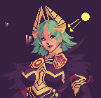
The #1 culprit of less favorable shading is called pillowshading. Pillowshading, as the name suggests, gives the sprite a blurry, pillow-y look to it as a result of an inconsistently portrayed light source. This often happens as a result of someone trying to portray those round shapes I mentioned before. As you can see, the hair is definitely pretty pillowshaded overall.
The easiest way to fix this issue is to pull the first shade to the edge.

After pulling that first shade out to just a few edges, not even all of them, it begins too look much more confident and consistent. This is what I was referring to when I said the shading of round shapes near the edge doesn’t really work. It ends up too blurry, so flatter colors end up giving you a much more natural looking, more defined shape.
Other issues when it comes to shading are often on a more case-by-case basis and aren’t as general in terms of applicable fixes. If something looks off to you, don’t be afraid to keep messing with it, use references, or ask for help!
Other Tips
Just a couple of quick tips to close this off:
- There is no shame in using references whatsoever, whether they be vanilla portraits, other spiter’s portraits, or even other mediums like digital art/painting or photos of real objects/people. The latter especially can be surprisingly incredibly helpful.
- The edges of the shaded areas make use as the same slopes and curves as shaping objects does. Familiarizing yourself with those techniques/ideas is applicable to lots of aspects of detailing in general.
- I mentioned it before, but when the light is hitting an area, you can think of your 1st shade as your “main shade”. Your 2nd shade behaves as a “detailing shade”, like you could see in the hair. Any shades below those first two should be used sparsely for detailing, often only for harsh/dark edges or for anti-aliasing. When working in a shaded area, this though process still applies, just shifted down a shade; This would make your 2nd your main shade, and your 3rd shade your detailing shade.
- This video comes from a digital art lens, but there are some tidbits that explore a better understanding of how light interacts with objects at different angled/positioned light sources: HOW TO PAINT LIGHTS LIKE A PRO (the easy way) + Giveaway - YouTube

Anti-Aliasing
After you’ve roughed out your shading, up next is anti-aliasing, which in my opinion is the most important step and technique in the GBAFE portrait style. It’s an extremely versatile skill, as it applies to practically every aspect of a portrait, whether it be skin/anatomy, clothes, hair, armor, trim; it does everything.
What is Anti-Aliasing?
Anti-aliasing is the use of extra pixels of different shades to smooth an otherwise jagged, aliased line or edge. Below is an example; the left is anti-aliased, while the right is aliased.
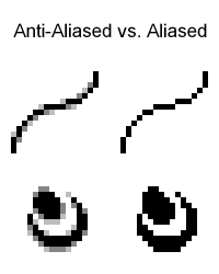
The anti-aliased line and shape are noticeably smoother, with the individual pixels of the shape being less apparent.
Aliased lines and edges aren’t necessarily a bad thing, and have their place, especially in regards to straight inorganic edges, but for softer shapes and more natural curves, anti-aliasing gives a much more desired look within the GBA style.
Anti-aliasing has a side-effect on the edge that it is smoothing; fortunately, it’s one that we can take advantage of when shaping our edges.
Anti-Aliasing's Use in Shaping
I will preface this section with a hot-take. I think anti-aliasing’s use in shaping is more impactful and important than its use in smoothing edges. Since its pixel art, of course those pixels will ultimately be apparent regardless how smooth of anti-aliasing you use, it’s in the name. Trying to “take the pixels out of pixel art” would be counter productive. Use enough to make sure your edges aren’t jagged and read well, but don’t worry too much about smoothing everything.
With that said, let’s explore this “side-effect”. In the last section’s example, note the difference in the overall shape between the two lines.
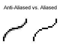
While it is obviously smoother, it is also thicker. This is a result of the extra pixels added to smooth it.
Though it may differ in the way it does affect it from case-to-case, anti-aliasing will ultimately always affect the perceived shape of the edge you’re smoothing.
The most common way this happens is when using darker shades; the value of these shades “pulls” the edge either in or out. Below is an example of this effect.
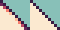
The outline between the left and right image are the exact same, yet one on the left has a subtle convex curve to it. This is because the darker shades at the corners are “pulling” the edge inwards, like I mentioned before. This same technique can be applied to convex curves, as in the example below.
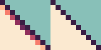
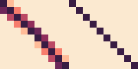
These two examples can even be used in conjunction to achieve an even more noticeable curve. Please note that the outline in the middle has not changed at all between the left and right images.
Here in my Giovanna portrait, I’ve highlighted some sections where I’ve used this exact technique with the 1:1 pixel slope from the examples above.
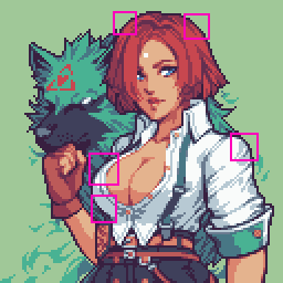
As I said before, anti-aliasing affects the perceived shape of any edge it is smoothing, not just these 1:1 pixel slopes.
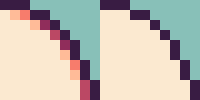
Understanding how different valued shades “pull” your edges, as well as to what degree they do it, is key to exceptionally smooth and natural edges.
- Don’t overthink it too much; sometimes one or two pixels is all you need, especially for tighter curves like the examples from above.
- Darker shades will always pull the edge more than a brighter shade does.
- The more shades you have in a ramp, the more flexibility and control you’ll have over these subtle changes in value to shape your edges. This is why I chose to use skin tones for my examples, since they generally have 5 or more shades in their ramp in GBA style.
Since anti-aliasing is such a widely used technique throughout portraits, there are a lot of possible mistakes; some small, some not quite so small.
Common Anti-Aliasing Mistakes
I’ll address the elephant in the room; the most common and arguably most noticeable mistake in pixel art is banding.
Banding
Banding is a type of anti-aliasing that is categorized by shades stacked on top of each other. The shades that are meant to smooth the edge end up following the shape of the edge or the shade before them. This results in an attempted gradient look to achieve that smoothed edge. However, recall what I mentioned in the Shading and Lighting tutorial; gradients and pixel art don’t mix well. It instead just makes the edges look messy, and arguably makes the pixels even more apparent.
Banding can often lead to pillowshading, an error I covered in the Shading and Lighting section.
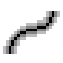
Below is an extreme example of banding for demonstration’s sake.
Just for an example of what banding would look like in an actual portrait, I added a bunch of banding to Eirika’s portrait on the left. The right is her normal portrait.
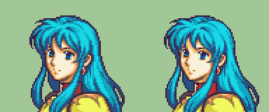
The edges and detailing are significantly less readable. They’re blurry, messy, and in some sections, very blocky, like the right side of the hair.
How to fix banding and over-anti-aliasing:
-
Recognizing it is the first step. A good general trick of thumb is to avoid letting your shades lining up exactly with your other shades or edge.
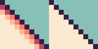
Using the 1:1 pixel angle from the examples earlier, this type of banding is pretty easy to catch because the 1:1 pixel angle pattern of the outline is being replicated with the 2nd shade.
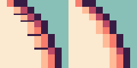
In the example above, the 2nd shade follows the exact pattern of the outline, as well as some of the sections of 3rd shade. These types of banding is the most easy to catch.

However, not all examples of banding are so apparent. In the example above, the two pixels of 2nd shade line up too much with the 3rd shade, causing some banding, slight as it may be. The top pixel of 2nd shade serves no purpose in smoothing anything, and just hurts the readability of the curve ever so slightly. -
Once you’ve recognized the banding, the easiest way to get rid of it is simply using less pixels to anti-aliasing.
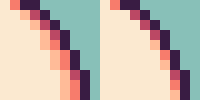
Using the example from before, the majority of the 2nd shade was doing practically nothing but muddying the edge.
A single pixel or two is often all you will need to anti-alias where pixels make a corner. -
The point above doesn’t just apply to banding, but other types of over-anti-aliasing. If your edges feel too busy or messy, but you’re not quite sure why, try just trimming away pixels that might be unnecessary.
The next common mistake I see is an interrupted main shade, often in regards to hair strands or armor/clothing trim.
Interrupted Main Shade
Another preface; this section is a little subjective, because I see a lot of artists do this and actually promote it as a technique. However, I personally think it hurts the readability of these specific types of details.
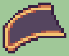
When working with trim, these shapes can get really thin. However, we still want anti-aliasing, but as we established earlier, anti-aliasing affects the perceived shape of what we’re smoothing.
Many artists will attempt something like this, where they keep that shape as thin as possible, without sacrificing the anti-aliasing.
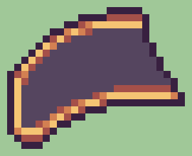
The issue with this is that the anti-aliasing is breaking up the main shade, as shown with the red below. I find this counter-productive, because anti-aliasing is actively hurting the readability of the shape in this case.
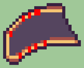
I personally prefer to sacrifice some of the thinness of the trim, so that the main shade remains uninterrupted. This allows you to get natural shaping with your anti-aliasing without losing the readability of the shape.
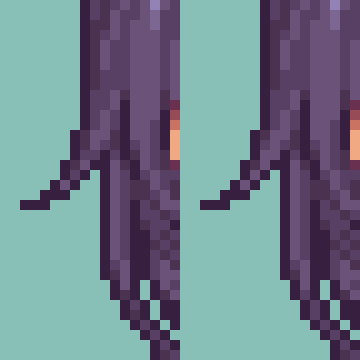
This situation also applies to long, disconnected hair strands, albeit to a lesser degree.
The example on the right keeps the main shade uninterrupted, and the flow of the strands is slightly easier to follow.
How to fix interrupted main shade:
- It’s pretty self-explanatory in concept; simply just make sure the main shade is unbroken, always at least touching corner-to-corner.
- A consistent way I’ve found to keep the main shade unbroken is these 2x2 (the bright red) squares when the trim changes height or direction. Adding your anti-aliasing on outside edges (the dark red) ensures you have some anti-aliasing while always keeping room for the main shade.
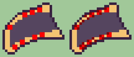
- The technique above can be applied to long hair strands as well, though the triangular shape means you don’t have to worry about it too much.
Here’s some general tips to finish this up.
Other Tips
- Less is more; As I said a couple times throughout this section, one or two pixels is often all you will need to anti-alias a corner. You can use more pixels when working with very steep, broader slopes, but most curves will not require more than 2.
- Experiment with different valued shades; Darker shades will pull your edges in more than brighter shades will. This is the crux of subtle curvature and is invaluable knowledge in that regard.
- Practice! Anti-aliasing is a skill you will develop over time and is integral to good looking sprites. Fortunately, because it is such a key part to the style, simply just making portraits will give you plenty experience and practice. Hair, trim, and jaws/cheeks will give you the most practice with how to use anti-aliasing for shaping.
- As always, there’s nothing wrong with using references or asking for help. People in the FEU Discord Spritans channel are willing to help, myself included, so please don’t be afraid to reach out to myself or others if something’s stumping you!
Below are some notes and resources that don’t belong to a category (yet) but still are important/helpful.
Miscellaneous Resources
Here is the Spritans Pin Dump, full of useful images and links to other tutorials. If there’s something this thread doesn’t cover, I suggest you check there next!
Spritans Pin Dump
If you’d like to learn or brush up on your anatomy, my friend found this very helpful book, Anatomy For Sculptors, and I’ve been using it every now and then to up my game, especially in regards to muscles. The book itself is a bit expensive, but there’s PDFs of it floating around if you’re willing to look for it. I’d link my own copy but I’m not sure how legal that would be lmao-
Shop | Anatomy For Sculptors
Thank you for reading, and best of luck! Hope this helped!
