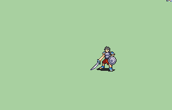
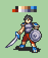
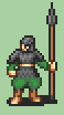
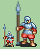
Coupled with the angling, I think the armor seems a little flat by shading or by contrast between the shades? Like, it doesn’t quite fit the depth of the sprite, as based on the pants?
If you end up angling the belt and changing the front shoulder pad, I think that would indicate a bit of a twist to the body, so there might be some more curvature shading due to lighting on the backside, which might help as well?
This also might mean that the arm holding the spear would need to shift its location in towards the body slightly (which in pixel terms is probably no more than 2, if not even just shifting it a single pixel over across the board) to reflect the positioning of the angling of the torso?
I’d suggest not using the white colour in the armour in exchange for making all of its features one shade darker; other things you might want to consider are emphasising the belt (I mistook it for armour trim before seeing the reference) and the sleeve cuffs (not sure if you have enough pixel space to pull this off, but if you can it will help the sleeves look less blobby) and adding some kind of ornament where the spear’s tip meets its shaft to offset the abrupt transition in colour.
Curse you, sending me one more step towards discarding my faux-European setting in exchange for one that apes the Three Kingdoms instead!
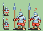
The colours are just generic, they’d be handled by a palette anyway so they could theoretically be anything.
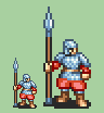
Here’s a bit more angled.
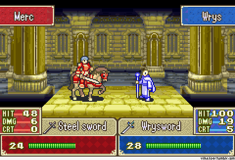
I’m not sold on the belt because it looks like butt, there’s really no way to make a slight diagonal like this look good and even actual FE sprites tend to have straight belts even when they’re standing at more of an angle than this guy.
First of all, as I’m pretty sure I have said already, making an animation, even with a standing sprite to start from, takes hours. So, no, I am not just going to animate any random sprite that people throw at me.
Second, even if I was going to do that, this is not the thread for throwing random sprites at me.


 ?
?