It’s probably a good idea to have somewhere to collect stuff now that i seem to be posting things again so here’s a thread i guess. (I had another at some point but it’s old and bad so let’s not talk about that.) Concrit’s always welcome, i don’t usually do mugs so i probably fuck it up a lot.
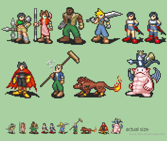
Mugs
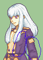
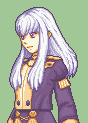
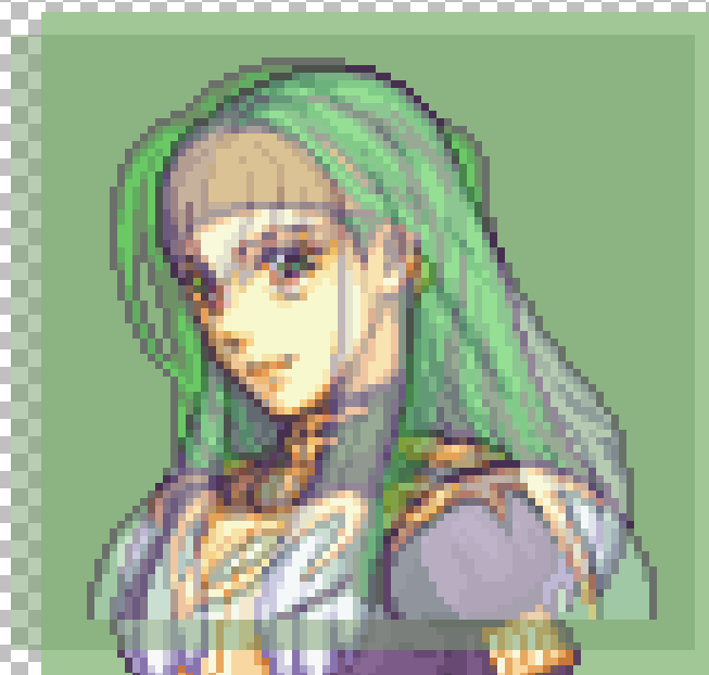
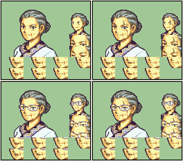
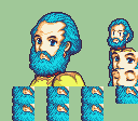
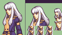
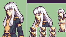
Aged-up Karla, for that alternate universe hack where she gets to meet her grandkids. (Edit of vanilla portrait. Hair’s from a villager.)
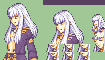
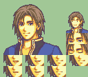
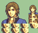
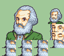
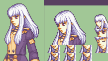
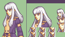
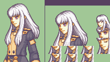
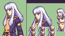
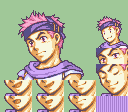
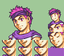
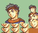
Younger Karel. Got lazy and didn’t get him a new shirt though. Maybe i should at some point. (Edit of FE6 version.)
Here with FE8 colours, too, just because.
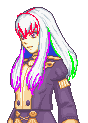
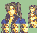
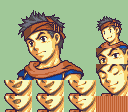
Alternate hairstyle Karel.
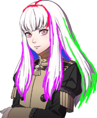
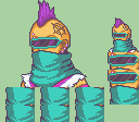
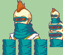
Cath after the Elibean cyberapocalypse.
Hugh before the Elibean cyberapocalypse.
Ephraim + Nephenee’s hat = Nephraim.
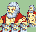
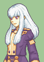
Eirikarl Marx for some reason.
Eirikarl Marx without the Eiri.
Marximum OverKarl, please don’t ask
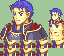
A splice of some variety, possibly a CHAR_.
Lysithea with varying palettes.
Ross/Serra splice.
The Kawaiiest Hector™.
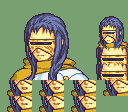
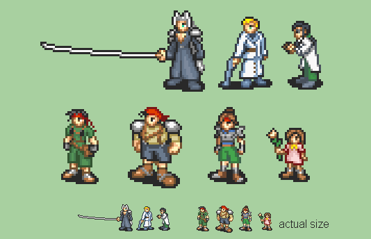
Things What Are Not Mugs
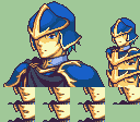
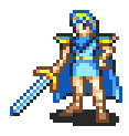
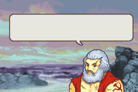
Hero-King™
Also here’s some Other Stuff i made because of Reasons. I need practice with things that aren’t just standard FE-sized humans… These aren’t really intended to have proper FE colours but feel free to nitpick them anyway.
Permissions: Everything in this post is free to use and edit unless otherwise noted.
If it is not in this post then it is not free to use, nor to re-host or archive elsewhere, regardless of time passed since it was originally posted or my availability for comment. Asking is fine, but if you do not receive an answer, that means the answer is still no.
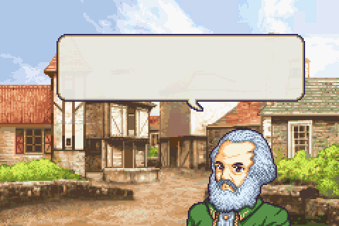
Not too happy with The Shorts Brigade but i’ve spent enough time staring at this already. Also that’s supposed to be Hojo on the top right but his design’s kind of unremarkable except for his incredibly punchable face and it’s really hard to cram that into an area of like 20 pixels so you can’t really tell.
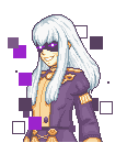
I think these parts are a bit pillowshaded, the hair imo could use more contrast between the shades and darker AA on the outline, and I guess i’d say more separation between the clumps of strands of hair if that makes sense
Something sorta like this, right now I can sorta make out the flow of her hair but I think it would benefit from more clear direction
Hopefully this ugly sketch explains what I mean better since I suck at words lol
As for the eyes maybe some more outline on the upper part could help, she’s a bit wide eyed
But yeah to echo what Feier said, she’s lookin’ pretty great so far
I think the biggest problem involves her eyes. They seem very… odd. I don’t know how else to say other than I’ve always seen Lysithea as a cute and perky sort of girl, while this Lysithea has kind of goblin-like eyes?
Maybe the hair is too close to her eyes? Could that be the problem? I’m not sure.
I think Klok is partially on to something with the eyes, though I think the main issue is the whole section of face, eyes, and bangs that are in between the “columns” of hair.
Looking at, say, Sad!Lyn’s portrait (or Syrene), it instinctively makes me think that Lysithea’s eye placements are part of the problem given that we’re almost seeing her head in profile view… but then I have to wonder if the shape of the head and face is full enough to begin with to go along with that? It might be and the eyes might just need adjusted in where they fall in the available space, but it might be worth looking at to make sure. (I’m on mobile at the moment, so I can’t do an overlay to see how the size stacks up and can only hypothesize…)
For the bangs, I think part of it is where and how the middle shade is being used - it just feels like to me that it’s lacking some definition of curvature and volume with respect to how the head is shaped and the direction that it is pointed in? It just doesn’t come across as natural to me? (Even though vanilla FE mugs are very hit or miss with how their hair is shaded in terms of conveying depth and volume…)
I do think of the ones posted that it comes across best as either the way it was or shifted 1px up - the 1px up does feel a little less moody, but I think it does accentuate my thoughts about the eye placements and bangs even more that it did without the shift.
EDIT - Okay, at my computer now. Compared to Syrene (and yes, adult vs younger girl), her head is a bit small. While the eyes are roughly about where Syrene’s are, the eye on our left is further left with the added head space. I’m also realizing that, if Lysi’s head is turned to this degree, she probably should have some darker skin shading along the left side of her face (below the eye, to the left of the nose, and down)? Or, at the very least, that’s how a a good chunk of the portraits with turned faces do it.
Hm. Yes, i was hesitant to try and define the nose more since the style tends to… not for the most part, especially with younger characters, but it seems like the angle kind of requires it.
Also tried to fiddle with the bangs some more. A step in the right direction? Maybe?
edit:
I was using the version with the hair two pixels up, so here’s one with it lowered 1px again.
That is definitely a step in the right direction with the bangs. The skin shading on the side probably needs to extend down further, as seen on Syrene. Maybe not to that degree of harshness in what shades are used or how dark they are, but it does stand out that only part of her face is shadowed now.
Also, didn’t get a chance to post this overlay visual before you replied, but:
I lined them up using the bottom of the chin as a common anchor between the two. Not sure if you have a tool that allows for layers and/or opacity control, but it might help to be easier to flip back and forth to see the the differences.


")