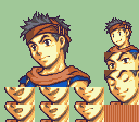
Side-angled faces are really tough, IMO. I don’t think I’ve ever seen one I -loved.- The best ones have mostly just been OK, at least in the FE-style.
I think the biggest problem with the perspective is trying to combine a realistic head shape with those stupidly huge anime eyes. Lots of 3d games discovered that around the psx era - anime characters just look like freaky aliens once you get to rotate them freely. 2d art gets around that by generally having things at a more favourable angle.
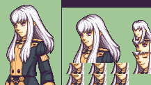
I think Syrene’s portrait looks pretty good, though.
1 Like
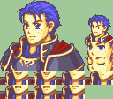
I like the shape separation on the hair now, it’s alot easier to read and overall the shaping of the sprite is nice 
Most of my critiques now can pretty much be summed up as “Less is more”, I made a bunch of edits to go along with the text so there’s a visual example if what i’m saying makes no sense
The shading on the inside of her hair 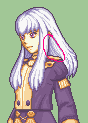
imo should be darker similarly to how you did it on the far side, that way it’ll be a little cleaner and clearer
As for the eyes, I think it’s mostly a matter of adding more outline to her eyes, the top of the pupil should be darker and it should get brighter as it reaches the bottom of the middle if that makes sense, the white pixel in the pupil (the lightcatch iirc is what’s called) is placed in a good spot where you have it for the near eye, for the far eye i’d make it darker since it’s not as close to the light source
The pillowshading in the outfit I think can mostly be fixed by shading it with the general shapes of the folds and the outfit in mind
![]()
like this right here is nicely shaped and I can easily read what’s going on, but what I think would make it better would be to shade it with the lighter side sorta leaning more to the canvas right side and the canvas left side gets sorta darker as it goes on to make it feel more 3D
![]()
The shape of this shoulder poofy thing isn’t as clear as it could be, I’d suggest using only the first and second shades of her outfit to shade it and use the third shade to define the little folds in it, the second shade would be used to make it feel like it has volume (if that’s the right word lol)
![]()
For the chest thing in the middle, I think it looks fine for the most part, i’d just remove the first shade of skin from it and then fill in the gaps of shading to make more solid shapes, the buttons are tricky and idk how else to explain them besides just try to make a smaller version of what the official art has
![]()
![]()

The hair is just “Less is more” essentially, the shapes of the strands are easily identified so all I think is left is basically just defining the flow of the hair which I think you don’t need all too much shading to do, the more of it you have the more cluttered it gets and sorta disrupts the flow imo

Sorta like this is what I think would work, I also upped the saturation of the second shade because I felt it was a little low, same with the outfit
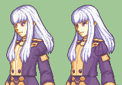
A quick minor thing I did was also lower the nose because I felt it was too high, i’m not entirely sure tho
But anyway overall I think what looked off was just that there was alot going on with the shading and it just needs a bit of tiding up to get it to all fit together (Just before I post I wanna mention that I think I screwed up the shoulder poofy’s angle a bit, 3H outfits are wack)
3 Likes
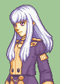
That improvement to the eyes is a big deal. Really makes them pop better.
Thanks, really appreciating the detailed feedback! Again, going to give it a good hard look before getting back to flailing my mouse around.
1 Like
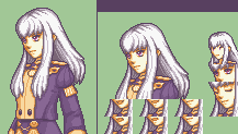
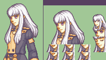
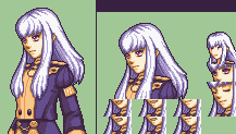
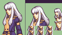
Well then!
Here she is again, with some more tweaking.
e: low saturation is kind of intentional, since fe6 colours. I’ll do a fe8 variant too once i’m satisfied with the shape.
2 Likes
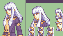
Batch of the now:
Lysithea with varying palettes. (Now finished and free to use.)
This unholy love child of Ross and Serra?
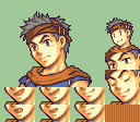
The Kawaiiest Hector™, for Reasons. (e: possibly kawaiier now)
9 Likes