The amount of details you put into each of them is really so eye pleasing, like damn.
Even though you feel a lot of them may need more work, I’m no artistic expert. To me, they are still beautiful. I look forward to more of your weapon icon creativity.
Most of the ones that I feel could use more work are ones that were older and I just think I could do better now, are ones that I don’t think I got quite right/accurate on the current pass, are ones that I want to change entirely (The Pure Sword, the Blessed Sword, etc.), or were things that I couldn’t pick between (Maltet) or, in the case of the tomes, changed how I was doing them later on (coloring the spines) and need to add on those changes.
Not sure how much more I’ll be posting when it comes to weapon icons unless I get the spark to make an update to what was posted. Most of the ones I’ve made recently-ish outside of these were personal ones for projects I’m doing which I likely won’t post as assets.
Not a freebie, but I did this map to replace one from The Raymond Chronicles and figured that I should actually post it in here, considering it’s been almost 2 months since that topic got posted over here…
I’m planning on trying to have the statscreen finished by April for FE’s anniversary… I just need to get the motivation to work out how I want to shade the tapestries and the embroidery and I wanted to come up with faction color palettes for it. Next update will probably be when I get that finished. (I do have one other project in the works that will be free-to-use, but it’s further away from completion and I need to make sure the palette wonn’t break anything when inserted.)
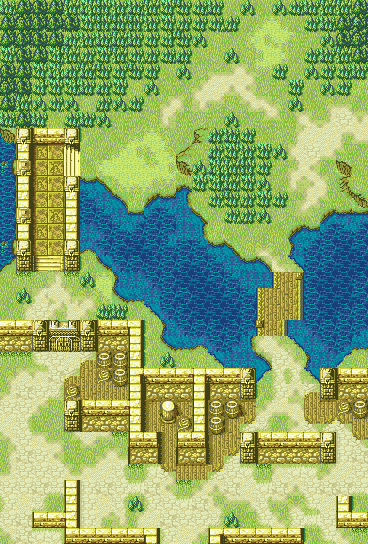
Honestly, I probably could have omitted it - I did this in a hurry the day I did it and wanted a place for reinforcements to spawn when they easily could have just spawned at the edge of the map, so just pretend it’s another tree, lol
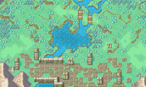
Another new map - this one is free to use, albeit with the caveat of someone will have to get the tileset working for it, since it’s been modified.
This one was inspired by Wave and Dancer_A’s FE5 and FE9 maps as they spurred the idea. Conceptually, this is a “If I were redesigning Path of Radiance Ch. 6’s map while keeping the overall flow to it” map - it’s got the forest in the northwest that Ike and co enter in and can sneak through, it retains the two bridges but staggers their locations, and it turns the bottom area into an actual encampment since that’s where most of the enemies were outside of the ones outside of the forest to the east.
Tile changes are included in the TMX that’s in the ZIP, along with the modified tileset. The easy tile change is the door opening. The bigger tile change is because of what the left bridge turned into - I decided to replace it with a dam and included the two brace caps along the left wall as an indicator for switches. Trigger the switches, and the tile change (if desired) floods the river to the right of the dam, wiping out some of the land around it, too.
Of course, just because it’s inspired by PoR Ch. 6 doesn’t mean that it needs to play out the same - it could be a defense map and you want to trigger the flooding to narrow down enemy lanes, it could be triggered as a map event by the enemies to narrow down your lanes to the base, etc. Or you could not use it at all if you so choose.
The tileset is really nothing more than mashing the 01003803 tileset with the walls, houses, and dock/boat elements from 0E007210, the 2x2 gate from 2E002F30, and the ruins floors and stairs from 6C006D6E, and then recoloring everything that was added using what I could from the base version of 01003803’s palette.
In making the map, I did wish I had ported a few more tiles over (shadows on grass for walls, the fence wall tiles, etc.), but I was already crammed on space, even though I didn’t ultimately end up using the houses in the lower section of the map (they looked too small in scale with the wall height). But, the houses conceivably could work with a different map premise or layout, so I thought they were more important than the other tiles to keep in the tileset.
For the bridge(s), one of my main design thoughts for the map was to stagger the bridges - when looking back at the oveehead map for Chapter 6, I was surprised that the bridges were in the same spot on the Y-axis, since my brain always thought that the one on the left was higher up (which was probably just because it was right up against the edge of the woods if you went left to avoid combat). I also wanted to have a lore reason for why the left would be a potentially safer route, making the left bridge into a dam that would only need to be modestly guarded, while having an open area as the main route to the compound on the right, so patrols would be roving and easier direct lines of sight to be spotted.
I’m very happy with how the map turned out, even if the overall concept/outline wasn’t entirely original. Also, shoutouts to Dancer_A for spending a little time going over the forests with me yesterday when I wasn’t entirely satisfied with how they looked.
I noticed an error the other day on the map I posted and noticed a couple more when I went in to clean up the mistake. The screenshots above have been fixed, but here’s the corrected TMX file.
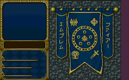
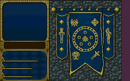
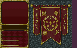
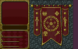
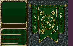
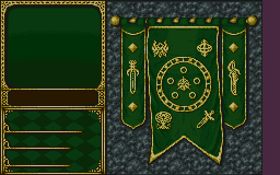
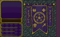
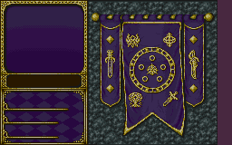
It’s officially the 20th in Japan, so happy 30th Anniversary to Fire Emblem!
I willed myself to get this done in time and am sharing it here first - the finished (Anniversary) stat sheet background:
Katakana
Swords
Ended up having to tone the brightness down from the last WIP back in July since it made reading some of the text too hard, but it kinda turned out to be an antique gold which I think added to it a little anyway. Outside of the brown name box area (carried over from the FE4/5 stat screen BG because I liked it), everything else is 100% hand done from scratch for this - the rock background (chunk made and then tiled), the cloth shading, the “embroidery” details, etc. It’s been a long journey, but this was definitely a test of my skill and willpower to churn out.
Also, I vaguely recall something about some tech to allow stat screen BGs to change based on unit faction, so I included versions of different palettes for each faction should someone make that happen.
I love the anniversary status screen, but the gold color on the banner can be distracting to the eyes when it is used. Makes it slightly more difficult to focus on the actual stats.
That was my one concern as I finished up the darkening, but I didn’t have any easy solutions come to mind barring completely redoing or wiping out most/all of the detailing and losing the depth on it. There are no spare colors in the palette, so adding shades is out and changing any will change the rest of the gold that’s used on the left side. I can try darkening just the golds again and see if that helps or is more suitable for use?
Give it a try if you like, but I found some success in changing the gold to a blueish silver.
In other news, the background palette is misplaced for some reason on some of them. Might be worth mentioning.