The only issue with seeing your rework for everything is that everything looks so much nicer (all 3 editors), but getting used to them is going to be a hassle
That much is obvious just from looking
I’m used to tab spamming when I’m working with these editors though, so the different positions are gonna be a little awkward to work with initially
Also idk if this works as well as initially
One big advantage of these new layouts is that all of the buttons are in standardized positions. Reload, Write to ROM, basically the entire top row as an example. Name, character/class/item ID, and so on.
I had to make a lot of compromises on the FEBuilder UI due to 7743’s wishes. I don’t like those compromises.
So, I’m making my own personal branch. I don’t plan to release it publicly… yet, but I’ll keep posting about it here.
This was the version of the Item Editor that I believe 7743 eventually incorporated into the main branch. He insisted several times that the ‘weapon stats’ be moved higher up, but I disagreed. We eventually adopted his vision, but I never liked the result.
Additionally, I made a bunch of other compromises, including the size of the weapon and skill icons. He ended up streeeeeeetching them out in the final version, and I hated that.
Therefore, this is the new final version of the Item Editor I have on my end. Feel free to cry that you don’t get to use this one, because it’s awesome.
I’m reworking the Class and Character editors for my own purposes, too. I’ll post those later.
You’re right, that would have been better for walking frames.
However, I simply prefer the aesthetic of gen3 over gen4.
I think mixing them would look weird. Here’s a HGSS link if anyone wants to try themselves.
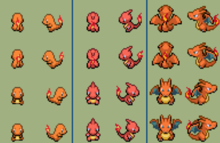
It took a few days of work to get it all done in the end and I am happy with the results. I simply want to warn people that there’s no up/down facing sprites.
More importantly, though, is that because they’re all 32x32, you can have only about ~15 different pkmn/classes of this size on a map at once before you exceed OAM limitations & all the sprites get messed up. If I end up working on this further, my primary aim would be to crop / re-draw / resize pkmn to fit 16 pixels wide where possible. Of course, the unedited 32x32 sprites would still be available, as sticking to the original aesthetic as closely as possible is important.
Oh, my god, I love that! Such a great class, and it feels like a wonderful T3-esque Druid promotion!
If I may, I’d like to request an alternate version with a ‘normal’ head/hat of some sort, with less Cthulhian vibes. Mostly as a generic alternate to the Dark Druid. We’ve been needing a generic T3 Dark Magi aside from the necromancer to go along with the High Magus and Patriarch for a while, so this would really fit that mold.
And seriously, wow, what a great animation. I love the magic runes that appear above his head. They look super unique!
I’ll consider the request. If I’m going to do it, it’d be very low on my priority-list though. The animations, class cards and map sprites are F2E, so if anyone else would like to try, they can feel free to do so.
Oh, and the magic runes are actually a pixel version I made of the Bionicle script.