(Technical details ahead).
The winner/placings will be chosen by an Instant-Runoff system, with 5 ballots. As stated before, the 5 ballots consist of Me, Arch, Circs, Cam, and the public. The public’s rankings for the Instant-Runoff ballot will be decided by placing in the poll below, which is decided by approval voting.
This means you can vote for as many designs as you would like.
The designs are then ranked by number of total votes.
Voting will close 11:59PM EST 9/12/17 (Just a few hours shy of a week of posting this).
Notes on voting
Consider all of the designs under each of the subsections below together. For those that submitted multiple versions of their work, if you prefer one version of the work to the rest, vote as if you were voting for the best one. I’m not going to disqualify anyone who did not provide a banner, but do keep in mind while voting that we would prefer having a banner-sized image.
First off, it’s slick, resembles the current logo, yet is also very minimalist and easy on the eyes. It doesn’t clash with the current color scheme, and more importantly, it follows all the laws of a successful logo.
This video is a good explanation of flag design, but also general logo design philosophy.
…
Melia’s is my #2 pick, but unfortunately I don’t like how the colors are too bright and clash with FEU’s current color theme.
Here are my thoughts on each, generally tiered from least favourite on up:
Pikmin’s design is a joke entry.
Orihara_Saki’s design is just GBAFE assets and seems just generally low-effort, not to mention lacking an actual banner.
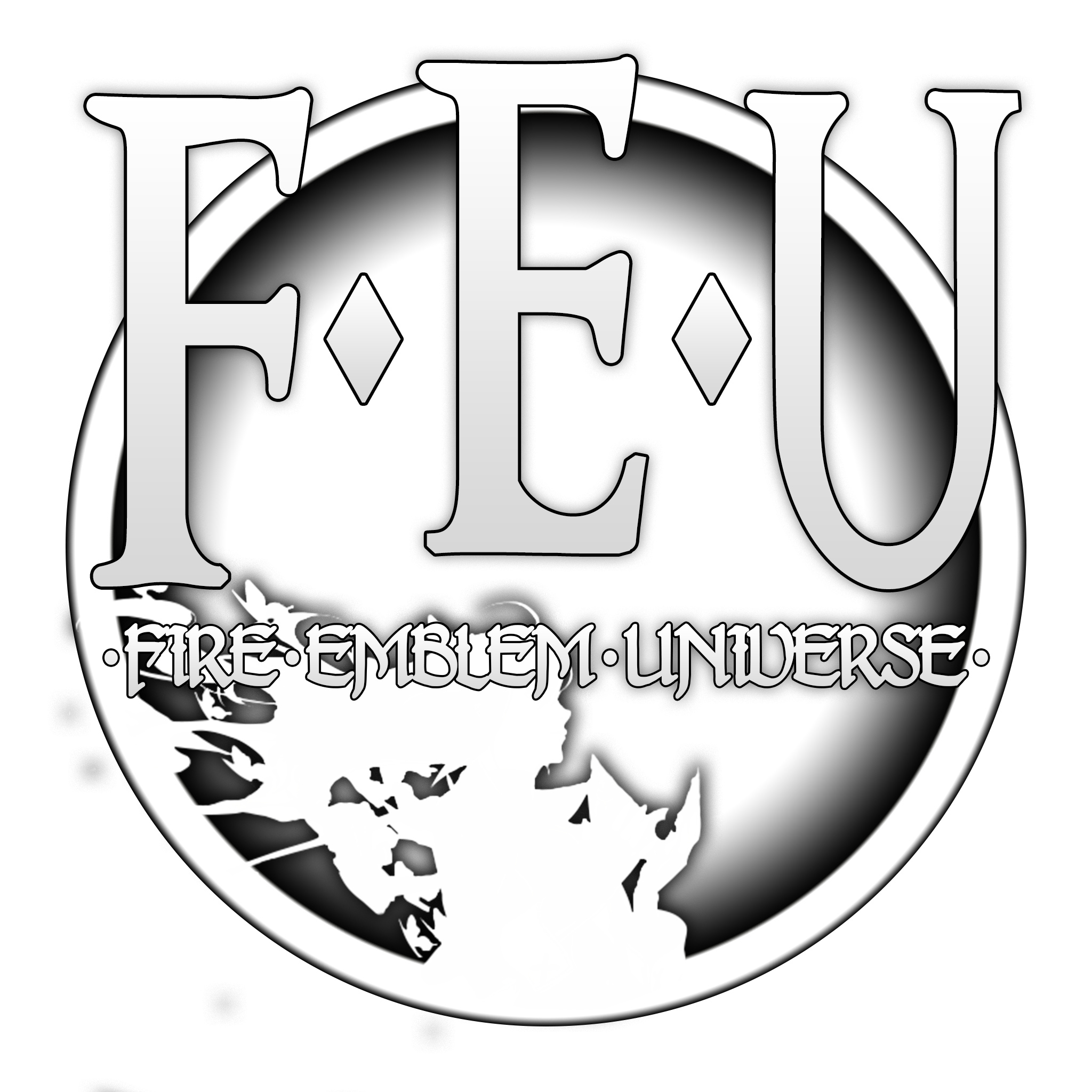
The original logo recreation is fine, but also sort of antithetical to the whole contest since it’s just the same thing again.
Leo_Link’s logo in my opinion again pulls too much from established Fire Emblem design, and I can only dislike it for those selfsame reasons.
I dislike CM9’s design since it’s effectively just FEU branding but Fire Emblem Heroes style which again has the issue of reusing official FE designs that take away from the identity of FEU, and atop that incorporates it into the identity of Fire Emblem Heroes, which is virtually the only Fire Emblem related thing that has no business on a hacking forum, by its very always online nature.
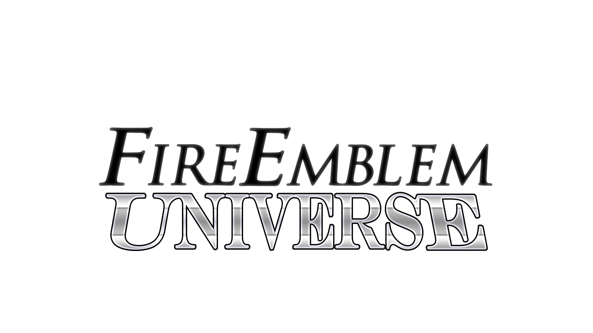
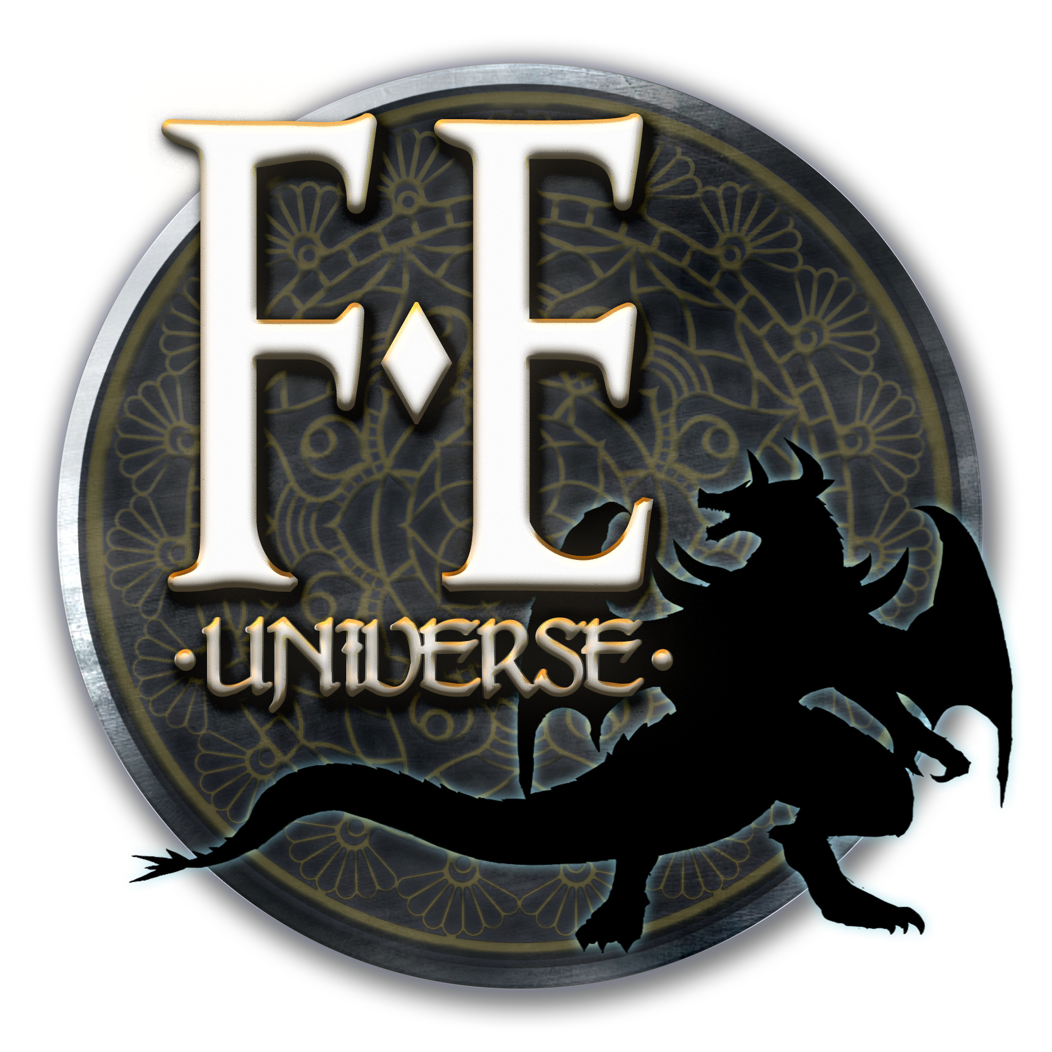
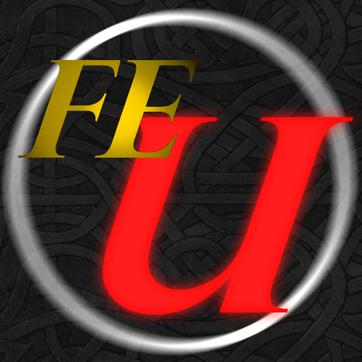
Fatih’s coin logo looks pretty good, but the banners are messy and leave much to be desired. Since the purpose of the contest is ostensibly just for logo purposes this would be fine, however considering a major contributing factor to the competition in the first place was wanting a full banner image I’d consider having a solid banner to be just as important.
NICKT’s designs are cool, but they look straight out of a 2009 internet forum and considering that’s a decade ago isn’t something that would attract me to a site in the current year; also mimics designs from Fire Emblem games, which sort of takes away from the identity of FEU.
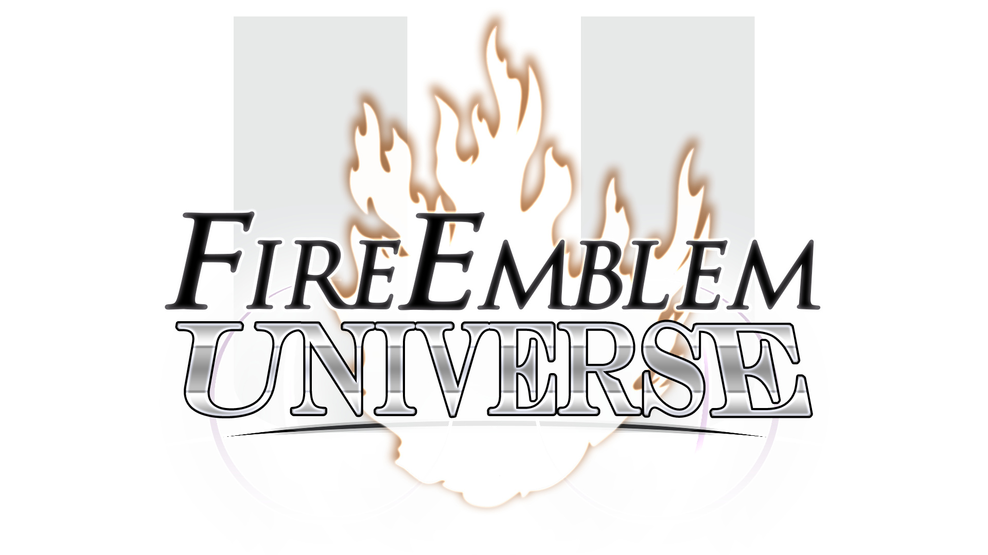
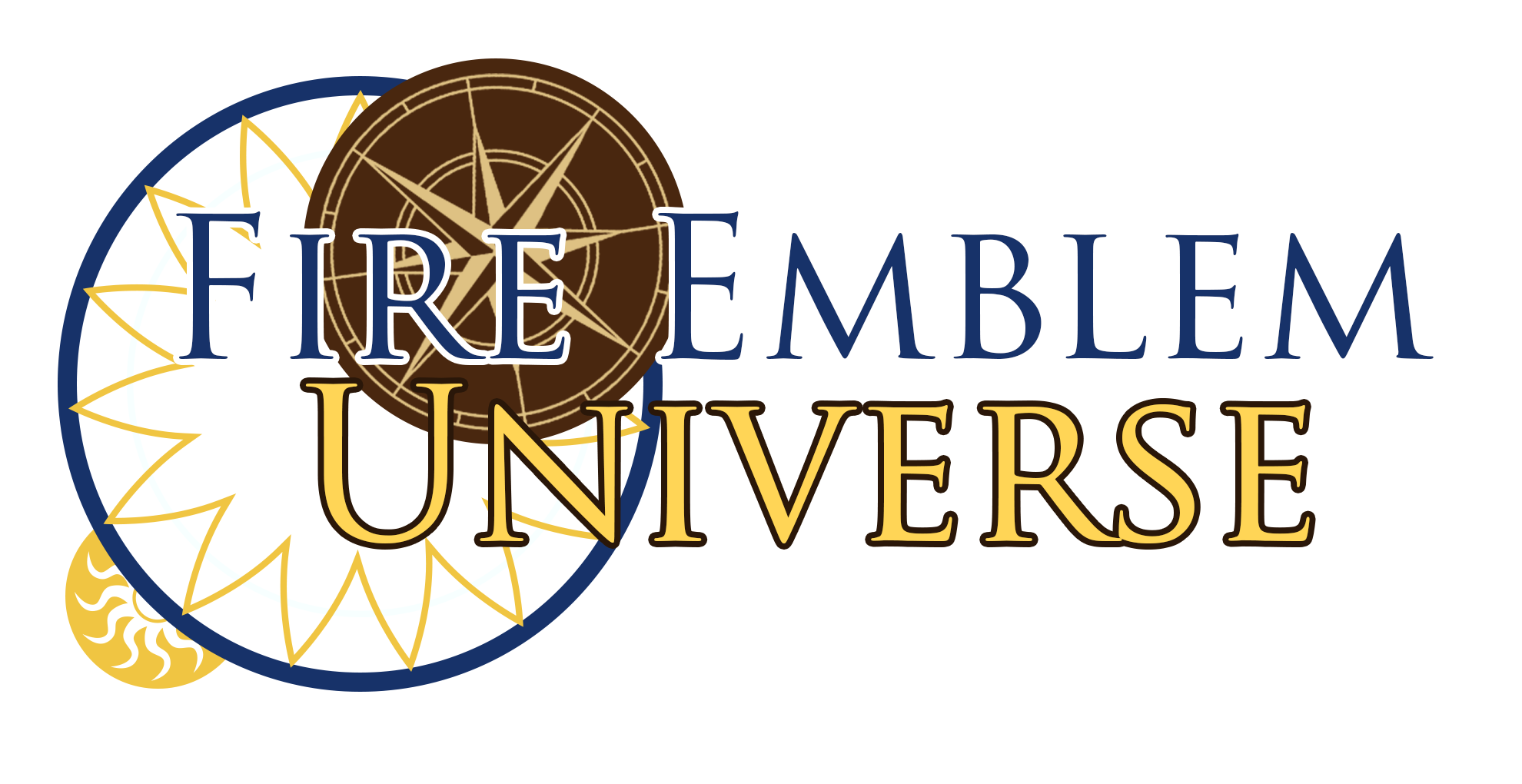
Meila’s design has everything a modern logo design should: it’s clean, has soft edges, and is nice to look at. However, its overall design suffers much the same problems that NICKT’s do; despite having more modern design sense, the image presented still feels like something you’d see online in 2009, just cleaned up to look more modern. Not to say it’s bad, it’s a solid #2, but it still just doesn’t fit as well as it could in my opinion.
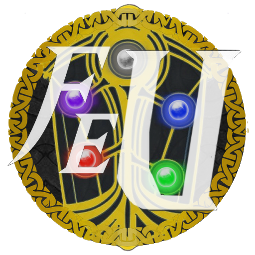
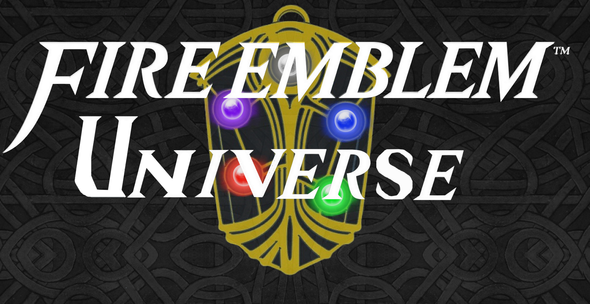
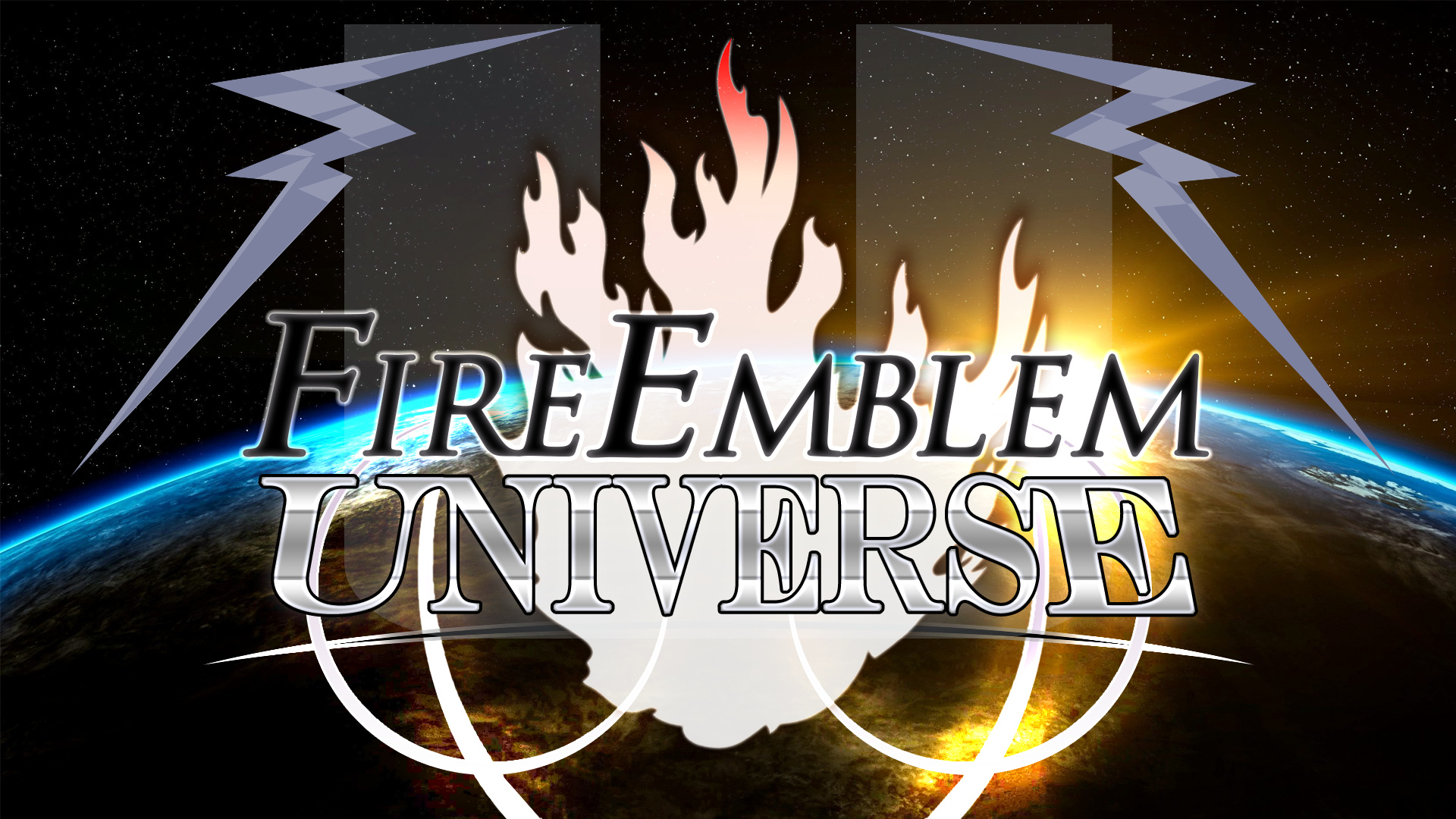
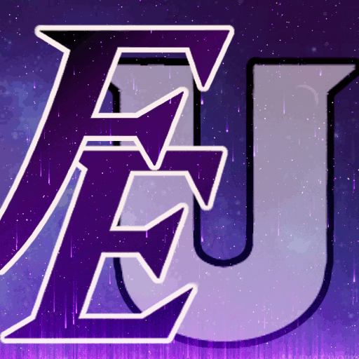
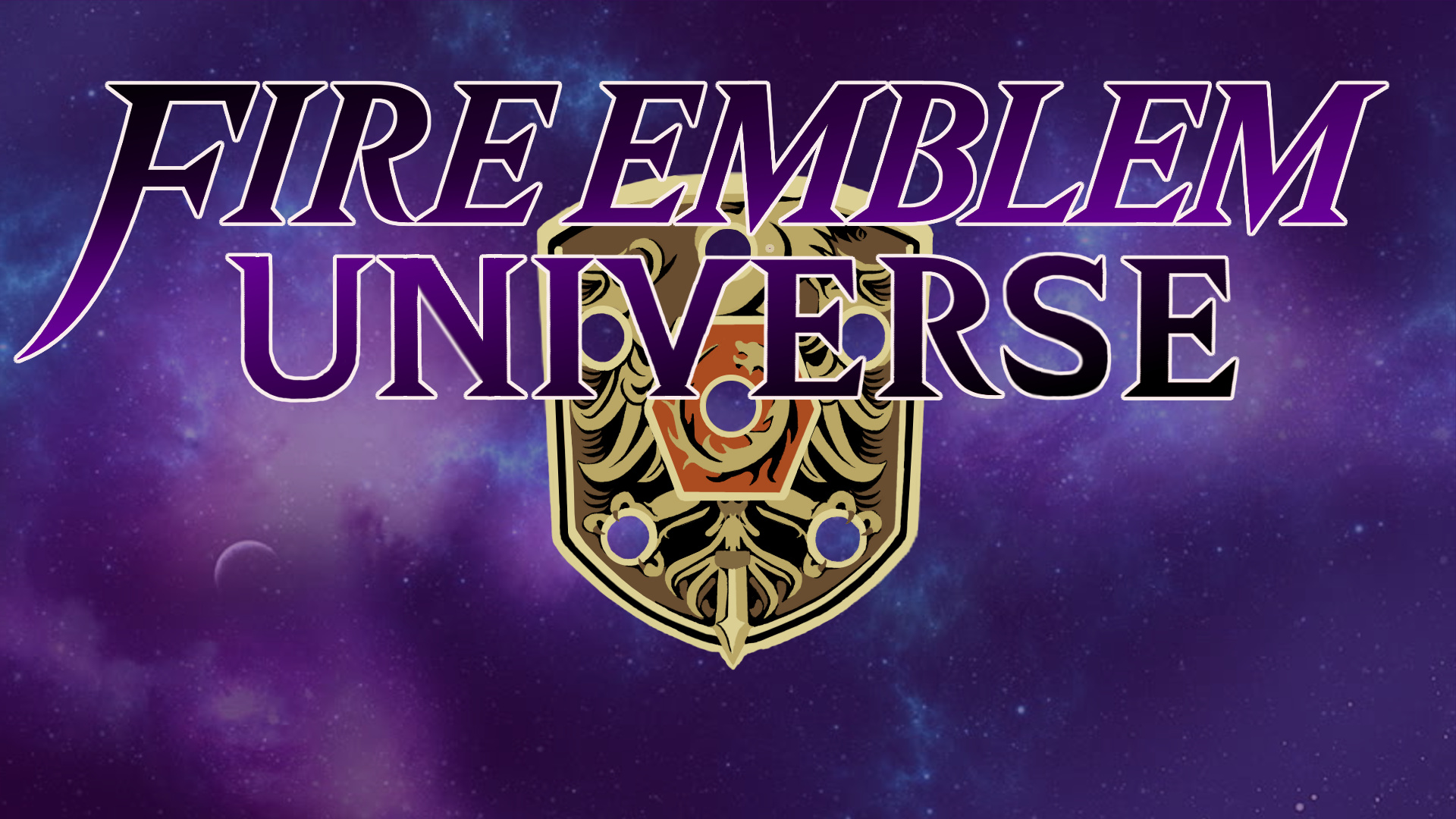
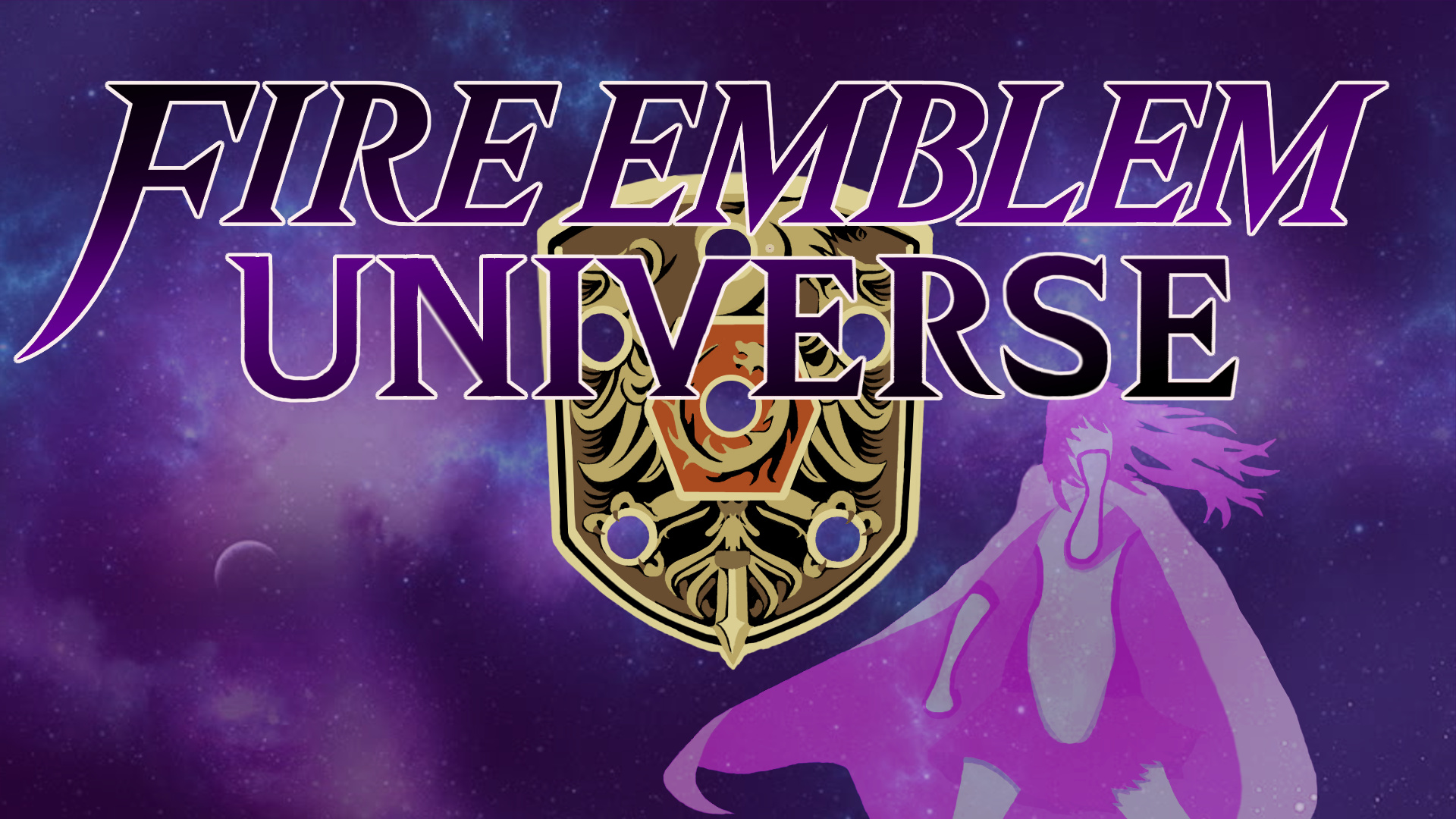
Mystletainn’s design is hands-down the best one here. It does sacrifice the circular icon logo (although the logo with the corners rounded off will still entirely function), but in exchange, you get the single most beautiful logo here. It generally skews away from directly copying official Fire Emblem designs for its structure, save for the binding shield in the background of the banner that, in all honesty, the logo would work even without. It heavily embraces the “Universe” part of Fire Emblem Universe, and this gives it a unique identity that many of the others lack by virtue of using the identity of something of Fire Emblem that is preestablished instead. Further lending to its strength is the Void silhouette in the banner image, which again pushes the identity of Fire Emblem Universe as its own entity, which it entirely is and entirely deserves to be regarded as. The entire thing is super clean and very well-designed, and it is easily the best logo on display here. And to top it all off, it has that absolutely gorgeous gif version that again pushes the “Universe” part of Fire Emblem Universe even more. It’s definitely my favorite of the bunch.
Only thing that bothers me about Fatih’s is the gray parts inside the U. Otherwise I’d vote for it.
Melia’s is too complex for my liking as a logo. Had it been a little simpler it would’ve been a clear winner for me.
The original one is my favourite, it’s not really befitting of the contest I guess if we’re making a logo but it’s the most effective at being one I’d say.
Yeah I tried to do something more like a RPG for my logo, ended up maybe too complex. But I think that a more modern one like Fatih’s or Mystletainn’s are way better, and fit with the actual colors of the dark theme website and discord.
Mystletainn’s banner is flashy, but the colors don’t work for me at all, and they will look pretty bad on the actual website. Where are these images supposed to be posted? If I have to look at them on the website or the discord every day, I don’t want them clashing with existing color schemes.
I chose the two I did because… do we even have a purple themed FEU website anywhere? Fatih’s blends in perfectly with the dark theme on both Discord and FEU.us, while Melia’s would still look pretty good in my opinion, and both follow the five rules of design quite well.
I agree that Mystletainn’s is good-looking, but I wouldn’t want to see it on the website as of right now.
Personally, I really like Faith’s logo. It’s a modern take on the classic FEU design.
The banners can always be fixed up and improved upon. I agree that it’s a bit too “busy” as is, but the core logo outweighs that for me.
Melia’s also stands out from the pack, but I don’t feel like it really fits the FEU color scheme?
Also, hats off to JefTheCat. The original is iconic. I love the fact that someone literally just submitted the original logo. I guess that’s why Faith’s is a clear winner for me, since I very much like the way that it calls back to the original in its design while still being distinctly different.
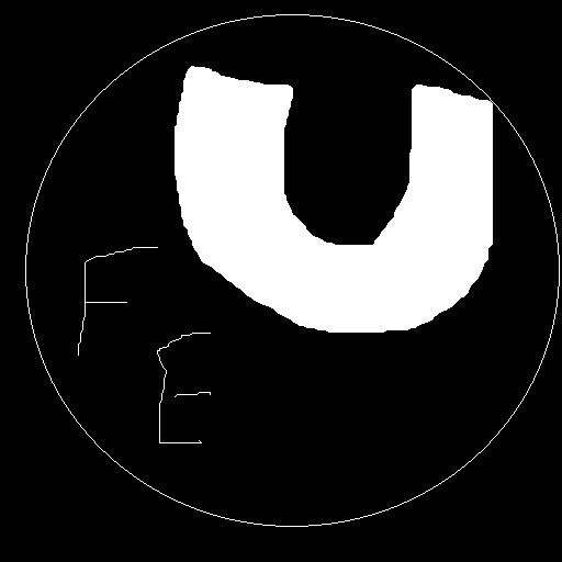
well i mean:
It’s very simple and only uses 2 colors(1,3)
The simpleness and messiness perfectly symbolizes the state of FEU and the average romhack(2)
It’s highly distinctive and unique(5)
And it doesn’t have much smol lettering(4)
My problem with Myst’s is that its a bit too flashy and tries too hard to fit a “modern” aesthetic. First of all, the letters aren’t even centered and curve off the frame. Secondly, the fancy effects are just that. Fancy effects. There’s no substance or solid design outside the letters.
Thirdly, (this is probably nitpicking) its square with no transparency. It needs the galaxy stuff to stand out, and a square isnt a super appealing logo to slap onto things outside of icons.
Quadrly? Fourthly? Whatever. The banner is just kinda messy. The Fire Emblem doesnt match the color scheme or general aesthetic, and the colors on Void somehow don’t match at all, making her look super out of place.
Personally, my favorite design is Melia’s.
Many people have pointed out that it comes straight out of a 2009 forum, but personally, I dont see an issue with that. I think it’s clean and modern enough to pander to a modern odience, while sticking to the roots of the site. It captures a JRPG aesthetic without being overbearing, and fits very well withing the context of a Fire Emblem community.
Another thing people mentioned were the colors not fitting with the color scheme of the site, which i also disagree with. The site has a black and white color scheme, which goes fine with literally anything. The colors are muted enough to not be obnoxious, and are vibrant enough to stick out against the black and white in an appealing way. It doesn’t conform to the color scheme, but rather complements it. (Besides, it’s not that hard to change the colors of the site itself I’d assume.)
In my opinion, Melia’s design hosts a perfect balance of old and new, and I think that’s what we should be looking for in a logo redesign.