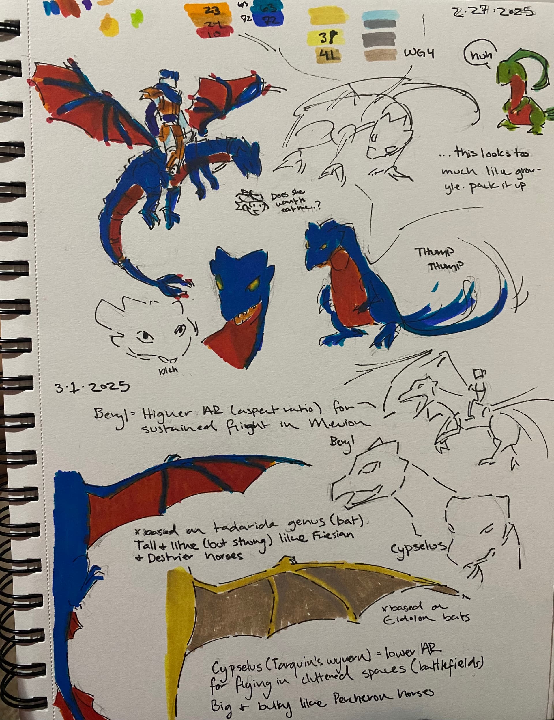
Dream of Five: Faction Visual Unification and the 1.7.0 Promotion Portraits Update
In 2013 when we’re still working on old Do5, I had the idea to make each country’s designs look coherent with one another, but I didn’t have the skills then to do that quickly, and we had to do what’s necessary first—and then, you know, stopped work in 2015, revived in 2023, completed in 2024, the whole nine miles. I did some edits, and sometimes full revamps, to old mugs, to bring the visual cohesion up, but a lot of the 2013 mugs are pretty quality and I didn’t really want to edit them too much if not necessary. I did make promoted portraits for the 3 lords pretty early on, so I knew about the tech existing, but didn’t occur to me to put in the effort to do it for the other 33 promotable units at the time.
While talking with other hack creators I learned that TMGC has promoted portraits for everyone, which I thought was cool and, at that point, I was confident in my spriting skills since my exit from retirement, I didn’t quite commit then, because that was still during pre-release and I still had to get my more necessary work done, but ultimately I’m a character design goblin and can’t control myself and sketched this:
Yeah, ok, I basically just take any excuse to draw Kolbane. I’ll talk through my process with the design in his section later. I also did a rough mockup of the sprite itself, but promised Parr I wouldn’t finish rendering the mug until after we release [complete] and get all my other things done first.
And then we released.
Which frees me up to actually render out his mug, and once I rendered out his mug I’m like, damn, I want this in the game. But Kolbane’s not a lord, he’s got a lot of story presence but it doesn’t justify him having a promo portrait change if everyone else doesn’t have it, and going back to the earlier point about visual cohesion, it was a chance to really bring the visuals together since I have the freedom to pretty much do what I want here.
So, one of the days, I go, ok
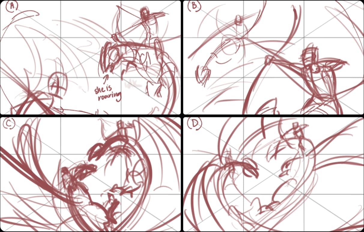
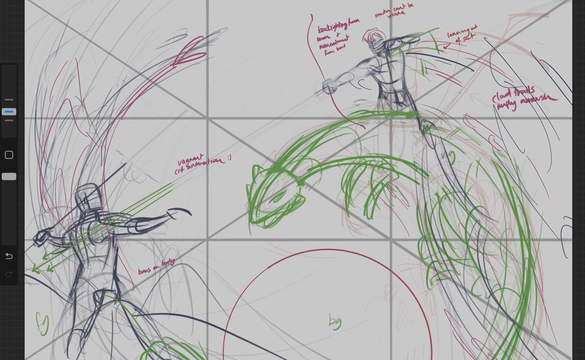
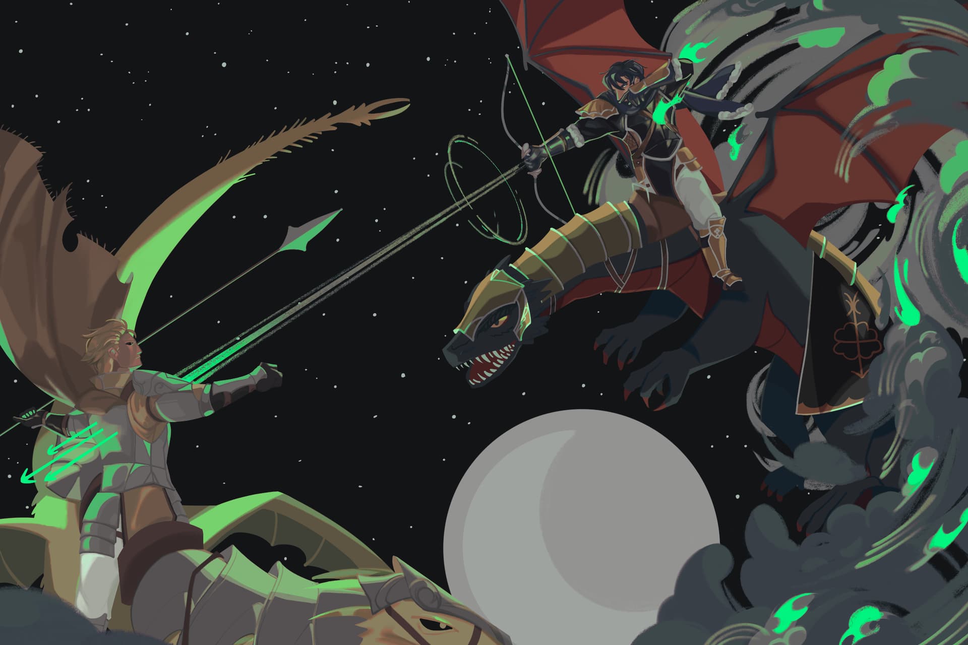
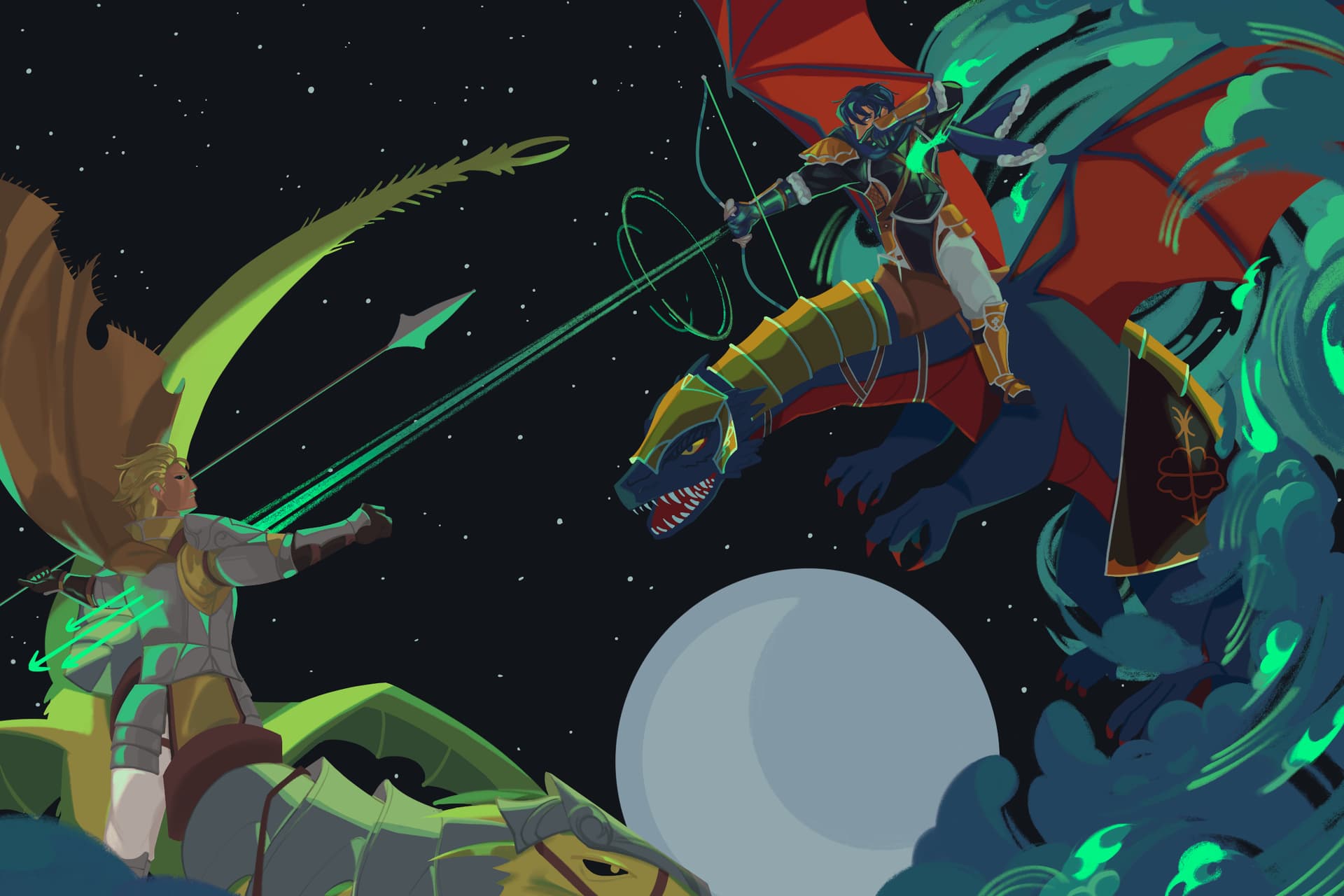
I sit my ass down, and do this.
3 weeks, 33 portraits.
1.7.0 release.
I’ll break down the groups of designs by country of origin so I can also talk through the overall visuals I chose for each country. The reasoning isn’t that deep in itself, I mostly picked stuff in 2013 off things I liked and overall stuck with them, sometimes adding some elements here or there. For this post I’ll only talk about characters who can promote, though sometimes I’ll bring in other related characters to help talk through the process. Outside of Kolbane and the lords though, I did just kinda draw stuff over the other characters, but I put thought into all of them.
Aukema
I chose Victorian visuals for Aukema (+ non-period-specific armor since I can’t exactly era-match armor with 1800s clothing), as I had an interest in Lolita/Ouji fashion which often take inspiration from Victorian era clothing–and ended up incorporating those elements in as well. Writing-wise Parr drew from Celtic and Anglo sources, so hey, it’s geographically adjacent enough! One other design element I just kinda threw in is ridges as decoration on armor, inspired by some historical pieces. It wasn’t meant to be an Aukema thing at first but once I noticed it’s on a bunch of existing Aukeman designs I just rolled with it as a full design choice.
Aukema’s celtic influences from the writing also extends to character tattoo designs, though the characters wear too much clothes to really show them. You can see some on Garath and Kolbane’s character sheets I’ve posted elsewhere, however.


Rena’s design both comes with her change in public status after the story points of end of 14-start of 15, and the Victorian elements are a lot more apparent in the unarmored fancy version as well. This design is actually what caused me to straight up incorporate elements from the JP fashion subculture in addition to more historic looks–I wanted Rena to have something elegant but she can fight in and doesn’t look weird on wyvern-back in, and what ended up in my sketches was something that looked…really similar to an ouji coat I had in my wardrobe, so I was like, full send it.


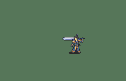
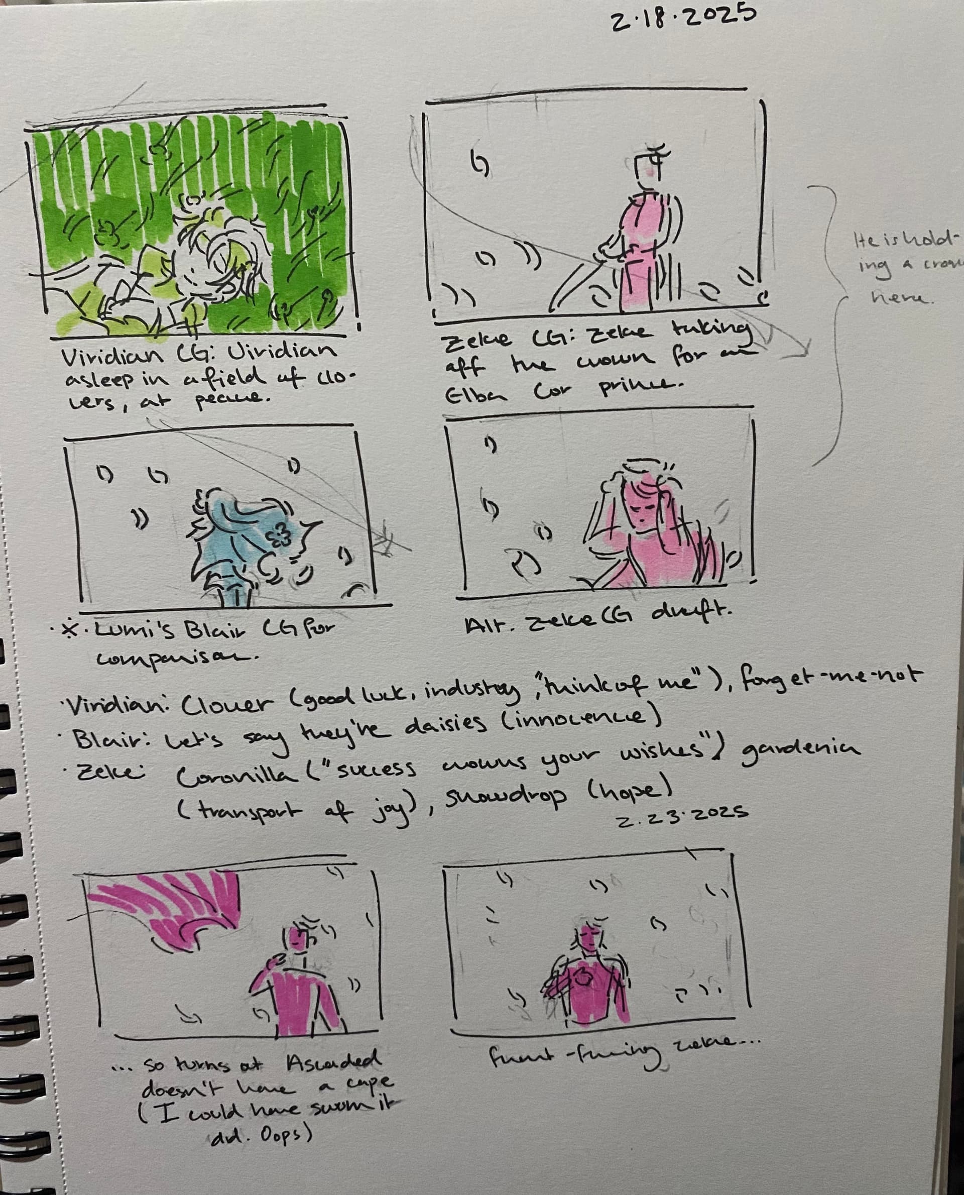
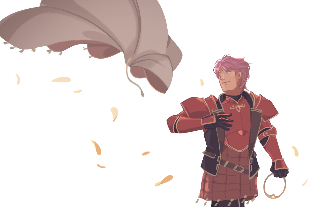
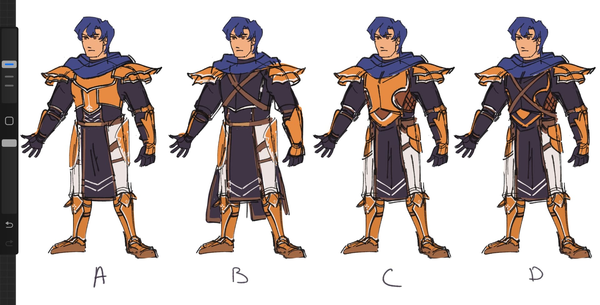
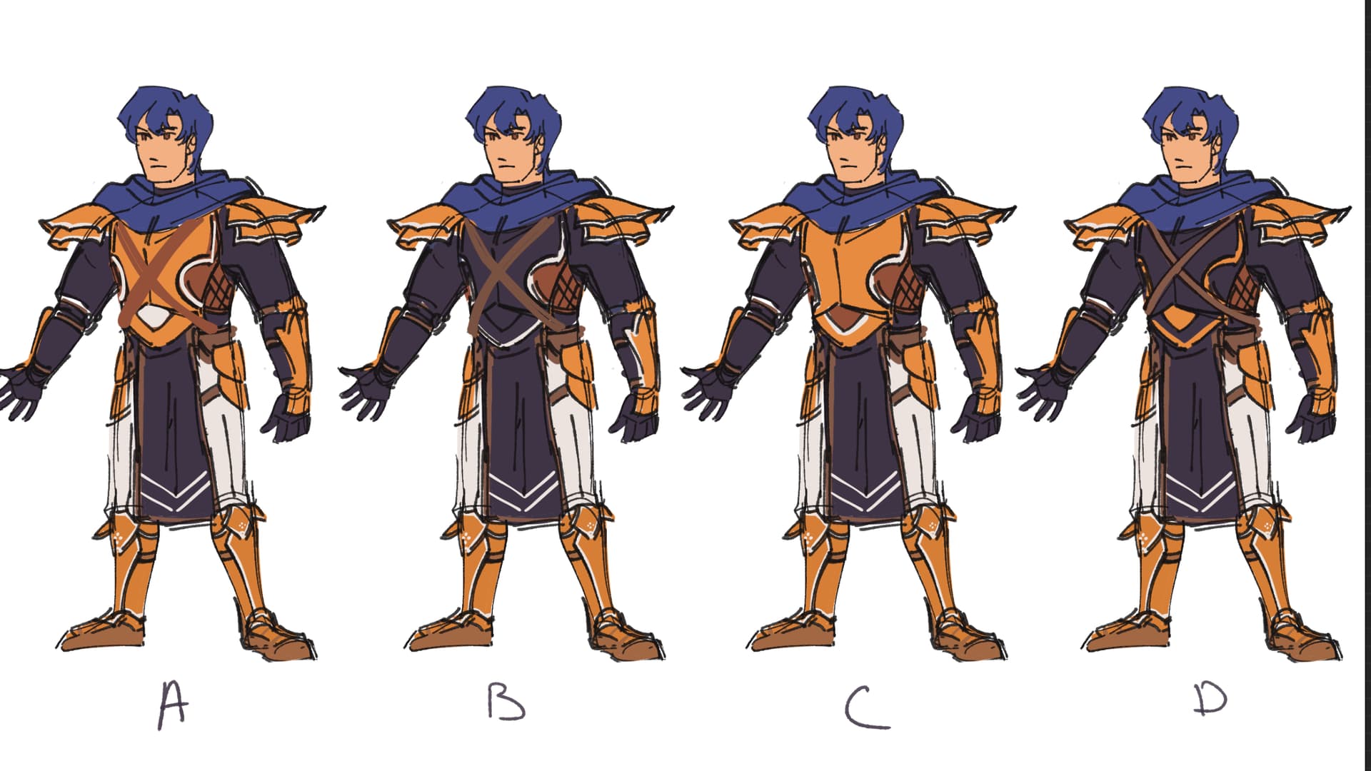
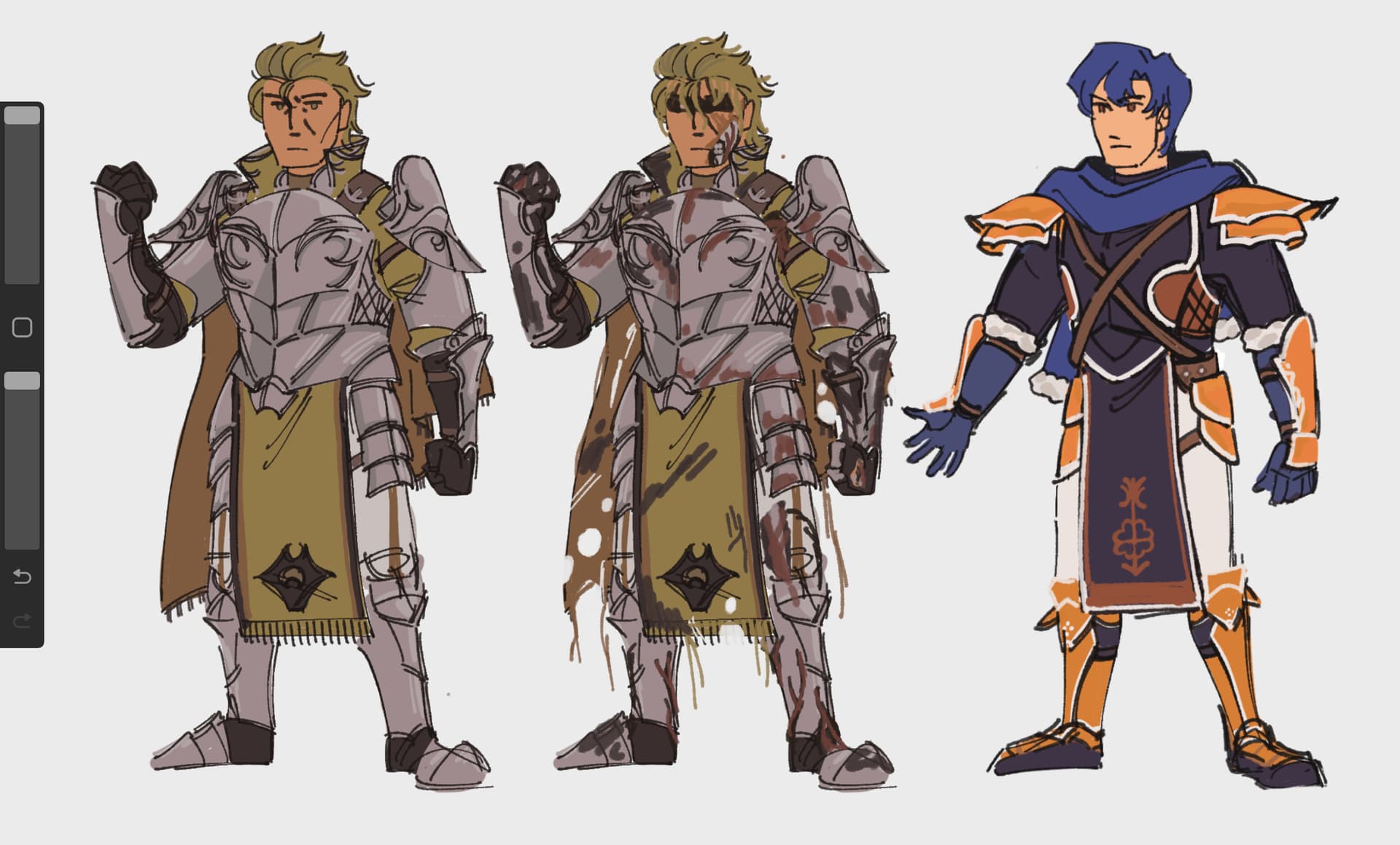
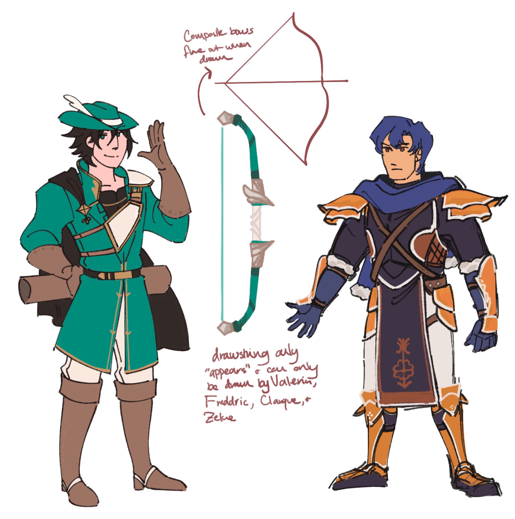
Kolbane’s a big reason I did all this, and I think listing his full set of alt portraits help illustrate the rest of my thought process more. Sometimes promo portraits are influenced by my own playthroughs, and in Kolbane’s case I have a pretty strict promotion schedule with him (hit lv20 before or during chapter 12 either route, promote, kill boss of c12 and hit level 2), which means that he promotes when your army is, narratively, not made of money, and he isn’t going to have a full custom shiny suit of armor waiting for him. I designed his new armor as piecewise replacing parts of his old armor with scavenged pieces. The paint streak is both to show him customizing his new stuff, and I think it brings a bit of edge to the new design–as do the tattered cloak and headband. Kolbane, while less experienced than Rena and Garath and often appears softer in story dialogue with them, his chapter 18 start of chapter and some of his optional dialogue–boss convos, pretty much everything he has to do with Musain chapter 8, show a side of him that’s got some fire and toughness that I want represented. His expression change was done directly to match the mood of his chapter 18 start dialogue. In the sketch I provided above, originally the paint stroke was only on the breastplate, but given how gba portraits crop I also added it to his pauldron, which both gives a nicer color distribution and keeps my favorite element of the design.
I provided his chapter 8A armorless outfit and his 23x house outfit here also—you’ll notice 8A mug has the angriest expression of all, but he originally had his default expression there. The expression used in the 8A variant was the original version of the promo mug expression that I found to be a bit too angry to be a default look, but I kept the layer in case I needed it for anything. Then while looking through one of our player’s let’s plays I noted a piece of dialogue in 8A saying “I mislike the way this one looks at me” or something to that effect, and his unpromoted portrait has a rather : ) kinda expression by default, so I thought, hey this would be a good point to bring in that angry face I already drew!
23x house portrait is provided here to really tie in the victorian visuals–his normal clothes is a button down which is present in many european-based looks, but the vest adds that much more of the victorian vibe i wanted to tie the world together, and given the circumstances in the 23x house, regardless of promotion status, he returns to using his : ) expression.


Asher’s promoted design is directly inspired by this portrait of Anthony Wilson Thorold. No relation to the actual historical figure other than I needed something that would fit the visuals and work for a promoted class.


Eilene’s fullbody sketch for unpromoted went for a puffier, frillier sweet-lolita inspired look, and I decided to full-send it for her promotion, complete with a lace headpiece. The lace headpiece also has some subtle feather based texturing on it to unify her looks with the other 2 pegs, who have feather-based headpieces.


Amelia’s clothes themselves isn’t really a big difference, she got a cape upgrade and a slightly different jacket cut and a ribbon, but I didn’t feel like she was the kind of person to get too ostentatiously blingy on a material level. Instead, I drew from her character ending–as she became someone who ended up being kind of a force of nature, I feel like having magic sparks built into her existing resting state would be a suitable look, and, if you recognize the source of my FEU portrait, a different panel of the same Thor comic was rather formative in what kind of visuals I liked.
look, he’s so cool. I’ll take any opportunity I can to make sparkly eyes.


Epicer made a PEAK meme on this design.
Mafia boss jokes aside, my idea here was actually more of a victorian business mogul. Suit, bowler cap, a sword hidden inside a cane. That being said, due to her palette being far from a traditional business suit, she ended up giving some mafia boss vibes, and I think that’s pretty funny so I ran with it.


Chester’s promo design was pretty directly inspired by Assassin’s Creed Syndicate. While we don’t have Assassins in Do5 and I don’t think Chester fits Assassin better than Rogue, nevertheless he is the fightiest thief personality-wise. As you’ll see in a number of my later designs I take a lot of inspiration from AC as a whole visually–I played so many hours of the Ezio trilogy.


Cathale actually originally had a version of her promoted design as her default–she was newly created for the revival and, we used an existing portrait that no longer had its original role for her. In her case, it was a portrait belonging to someone intended to be a lategame boss, and had a very ornate design. However, that did clash with some of her supports. So instead of a promotion, I made a simpler version of the design to use as her base portrait, edited the clothes to fit Aukema vibes better–you’ll note the green fabric is meant to be a vest, mentioned also in the Kolbane part, and the promoted design is a fancier vest layered over gambeson, which is also what I put Farrell in for his under-armor look (used in one of the CGs) as another point of country-of-origin unity.


Crowe’s writing portrays him as rather promiscuous, and a particular emote in the Do5 discord refers to a common word in his dialogue back in the 2010s. Thus, I felt it was appropriate for Crowe to give back to the community.
Sniper also gives +2 con on promotion and I figure I’d make them bulkier to reflect this.


Driscoll’s promo is a bit more low key, not because I don’t like the guy, but because I don’t think it’d fit his character to get something too drastic, so I gave him a military coat and relatively simple pauldrons because I think he’d like it that way, and his base design already achieves a good balance of low bling but high effort and detail level, so it was a suitable baseline to just do a bit more. That being said, his base design is the reason I decided to roll with gambesons as a part of the Aukeman armor selection, though a lot of that isn’t necessarily reflected on to portrait cuts and are more part of fullbody designs.


Both Cothiva’s base and promotion are based off of Victorian ball gowns, something I feel that, while generally would be impractical for battle for a melee unit, is justifiable on a socialite mage. I doubled down on the flower motif also given her herbalist background, and some of her promo ornamentation also give off a bit of 1920s flapper vibe, which isn’t quite part of the visuals I’ve set but it does fit her vibe and she’s fashion forward enough to justify it.


Gabriel’s original design was more or less a very Standard Dark Mage until someone one day pointed out his collar was shaped like the McDonalds Golden Arches. Now as they haven’t paid us for a sponsorship, I took the opportunity to add more Aukeman elements to his base design as-is. When it came time to promote him, I gave him what would really just be gentlemanwear in Victorian contexts, but also reads to a modern audience to be a stage magician, which given his character (seller of fake charms), was plenty suitable.


Marie’s promotion really should be looked at as a set with Alexis’s, since they have matching visuals with black, gold, and a ornate mask that underlines the mysterious rogue look more. Her
jacket is meant as those mutton chop sleeves that then button into those waistcoats with kind of a train after.


Conleth’s armor is kept the exact same on purpose–he’s already been given good quality armor in Farrell’s service, and his supports explicitly states that he did not change his armor, so all his design updates are with his clothes. He gets a Victorian military officer’s jacket and hat and a more voluminous cape, and the little badge he carries as a farrell scout is no longer there.


Jauger being a very heavily armored unit has less opportunities to show his clothing, and instead I gave him a very similar pose and rough armor structure as his lord and mentor Hereward.

Musain
Musain in its conception was heavily influenced by Les Miserables, as the person who originally created it submitted several characters who are direct Les Mis name references. While we decided to remove some of the more on-the-nose references, nevertheless we do keep a lot of its spirit, from the revolution plot to the french vibes. Les Mis as a story takes place in the early 1800s. 1800s western european country visuals is also used for Aukema, and while some overlap in visuals isn’t an issue especially as it does make sense with neighboring countries that would have some cultural diffusion–expanding the timeframe a bit would also give me more variety to work with, as how historical fashion worked means that there actually wouldn’t be too much real variety in cuts for a small slice of a time period until the modern ages.
I’m a fan of visual kei metal band Versailles, and their stage costumes take inspiration from the rococo era. I also decided to expand the timeframe I reference from into the 1700s, as well as take direct inspiration from Versailles costuming for some of the more glamorous looks.


Cyrille was fully designed in both versions by our assistant support writer SeraphKnight, who also created the character, and I just translated their designs to gba sprite format. The idea though is that Cyrille also wouldn’t be that fancy of a character so their promotion is reflected in the sum of smaller details–different hair, a gambeson jacket, slightly heavier armor.


Alexis generally kept his design from the 2010s, though I gave him a face update in 2023 after his character was written textually to be quite attractive but his old portraits face could not match. His original design honestly fit an Ondurite better than a Musai, but I chose to roll with it with the justification that as he’s escaping Musain to Onduris he’s looking to blend in with the locals. I figured that once joining up with Rena’s crew and that he’d likely promote closer to her return to Aukema, he wouldn’t really have any reason to keep wearing Ondurite dress. As a matching set design with Marie, I gave him a different hat and black/gold centric outfit that leans more on to his own cultural looks–alongside the mask, on oppsite side Marie’s. And when I mentioned Versailles costumes as another source of inspiration, his shirt is directly referenced from this:


I’m putting Seren and Fran’s together because I designed theirs as a set. Fran gains a feather pin on her sash of the same style but smaller as Seren’s helmet feathers, and Seren wears a sash that shares a pattern (may be hard to tell since rotated) as the sash Fran wears.
Individually I gave Seren some heavier armor and a haircut–figured that if I can make characters grow hair out, I can make characters cut off hair too. Fran gets heavier armor as a reference to her high defense stat in addition to bulkier arm muscles per previous comment with Crowe about Sniper con, as well as a 1700s tricorn hat, because I think tricorn hats are symbolic of the revolutionary spirit.


Jolyon’s portrait was one fully remade for, well, really I drew it in 2015 originally, but it has a pose that fit his character better than his original, and I especially want to channel the spirit of “Do You Hear The People Sing”. Jolyon’s got a very theatrical vibe to him in general, so with him I also took heavy inspiration from Versailles costuming, in particular this one, of Teru
I also gave him heavy glam makeup to further highlight the theatricality, and once I get to the Onduris section, the way his promo mug’s eye makeup is drawn mirrors the way Sileth’s, to also reflect their mirror roles in their respective routes.


Florent and Marin are also done as a set, and also visually ties into Jolyon’s design–both get military sashes with medals in their respective palettes, tied together with the colorful feathers. Each keeps their base armor (as armor is, still, expensive, and if you dont need an upgrade), but both also get more detailing on clothes, a switch to a cravat from a scarf and epaulettes for Florent, , and a fuller cape for Marin.


Rozelle’s point I branched out from was her Epithet of ‘Black Rose’, and from that point I added in matching visuals–heavier makeup (they didn’t let her have that in jail), a black lace shirt, and a different hairstyle. It’s a design that’s basically Roz but More but my hand died for it so hey?


Meliza’s design structure follows a lot of similar design elements I used for post c-14 Fleurre, so there’s the family connection, with a very ornate collar that, honestly, has more roots in 1500s Elizabethan styles but, it’s Musain and not Real 1700s France, so I’m free to take that liberty. Otherwise while detailed, the thought process is otherwise fairly simple.
Onduris
The original 2013 vision of Onduris just had 2 strongly defined elements–exaggerated collars and colorful flowing fabrics. Turns out that I didn’t want to draw exaggerated collars for every design as that became pretty limiting, but it is one of the [pick x] elements that i can draw from. In 2023’s revision Parr wrote in some spartan influences into the Onduris worldbuilding, and I also used that as a springboard to unify the Onduris Look. I studied Latin for many years in secondary school, and Grecoroman looks generally vibe well together, as one extends into another, so I took inspiration from Rome, as well, and finally the ‘colorful flowing fabrics aspect’ was really just me playing too many hours of Assassin’s Creed Revelation being stuck in my head–it was my first AC ever, and the visuals were beautiful especially for the time, so for that I also decided to directly draw from 1500s ottoman empire.
Onduris is probably, of the mainland countries, the set of visuals that I’m most proud of, and the mix of elements really comes into its own.


Mori’s unpromote design was mostly kept from the old days, since he’s a major character and his look was pretty defined. I ended up editing his unpromoted design for having a more fitting collar pattern and making the sleeves flow in a way that can be extended to a tunic like loose top–the full design of which is shown in one of the ending sketch CGs, though harder to tell with a portrait crop. Mori’s promoted design has also gone through a change–since his promo was designed fairly early on in the process, it was before I fully codified the full extent of onduris looks, and so I later edited it to have those roman leather flaps but on the armor itself, something I ended up repeating as an element in several other designs.


Sileth’s design IS made once I had a better idea of the full picture of Ondurite visuals and was designed with a roman tunic in mind, and the extension of that in promotion is a toga. She too have asymmetrical glam makeup, with the more heavily done eye on the opposite of jolyon’s in a similar but not same shape. Headband is inspired off a painting of an ottoman woman, and I repeated the pattern on her shoulderpiece.


Kahn got a redesign while I made the promo portraits entirely–I kept his hair, face, and cape, but while I was doing research I came across this armor—and I felt it just fits him.
it wasn’t quite fancy enough for a promo, and I didn’t really think his old design fitted all that well, so I fitted his base design to this armor, and then for his promotion I gave him a new hairstyle–symbolizing him cleaning up his act and Wren introducing him to real haircare if you actually got him to promotion, and the tiered pauldrons based off Roman designs.


Wren also got a full set of design update while I did this project as her old portrait looked too young for the age that she’s supposed to be at, so I just redid her design entirely but keeping the elements recognizable. In her case I want her to wear a Stola, and vestal priestesses was also just a vibe i kept in mind while redoing her design.


Nari’s base design came from a 2014 era sketch I had saved on my computer that I was fond of, and her promo was a Nari But More take because I think it just works with her. A bit more trim, More piercings and jewelry, and upgrading her armor to fit the multitier roman pauldron vibe.


Baldur I wanted to be a case of getting more to his person than his clothes kind of promotion. His clothes does have some subtle changes–an extra earring, a bigger and more beat up pauldron, and those off the shoulder tunics you’d see on Greek heroes—but the bigger difference with him is bulkier and more defined muscles, more scars, and slightly longer hair.


Shen’s look is in a similar vein to Meliza–though not quite for the same reason given that mir’Katal is not his family but someone he admires, but his promo was designed to take a lot of the same elements from mir’Katal’s post-14 look, though quite a bit more modestly. Still, I think a touch of the glam suits him.
These are all the Ondurites that promote, but I also did resprite most of the promoted units (as well as Nikita from Astra) to fit the aesthetic better, so as a whole it’s one of the more cohesive visuals Do5 has to offer.
Vishara
Vishara is really the start of my Assassin’s Creed influences in Do5, as I played the Ezio Trilogy sometime in '12-13 and was absolutely hooked, and came out wanting to turn all of Vishara into Renaissance Italy. Now Italy is pretty warm, and Vishara’s pretty cold, so I added furs on top of that. Parr’s writing influence for Vishara is Romania, with some Roman elements as well, so there’s also a sprinking of those influences whenever I can fit it.


Lizaveta’s baseline design is newly made by AstraLunaSol with my aesthetic guidelines, and she dresses particularly lightly compared to other Visharans since she was escaping her homeland. On her promotion, she takes a more full on Vishara Noblewoman look, furs and all, to symbolize that she’s done running away and she’s taking it up with her family.


Ioan’s design is newly made for the 2023 take after Epicer pointed out to me that his old mug was a splice, unacceptably. In this take I made him gruffier, but less generic than his previous design. As he’s fairly covered in armor, the clothing-based aesthetic notes doesn’t quite jump out as much, though the fur is fairly forefront. I did make the fabric of his shirt collar texture like something that could exist in the renaissance, the leather flap on the armor take roman inspiration shared with a few ondurite designs, and his coat under the fur collar is referenced from romanian traditional dress, just, mostly covered. For his promotion I figured an unfussy mercenary wouldn’t really do too much, so I just made him much hairier and gave him facepaint to look more menacing, as well as a few dents and scratches in his armor.


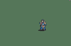
Arcus was kinda funny because we did use his portrait from the original rom which is much smaller, and I made a promoted portrait based off that. Then Astra came back and gave us his updated Arcus and, since Arcus is his direct contribution, that’s word of god. Now new Arcus base is already very ornate, so I had to go even more so for his promotion, he’s a lord after all, and also added a couple of unifying elements like a slightly ruffly shirt and the leather flaps. I included his unarmored design also to really tie in the renaissance-with-the-fur aesthetic, complete with the whole ‘have under layers show through with cuts in fabric to show you’re rich’ heavily characteristic of Renaissance clothing i forgot the term for and all.


As with other covered-in-armor characters there’s little room to show much clothes, though I did put her in a ruffle-collared shirt similar to the one arcus wears in his promo. Promoted design adds in the fur and a different hairstyle, but most notably, the eyepatch. Now, on a meta level, I gave her an eyepatch because they’re cool. Did she actually lose an eye? she could have, she’s a pretty gun-ho fighter who isn’t terribly cautious. Could she have just poked her eye with Lizaveta’s eyeliner out of curiosity and need to rest it for a month and just decided to keep it? Also possible. Did she just see Garath wear it and decided to take a hit to accuracy in order to up her intimidation? Also very possible—and we’ll leave it up to player interpretation here.
Xuanhe/Svanhild
Xuanhe is the part of Dream of Five I truly own, and as a Chinese person and a huge Wuxia fan, That’s the vibe I wanted to bring forth. While XH is heavily inspired by varying things in Chinese culture and history, and I’ve done a lot of historical research on my own for the basis of the worldbuilding, nevertheless I want to underline that XH isn’t Just Lifting China Wholesale and with that, I deliberately avoided pinpointing it to a particular dynasty for visuals and instead taking inspiration from Wuxia games, Dynasty Warriors, and various Wuxia and Xianxia CDramas I watch for the visuals. For one, it’s quite a lot less confucian than the real China is…
Out of the 3 playable, 4 on screen characters from Xuanhe in Do5, only one promotes.


Like Rozelle, they didn’t let Annelise have her makeup in jail.
Annelise’s promoted design isn’t a huge departure from her unpromoted design, mostly because Sev already did a spectacular job with the unpromoted that it’s hard to really go up much more from it. When me and Sakusa (Annelise’s creator, good friend of mine) were workshopping her character, however, we wanted her to be the most public-image-conscious (this is reflected in her volund supports) while secretly being a bit of a thug–this actually comes out quite a bit more forefront while during do5, as she’s stranded in a foreign land and mistreated on arrival, and the chip on her shoulder is full on display from that. So with her promotion I opted also for a more classically chinese-vibed makeup look and a bit of gold trim here or there, as well as adding a golden bird to her pauldron.
Now reference Thyra’s design:
In Chinese mythology there’s a set of four mythological creatures known as the Four Symbols. If you play GBF you may know them from RotB. Now the XH royal family’s symbols and, extending to Thyra as the heir and oldest, is the dragon, so by that extension, Thyra gets Qinglong. Annelise, as the flier, gets Zhuque, and thus the bird. Volund is Baihu, though that’s less reflected in his Do5 portrait crop itself (pretend it’s on his belt or something), and and Xuanwu’s a character entirely not in Do5 at all.
So yeah there’s the breakdown behind the design process for all promotion designs in Do5, hopefully it’s somewhat interesting, enjoy!