TLDR
I’m working on a strategy rpg called Gravitas: Noblesse Oblige, and it’s time to retire my programmer UI for something that “won’t scare the hoes” as it were. Skip to the bottom to just see what the assets I’m looking for are if you can’t be bothered to read my ramblings on art direction and blah blah blah. Price negotiable, but I will offer $200usd for the package of assets I’m looking for.
Contact me on discord and share some of your prior work, thanks!
Discord: ryan_whimsy
Current UI
-
WARNING: Programmer art

-
Note: Ignore top bar and clock in top right. I’m getting rid of the top bar and the clock will need to be given a graphical redesign instead of text for the most part.
-
Design Goal: No full screen menus. You select something and its ‘page’ opens up on the side of the screen. This way you can always see the map and the UI doesn’t feel like it’s pulling you away from the game.
-
Example: Clicking on a city opens up a page with its stats.


- Example 2: Clicking an army to show its leader and troops.
- The following are a few additional screenshots of the game world without UI. It’s pretty, so let’s try not to hide too much of it with UI on screen!


Style / Art Direction
- This is a Kingdom Management game with turn-based tactical battle (biggest inspiration being Fire Emblem). As the player you will have the task of managing your Kingdom on the world map, as such I want the UI to feel like the records your administration has been keeping. The goal is to make bureaucracy cool here, not that it isn’t already. Why are you looking at me like that?
- Here is a mockup of the idea I want to head toward:

- When clicking on an object we’ll play a paper rustling noise and the UI will look like a book opened to the page showing info on the object selected.
- Examples of selected objects: Cities, Armies, Scouts, Trade Routes, etc.
- The standard layout I envision is a top section with the character portrait or flag for the thing you clicked on with its name and maybe one or two bits of info to tell you what you clicked on. Then a section divider line with all the relevant stats or buttons below.
- Below are some pixel art examples of books I found online, we’d only need one side of the book as we don’t want to take up the full screen.


- The second one here also has bookmarks that can be used as tabs to flip to different screens. For example, when clicking on a city we might just want the overview page or I might want to flip to the buildings tab.
- UI Elements: It will look plain if text or sprites are just slapped on the page (see the current UI lol), so I will be looking for some kind of border or container to place separate icons and text in. Most of the time it will be an Icon representing a Stat, like Population next to the number.
- Example of containers

- Buttons: For buttons I think it would look nice if it felt like something you’d see on a page, so I was think we could denote a button by a stamp/wax seal. Before pressing it, it could be a little red blob, then when pressed we stamp it with a seal.

- There’s going to be 2 playable characters so I think it would be cute if we had 1 stamp for each of them. One would be crossed halberds and the other would be a wolf head.
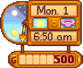
- Clock Asset: The world map plays in real time (paused while not doing anything) while battles are turn-based. If you’ve ever played a game like Europa Universalis or Crusader Kings it’s like that. I need to be able to display the date (MM/DD/YYYY format) and I want to replace the time I’m currently displaying with a day/night wheel kind of like what you see below. I intend for the wheel to spin behind the UI element so you see the sun or moon rise to indicate the approximate time. If you can include a section to show player gold as well, that would be ideal. We also need a way to indicate to the player if time is moving or is paused and I think an hour glass with sand dropping through it would be nice, but I’m open to other suggestions on this one.
Resolution / Sizing
- UI is currently being rendered at 1280x720 to make sure the fonts look sharp and clean. UI elements can be smaller and scaled to fit appropriately.
- The book asset will be scaled up to approximately 400x720 to take up around a third of the screen. As long as the dimensions of the sprite can scale up to this, we’re good. The width can be a little more or less, doesn’t matter much, just giving a ballpark here.
Assets Needed
-
Book: This will need to be 2 assets, the cover and the pages on top. If you can make the color of the cover greyscale that would be ideal as I can then easily blend different colors to it depending on what we’re looking at. For example, the cover could be red when you click on an enemy. Pages can be colored.
-
Bookmarks (tabs): Make these large enough so I can place an icon denoting what the tab will be for.
-
Flip page icons (left and right arrows)
-
Section break line, you know, one of these
 but a little fancier
- Text Container: I’d like to be able to fit at least 3 columns of 5 rows on the same page as there is one menu in particular that will list a bunch of trade goods and I want to minimize flipping pages through them all. Use your judgement in terms of sizing and padding, I will scale the same way I scale the book asset.
- Stamp button (unpressed and pressed)
- Clock + Hourglass: This item is where you can feel most free to take some creative liberties. As mentioned above, I’m open to suggestions of switching the hourglass out for something else.
- Tick box w/ and w/out checkmark: This will be used in some menus to indicate something is enabled/disabled.