Less of a top ten and more of some quick notes on why I like these so much. I’ll give em some stats too.
Style-How well the animation does what it’s trying to do, and looks cool doing it
Detail-The quality of the sprite itself
Realism- generally just how well it would blend in with vanilla animations as to not stick out.
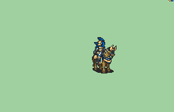
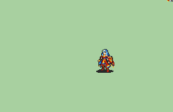
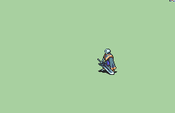
Nuramon’s Sentinal -
%20Soldiers,%20Halberdiers/%5BCustom%20Lance%5D%20%5BU%5D%20Sentinel%20by%20Nuramon/1.%20Sword%20(More%20Spin)/Sword.gif)
Style - 10/10
Design - 10/10
Realism - 8/10
Nuramon does the Lord’s work yet again. This is by far my favorite infantry sprite and for good reason. The seam lines between armor plates work so well, and the shield doesn’t get in the way of that detail in the slightest. The animations are fluid and to the point while still being fun to see. This is just peak.
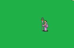
Greentea’s Linus
%20Mercenaries%20and%20Heroes/%5BHero-Reskin%5D%20%5BM%5D%20Raven%20by%20Greentea/1.%20Sword/Sword.gif)
Style - 8/10
Detail - 8/10
Realism - 6/10
Never been a huge fan of the hero class, but I’ll give respect for this where it’s due. This is probably the best-looking hero design out there. The silver lining is easy on the eyes yet brings out a ton of detail. The shield looks great, and who doesn’t like a nice longcoat? My only thing about the sprite is the sword still being vanilla, it does look really off with the rest of it.
Aruka’s Swordmaster Joshua
%20Myrms%20and%20Swordmasters/%5BSwordmaster-Variant%5D%20%5BM%5D%20Joshua%20by%20Aruka/1.%20Sword/Sword.gif)
Style - 9/10
Design - 6/10
Realism - 7/10
Playing the Sacred Trilogy made me grow to this one. The clothing design isn’t my thing, but I couldn’t deny how good these animations are, especially the crit. It’s fun, it’s flashy, but it doesn’t drag on or do too much, especially for a swordmaster.
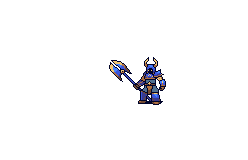
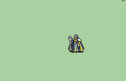
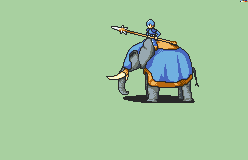
Nuramon’s Marshall
Style - 10/10
Detail - 8/10
Realism - 9/10
Probably my favorite animation ever. The Marshall is a walking tank, and Nuramon perfectly represents that with its grandiose weapons and details like the bow animation using what looks like bolts. The armor is well separated without being cluttered, though I wish the legs had a bit of that gold trim like the rest of it.
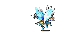
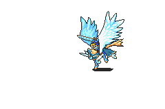
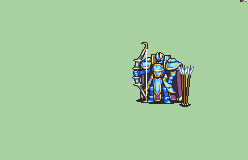
EA’s Erika T-2 (Yes I know this is technically Redbeans)
Style - 10/10
Design - 10/10
Realism - 9/10
Common red bean W
The Ceilica sprite was already good. It has a crisp, clean design, amazing animation, and details without feeling cluttered. You can tell what’s supposed to be what. I chose EA’s recolor solely because it’s perfectly Erika. The full red color with the gold trim is just such a nice aesthetic that can’t be beaten.
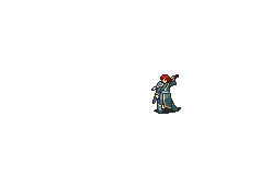
Eldritch’ Necromancer Generic
Style - 8/10
Detail - 8/10
Realism - 10/10
Despite the Necromancer being designed specifically for Lyon, this one does a great job of being generic. It feels like a sage or a summoner promotion that could genuinely be vanilla. The hood and the muted pallet just work so well.
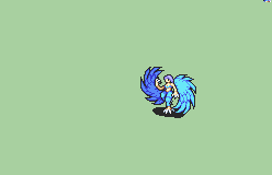
Divine Dragon
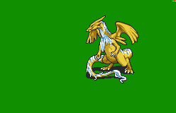
Style - 8/10
Detail - 10/10
Realism - 6?/10
The divine dragon is probably the best manakete sprite in the repo for sure. I’ve always had a thing for cloud-like eastern dragon fur on a western dragon frame, and this is no exception. I wouldn’t call it an issue, but it does feel like it was ported from a DS game.
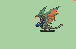
Leo_Link’s Malig Knight
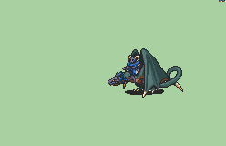
Style - 9/10
Detail - 10/10
Realism - 7/10
I’ll be honest, I used to dislike the v1 Malig Knight. It felt weirdly unpolished and shaded, but Leo cooked and now I love this one to death. The wyvern in particular looks super good, and the rider is equally well-designed. Being able to make green, orange, and blue work so well is a talent.
/Sword.gif)
%20Snipers%20and%20Ballistae/%5BSniper-Reskin%5D%20%5BM%5D%20Royal%20Sniper%20with%20Plume%20by%20Meteor/5.%20Bow/Bow.gif)

/Legendary.gif)
%20by%20Nuramon/6.%20Magic/Magic.gif)

%20Myrms%20and%20Swordmasters/%5BSwordmaster-Variant%5D%20%5BF%5D%20Fir%20by%20Redbean/1.%20Sword/Sword.gif)
%20Brigs,%20Pirates,%20Zerkers/%5BBerserker-Reskin%5D%20%5BM%5D%20Juggernaut%20by%20Sphealnuke/3.%20Axe/Axe.gif)
/Magic.gif)