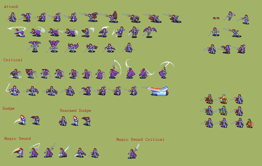
Did this Roy rework. Let me know what you think.
cool
i guess
If I can sound like an idiot for a second, what’s with that sword? It looks kind of like it has a nagel but it appears to be pointed inwards towards Roy which makes no sense whatsoever.
He also seems kinda awkwardly skinny in some frames but as a teenager maybe that’s intentional. Otherwise pretty cool.
The sword is just an anime design but as for skinny teenager, well…he is a teenager. All i did was make his body in line with other sprites. Original roy was so thick that it stood out, so i brought it in line with the others.
eirika roy, noice.
Looks clean. I think I still prefer the original Roy hair as it just has more character? But the body definitely looks better. Colors are nice too. 
The original battle sprite’s hair was modeled after an old design where he had a lot more JRPG spiky hair than in his final portrait, though.
