Prep Screen Menu Editor
Screenshots


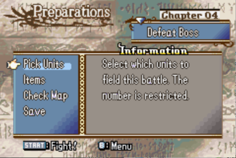
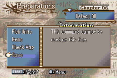
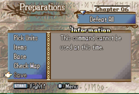
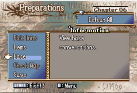
This will allow you to easily edit the menu options in the prep screen. In vanilla, these are loaded in a somewhat hardcoded fashion, but this includes some ASM and a CSV that allows you to edit and conditionally change these items.
How to: Spookify your prep screens
Like I said, the first part of this is some ASM. It handles building the menu options that you define in a modular fashion.
ALIGN 4
#inctext lyn "PrepScreen/PrepScreen.elf" "PrepScreen/Hooks.elf"
I hope this looks familiar by now. Nothing else is required.
The second half is the CSV that defines the conditions, name text, description text, and effects for your menu items. Heap the CSV with your other tables; as is, it is set up to function exactly how vanilla does. This data DOES NOT exist in this way in vanilla. This is a completely new table so the user can more easily define how the menu appears.
Each menu item appears as an entry in the table, and each item will be loaded in the order that they appear in the table. I’ll go through what each column does:
ID
I wouldn’t edit this for vanilla values, but each menu item has an ID associated with it. If you make new menu items, they will need an ID. I suggest using 5 or 6 since those are unused in vanilla. Within this ASM, the ID seems arbitrary as long as you don’t repeat them.
 0 = pick units
 1 = items
 2 = save
 3 = link arena cancel
 4 = support
 5 = ? (one of: fortune, ranking)
 6 = ? (one of: fortune, ranking)
 7 = check map
 8 = start battle?
Credit @StanH doc.
Name Text
Pretty straightforward. This is the text that will appear as the name of the item. (“Pick Units,” “Check Map,” etc.)
Usability (Whether to display)
This is reserved for a usability routine that returns false if you do not want the menu item to display at all (see images 1 and 2 how “Support” is not shown). Return true if you do want this option to appear. A 0x00 entry will always display the menu item.
Usability (Greyed out if false)
You know how in Valni and Lagdou, the “Save” option is greyed out an unusable? Do that to your menu items with this. Point to a routine that returns false to grey out and true to remain normal. Again, 0x00 will always display normally. PrepScreenSaveGreyUsability is included as an example and to emulate what vanilla does to grey out “Save” during the Valni and Lagdou chapters.
Warning for these usability options: Do not forget |IsPointer! It got cut off in my screenshot.
Desc Text
This is the text ID that will be shown when hovering over the menu item as the description text.
Greyed out desc text
Self-explanatory. This is the desc text that will be shown if the menu item has been greyed out.
Effect
This is the effect routine for each menu item. To be honest, I haven’t analyzed these a whole lot yet, but that’s what it is.
Finally, a terminator entry of all 0s is necessary as the last entry.
And that’s it really. I hope to have a little more analysis of the effect pointer.
One warning: you CANNOT display more than five menu options at a time. The graphics freaks the fuck out if you try. It’s fine to have more than five items in the CSV, but make sure via usability that more than five never show up simultaneously.
BONUS: Eliminating a Valni/Lagdou headache.
You know how in the top right of a prep screen, it shows “Chapter” followed by the chapter number? This is true except in Valni and Lagdou where it shows “Tower” and “Ruins” instead respectively.
ORG $96B1C
SHORT 0xE00A // Eliminate "Tower" in prep screens
ORG $96B3A
SHORT 0xE003 // Eliminate "Ruins" in prep screens
ORG $96B4C
SHORT 0xE003 // Eliminate "Ex.map" in prep screens
This’ll ensure that it always shows “Chapter” even in chapter IDs that were Valni/Lagdou.
No go and make a base convo system… or maybe prevent the player from viewing the map in a prep screen for a chapter.  Spread your evil!
