Pkmn type icons

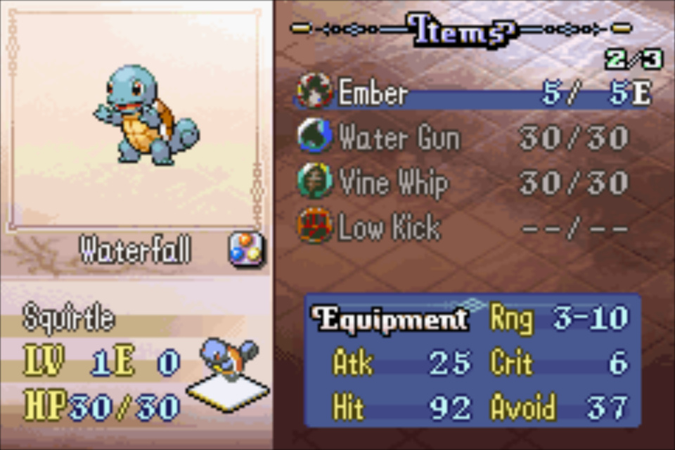
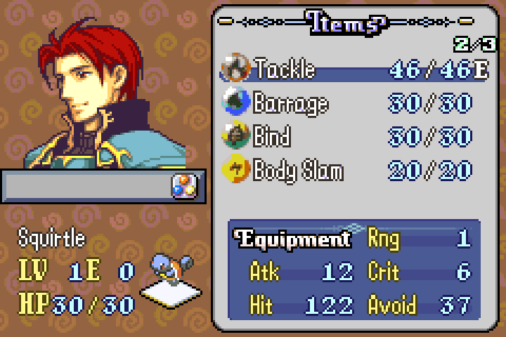
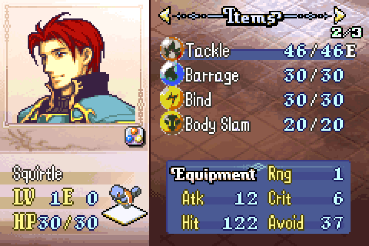
I’ve formatted some pkmn icons to the fe8 item icon palette, but I think they look bad. (Using one of Sme’s stat screens here, though, which looks nice!)

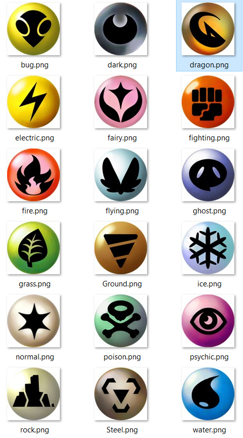
The source icons, at 104x104 each. (Google drive)

I initially resized them to be 16x16, but I thought it looked a bit weird that they touch like below. But they do look a bit clearer. I think the bug type ‘body slam’ (yes the names are just for testing lol) looks more like a mushroom than anything.

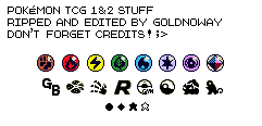
There’s also these sprites I could use for a few types from the TCG gameboy series, though I’d need to figure out the other 11 type icons, and the reflecting light is on the top right of these.
tcg icon

I’ve spent a couple hours futzing around with this to not so great results, so I’d appreciate any assistance or advice.

Thank you.

https://drive.google.com/drive/folders/17urk1D-p5dWDRd70VhnTxylNSHYr4xpO?usp=sharing

2 Likes

I’d go 14x14 with the “spheres” and use a defined outline around them - that will give them some definition and prevent them from blending by touching. Then it’d just be a matter of tweaking the shades showing the spotlight and curvature and manually drawing in the design on top of it to the best you can with the limited space.

I whipped this up super quick as a test, just to potentially give some ideas (feel free to use it as a base and iterate from):

4 Likes

Thank you for the tips. This is how they ended up looking after a bit more editing & fixing the border around them. Some of them aren’t that great, but I am happy to have what I consider as passable icons now. If anyone has advice on how to further improve these, I am all ears. I can see that they could be better still.

normal type poison type psychic type rock type steel type water type bug type dark type dragon type electric type fairy type fighting type fire type flying type ghost type grass type ground type ice type

2 Likes