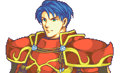
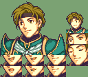
I’m Nuramon and I’m here today to present you my gba style version of general Zelgius from FE10.
And because I seek for critique and feedback xD
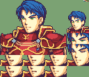
It’s the first portrait I’ve done so far and I’ve been working on it for quite some time now.
Zelgius is one of my most favourite characters in the series.
He basicly brought me here, since I’m modding him into FE7 xD
Anyway, back to topic.
Here is it:
Credit goes to NICKTofficial for the hair and parts of the face.
The armor was done from scratch by myself.
So far I’m relatively satisfied with the result but any advise you can give me to improve the portrait is welcome.
Kind regards
Nura
PS: Since you’ll probably find some gramatical errors, sorry for that. My english isn’t the best.
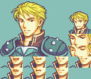
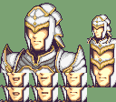
I’m not very good with mugs, but I think it looks pretty good, the armour’s neat. The main issue I have with it is that his head is just too big for the body. Compare it to some of the actual FE portraits:
If the tops of their heads align, his chin is in line with their shoulders. His mouth is in line with their chins. Not only does that mean he sticks out from the other FE mugs, but it makes his body look small in comparison. You can tell both Dorcas and Hawkeye are big, beefy guys, but the size of Zelgius’ head makes his body look kind of scrawny. So I recommend shrinking the head, and then moving him up in the box so you can show more of the armour.
Something like this!
Edit: Looking at it again, I’ve made his neck look really long. Maybe try lowering the head and pulling the shoulders up?
That looks pretty good! I’d have made the head just a little smaller, but that’s just a matter of taste - he shouldn’t stick out next to other big characters like Hawkeye or Hector now.
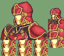
If I’m going to nitpick, the “ropes” across the chest look a bit jaggy.
Here’s an attempt I made to smooth them out a little - you can probably do better.
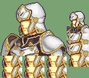
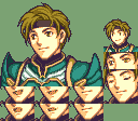
Meanwhile I’ve made a few tweaks here and there.
Like placing him higher in the box to let him look taller in comparison to e.g. Hector. (he looked kinda small at first)
I also made the mouth and eye frames as well as the mini so it can be inserted.
The palette was also sorted via usenti.
That’s the final result: (at least till I find something that’s bothering me xD)
It’s free to use for everybody. All I ask for is to give credit.
@Nuramon Post this in the Mugging Blitz thread. It’s a community project which aims to make as many free-to-use (and to edit) sprites in as little time as possible.
The portrait so far is very good so far but there clear flaws that hamper it down being the shading mainly aside from the proportions.
There is light hitting his face directly from the far side yet the pauldrons have a highlight smack dab in the center. This in of itself creates confusion and displays a lack of consistency which reflects the creator as a whole. Your work reflects your skill and abilities.
References are a good step to have a better understanding of how portraits work and seeing how light functions. Referencing the vanilla GBA Mugs is a highly if not mandatory step in order to become better.
I referenced the vanilla GBA mugs (e.g. Harken) as well as the FEXNA Zelgius portrait from Nickt while working on the portrait and I thought I’ve done the light correctly.
Most of the vanilla mugs share the same exposure. I tried to capture that as well.
The light hits from the near side. The highlight on his far side is the part of his face that isn’t shaded by his nose. Very much like in Harken’s protrait. At least in my opinion
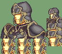
As for the proportions matter, I know that they aren’t top notch. Mainly due to the fact that Zelgius’ pauldrons are originally quite huge and I had to shrink them to make them fit in the box.
Or am I missing something else?
I’ve worked on my Zelgius mug since it had some flaws which @Blade pointed out. I just didn’t saw them til recently so sorry for that. >.<
I’ve tested around with the shading and reduced the width of the breat plate. His arms looked a bit thin before. And most notably I’ve redone the eye brows.
I’m still not fully satisfied with the shading on some parts of the armour.
What do you guys think about it?
For reference I added both the old and new one. old new
Hello Nuramon, I love your sprites and would like to use them for my hacking project. Of course I will give your name on the credit. I would like to have Harken, Sain, 3 generic soldier and the paladin.


 old
old new
new