Neat relevant pixel art tutorials I found online

(in shilling category because despite not being my websites, I feel that is currently the most appropriate category, as I did not write the tutorials nor am I posting them directly to FEU. feel free to change this, mods)

I was googling around for pixel arting concept resources specifically about antialiasing. Found a few gems.

(Note this website has a boobs guide article that has uncensored pixel boobs for informational purposes. Mods remove this link if it’s a problem)

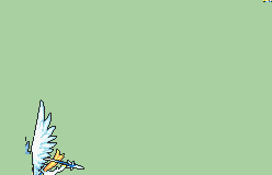
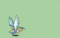
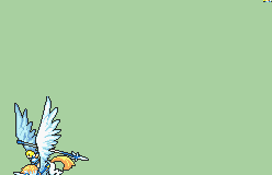
I have always found it hard to break down what antialiasing is and does; this article does a good job. In addition, it goes over selective outlining, which is used in some vanilla GBAFE battle animations.

This article breaks down antialiasing in a simpler way, giving matter-of-fact examples of various cases and uses.

Most pixel art color theory resources tend towards the style you see in many indie games with harsh highlights that leverage yellow to make them stand out; I will not link these, as it is not applicable to GBAFE style.

This one from the aforementioned Pixel Parmesan website (again, there is an article with boobies if you look, remove link if necessary) seems less biased towards a style although it does use a lot of technical language and examples:

Might be best to read this AFTER the antialiasing one, or maybe even never, as GBAFE palettes are rather standardized and most antialiasing, where color picking is fussy, is done on the skin, again, very standardized. Might help with palette index sharing though.

I might slap together a little rule of thumb for face shape antialiasing and element spacing in GBAFE in a bit, since since I noticed that there are very specific conventions for it, especially in the chin area, which might simplify things for people getting deeper into edits or customs, or even for those who are splicing but aren’t using certain parts.

Edit: Link to imgur album of a bad guide I threw together

6 Likes

Yasako being a guide for guides? les goooo

thanks for this

I learned a lot about animation from the stuff compiled on this site (Obviously, look at the other tags too, but I mostly used stuff from the animation one)
I think the “Animation Easing” one is a big concept a lot of people can learn to make their animations feel better with almost instant results, if you want a pointer

4 Likes

How to get an easy passing grade in battle animation.
I would like to write a few memo.

There are two very important pictures in a battle animation.
These are the first picture of the character standing on a stick (key frame) and the picture of the character taking damage.
If you can draw these two pictures properly, you will probably get a passing grade even if the rest of the animation is not so good.


This is because these two pictures will be on the screen the longest.
Unlike other pictures that only cover one or two frames, these two pictures will be on the screen for a much longer period of time.
It is not humanly possible to distinguish one frame (1/60 of a second).
It is impossible without recording and feeding frame by frame.
Vanilla also has strange motions when viewed frame by frame.

However, since these two pictures are displayed on the screen for tens of seconds at a time, if there is something strange, it will be very noticeable.
Therefore, please do your best to draw this ordinary picture.
It is worth spending much more time on it than the other painting.

3 Likes

How to achieve higher compression of battle animations

It is to move them in 8-dot increments.

Detailed rules
Shared areas will be compressed.
Shared areas are identified by 8-dot tiles.
The same image (same file name) will be used.

For example, the following scene.
This is a bad example in vanilla.
It would be more efficient to modify it as follows

What is wrong?
The motion is similar, but it is not moving in 8-dot increments.
The picture is almost the same, but it is shifted a few dots to the side.
Therefore, the same picture is not considered moved, but is registered as a new picture and is not compressed.

BAD
anime_019
anime_021
anime_022

FIX
anime_019
anime_021_fix
anime_022_fix

DIFF

Since Pegasus and cavalry are larger than infantry, these trivial things can consume a lot of space.

By simply copying exactly the same as above, tiles can be used more efficiently.

Of course, over-optimization that detracts from the appearance is not a good idea.
The appearance of the animation should be the first priority.
However, if the difference is trivial and does not affect the appearance, consider copying the data and moving it by 8 dots (tiles).
Just by being aware of this, You can create a more highly compressed animation.
Pegasus and Dragon have similar waste in the above optimization, and immediately after this, in the motion of flying far away, which can easily be reduced by about 2 sheets (8kbytes) by optimizing them.

Aim for nice animations that move very well but are small in size.

3 Likes