LG's (Sprite) Freebies

Personally I hate those wall tops, I think they’re horribly out of place against nearly everything else. However, I’d be a liar if I didn’t say pretty much everything here didn’t look superb outside of that - I’m particularly a huge fan of the first map, as it nails the aesthetic that I think is impossible otherwise and utilizes just about everything that makes my tileset fuckin amazing.

Object Image stores all of the palettes, and assuming you didn’t edit any of the palettes yourself, all of my existing palette variants would work for it, too… Well, once I get off my lazy bum and finish setting things up on the tileset. Which I might just work off this one, depending on what got removed.

Keep it up!

2 Likes

I used the wall tops for the sole reason of wanting to convey that it was a look down inside of the house since it was chopping off a layer of height to do it. In an absolutely ideal world (maybe something that Lex Talionis or Tactile could do one day), my idea would be that the interior would only be revealed to a faction when that faction has a unit inside of the structure (i.e. if an enemy is lying in wait in a house, the house interior would be visible to them, but not to the player) and would “close back up” when no one was inside. I intentionally avoided using them everywhere else since the angle they show at doesn’t really work with the other wall styles in the FE tilesets, just as you mentioned.

I was more concerned with the addition of the tiles for the object image than the palette itself since I know that you said that there wasn’t a lot of room initially. I did try something different with making edits to the tileset this time than I normally do which I hope avoided the problem where the program I use will sometimes screw with the palette order, which is why I wanted to at least note that it shouldn’t have changed but was iffy about whether that was true.

For the tileset itself, I removed the silver-y ruins type walls that were under the brown stone walls on the right side and moved the 2x2 door over there to make room for the walls and wall tops from Wave’s tileset, and then I rearranged the stone wall tops to help squeeze those in, though there might have been a more efficient way to arrange them. Originally, I was going to put the stone walls where some of the water tiles were in the gap above the wood floor barrels and rope and then decided against it, but I had already removed the water tiles at that point and didn’t want to either redo the edits to the wall tops and tiles or copy the water back over, so I just left them out (also figuring/hoping that it might help with space issues).

2 Likes

Imagine living inside a house that’s one tile wide.

“Hey, where’s the bathroom?”
“Bathroom? Haha, you think there are actual rooms in here.”
“…”
“And the walls are literally as wide as the hallway. The hallway that is the only space in the house, and is itself as wide as literally one barrel.”
“WHY.”
“The housing market sure is awful these days.”

Lol.

If only there were 1% wall, 99% floor tiles… Contractors in FF land must be terrible at their jobs.

(But, yeah, like I said, the house components (mostly the tile block for the roofs) really aren’t made for making really houses with “vertical” depth to them (as I assume that whatever FF it was from just loads a building interior when you go in one), so I kinda had to make do to fit the gameplay concept into the space available.)

1 Like

Great battle frames and stuff, these fits the royal aesthetic that I’m looking for. Can I please edit or use these in my future hack?

2 Likes

You know what, sure, go ahead.

1 Like

Hey folks, it’s been a while since I had an update in here. The last year was a bit rough as my old computer just about gave up the ghost, so I didn’t get a lot of spriting done (or what I did make was for personal projects).

Fortunately, I finally finished a long-standing project that I’ve been working on. (Unfortunately, barring a massive swing of ideas, I don’t know if I’ll have much to publicly post after this, except maybe some maps if the fancy strikes me.)

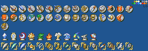
As always, I am simply working on these in my graphics program - I don’t have whatever the vanilla game’s palette order is handy, so things may need fiddled with. If someone has it and wants to provide it to me, I can go into Usenti and reorder the palette. Regardless, I present a brand new suite of weapon level / convoy icons, affinity icons, and “attribute” icons:
Custom Weapon Affinity Attributes - No BG

(!! These are free to use, but I will put them in the first post at a later date when I have time to plug them in and organized them into the sections at the top. !!)

Presented above without the 16x16 transparent color behind them for readability to start. (Yes, I know that the vanilla icons for Affinity are 14x14 and Weapon Level are 15x15, but I wanted more space and standardized sets.)

For ROM hacks, everyone will have options for what they want to use for the most part, but for Tactile or Lex Talionis or whatever else, I wanted to make sure that there were as many options as I could think of for the set should the user so choose to go that complex.

Row 1: Sword/Light Sword, Greatsword, (Cavalry) Lance, Spear, Axe, Poleaxe, Bow, Crossbow, Ballista/Siege Weaponry, Throwing/, Daggers/Hidden Weapons, Brawling, Strikes (Laguz), Shields, Authority

Row 2: Tome (Unified/Generic a la Archanea), Fire, Thunder, Wind, Nature/Anima, Light, Dark, White Magic/Faith, Black Magic, Dark Magic, Reason (Combined), Staff, Dragonstone, Dragonstone (Breath)

Row 3: Convoy Stock

Row 4: Ice Affinity, Anima Affinity, Dark Affinity, Light Affinity, Earth Affinity, Fire Affinity, Thunder Affinity, Water Affinity, Heaven Affinity, Metal Affinity, Wind Affinity

Row 5: Flying (Grounded), Flying (Gliding), Flying (Airborne), Noble/Main Character, Priest, Mage, Infantry, Dragon, Armored, Wood, Monster, Pillager, Horse, Beast, Undead

As mentioned, the idea was to be accessible for non-GBA implementations that might want to take the approach of having more affinities or weapon types (or even having the types split a la Berwick Saga to reign in what weapons types of units or classes could use) or to display class attributes more in line with what Awakening and beyond do (i.e. Pegasus would be Horse + Flying, for example) or do things like mark clerics as Priests so that you could do stuff like the chapter in Path of Radiance or cause healer units to give 0 EXP when attacked/killed, etc. Hopefully plenty of options to suit whatever you might need or want to use.

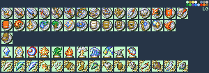
Here’s the set as above with the 16x16 backgrounds on it, as well as one lined up like you would get when exporting the graphics from the game (just not split in half):
Custom Weapon Affinity Attributes - Green BG

Custom Weapon Affinity Attributes - Condensed

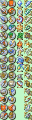
I do personally feel like the icons work best on a dark background (as seen by how much better they look against the dark blue than the transparent BG green color - I was using a darkish blue that was around (32, 88, 144) as the 16x16 background during creation and it felt like just enough contrast for them to stand out but not be too bright to be distracting), but I also didn’t test these too much on sample stat screen backgrounds, so if anything looks funky, I may end up doing revisions based on what ends up being reported in.

Hit the jump if you care more about the background/details/creation of the icons

This project started a while back because I felt like the Cipher set I did, while neat, was both causing issues and wasn’t something that I could say was wholly my own - it was using other designs and assets that had just been transcribed into GBAFE style by scratch. After I had been tagged asking if a set of affinity icons had been something that I had made (which I hadn’t), it spurred the idea to want to take that initiative and actually make a set for myself.

I took the basis of the round Skill icons that showed up in some of the battle mockups earlier up in this thread and used that as the base plate for the weapon icons and wanted to make them like a concave silver plate/platter that the weapons were sitting across and on top of. I started with the easy basics but wanted to change things up from typical FE weapon level icons, going with a sword that was more styled like a Rapier instead of a wider-bladed sword, going with a conical lance instead of a traditional looking lance, starting with a blank book that could be used for single tome rank games, etc.

Once I learned of everyone’s fascination with Steel Blades, I made an alternate option with a large-bladed Sword, which then kicked off the expansion of the project to be even more in-depth with options than the Cipher set - I wanted to do everything that was on it PLUS a bunch more. Berwick’s wide array of weapon types further made me want to go through with the concept, since it made sense to limit Cavalry to certain types of lances or to prevent mounted units from using Poleaxes and make infantry the only ones that could use them. For the magic types, the intended route is individual Anima types, but I provided a combined “Nature” type for those wanting to stick to GBA stylings. Fire/Earth are one, Lightning is by itself, and then Wind/Water is the last.

For the Affinities, I started with Ice since I had a vision of an ice crystal with something light inside of it, a bit like the crystals for Din’s Fire, etc. from Ocarina of Time. After that, I had visions of ideas for some of them that I sketched out on paper - the rest were just a matter of time and thinking about them to come up with something that make sense and looked interesting. Anima was the last addition as I completely redid the original one that I had made since it didn’t feel original enough - the fact that it’s a mirror goes into the whole “Anima = the soul” angle, but it also uses all three magic type colors (red, yellow, blue) in it, so it felt like it carried on the legacy of the original vanilla icon well enough through that.

For the class attributes, most of the extra new things were based on ideas I had for project and class concepts of things I’d like to do - Dracoknights that can’t fly as high as Pegasi (a la FE Warriors how they stay close to the ground) which necessitated a “non-Flying” Flying icon, or having Fleet/Ballistae be their own unit that could be damaged for extra damage by Fire magic because they’re made of Wood, the Lord-slaying weapons in Extinguished Blade led to a marker denoting who the MC of the project was and who could use the Seize command, etc.

17 Likes

I did some testing on the icons using the vanilla FE8 stat screen background and realized that I needed to make a few tweaks here and there, mostly to the weapon level icons.

The three images in the above post have been updated to contain the new fixes (and I chose a better blue to see the icons without the 16x16 borders on for the first image).

Here are a few test shots showing things against the background for a feel of what they would look like:
TestMock1
TestMock2
TestMock3
TestMock4
TestMock5
TestMock6

(All items are placed where they would be with their vanilla alignments.)

12 Likes

New map! @MageKnight404 has been replaying Valkyria Chronicles on stream recently and it got me in the mood to finally finish my “trilogy” of maps based on some of the early game maps in the game.

This map in particular is adapted from Chapter 03: Vasel Urban Warfare - ‘West Bank of Vasel City’:
VC Ch 3
[Overhead tactical planning map from the game]
A video of the chapter (timestamped): Valkyria Chronicles PC 03 - Vasel Urban Warfare. Mission: West Bank of Vasel City - YouTube

This is using the same tileset as the map in this post. No extra layers for tile changes or anything this time. Just wanted to use the map layout to make something and “fill in” the areas of town that you don’t have access to in VC’s version of the map (notably between the two camps). The rope near the “flat top” building near the north is intended to be an “Event” spot for the unit to “climb” to the top of the roof (ideally, with a Siege Tome user sitting up there to get rid of).

Hopefully, by adding the connective pieces between the “zones”, it opens things up to allow for other chapter objectives or routes through the map than simply doing what the goal was in its source game. The tileset posed some limitations in recreating things entirely faithfully (especially the non-standard buildings in the top-left and near the bottom-left), but I like to take some liberties with things anyway, just to spruce them up.

>> TMX HERE <<

If you would like the houses to be able to be visited, you are welcome to download the TMX and change the doors to be open and add tile changes on your own.

20 Likes

A little bit of a “tease” on this one, since I still need to wrap it up (convert to TMX and do the tile changes in Tiled), but this took long enough to get to this point that I want to post it and share it now anyway…

(Inspired by the Osaka Bay map/stage in Samurai Warriors 2!)

Should hopefully have this finished up later this week!

20 Likes

first time i see someone using mountain tiles in the water to resemble a reef, that was genious :+1:

1 Like

Getting some serious “Battle of Red Cliffs” vibes from this – need Zhuge Liang to pray for wind :pray: :face_in_clouds: :wind_face:

4 Likes

Map finished! Some minor tweaks from the above:

This uses this tileset from the Repo.

The TMX has layers for the doors, chests, and all but one set of planks between the boats and rafts, should you want to have events where the planks get destroyed or something as the map goes on.

14 Likes

Hello I am a student working on a FE style game for my class project. It’s not FE but it’s heavilyinfluenced by it. I would like to know i these assets are riped form any FE game or if they are your own and if they are yours would i be abe to use them for my project? According to my teacher’s grading criteria the asset can be from the internet as long as they are copyright free.

Of the items that are free to use (only the stuff shown or linked in the first post), the dragon and circle on the Old Jugdral-themed Stat Frame were “traced” over from assets in Genealogy of the Holy War and the maps were obviously made from tilesets taken from the games (or other series in the case of the FF Pandemonium tileset, etc.).

The other UI elements (weapon icons, affinity icons, etc.) were all made from scratch, either as entirely custom designs or off of visual reference of pieces of official art, etc.