LG's (Sprite) Freebies

I have finished copying everything over with replaced images. You should now be able to actually tell what is going on without the semi-transparent Photobucket overlay obscuring the graphics.

3 Likes

New map!

EncounterAtBruhl-a

>> TMX download (no tile changes for this map) <<

First time working with Zoramine’s Revamped Fields Village tileset - the higher cliffs and half-hills were why I wanted to use it, but also the elements I struggled the most with making use of with no prior experience on them.

I saw the topic about Advance Wars map sprites and it make me realize and be a little surprised that I don’t think anyone had tried to do a demake of similar tactics series Valkyria Chronicles but in GBAFE and making use of Advance Wars sprites to make it happen (even though VC is more about infantry than machines…), so it gave me the idea to try and recreate a map or two in GBA format.

This map is based on the Prologue from Valkyria Chronicles, Gallia, to Arms! Part 3: Encounter at Bruhl, though I took liberties with the design to make it more Fire Emblem-y, to use the full square map space (as opposed to chunks being blocked off like in VC) while keeping the major features - the bridge, the sandbags (as walls), the hilly west side of the map - and to make use of the extended cliffs and the hills in places where I thought they could fit.

18 Likes

Good use of the hill tiles.

1 Like

This was probably one of the more intense days of spriting I’ve done in all of my years doing it - about 10 total hours today remastering an old battle frame after I (finally?) realized that the project it had been given to was likely “dead” enough that I could probably make it available for everyone else to use (and, with the blessing of the project’s creator to do so)… but, since it was like 8 years old, it needed a fresh coat of paint. Even though a lot of the fundamentals are still the same, I did have to do some major overhauling in places

Here’s the original version of the battle frame as it was before its face lift:
EternalBondTemplate

And, today, I present the new version of the template, free for anyone to use and edit (and fiddle with to try and insert it):
EternalBondBattleFrameRemaster-MasterWPalette
(Master version with palette and Enemy/Player/NPC/Other/Ally options (and this time I kept the font colors in the palette :D))
EternalBondBattleFrameRemaster-RBwCloseAngels
(Master version without palette)
EternalBondBattleFrameRemaster-RBwFarAngels
(Alternate version with the angels further away before I moved them to the center)

I also had a separate layer that replaced the “swoosh” in the Name Box with a solid color to just make it a simple gradient, in the event that the tile limit becomes an issue (though I don’t imagine that will help a ton if it needs to be done…).

Here’s an edit of one of the mock-ups from earlier in the thread using this new battle frame so that you can see a rough idea of what it would look like in action:
IrisRoeblisMockUp-Test

I want to thank @ZessDynamite in a roundabout way for making this happen - their new battle frame for Absolution (you should check it out if you haven’t yet!) and its use of Red/Blue/Gray as a color scheme made me actually remember about this template and that it existed in my files and it spurred me on to want to do the remaster to this in the first place.

(And now I return to hibernation and sleeeeeep…)

30 Likes

That new battle frame is looking nice. :smiley: Also Valkyria map. very nice. Valkyria Chronicles is a fun series. (At least imo. Others are entitled to their own opinions.)

Once again - new map!

>> Link to TMX here! <<

I was looking at the new Frozen Throes screenshots this morning and this idea just hit me. I decided to reimagine Revelations (Radiant Dawn 4-4 AKA that annoying map with Oliver) using N426’s Improved Castle Tileset (using “Palette 1”), while changing things up a little bit (though most of the southern end of the map is roughly the same conceptually) and adding my signature “big map change” to it.

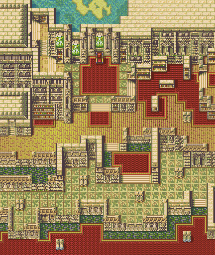
I added a “loft” up in the top left as a place where Oliver would have kept his prized Herons to keep them safe and admire their beauty, as well as repurposing the closed rooms on the east into a library-like area (I imagine that one could add events around some of the bookcases to find Tomes as well). I kept the concept of the ledges, and many of them feature cracked wall tiles that will turn into stairs so that your units can actually climb those spots. I tried to prevent as many chokepoints as I could to keep the flow smooth, though there are a few places left where that could still happen.

The big change is the addition of a “secret tunnel” exit, because we all can imagine that Oliver would have something like that available in his manor, lest he be caught with something illegal…

This also opens up the map to several other possible objectives in scope by having another entrance/exit available once the passage is revealed. (When placing the chest in the Heron’s Loft, I imagined it holding a Speedwing…)

22 Likes

Apparently, this mapping kick just doesn’t want to subside!

Retreat From Bruhl 1

Like the Path of Radiance Chapter 6 map, this one will potentially take some work to actually be usable as it uses an edit of Zoramine’s Temporary Port Village tileset - the most notable change is that the wall tiles from Wave’s FF Town tileset have been added (back) in and some tiles were removed to shuffle things around. The palette should be the exact same as the base tileset, but I have no idea if the tileset’s resulting object image will actually work or not. (If not, maybe when the tileset is no longer temporary, some of what I added can be included into the final tileset in order to have one that actually works.)

This map continues the theme from the Valkyria Chronicles map from December, this time being a reimagining/interpretation of Chapter 2 of Valkyria Chronicles, Escape from Bruhl Part 2: Retreat from Bruhl. The town has been abandoned/evacuated of civilians and the remnants of part of a wall litter the road, as do barrels and rope in places. Again, I had to take some liberties since VC’s maps aren’t square and I also had a specific gameplay element in mind to incorporate for the map, necessitating some other deviations from the source - while the concept is very heavily used in FE, I don’t know if it’s been done in the way I chose to do it: “traversable houses”.

Using the tiles I added (back) in from Wave’s initial version of the FF town tileset, the map features tile changes that allow the interiors of most of the houses to be moved through. One house does not have this capability and another house intentionally trolls the player by being barricaded from inside once opened, but all of the other houses can be revealed and moved through (some only lead to places for hidden items or chests while others offer full paths or potential recruitment/reinforcement zones), allowing enemies to be hidden inside or items left behind to be looted/pilfered (and I left plenty of things to indicate hidden items in addition to chests).

Retreat From Bruhl 2

Retreat From Bruhl 3
(Hidden Chest by waiting next to the obviously different spot on the wall)

There’s also plenty of room for other events to trigger than just around the barrels, rope, and walls in the houses - the tower near the gate could have a ballista on it, used to attack further away in defense of the structure. Maybe an NPC reinforcement could appear from the staircase in the center house once it’s opened and they could be convinced to join you. Maybe you could find some money that was left in the fountain by standing next to it or by “mining” the lone rock along the path to the side of the road. Maybe there’s an ally (or promoted/boss enemy) hiding in the cellar of the house on the far right. But, having the houses be able to be opened allows for different paths through the level, which was the main goal I wanted to focus on ever since I saw the sample map that Zora posted as the tileset was being worked on. (FF’s town buildings aren’t quite suited to making larger houses, which made creating paths inside rather challenging with limited space as did working with the roof tile options to try and make larger houses…)

While the source conflict in Valkyria Chronicles was a split Defend/Destroy map (hold out and wait for help to arrive while protecting the gate, and then destroy the attacking tank once help arrives), the layout of the map could be used for anything (Destroy the gate, Defend the gate, rout the enemy, defeat boss, escape, find a certain item that was hidden and steal it, etc.) and there really isn’t a set starting point though I stuck with keeping the starting area from VC mostly in tact in the southwestern corner.

>> Download here: TMX <<

I am thinking that I’m going to do one more VC-inspired map and make this a “trilogy” of sorts and will probably end up using this edit of the tileset (or a completed one, if someone takes the work here and makes it actually usable) for that map as well since the brick walls and such will complement it nicely… But, that is for a future post!

18 Likes

Personally I hate those wall tops, I think they’re horribly out of place against nearly everything else. However, I’d be a liar if I didn’t say pretty much everything here didn’t look superb outside of that - I’m particularly a huge fan of the first map, as it nails the aesthetic that I think is impossible otherwise and utilizes just about everything that makes my tileset fuckin amazing.

Object Image stores all of the palettes, and assuming you didn’t edit any of the palettes yourself, all of my existing palette variants would work for it, too… Well, once I get off my lazy bum and finish setting things up on the tileset. Which I might just work off this one, depending on what got removed.

Keep it up!

2 Likes

I used the wall tops for the sole reason of wanting to convey that it was a look down inside of the house since it was chopping off a layer of height to do it. In an absolutely ideal world (maybe something that Lex Talionis or Tactile could do one day), my idea would be that the interior would only be revealed to a faction when that faction has a unit inside of the structure (i.e. if an enemy is lying in wait in a house, the house interior would be visible to them, but not to the player) and would “close back up” when no one was inside. I intentionally avoided using them everywhere else since the angle they show at doesn’t really work with the other wall styles in the FE tilesets, just as you mentioned.

I was more concerned with the addition of the tiles for the object image than the palette itself since I know that you said that there wasn’t a lot of room initially. I did try something different with making edits to the tileset this time than I normally do which I hope avoided the problem where the program I use will sometimes screw with the palette order, which is why I wanted to at least note that it shouldn’t have changed but was iffy about whether that was true.

For the tileset itself, I removed the silver-y ruins type walls that were under the brown stone walls on the right side and moved the 2x2 door over there to make room for the walls and wall tops from Wave’s tileset, and then I rearranged the stone wall tops to help squeeze those in, though there might have been a more efficient way to arrange them. Originally, I was going to put the stone walls where some of the water tiles were in the gap above the wood floor barrels and rope and then decided against it, but I had already removed the water tiles at that point and didn’t want to either redo the edits to the wall tops and tiles or copy the water back over, so I just left them out (also figuring/hoping that it might help with space issues).

2 Likes

Imagine living inside a house that’s one tile wide.

“Hey, where’s the bathroom?”
“Bathroom? Haha, you think there are actual rooms in here.”
“…”
“And the walls are literally as wide as the hallway. The hallway that is the only space in the house, and is itself as wide as literally one barrel.”
“WHY.”
“The housing market sure is awful these days.”

Lol.

If only there were 1% wall, 99% floor tiles… Contractors in FF land must be terrible at their jobs.

(But, yeah, like I said, the house components (mostly the tile block for the roofs) really aren’t made for making really houses with “vertical” depth to them (as I assume that whatever FF it was from just loads a building interior when you go in one), so I kinda had to make do to fit the gameplay concept into the space available.)

1 Like

Great battle frames and stuff, these fits the royal aesthetic that I’m looking for. Can I please edit or use these in my future hack?

2 Likes

You know what, sure, go ahead.

1 Like

Hey folks, it’s been a while since I had an update in here. The last year was a bit rough as my old computer just about gave up the ghost, so I didn’t get a lot of spriting done (or what I did make was for personal projects).

Fortunately, I finally finished a long-standing project that I’ve been working on. (Unfortunately, barring a massive swing of ideas, I don’t know if I’ll have much to publicly post after this, except maybe some maps if the fancy strikes me.)

As always, I am simply working on these in my graphics program - I don’t have whatever the vanilla game’s palette order is handy, so things may need fiddled with. If someone has it and wants to provide it to me, I can go into Usenti and reorder the palette. Regardless, I present a brand new suite of weapon level / convoy icons, affinity icons, and “attribute” icons:
Custom Weapon Affinity Attributes - No BG

(!! These are free to use, but I will put them in the first post at a later date when I have time to plug them in and organized them into the sections at the top. !!)

Presented above without the 16x16 transparent color behind them for readability to start. (Yes, I know that the vanilla icons for Affinity are 14x14 and Weapon Level are 15x15, but I wanted more space and standardized sets.)

For ROM hacks, everyone will have options for what they want to use for the most part, but for Tactile or Lex Talionis or whatever else, I wanted to make sure that there were as many options as I could think of for the set should the user so choose to go that complex.

Row 1: Sword/Light Sword, Greatsword, (Cavalry) Lance, Spear, Axe, Poleaxe, Bow, Crossbow, Ballista/Siege Weaponry, Throwing/, Daggers/Hidden Weapons, Brawling, Strikes (Laguz), Shields, Authority

Row 2: Tome (Unified/Generic a la Archanea), Fire, Thunder, Wind, Nature/Anima, Light, Dark, White Magic/Faith, Black Magic, Dark Magic, Reason (Combined), Staff, Dragonstone, Dragonstone (Breath)

Row 3: Convoy Stock

Row 4: Ice Affinity, Anima Affinity, Dark Affinity, Light Affinity, Earth Affinity, Fire Affinity, Thunder Affinity, Water Affinity, Heaven Affinity, Metal Affinity, Wind Affinity

Row 5: Flying (Grounded), Flying (Gliding), Flying (Airborne), Noble/Main Character, Priest, Mage, Infantry, Dragon, Armored, Wood, Monster, Pillager, Horse, Beast, Undead

As mentioned, the idea was to be accessible for non-GBA implementations that might want to take the approach of having more affinities or weapon types (or even having the types split a la Berwick Saga to reign in what weapons types of units or classes could use) or to display class attributes more in line with what Awakening and beyond do (i.e. Pegasus would be Horse + Flying, for example) or do things like mark clerics as Priests so that you could do stuff like the chapter in Path of Radiance or cause healer units to give 0 EXP when attacked/killed, etc. Hopefully plenty of options to suit whatever you might need or want to use.

Here’s the set as above with the 16x16 backgrounds on it, as well as one lined up like you would get when exporting the graphics from the game (just not split in half):
Custom Weapon Affinity Attributes - Green BG

Custom Weapon Affinity Attributes - Condensed

I do personally feel like the icons work best on a dark background (as seen by how much better they look against the dark blue than the transparent BG green color - I was using a darkish blue that was around (32, 88, 144) as the 16x16 background during creation and it felt like just enough contrast for them to stand out but not be too bright to be distracting), but I also didn’t test these too much on sample stat screen backgrounds, so if anything looks funky, I may end up doing revisions based on what ends up being reported in.

Hit the jump if you care more about the background/details/creation of the icons

This project started a while back because I felt like the Cipher set I did, while neat, was both causing issues and wasn’t something that I could say was wholly my own - it was using other designs and assets that had just been transcribed into GBAFE style by scratch. After I had been tagged asking if a set of affinity icons had been something that I had made (which I hadn’t), it spurred the idea to want to take that initiative and actually make a set for myself.

I took the basis of the round Skill icons that showed up in some of the battle mockups earlier up in this thread and used that as the base plate for the weapon icons and wanted to make them like a concave silver plate/platter that the weapons were sitting across and on top of. I started with the easy basics but wanted to change things up from typical FE weapon level icons, going with a sword that was more styled like a Rapier instead of a wider-bladed sword, going with a conical lance instead of a traditional looking lance, starting with a blank book that could be used for single tome rank games, etc.

Once I learned of everyone’s fascination with Steel Blades, I made an alternate option with a large-bladed Sword, which then kicked off the expansion of the project to be even more in-depth with options than the Cipher set - I wanted to do everything that was on it PLUS a bunch more. Berwick’s wide array of weapon types further made me want to go through with the concept, since it made sense to limit Cavalry to certain types of lances or to prevent mounted units from using Poleaxes and make infantry the only ones that could use them. For the magic types, the intended route is individual Anima types, but I provided a combined “Nature” type for those wanting to stick to GBA stylings. Fire/Earth are one, Lightning is by itself, and then Wind/Water is the last.

For the Affinities, I started with Ice since I had a vision of an ice crystal with something light inside of it, a bit like the crystals for Din’s Fire, etc. from Ocarina of Time. After that, I had visions of ideas for some of them that I sketched out on paper - the rest were just a matter of time and thinking about them to come up with something that make sense and looked interesting. Anima was the last addition as I completely redid the original one that I had made since it didn’t feel original enough - the fact that it’s a mirror goes into the whole “Anima = the soul” angle, but it also uses all three magic type colors (red, yellow, blue) in it, so it felt like it carried on the legacy of the original vanilla icon well enough through that.

For the class attributes, most of the extra new things were based on ideas I had for project and class concepts of things I’d like to do - Dracoknights that can’t fly as high as Pegasi (a la FE Warriors how they stay close to the ground) which necessitated a “non-Flying” Flying icon, or having Fleet/Ballistae be their own unit that could be damaged for extra damage by Fire magic because they’re made of Wood, the Lord-slaying weapons in Extinguished Blade led to a marker denoting who the MC of the project was and who could use the Seize command, etc.

16 Likes

I did some testing on the icons using the vanilla FE8 stat screen background and realized that I needed to make a few tweaks here and there, mostly to the weapon level icons.

The three images in the above post have been updated to contain the new fixes (and I chose a better blue to see the icons without the 16x16 borders on for the first image).

Here are a few test shots showing things against the background for a feel of what they would look like:
TestMock1
TestMock2
TestMock3
TestMock4
TestMock5
TestMock6

(All items are placed where they would be with their vanilla alignments.)

11 Likes

New map! @MageKnight404 has been replaying Valkyria Chronicles on stream recently and it got me in the mood to finally finish my “trilogy” of maps based on some of the early game maps in the game.

This map in particular is adapted from Chapter 03: Vasel Urban Warfare - ‘West Bank of Vasel City’:
VC Ch 3
[Overhead tactical planning map from the game]
A video of the chapter (timestamped): Valkyria Chronicles PC 03 - Vasel Urban Warfare. Mission: West Bank of Vasel City - YouTube

This is using the same tileset as the map in this post. No extra layers for tile changes or anything this time. Just wanted to use the map layout to make something and “fill in” the areas of town that you don’t have access to in VC’s version of the map (notably between the two camps). The rope near the “flat top” building near the north is intended to be an “Event” spot for the unit to “climb” to the top of the roof (ideally, with a Siege Tome user sitting up there to get rid of).

Hopefully, by adding the connective pieces between the “zones”, it opens things up to allow for other chapter objectives or routes through the map than simply doing what the goal was in its source game. The tileset posed some limitations in recreating things entirely faithfully (especially the non-standard buildings in the top-left and near the bottom-left), but I like to take some liberties with things anyway, just to spruce them up.

>> TMX HERE <<

If you would like the houses to be able to be visited, you are welcome to download the TMX and change the doors to be open and add tile changes on your own.

19 Likes

A little bit of a “tease” on this one, since I still need to wrap it up (convert to TMX and do the tile changes in Tiled), but this took long enough to get to this point that I want to post it and share it now anyway…

(Inspired by the Osaka Bay map/stage in Samurai Warriors 2!)

Should hopefully have this finished up later this week!

19 Likes

first time i see someone using mountain tiles in the water to resemble a reef, that was genious :+1:

1 Like

Getting some serious “Battle of Red Cliffs” vibes from this – need Zhuge Liang to pray for wind :pray: :face_in_clouds: :wind_face:

4 Likes

Map finished! Some minor tweaks from the above:

This uses this tileset from the Repo.

The TMX has layers for the doors, chests, and all but one set of planks between the boats and rafts, should you want to have events where the planks get destroyed or something as the map goes on.

13 Likes