LG's (Sprite) Freebies

New map!

Had the idea for this one come to me in that odd morning state as I was half-asleep and half-awake one day - used @WAve’s FF2 Pandemonium tileset to do what I did for FE9 Ch 6 for FE5 Ch 24x.


Tileset: https://www.dropbox.com/s/e7kf6flcnxoj0bw/FF2%20Pandemonium%20Edit.png?dl=0
(Will likely not have the correct palette order due to the modifications I made to it*)

While doing this, if I had any feedback about the tileset, it’d be that there’s a little bit of palette overlap between the lighter blue floor tiles and some of the purple crystal elements which I had to modify in doing this palette edit. I also feel like there are a few more elements that are really needed to fully flesh it out - I added a Stairs tile (which I ended up not using anyway) as well as the 3x2 large door (which I again didn’t use) from the Fortress/Stronghold tileset as I noticed in the mockup screenshots in the Repo thread that it might be handy for the tileset to have if you had a more interior structure. The main source of issue that I had was trying to use the “top floor” boss area in conjunction with the rest of the tileset (as I wanted to mimic the Manastone floors that Evyel and the boss are on) because there just aren’t really any good transitional tiles to make use of and the way the floor had to be chopped up into a 16x16 grid didn’t really allow for many possibilities. In the end, I had to make use of the tile used for the top of the floating crystals, which I don’t even know if it’s traversable by units. (*If any of this feedback is taken into consideration for the tileset, I recommend using the edit linked above as only a guide so that the palette order can be retained from the original source tileset.)

The main idea on this was to have a map not entirely constrained by the objective of 24x while also opening up more freedom of movement, especially for fliers and/or rescue drops. The area at the top of the map could still be a “rescue Evyel” spot or it could be the new location for a Boss or even a defend point and the center “table” could instead be the “rescue Evyel” point or the Boss’s location (like in vanilla). Again, no idea what the movement rules are for some of the structures and objects, but the intention was that anything that wasn’t a wall, pillar, or the bigger crystal structures/statues could be flown over. (And then, used a couple of areas from games that I’ve played as inspiration for the palette and floor tiling choices, and boom.)

21 Likes

the tiles remind me of rpgmaker.
cool.

In the words of the great Will Smith - “That’s hot! Ah, that’s hot!”

Jokes aside, nice edit.
Love the new palette, it reminds me of the “Heaven” dungeon from FF2. Clever way of linking the throne room to the rest of the map.
Thanks for the feedback on the tileset. Creating something for yourself is easy - but there’s always loads of things you miss when trying to make something for others to use.

1 Like

For the palette, wanted to try and capture something that was spooky and otherworldly with flashes of color, which is why I went with the grey and desaturated purple for the main colors and the yellow/orange and blue colors (which fit perfectly) for the splashes of color. The throne room portion got magenta to evoke and be an homage to the Manastone terrain (as mentioned above). Also made it easier to draw from Diablo II’s Arcane Sanctuary and the Distortion Corridor from Radiata Stories for additional inspiration on the map.

I did remember one more thing that I forgot to add as feedback on the tileset - I ended up avoiding the 3x3 “galaxy” tile block and just stuck with the regular stars. I noticed on the sprite rips of the Pandemonium area in FF2 that there were more varied shapes to the gas clouds in them, so if it’d be possible for some more options, that would probably help as well. Maybe not as much as variety as typical grass has for its lighter or darker patches, but some diagonals and transitions to make things work smoother would make it a little more usable than just the 3x3 configuration.

3 Likes

Looks fantastic man.

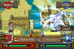
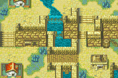
After cranking out my contribution to the 1 Screen Mapping Blitz, I wanted to have some fun and wind down by featuring the map in a mock scene.

Like the last mock up I posted, the icons in this are not F2U or F2E. (Credit to Alusq for the Sassy Cleric battle sprite base and OreoStyx for the repaletted Pegasus Knight base.)
KaitlinBasordPhenacGarlanMockUp

But, if you like what you see of the map, you can snag the TMX from the post linked at the start of the comment!
Garlan Village - N426 Updated Village

(I decided to work on these two things this weekend - at some point I’ll upload the files direct to the first post to replace the Dropbox links. Sorry!)

13 Likes

Since I got a notification that the topic had been linked in a list of resources, it made me realize that I don’t think I ever crossposted my old (Weapon) Icon Tutorial(s) from SF over to here. (Emphasis on “old”.) I figure, despite its age, it might still be useful to those that are just starting to make those kinds of graphics or otherwise might be able to learn or glean something new to enhance their current skills.


Icon Tutorial V 1.0

DISCLAIMER:

This tutorial will showcase a way to construct Fire Emblem style weapon icons from scratch. NOTE: This tutorial is largely focused on creating weapon icons in the style used in the three GBA titles, though making icons for other games will largely only be different in style/shading and palette.

Please bear in mind that this guide is not 100% accurate to the exact way that Intelligent Systems stylizes their weapon icons. Many icons are inconsistent with one another within the same game, so there may be a few things that my personal style may not completely reflect upon (for whatever reason). I have tried to be as objective as possible in this, limiting the use of as much of my personal stylings as possible.

(Dec 17, 2020 Addendum: As FEU is more focused on the actual hacking side as opposed to only graphics creation, you may have issues with palette order in the below tutorials. Again, these tutorials date back 9+ years for some versions - palette order seemed to work fine back then without today’s fancy tools, so…)

Getting Started

Before getting into creating a weapon icon from scratch, as a spriter, you’ll want to have a few resources before beginning.

  • MS Paint or equivalent program

– I’ve written this from an MS Paint perspective, as it’s largely the most common program that spriters are using. While I personally use Jasc/Corel Paint Shop Pro (depending on the version), a high-level image editing tool is NOT required to sprite weapon icons, though these steps can be adapted for most other programs.

  • Reference set of game-used icons

– I personally use Ice Dragon’s NA!FE8 Symbols sheet as my reference set whenever I need to check something against how an icon appears in one of the games. While it doesn’t have ALL of the icons from the three GBA titles, it has enough that it should get you by. (You can always go to each individual game’s page on SF’s main site and reference/download any of the other icons that you need.)

  • Weapon icon palette (Possibly OPTIONAL)

– Depending on what you are individually spriting weapon icons for (be it a mock battle scene, mock statsheet, or as icons to be inserted into a hack), this may or may not be required. For icons being inserted into a hack, this is a mandatory step. I’ve provided the FE6/7/8 weapon icon palette here, as it will need to be used to ensure that your icons are game-insertable (assuming that the palette hasn’t been altered intentionally). If you’re working on an icon that is for mock-up purposes, you are free to use whatever colors you choose, though sticking to the official style and palette does help if you wish to transition to doing work for a hack.

Setup and Line Art Phase

To start spriting a weapon icon, begin with a 16px by 16px box using a non-palette background color. The file linked above has two in the bottom-right corner, a light green (I believe this is the background color used in the actual palette) and a grey (my personal preference for readability while working).

(For the entirety of the tutorial, I have provided images in both regular magnification and 8x zoom flavors, so that you can see what the icon would actually look like, as well as actually seeing what I’ve done in each step.)

WeaponIconTutorial-1 WeaponIconTutorial-1z

Now, depending on what I’m spriting, I either free draw or have a reference image pulled up. Now is the time to decide, and have that ready to go. For this tutorial’s sake, I’ll be free drawing a Lance-type icon. Always remember to keep in mind what kind of icon you’re spriting and remember that the reference set is always there if you need to see examples of existing icons.

At this point, begin by selecting the black color of the palette (RGB 40, 56, 32) as the primary color. You’ll likely want to zoom in on the image for better control (8x is probably the best way to go). Once the size is to your liking, select the Pencil tool and begin placing individual pixels in line art fashion. Consult the reference set of icons for basic shaping and design structures if you find that placing pixels by instinct isn’t looking quite right.

Weapon icons CAN use the entire 16x16 canvas, though icons in FE6/7/8 tend to avoid this unless it is absolutely necessary. For the most part, the official icons stick to the inner 14x14 pixels (1 pixel border around the outside of the area), though they will stray and touch a side here and there (for best results, consult the reference set).

I finished free drawing (once I got something interesting and close to what I wanted), and came up with this as my icon’s line art:

WeaponIconTutorial-2 WeaponIconTutorial-2z

Depending on what you’re spriting and how your creative flow is, it may take tens of minutes to even an hour to get line art shaped how you want it.

Flat Colors and Shading

With your completed line art ready to go, begin filling areas with the lightest shade that you want to go in that area. The reference set should provide you with enough general pairings of shade sets (for instance, the white shade, the light blue shade, and the darker gray-blue often tend to be paired together for blade shading) to get an idea of what the lightest shade will be for an area of the icon. If anything design-wise starts to appear off as you’re filling in the flat colors, remove them (by Penciling the background shade over them) and alter the line art until you feel that you’re ready to add the flat colors again.

WeaponIconTutorial-3 WeaponIconTutorial-3z

(As you can see, I slightly altered the butt of the spear between Image 2 and Image 3 once I decided that, design-wise, the lance didn’t really fit what I was aiming for.)

Once everything looks right with the line art and the flat colors, begin adding in the other shades in the shade sets, while trying to match the shading conventions shown in the reference set. At this stage, you may realize that some of Intelligent Systems’ conventions are shaky and in need of improvement. If you choose, now would be the time to stray from their conventions and shade things more naturally. Whatever you decide to do, make sure the icon looks right at normal zoom before you finish. If anything looks odd or needs fixed, jump back to Chapter 2 and work on the line art and flat colors (unless it’s merely a shading issue, whereby you can just play around with the shading pattern or colors).

And now, we have our finished result:

WeaponIconTutorial-4 WeaponIconTutorial-4z

As you can see, I’ve shaded the middle of the lance’s tip with the darker gray-blue shade and shaded the bottom of the tip with the lighter blue shade. The “wings” to the sides of the shaft are shaded in reference to the shading on the Poison Sword icon (darker gray-blue matching to the brown and red matching to the reddish-grey color). The piece in the center of the wings is shaded in reference to the color scheme pairing on the outside of the Bolting tome. The shaft is shaded instinctively using the red shades found on the Poison Sword icon. Once the inner shading is done, make sure that you edit the outline shading by incorporating the brown shade in places (generally for wood, such as lance shafts (unless they have brown in them, in which case I personally use the other outline shading color to avoid blending the inner shading with the outline shading)) or by using the dark purple shade. It would be a good idea to use the reference set here for examples, depending the kind of icon you’re working with.

Different types of icons have different general patterns and structures, so use examples as a guide if you’re working with an icon that fits a bit outside of the spectrum given here (magic tomes and staves, item icons, new weapons that might fall under a new designation, etc.).

Hopefully, someone finds this useful. Weapon icons aren’t the most challenging sprites to make by far, but you’d be surprised at how much detail you can actually fit into a 16x16 sq. pixel box. And, always remember that the reference sheet is there for shading and design examples, if you need them. As with most kinds of spriting, practicing by continuing to update older icons and spriting new icons will only allow you to get better. Your icons might not perfect when you start, but as you work on them more, they’ll start to get flashier and better proportioned.


Icon Tutorial V 2.0 Expansion

Welcome to the Custom Icon Tutorial v2.0! In this tutorial, you will (hopefully) learn how to make custom weapon icons of your very own without having to rely on reusing pre-existing icons for things that they don’t fit. As opposed to v1.0 which contained a single example of making an icon, v2.0 will contain multiple examples of types of icons to cover more cases.

What’s new in Version 2.0?

  • Downsizing to GBA-sized icons
  • More difficult physical-style icon
  • Custom magic tome icon

List of things referenced in the tutorial:

Disclaimer:

This tutorial showcases a way to create Game Boy Advance -style Fire Emblem weapon icons. Weapon icons for the other titles can be created in a similar manner, but require different palettes and shading styles. (For the case of icons for Path of Radiance or Radiant Dawn , icon size also changes.) This tutorial will not cover those styles.

Please note that I will try to make this guide match as much to the existing style that Intelligent Systems has used; however, after years of spriting weapon icons, my own style and shading conventions may influence the final products slightly. I have tried to limit this as best as possible during the tutorial sections.

PREFACE: Introduction & Useful Tools and References

Spriting weapon icons is arguably the easiest type of spriting in the Fire Emblem style. Just because making weapon icons is easy doesn’t mean that there isn’t value in doing it. Weapon icons are invaluable in giving your works a touch of their own uniqueness and flair. This prevents the overuse of Intelligent Systems 's icons as placeholders for weapons that they just don’t fit. For instance, when making a mock battle scene to showcase a battle sprite or a battle template, why use old weapon icons when you can have something that you made by hand there instead? And, weapon icons are almost obligatory in well-created hacks, especially if your project is trying to be its own unique Fire Emblem title, not tied to Intelligent Systems’s works except in name. Needless to say, weapon icons are a fundamental part of Fire Emblem spriting.

Being the easiest type of sprite to create in this sub-discipline means that the requirements for making weapon icons are quite simple. In order to create a weapon icon, you’ll need the following things:

  • A paint program
  • A copy of the existing icon sheet for FE6 / FE7 / FE8
  • A palette for the icons (if you so desire)

The paint program is self-explanatory. All you’ll need for making weapon icons is a default program like Microsoft Paint . Now, this doesn’t mean that you can’t use your preferred program of choice.

As you’re making icons, you’ll often want to compare your outline or final icon to an icon that Intelligent Systems used in the GBA games to make sure that proportions make sense or as a shading reference. For that, I use Ice Dragon’s FE8 Symbols Sheet (NA). Now, this particular sheet doesn’t necessarily contain all of the icons that Intelligent Systems has made (Al’s Sword isn’t on there, for instance), but it contains a wide number of the available icons. If there is a specific icon not on the sheet, you can always go to the game’s page on Serenes Forest and grab the icon from there.

The last bullet is somewhat optional, depending on your reason for spriting weapon icons. I figure that most of you are here to make icons for hacks/projects/etc., in which case you’re going to need the palette used in the GBA games. I’ve uploaded a reference palette which contains the 15 colors used in-game for weapon icons. If you’re simply working on a mock battle scene or a stat sheet or anything of that variety, you can omit the the palette and use whatever colors you want. Granted, an icon in the correct palette looks more authentic than one without, and if you ever get the urge to use the icon in a hack, you’ll need a limited palette anyway.

The main strategy for spriting weapon icons can be represented as such:

  1. Create the size box and begin outlining your icon,

  2. Fill the outlined area in with solid shades, adjusting the outline when necessary, and

  3. Shade the filled areas, repeating Step 2 if adjustments need to be made.

I’ll touch on these steps as I proceed through the three examples in the remainder of the tutorial.

Downsizing larger icons to GBAFE-size icons

As listed by the steps above, the first thing one must do to make a custom weapon icon is to start with a 16x16 square pixel box, with a background color. For this tutorial, I’ve provided 1x and 4x images so that it is easier to see the details as well as what the icon looks like at its natural resolution.

CustomTome1-1x CustomTome1-4x

When working on any kind of icon, I usually find it best to start by zooming in.

This chapter is dealing with downsizing, or in layman’s terms, taking a weapon icon that’s larger than the GBA size and making a custom icon that creates the weapon that’s sized for the GBA games. This is not limited to icons from Path of Radiance or Radiant Dawn however. It is entirely possible to use an icon from, say, Tales of Eternia , and downsize it into a GBA-sized icon. With this in mind, find a picture of the icon (preferably one with its colors in-tact and such) to use as a reference for the design, coloring and shading of the final icon. For the tutorial, I asked people to name a Path of Radiance or Radiant Dawn weapon, where I’d use the first response for this section. The weapon that was selected was Creiddylad from Radiant Dawn .

Now, in general, icons can use the entire 16x16 square pixel canvas, though a fair number stick within the inner 14x14 square pixel range. Some of the more unwieldy weapons (axes, larger lances or swords, etc.) will often touch the edges of the canvas in places, due to their design and the overall goal of keeping the icon relatively centered in the canvas. Since this is a tome though, I have less to worry about on those fronts, as tomes use a standard design for their boundaries.

So, with that in mind, add the boundary of the tome to the canvas, either by manually drawing it on or by grabbing a tome from the symbols sheet and clearing out the inside design.

CustomTome2-1x CustomTome2-4x

Now, if this had been an icon like, say, the Bolt Axe, we would have had to manually draw the axe’s outline first before adding any details to it. An example of a non-tome can be found below Creiddylad’s tutorial.

Since we’re downsizing an existing tome, the next step is to begin placing the main details of the tome’s design inside the space for the tome. The main feature on Creiddylad is the four “feathers” and the area of light in the center. Now, there is still a large amount of trial and error involved in getting the patterns to look right and such. And, with still images, the trial and error that I actually went through in these examples isn’t emphasized very well.

Downsize3-1x Downsize3-4x

Once you get a pattern that relatively matches the source image, add the next sets of details to the image. In the case of Creiddylad, I added shading to the “feathers” and circle of light in the center. And, I also added the lighter pixels extending out from the center circle up until they reach the edges of the “border” between the center and “feathers”.

Downsize4-1x Downsize4-4x

From here, it’s just constantly adding details. In the next step, I add the blue lines continuing from the center and the darker blue-gray pixels around the blue areas.

Downsize5-1x Downsize5-4x

And then, lastly, I add in some of the light blue-gray pixels to finish the icon off.

Downsize6-1x Downsize6-4x

One of the main issues you might run across when downsizing is lack of colors that match the source image. In cases like that, you need to just use the closest color or a color that works in its place. For instance, on the actual Creiddylad tome, the light extending from the circle in the center is a pale yellow color. There is only one yellow color in the standard GBAFE palette, so I used the light gray color in its place.

Now, this works for tomes nicely, but actual weapons are a different story. So, to accommodate that, I’ll also do a walkthrough of downsizing the Crystal Shell from Tales of Eternia to GBAFE size.

The first step, as above, is to start with the 16 x 16 square pixel box, filled with a background color.

Now, since I’ve done two icons similar to this [reference the “Thief Gloves” icon from Elibean Nights], I’m going to pull those up as references for myself as I do this. On top of those, the above GIF file is also pulled up so I can see what it is I’m downsizing.

Start by adding in the outline of the icon. If you make some lengths of pixels too large, then shift what you have around to change the size. I start working by providing 95% of the outline of the Crystal Shell, leaving out part of the area near the thumb, since I’m not quite sure how I want to fill it in yet.

DownToE2-1x DownToE2-4x

Next, start on the easy to add features, as well as important “landmarks” in the icon. For this specific example, this involves adding the border of main part of the glove to the icon, as well as adding in the shading for the fingers and the “underneath plating” that is below the main part of the glove. I also added initial placements for the three spikes extending from the front of the glove.

DownToE3-1x DownToE3-4x

Then, it’s a matter of adapting the inner areas of the main part of the glove through trial and error (in which I spent a good 30 minutes playing around with the placement of shades and light source shading). In this final step, you also must add in some of the purple outline color in place of the black outline color, for blending purposes. I also change the shape of the front spikes to make them look more like spikes. And, with that, the Crystal Shell is done:

DownToE4-1x DownToE4-4x

Adventures in Customing II

Unlike the Custom Icon Tutorial v1.0 where I free drew a physical weapon, in this chapter, I’m going to mesh that tactic as well as the downsizing tactic from the previous chapter to make this example icon. Since it was requested, you’ll be getting an axe icon, though a less than traditional one. The image reference (pulling in the downsizing tactic) for today is the Blaze Axe from Radiata Stories .

As an added bonus in this chapter, there will also be linked videos with my progress working on the icon for this chapter recorded. That way, as opposed to me saying “trial and error” without showing the intermediate steps where I refined parts, with a video you can see my exact steps to get a better feel for the process.

Part 1:
https://youtu.be/L7fgrX30dlE

Part 2:
https://youtu.be/qQGjRE7-6no

“Finished Icon”:

CustomAxe1-1x CustomAxe1-4x

As I said at the end of the second part of the video, I wasn’t really sure where to go with the flame shading. I got some feedback and improved the shading a bit. Here’s the finished version of the icon:

CustomAxe2-1x CustomAxe2-4x

Designing a Cover

In this final chapter, I’m going to free draw a magic tome. (Dec 17, 2020 Addendum: While times have certainly changed from when this was originally written (as there is far more reference/official art to draw upon for tome designs to “downsize” (Cipher, Heroes, etc.)), sometimes you just want to design something that wasn’t based off of something else.)

One last time, start with the regular 16x16 box, making use of the same “blank” tome as used for Creiddylad:

CustomTome2-1x CustomTome2-4x

I polled a friend, and he suggested that I sprite an Ice-based tome for this example. Looking at Fimbulvetr’s icon, the majority of the background is blue, so I grabbed that color and filled in the interior of the tome with it. For Fire-based tomes, the interior color is generally red or brown. Wind tomes generally feature the dark green color as the interior color. Thunder tomes ofter use brown or the black outline color as the background color. The GBA Light tomes use brown as the interior color, while FE9 / FE10 would use the dark blue-gray color as their interior color. Dark tomes generally use a mix of the black and purple outline colors as well as the brown color in places. (You’ll note that it’s slightly hard to see the blue color that’s in the interior of the icon due to the blue background. While I happen to like this background color, it does conflict heavily with the blue color.)

CustomTome3-1x CustomTome3-4x

The next stage of designing a tome is determining the base pattern that you want the tome to have. This stage will likely be one of the longer steps in tome designing. Since this is an Ice-based tome, I needed to make the design follow suit. Using the light green color on the palette (as it is often paired with the blue color), I added the following design to the tome:

CustomTome4-1x CustomTome4-4x

Once the base design is relatively set (enough that there’s nothing else to do with it, without just changing it around), the next step is to add shading and other colors to the design. At this point, this step is primarily trial and error, playing around with related color sets until you get something that is discernible at 1x zoom, yet is still shaded when zoomed in. After playing around for about 15 minutes to a half an hour, I finally settled on the final design (tweaking the design here and there, as well as adding in the “inner outline” (the area immediately inside the regular outline).

CustomTome5-1x CustomTome5-4x

Hopefully, the Custom Icon Tutorial v2.0 has covered more types of icons and allowed you to further grasp the art of the weapon icon in general. In fact, if you want a test of your abilities as you progress though this (or after reading), try performing the same icons that I’ve done and see how they come out. Maybe you’ll end up making an icon that’s more representative of the source or is a great-looking creation of your own. Remember, while weapon icons might not be the most challenging type of sprite in Fire Emblem 's style, they do have their importance. And, always remember that the reference sheet is there for shading and design examples, if you need them. Lastly, don’t forget that practice is the key to this art. Tweak your older icons, sprite new ones when you have time, and just keep at it. As you do, you’ll steadily improve your works, making them more detailed, better proportioned, and of sterling quality.


I would ideally like to do a new version of a tutorial for making icons as my style has evolved and grown in the almost 10 years since I posted Ver 2.0, but it wouldn’t be a video tutorial since it would take days for it to upload on my present connection speeds.

Since I don’t know how useful just seeing individual steps of my process would be, I guess I kind of want to open the floor to see if anyone has any questions that they might want insight on or something that they would want me to focus on if I do make a Version 3 revision?

(EDIT - December 17, 2020 - The tutorial has now been cross-posted with mostly native images, barring a few reference images.)

17 Likes

Photobucket’d, a fate worse than death.

3 Likes

I have finished copying everything over with replaced images. You should now be able to actually tell what is going on without the semi-transparent Photobucket overlay obscuring the graphics.

3 Likes

New map!

EncounterAtBruhl-a

>> TMX download (no tile changes for this map) <<

First time working with Zoramine’s Revamped Fields Village tileset - the higher cliffs and half-hills were why I wanted to use it, but also the elements I struggled the most with making use of with no prior experience on them.

I saw the topic about Advance Wars map sprites and it make me realize and be a little surprised that I don’t think anyone had tried to do a demake of similar tactics series Valkyria Chronicles but in GBAFE and making use of Advance Wars sprites to make it happen (even though VC is more about infantry than machines…), so it gave me the idea to try and recreate a map or two in GBA format.

This map is based on the Prologue from Valkyria Chronicles, Gallia, to Arms! Part 3: Encounter at Bruhl, though I took liberties with the design to make it more Fire Emblem-y, to use the full square map space (as opposed to chunks being blocked off like in VC) while keeping the major features - the bridge, the sandbags (as walls), the hilly west side of the map - and to make use of the extended cliffs and the hills in places where I thought they could fit.

18 Likes

Good use of the hill tiles.

1 Like

This was probably one of the more intense days of spriting I’ve done in all of my years doing it - about 10 total hours today remastering an old battle frame after I (finally?) realized that the project it had been given to was likely “dead” enough that I could probably make it available for everyone else to use (and, with the blessing of the project’s creator to do so)… but, since it was like 8 years old, it needed a fresh coat of paint. Even though a lot of the fundamentals are still the same, I did have to do some major overhauling in places

Here’s the original version of the battle frame as it was before its face lift:
EternalBondTemplate

And, today, I present the new version of the template, free for anyone to use and edit (and fiddle with to try and insert it):
EternalBondBattleFrameRemaster-MasterWPalette
(Master version with palette and Enemy/Player/NPC/Other/Ally options (and this time I kept the font colors in the palette :D))
EternalBondBattleFrameRemaster-RBwCloseAngels
(Master version without palette)
EternalBondBattleFrameRemaster-RBwFarAngels
(Alternate version with the angels further away before I moved them to the center)

I also had a separate layer that replaced the “swoosh” in the Name Box with a solid color to just make it a simple gradient, in the event that the tile limit becomes an issue (though I don’t imagine that will help a ton if it needs to be done…).

Here’s an edit of one of the mock-ups from earlier in the thread using this new battle frame so that you can see a rough idea of what it would look like in action:
IrisRoeblisMockUp-Test

I want to thank @ZessDynamite in a roundabout way for making this happen - their new battle frame for Absolution (you should check it out if you haven’t yet!) and its use of Red/Blue/Gray as a color scheme made me actually remember about this template and that it existed in my files and it spurred me on to want to do the remaster to this in the first place.

(And now I return to hibernation and sleeeeeep…)

30 Likes

That new battle frame is looking nice. :smiley: Also Valkyria map. very nice. Valkyria Chronicles is a fun series. (At least imo. Others are entitled to their own opinions.)

Once again - new map!

>> Link to TMX here! <<

I was looking at the new Frozen Throes screenshots this morning and this idea just hit me. I decided to reimagine Revelations (Radiant Dawn 4-4 AKA that annoying map with Oliver) using N426’s Improved Castle Tileset (using “Palette 1”), while changing things up a little bit (though most of the southern end of the map is roughly the same conceptually) and adding my signature “big map change” to it.

I added a “loft” up in the top left as a place where Oliver would have kept his prized Herons to keep them safe and admire their beauty, as well as repurposing the closed rooms on the east into a library-like area (I imagine that one could add events around some of the bookcases to find Tomes as well). I kept the concept of the ledges, and many of them feature cracked wall tiles that will turn into stairs so that your units can actually climb those spots. I tried to prevent as many chokepoints as I could to keep the flow smooth, though there are a few places left where that could still happen.

The big change is the addition of a “secret tunnel” exit, because we all can imagine that Oliver would have something like that available in his manor, lest he be caught with something illegal…

This also opens up the map to several other possible objectives in scope by having another entrance/exit available once the passage is revealed. (When placing the chest in the Heron’s Loft, I imagined it holding a Speedwing…)

22 Likes

Apparently, this mapping kick just doesn’t want to subside!

Retreat From Bruhl 1

Like the Path of Radiance Chapter 6 map, this one will potentially take some work to actually be usable as it uses an edit of Zoramine’s Temporary Port Village tileset - the most notable change is that the wall tiles from Wave’s FF Town tileset have been added (back) in and some tiles were removed to shuffle things around. The palette should be the exact same as the base tileset, but I have no idea if the tileset’s resulting object image will actually work or not. (If not, maybe when the tileset is no longer temporary, some of what I added can be included into the final tileset in order to have one that actually works.)

This map continues the theme from the Valkyria Chronicles map from December, this time being a reimagining/interpretation of Chapter 2 of Valkyria Chronicles, Escape from Bruhl Part 2: Retreat from Bruhl. The town has been abandoned/evacuated of civilians and the remnants of part of a wall litter the road, as do barrels and rope in places. Again, I had to take some liberties since VC’s maps aren’t square and I also had a specific gameplay element in mind to incorporate for the map, necessitating some other deviations from the source - while the concept is very heavily used in FE, I don’t know if it’s been done in the way I chose to do it: “traversable houses”.

Using the tiles I added (back) in from Wave’s initial version of the FF town tileset, the map features tile changes that allow the interiors of most of the houses to be moved through. One house does not have this capability and another house intentionally trolls the player by being barricaded from inside once opened, but all of the other houses can be revealed and moved through (some only lead to places for hidden items or chests while others offer full paths or potential recruitment/reinforcement zones), allowing enemies to be hidden inside or items left behind to be looted/pilfered (and I left plenty of things to indicate hidden items in addition to chests).

Retreat From Bruhl 2

Retreat From Bruhl 3
(Hidden Chest by waiting next to the obviously different spot on the wall)

There’s also plenty of room for other events to trigger than just around the barrels, rope, and walls in the houses - the tower near the gate could have a ballista on it, used to attack further away in defense of the structure. Maybe an NPC reinforcement could appear from the staircase in the center house once it’s opened and they could be convinced to join you. Maybe you could find some money that was left in the fountain by standing next to it or by “mining” the lone rock along the path to the side of the road. Maybe there’s an ally (or promoted/boss enemy) hiding in the cellar of the house on the far right. But, having the houses be able to be opened allows for different paths through the level, which was the main goal I wanted to focus on ever since I saw the sample map that Zora posted as the tileset was being worked on. (FF’s town buildings aren’t quite suited to making larger houses, which made creating paths inside rather challenging with limited space as did working with the roof tile options to try and make larger houses…)

While the source conflict in Valkyria Chronicles was a split Defend/Destroy map (hold out and wait for help to arrive while protecting the gate, and then destroy the attacking tank once help arrives), the layout of the map could be used for anything (Destroy the gate, Defend the gate, rout the enemy, defeat boss, escape, find a certain item that was hidden and steal it, etc.) and there really isn’t a set starting point though I stuck with keeping the starting area from VC mostly in tact in the southwestern corner.

>> Download here: TMX <<

I am thinking that I’m going to do one more VC-inspired map and make this a “trilogy” of sorts and will probably end up using this edit of the tileset (or a completed one, if someone takes the work here and makes it actually usable) for that map as well since the brick walls and such will complement it nicely… But, that is for a future post!

18 Likes

Personally I hate those wall tops, I think they’re horribly out of place against nearly everything else. However, I’d be a liar if I didn’t say pretty much everything here didn’t look superb outside of that - I’m particularly a huge fan of the first map, as it nails the aesthetic that I think is impossible otherwise and utilizes just about everything that makes my tileset fuckin amazing.

Object Image stores all of the palettes, and assuming you didn’t edit any of the palettes yourself, all of my existing palette variants would work for it, too… Well, once I get off my lazy bum and finish setting things up on the tileset. Which I might just work off this one, depending on what got removed.

Keep it up!

2 Likes

I used the wall tops for the sole reason of wanting to convey that it was a look down inside of the house since it was chopping off a layer of height to do it. In an absolutely ideal world (maybe something that Lex Talionis or Tactile could do one day), my idea would be that the interior would only be revealed to a faction when that faction has a unit inside of the structure (i.e. if an enemy is lying in wait in a house, the house interior would be visible to them, but not to the player) and would “close back up” when no one was inside. I intentionally avoided using them everywhere else since the angle they show at doesn’t really work with the other wall styles in the FE tilesets, just as you mentioned.

I was more concerned with the addition of the tiles for the object image than the palette itself since I know that you said that there wasn’t a lot of room initially. I did try something different with making edits to the tileset this time than I normally do which I hope avoided the problem where the program I use will sometimes screw with the palette order, which is why I wanted to at least note that it shouldn’t have changed but was iffy about whether that was true.

For the tileset itself, I removed the silver-y ruins type walls that were under the brown stone walls on the right side and moved the 2x2 door over there to make room for the walls and wall tops from Wave’s tileset, and then I rearranged the stone wall tops to help squeeze those in, though there might have been a more efficient way to arrange them. Originally, I was going to put the stone walls where some of the water tiles were in the gap above the wood floor barrels and rope and then decided against it, but I had already removed the water tiles at that point and didn’t want to either redo the edits to the wall tops and tiles or copy the water back over, so I just left them out (also figuring/hoping that it might help with space issues).

2 Likes

Imagine living inside a house that’s one tile wide.

“Hey, where’s the bathroom?”
“Bathroom? Haha, you think there are actual rooms in here.”
“…”
“And the walls are literally as wide as the hallway. The hallway that is the only space in the house, and is itself as wide as literally one barrel.”
“WHY.”
“The housing market sure is awful these days.”

Lol.

If only there were 1% wall, 99% floor tiles… Contractors in FF land must be terrible at their jobs.

(But, yeah, like I said, the house components (mostly the tile block for the roofs) really aren’t made for making really houses with “vertical” depth to them (as I assume that whatever FF it was from just loads a building interior when you go in one), so I kinda had to make do to fit the gameplay concept into the space available.)

1 Like

Great battle frames and stuff, these fits the royal aesthetic that I’m looking for. Can I please edit or use these in my future hack?

2 Likes