[Indie][Steam] Those Who Rule - Chapter 3 Released! (Open Beta V2)

Another quick round of updates. I have finished two more default abilities for the defender and skirmisher class. One that will look familiar, and one that while not completely new to the genre, is not seen in Fire Emblem. Also got two new character commissions done that I’m really happy with, one is an archer, the other a skirmisher. I’ll let you guess which is which.

Tenki and Abigail


Now let’s dive into the abilities, starting with something familiar, the agile (aka definitely not canto) ability!
AgileGif

We all know how OP moving again after acting can be, so I’m capping the movement after attack at 2, as well as making it affected by enemy zone of control. I think that should be enough to keep it in check, but I’ll adjust as needed once I have chapter 1 out for feedback.

Let’s end with some spice, the taunt ability:

It will inflict the taunt status on all units within two tiles, which will cause them to attack the taunter using the shortest path, meaning they won’t backstab if you’re facing the units you taunted. This allows you to “predict” where their next move will be so you can flank with other units.

This helped me work out the framework for AoE abilities, as well as forced me to implement a basic version of ranged attacks! Excited to implement bows and throwable items in the future. Shout-out to Saint Rubenio in the games Discord for awesome suggestions!

I also had someone send me a link to their live stream of playing through the game, and it made me realize just how dialogue heavy the prologue is. I went through and cut out some parts I thought were unnecessary exposition this early on, and made the writing less verbose where I could. Still think I might need to just hire a writer in the future. I have fun with it, but if I’m being honest with myself, I’m an average writer at best. :sweat_smile:

Thanks everyone for the continued support hope you’re all having a great weekend!

8 Likes

Hey everyone!

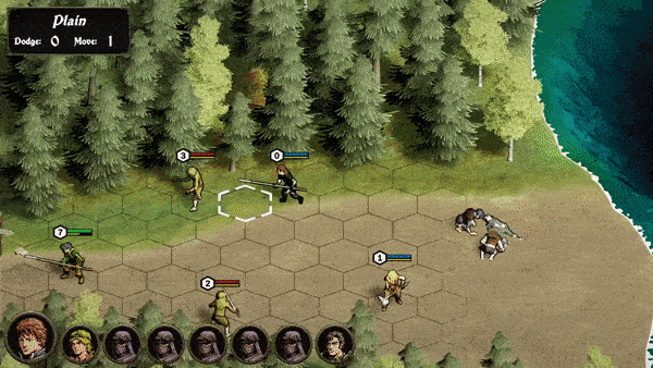
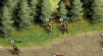
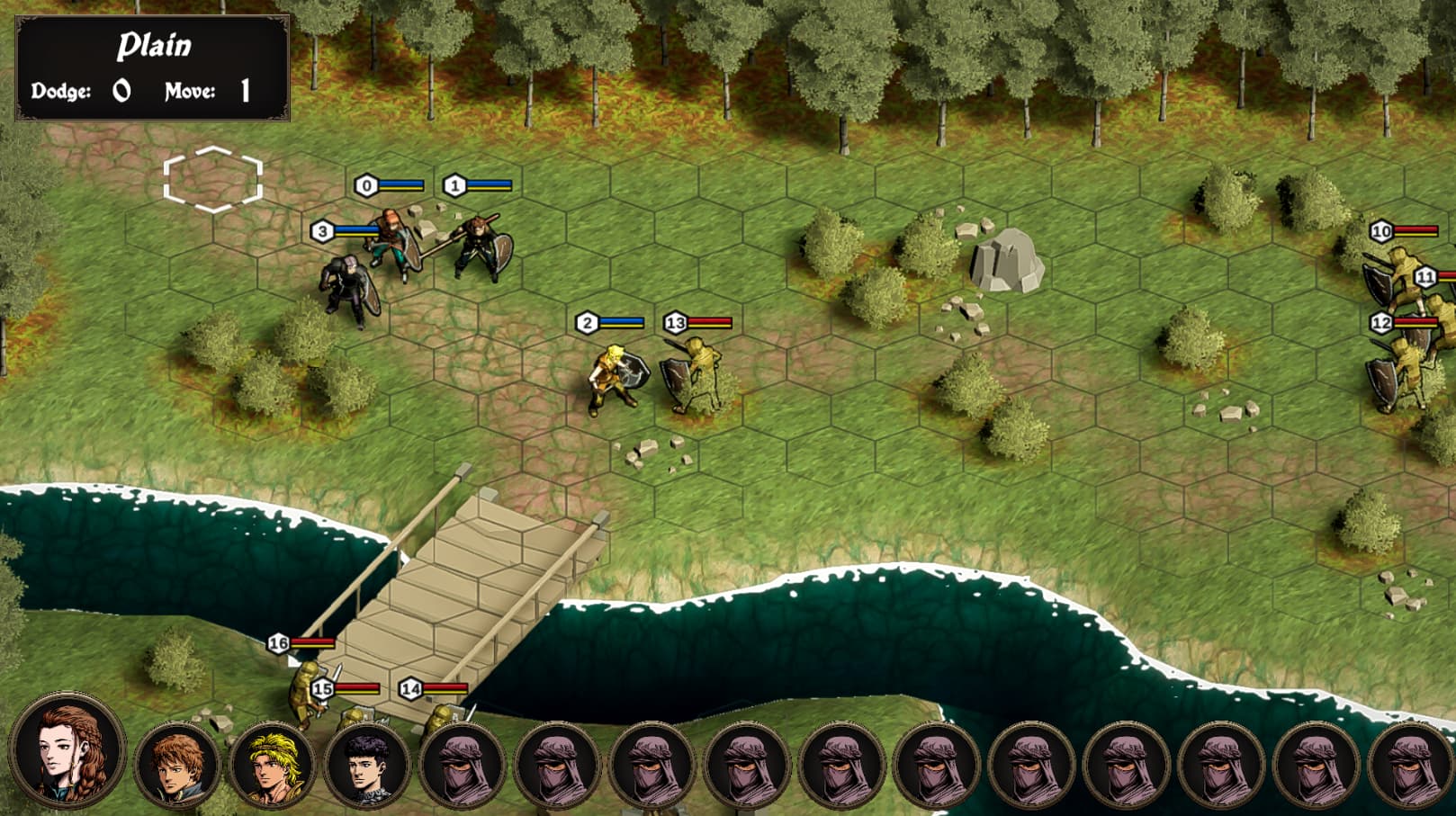
Been heads down a bit working on code to transition saves to the new chapter. I’m making steady progress on chapter 1, currently outlining the battle map first before I do any environment design. This will give me a solid foundation to build off of as I know how the “flow” of the chapter is going to go. Expect much more combat than in the prologue!

Also, I may be in the market for a writer, but it depends on how my finances shape up. I wouldn’t ever expect someone to work for free, and I don’t think offering a cut of revenue would be sufficient payment this early on in development. What I am realizing is how much of a gargantuan undertaking all the different parts of the game are solo, so I may be looking to create a team in the future. Nothing set in stone though, but DM me if this sounds like something that might be interesting to you or if you know someone who would be interested?

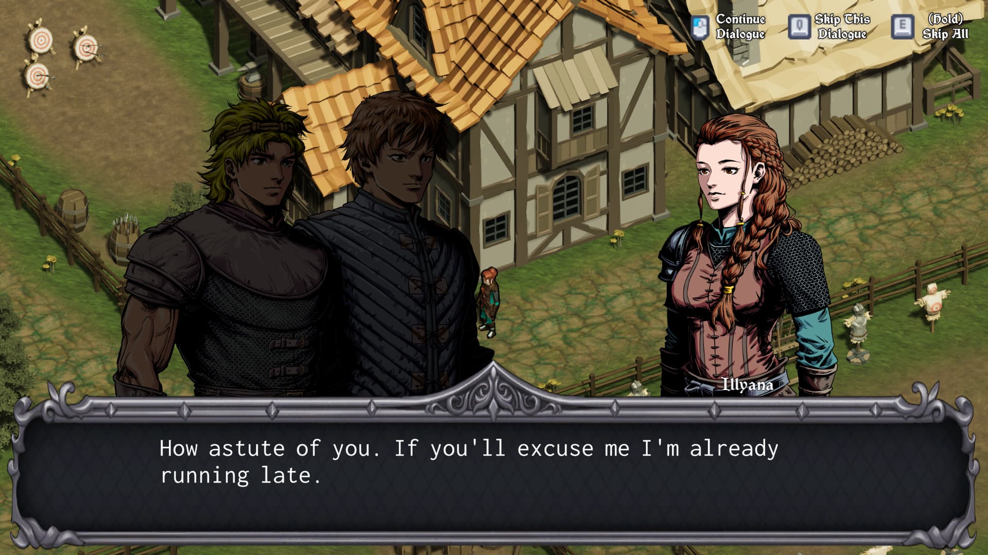
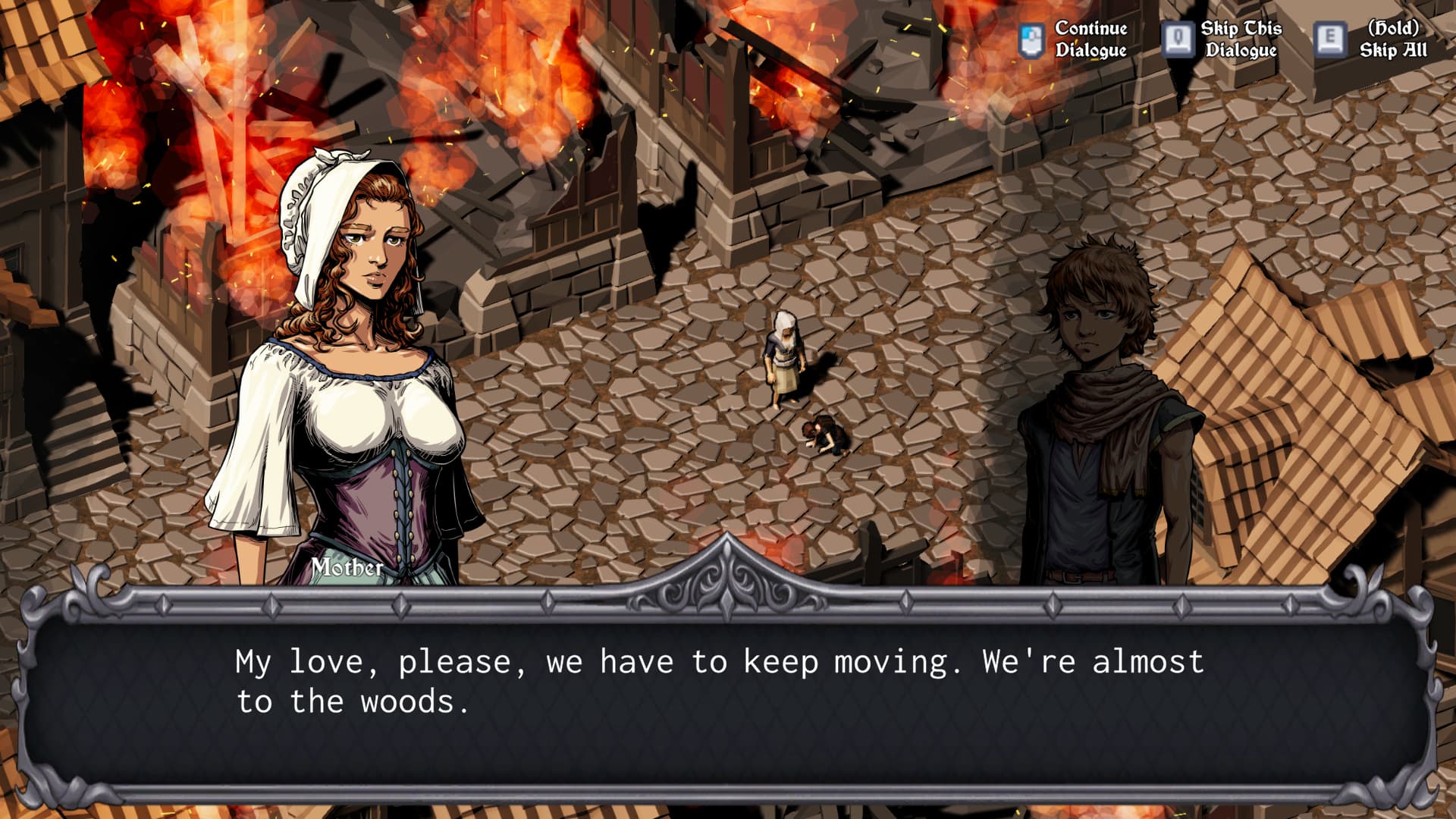
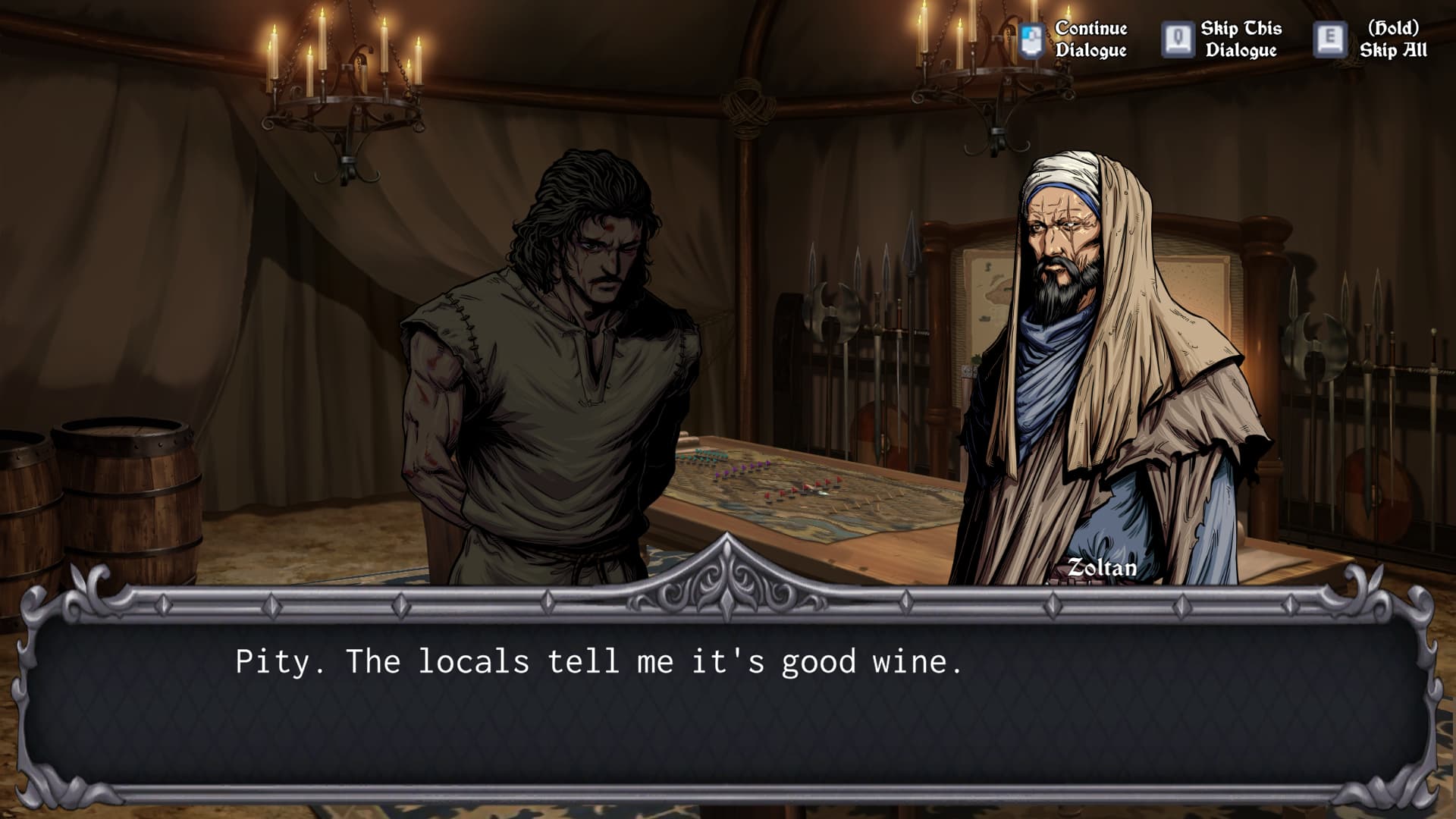
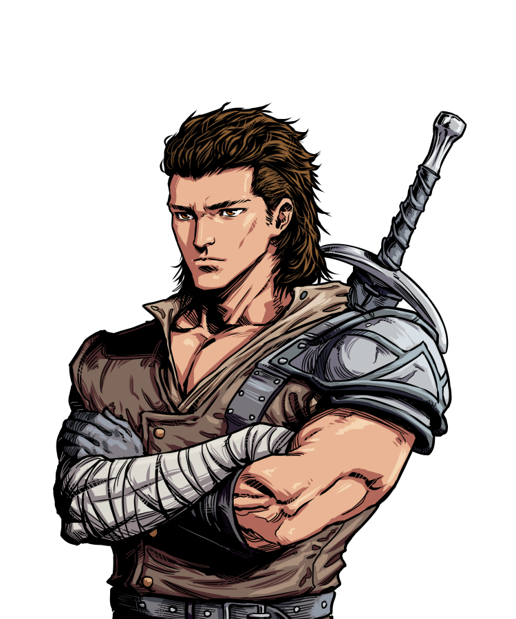
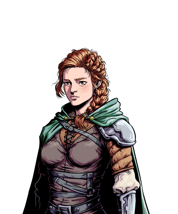
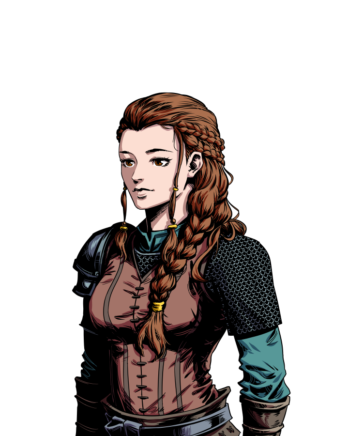
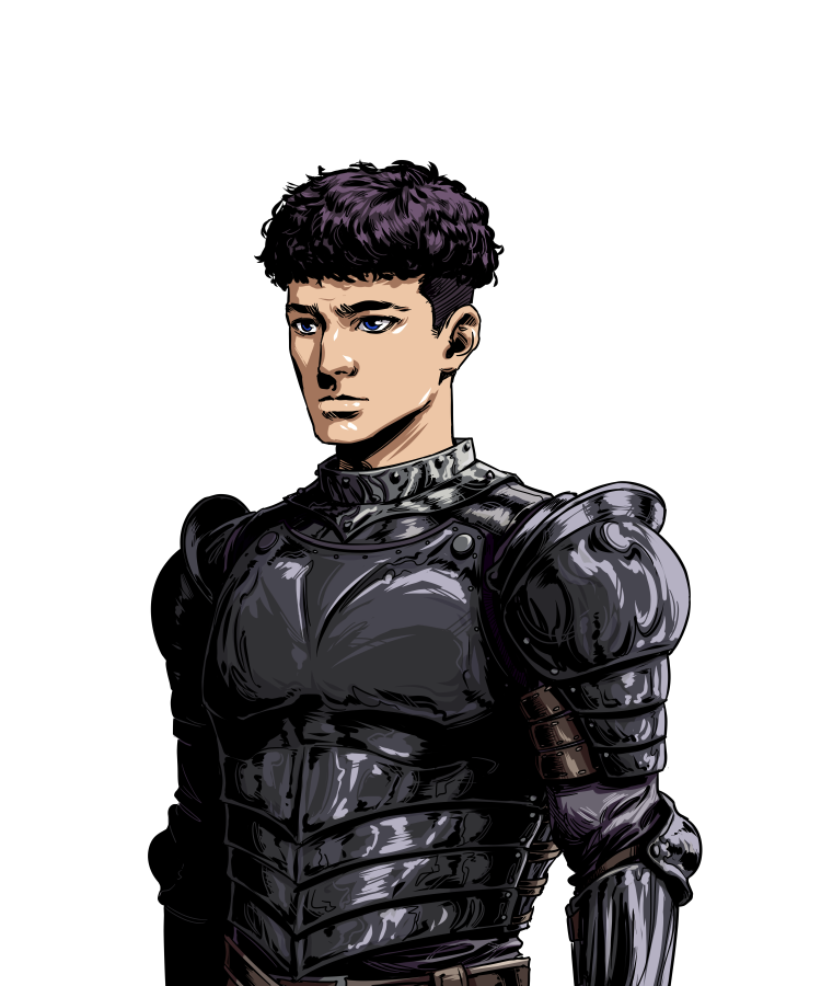
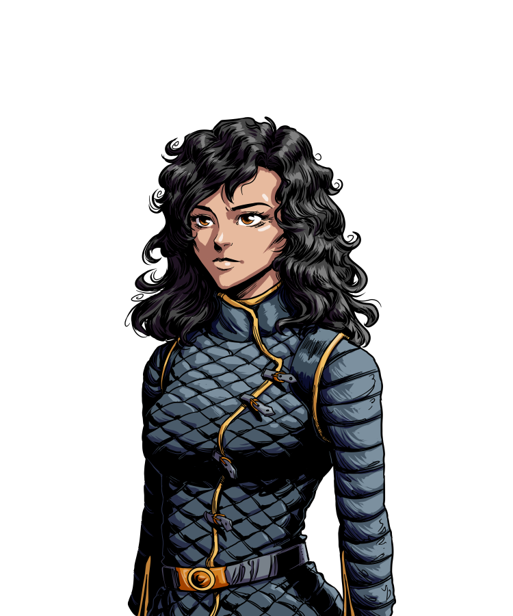
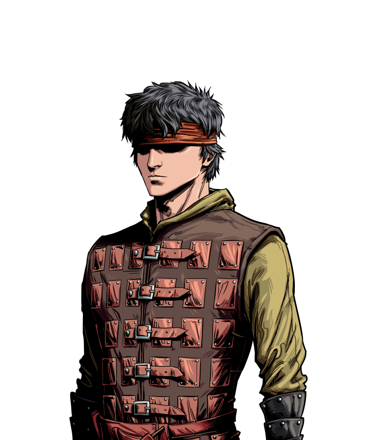
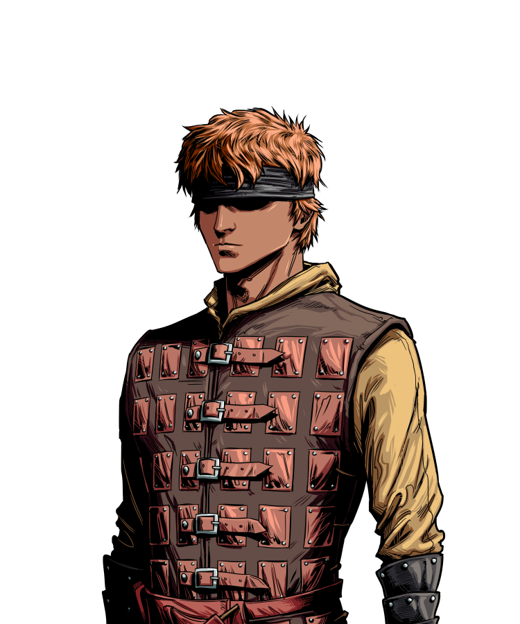
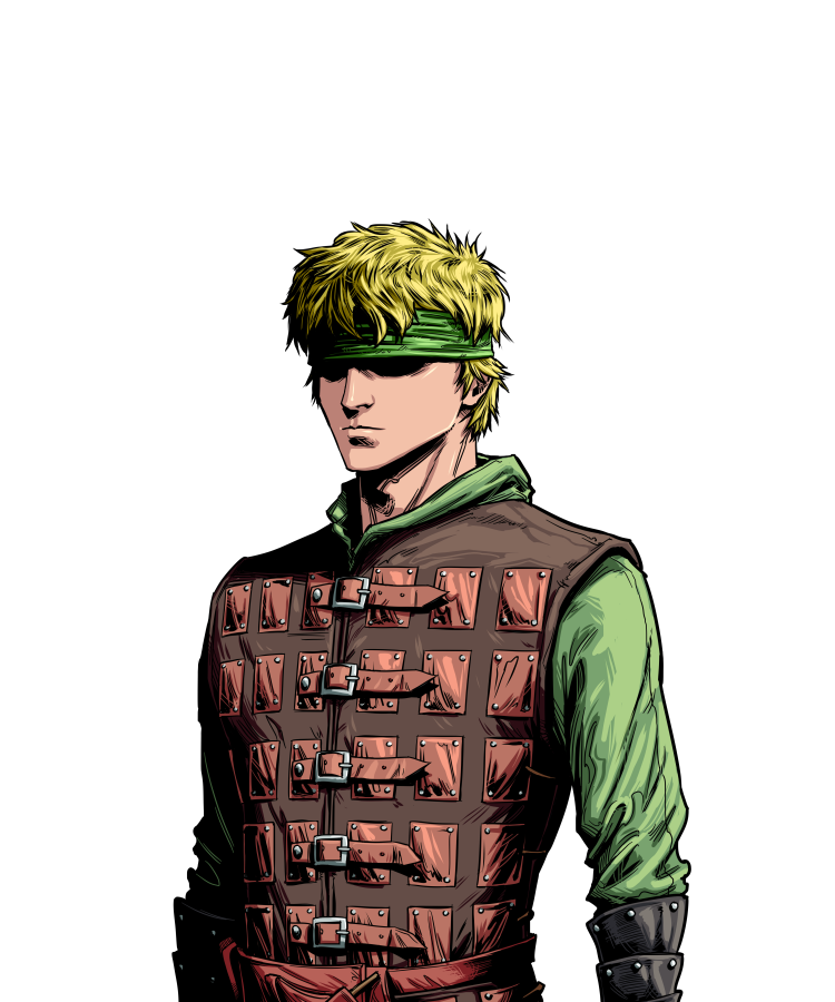
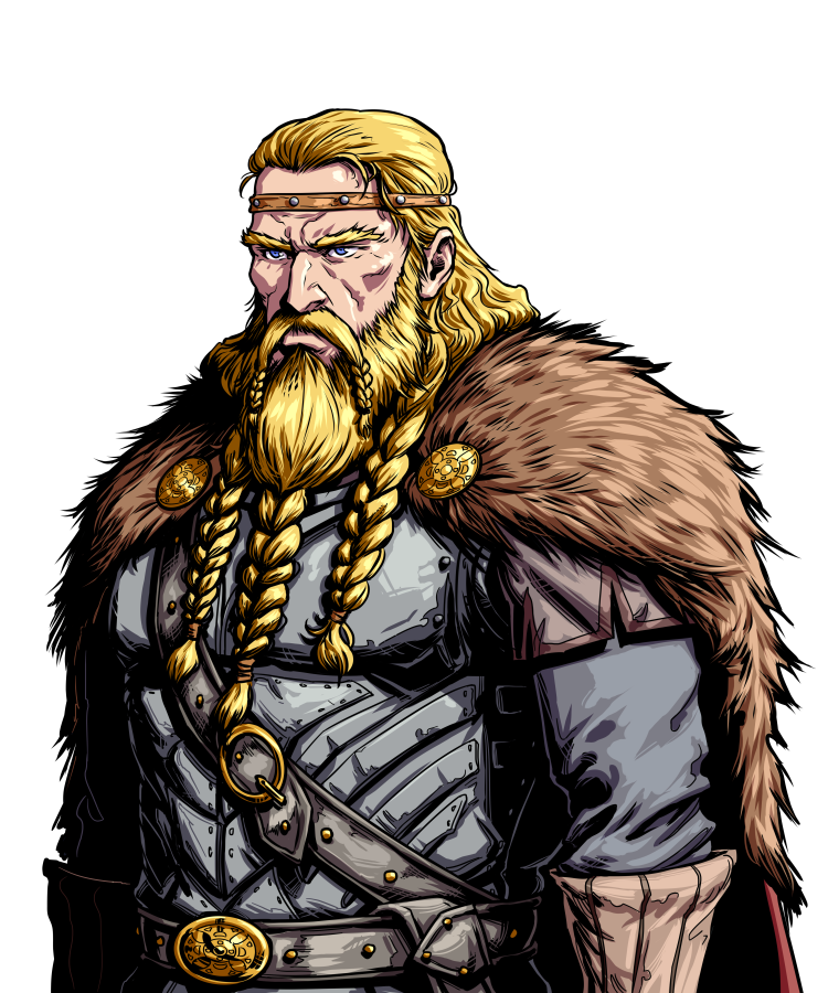
Back to actual updates! Here are some new characters being introduced in chapter 1:
Playable

NPC

Enemies (recolors for variety)

Some other quick updates, I got some feedback that the tutorials were too “stacked” together, and should be spread out to when the actual action is happening. So I did just that! Low quality gif, but I think it gets the points across. Basically the tutorials will pop up for each action the first time it shows up in a turn.
ezgif.com-gif-maker

A couple of things that I’m looking to change AFTER I finish chapter 1. I will poll these changes once I have chapter 1 out and playable, as players will have a lot more combat to base their preference off of. However I’d love to get any early feedback you all have!

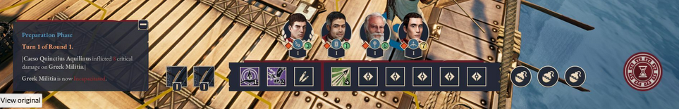
Attack UI: I’ve had thoughts of trimming down the UI by a LOT. Right now it takes 5 clicks just to do a basic attack on a unit. 1 - click the unit to show movement range, 2 - click the tile to move to, 3 - click the ‘Attack’ action, 4 - Choose the weapon, 5 - Choose the target. This can be optimized to just the essentials. Since the turn system allows one unit at a time, we can remove choosing the unit and show the movement range automatically for the next unit in queue. The UI would be one bar at the bottom, showing all the weapons you can equip, and if you hover over it, the abilities you can use with it. Items, class, and personal abilities will show in the bar too. Then you’d just select the target once you’ve hit a weapon/ability and you’ve trimmed down 5 clicks to just 3 a turn, which over the course of the game would be massive!

Turn System: I’m thinking of simplifying it a bit and only allowing one attack per “turn” per unit, but the endurance stat will decide who goes first. Right now I’m running into a balancing issue where i never want player units to have low END because that means someone’s favorite unit might act way less than others, which wouldn’t be a ton of fun. Making this change still rewards high endurance by letting them strike first, but that’s it. It also makes the “algorithm” of who goes next much easier to understand at a glance.

Shields: Right now shields operate as a % chance to reduce damage by a set amount. 50% to reduce incoming damage by 5, for example. This leads to the player needing to do more calculations, and also a potentially frustrating RNG factor against enemies where you keep getting your damage reduced. Whereas with your units you don’t want to have to rely on a 50% chance to keep them alive. I’m thinking of changing it to shields acting as an added “health bar” that recovers each turn. So at the start of each units turn their shield would refresh to block 10 damage, for example. Weaker shields would block less, heavier ones more. But the damage absorption would only happen if they get hit, so it’s a good way to keep your units topped off without overly relying on heals.

That’s it for now, stay tuned for hopefully a new map in the next update!

5 Likes

I’m in favor of END determining turn order rather than turn frequency.

As for the shield idea, the extra shield HP fully restoring every turn sounds pretty strong. What if the amount that a shield regenerates each turn is a unique stat for each shield?

2 Likes

YES! I love that idea. I was actually going to put as a “con” to the new shield idea that I don’t know how I would differentiate shields besides from their total value, but that completely solves that problem, while also making sure shields aren’t “too strong”. Basically a shield with a block value of 5 will regen 5 at the start of the turn, and a shield with 20 could regen 2, or maybe not at all? Love it!

You honestly don’t know how many nights I’ve been mulling this change over and couldn’t figure out how to make the balancing work, and you solve it in 5 minutes. :joy:

I might put this into chapter 1 tbh, it just seems like a better all around system now.

1 Like

Hey everyone, just a quick update I wanted to share with you all. The world map is complete! The majority seemed to like the colored version better, so I did some polishing last week and ended up with something I’m pretty proud of. Thank you to all who voted (and sorry if you voted for parchment lol).

Anyway that’s all I really have to show for now. I’m done with the “sculpting” of chapter 1 terrain which took longer than I anticipated. I think it looks decent enough to move forward with painting the terrain.

WIP level for those curious how editing in Unity looks

Hexes are just there for reference, not how it’ll actually play out, but as promised I’ve added more terrain in chapter 1. Will be adding “rocky” terrain as well that has defensive penalties, in addition to the bushes you already see. Also bridges acting as choke points! Some that you’ll utilize and some where your enemy will have the advantage.

One more thing I should mention is I’m trying out a writer as well! Going to pay them to redo the dialogue in the prologue scenes before battle as I felt it was a bit too much exposition. If it goes well I may hire them out to do some more, but I was pretty impressed with what I read in their portfolio, so I’m confident they’ll do well. I like to keep my options open, so probably going to try out some others as well just to get a sense for different styles so if you are a writer or know any looking to work on a very slowly progressing video game slide a portfolio link into my DMs!

That’s all I got, hope you’re all having a great weekend!

6 Likes

Hey everyone!

Sorry for the gap in updates, been heads down on chapter 1 work to hit the deadline to submit a demo to Tiny Teams by July 17th. I now have the chapter 1 map in a state that I want it. It’s going to introduce brush (+20 evasion / 2 movement) and rocks (-20 evasion / 1 movement). I’m a little worried about negative attribute terrain, as I can’t remember an FE that had it, probably for a good reason. The worst thing terrain would do is cost more to move over, or be untraversable, but rocks will actually punish the player if they end a unit’s turn on it. I’m going to keep it for the demo, and just watch any feedback closely as I think it introduces a cool tactical aspect (you can kick enemies onto it), and adds a bit more decision making (do I want to go on this tile and hit a backstab, but leave my unit more vulnerable?). Would love to hear what you all think.

Here is the actual map:

Rivers are going to just be straight up untraversable for now, maybe adding a class that can do it down the line. Though the more “realistic” elevation difference in the art style would make it look quite weird. I mentioned last week, but I’m planning on reworking the shield system to be in line with what ScubaLuigi suggested. Since I’m on a pretty tight deadline, I may not be able to squeeze it in by July 17th, but I’m going to try to get it in. Changes to the endurance/initiative turn system probably won’t make it, but it will most likely be changed.

Other things I’ve got done so far:

  • Created a new AI that will rush your position. This one took me a bit… AI can be tricky.
  • AI will take into account terrain (at a pretty low weight), and pick the better one for them if it means doing the same damage.
  • Friendly units can now move through each other. The movement already felt pretty restricted with units exerting Zone of Control (ZoC), so this helps give you more mobility options.
  • Some bugs where stunned units could still dodge and exert ZoC.
  • Spent a ton of time writing the backstory for characters so I could hand it off to a writer and see what they come up with for chapter 1. I’ve got some recent positive feedback about my writing that’s made me want to take another crack at it again, but for now I think it’s good to have someone else do it to save me some more time. Plus I’ll at least have something to compare against.
  • Creating new character models for recruits, who you will actually be fighting in chapter 1, not Iroqua ambushers. Also a character model for Aella.

Portraits are still coming in steadily each week. The Valjord king is done, I’ll give you guys the first look here since i really like how he turned out I have to share.

That’s all I got. Expect the open beta to be updated by July 17th with chapter 1 added with meatier gameplay! I still have quite a few things that I want to add, but I’m going to really go petal to the metal to get this stuff out. Still has some balancing to do as well as I want it to be a little more challenging.

Have a good Friday and a good upcoming weekend everyone!

8 Likes

I really like all the portraits that have been shown off here.

1 Like

This looks awesome, looking forward to seeing more!

1 Like

Yeah sometimes I feel like they’re the best part of the game (at least the most professionally done), and it’s the one part I’m not doing myself! :joy:

Thanks Relic! Hoping I’m able to start just churning more content now that the systems are more nailed down.

1 Like

FE4 has a few terrain tiles (notably roads) that give negative stats when on them. Roads do give you the counterbalance of a slight movement bump when traversing them though, and I think that there should be some kind of positive to the negative to balance it out rather than just being a punishing terrain type beyond the risk/reward of going onto it in the first place?

If it’s a case of “rocks = less footing”, then maybe give the unit slightly less “attack speed” (or your equivalent), but actually grant a small bit of evasion vs non-ranged attacks from an adjacent tile since the opponent might not want to close in as much with the rocks there, making them slightly more likely to whiff an attack due to spacing?

(Also, I really should remember to look at this thread more often, I really like what you’ve been doing for your project!)

3 Likes

That means a lot to me LordGlenn, thank you for the kindness. <3

Some kind of counterbalance like you mentioned could be a good solution. As of right now the only “levers” I have for balancing terrain tiles are a evasion and movement cost, but I could totally do 0.5 movement cost. I was planning on implementing “special tiles” at some point that trigger when a unit ends their turn on them (caltrops/spikes, poison). I can probably code that special type to include AS as well.

You actually just jogged my memory a bit too about negative tiles. FE8 has the lava tiles near the end game. No evasion/movement penalties from what I remember, but they had the effect of damaging units at the end of a turn. After looking it up there were some in FE6 as well, and even Path of Radiance (pitfalls on the bridge map). It seems they’re always more of a chapter/map specific thing though, so not having it in every level. Whereas rocky terrain would probably be seen just as commonly as brush/forest tiles in Those Who Rule, making it something the player would always have to be on the lookout for.

Personally I don’t find avoid penalties to be much of a penalty at all, since in these “hit chance” strategy games I’m always assuming I’m going to get hit anyway. If it made you take more damage or something or slowed you a bit in combat like lordglenn said(which sounds pretty unique) then it would be more significant, especially as a terrain type you’re incentivized to knock enemies into.

1 Like

Hey everyone!

tl;dr: Chapter 1 is out in the demo! Play it here by clicking “Request Access” and you will automatically be added to the beta. A lot of new gameplay features that I’d love to hear your feedback on, so if you have time I’ve opened another little survey here.

Sorry for the radio silence for a while, I was pushing really hard to get the demo complete by July 17th so I could submit the updated version of the game to Tiny Teams. Unfortunately there was some misunderstanding with time zones so I didn’t get to submit Those Who Rule on time.

On the bright side, I still get to share the updated demo with all of you! If you’ve been following the updates the past few months you’ll know some of the new content that has been added. New units, items, abilities, terrain, shield system, story, and a brand new chapter. The prologue was more of a guided experience to introduce the player to the mechanics of the game. While chapter 1 still has some tutorials, it has a lot more meat and decision making left up to the player. I’m hoping chapter 1 paints a clearer picture on the direction the game is going, and helps people see what foundational mechanics they like/don’t like.

Here’s a little gameplay trailer I put together (still learning how to edit videos), but I think it turned out okay for a small showcase.

I’ve also tried to add a larger variety of scenes utilizing some cool new backgrounds and then some hand crafted scenes to help the storytelling.

Scene Previews

Want to give a big thanks to everyone in the community who gave the game a shot and provided their feedback or even words of encouragement. You all really make the experience (and sometimes grind) of making a game a much more pleasant experience.

Hope those of you who try out the updated demo have fun with it. Link to the demo and the survey are at the top of this post, excited to see what everyone has to say and what ways people think the game can be improved. It is by no means done, and I’m still changing some pretty foundational things as I go, so make your voice heard!

Have a great rest of your weekend. :raised_hands:

5 Likes

I like this update a lot. Chapter 1 has both a chokepoint and an open area where you fight guys, providing two different combat situations in one map. It kind of feels like playing FE2 in that way, but in that game usually a map will consist of choking one point or one open area battle, while this has both. I like it, no complaints on the map design!

Just one small nitpick on the tutorials this time, I’m not sure if they appear in a set order or appear based on what you do, but when I played this the zone of control explanation came up after a few tutorials made mention of it. They don’t make much sense when they mention a mechanic that hasn’t been explained yet.

I found that I was staring at the turn order portraits on the bottom of the screen for awhile to figure out when the next enemy would move. I really should be able to tell the difference between the characters and the faceless enemies faster, but I’d appreciate if they could be team colored so I can tell at a glance.

Some ability stuff next, I would guess you already know about this, but it’s strange to have to pick a weapon to use after choosing an ability since none of them use a weapon, especially picking a weapon before using a bandage. Similarly, they all bring up the combat forecast window even when it isn’t relevant, again for using a bandage. Taunt confused me for a bit since it hits all enemies in 2 spaces, but it makes you choose an enemy in range first and brings up the combat forecast. It would be better if it just showed the range and one more left click performed the taunt.

There’s much more opportunity to make use of the flanking and backstabbing in the second map than the first, and now I really like the mechanic and consider it the main identity of the game. I don’t know what the damage bonus for backstabbing is, but it feels big. Which is good!

One last thing, at the end it says there’s a discord but I didn’t see a way to access it.

Overall I think this is really shaping up!

2 Likes

Appreciate you giving it a play-through ScubaLuigi! This is all great feedback.

Appreciate the comments on the map design! I wanted to make sure this chapter had a good feel to it, and that there were spots that were apparent you’d want to fight around that would give advantages if you could take them.

As for the ZoC tutorial, totally agree, it does come a bit late. I was afraid if I stuffed anymore tutorial material into Slyker’s turn it would feel like overload, wanted to keep it around 1-2 tutorials for each unit’s first turn. Can’t think of a creative way to get around it besides just jamming it into the first unit’s turn, maybe swapping their tutorials.

I will definitely be coloring the turn order! This actually ties in nicely with your points on the UI having unnecessary clicks. I’ve been looking for a way to reduce inputs to take an action, and I’m thinking of doing something similar to Expeditions: Rome, where on a unit’s turn, you have their action bar at the bottom with everything they can do and every weapon. So then you would just select the ability, and the target, and no other selections need to be made. If I did this, I’d put it at the bottom, then the turn order would move to the top and I’d take that time to put health and team coloring as well. If weapons were required for an ability (shield bash requires a one handed weapon), then I’d just grey it out until one is equipped.

The action bar would be quite a big step away from the FE formula though, but I don’t think that’s a bad thing. I don’t feel like FE has changed their UI inputs for as long as I can remember, so it would definitely throw some people off, but I think it wouldn’t take long to re-calibrate. Would be interested to know what you think about that!

Backstab is 2x right now, basically the way to “critical hit” in the game, but without the RNG. I might actually tone it down to 1.5x as I’ve gotten feedback it made chapter 1 quite difficult getting swarmed and one backstab from the enemy could end the game with a defeat. That said it’s also satisfying when you pull it off on your enemies, so I want it to be powerful too.

Also here is the discord link: Those Who Rule
We mainly just talk about mechanics/characters, but it’s a nice way to get more instant feedback on ideas. I’ll add it to the main post as well, thanks for reminding me!

2 Likes

In my opinion it’s a good thing for the game to feel less like Fire Emblem. Little UI changes and stuff can make it feel less like a cheap copy and more like an original work. Though maybe it’s just me who thinks that’s important.

A more objective reason would be that FE’s UI design has always been made for a controller. If playing SRPG Studio projects has taught me anything, it’s that having a text list menu pop up on the side for your actions is not at all intuitive for mouse control, forcing you to dart your cursor all over the screen and back again just to make one unit attack another.

As for the backstab feedback, I thought it felt great probably because I didn’t get back stabbed myself even once, so I was never on the receiving end of it and can’t judge if it’s too strong in that regard. Or maybe it’s great the way it is and other players are just bad at the game. :sunglasses:

2 Likes

Hey everyone!

Sorry I’ve been quiet for a bit. I just got married at the start of September! So that was where a lot of my time has been going. Other than that, TWR got accepted for GRound (large playtesting site), which helped get a ton of feedback on the game.

I’ve been making a ton of UI updates, trying to get everything close to a “final state” before I go back to expanding content. I think I have the main game mechanics nailed down for how I want them, which I know is weird to say with the game being this far along, but things still change like crazy!

Here is an example of the old UI compared to the new. You can now finish your turn in as little as 2 button clicks! If you use special abilities or swap weapons it’ll obviously be more, but that’s a lot easier to do as well with simple button hotkeys!

Would love to get a general sentiment on the new UI, as I know it takes it quite far away from the FE formula way of doing things. Which do you enjoy more?

  • Old UI (Similar to FE)
  • New UI (Less inputs)

0 voters

Here is a bit of a change log for those interested:

Changelog
  • Completely redesigned action bar UI, as well as battle info into more of a final state.

  • Your unit is now auto-selected for you. I noticed while watching some streamers play through it that it wasn’t immediately obvious to new players who was acting. By auto-selecting them for you, as well as showing the portrait in the action bar, I hope to avoid that confusion. This also takes away 1 unneeded click.

  • Your attack is now auto-selected if you have an enemy in range to attack.

  • You no longer choose a weapon, instead you default to the one you have equipped. If you want to change it, you can click on the weapon in the action bar, or hit “TAB” to equip the next weapon (key mappings coming soon TM). Almost everyone who played remarked on the confusion of using the bandage and having to click to select the weapon.

  • Choosing abilities will be done similarly to equipping weapons, with E and Q taking you to the next ability. If an ability requires a certain weapon, that weapon will be

auto-equipped, so the player doesn’t need to take any unnecessary inputs.

  • New font throughout the game. May try it in the dialogue as well.

  • New tile designs.

  • Some code refactoring to increase maintainability, and prepare for adding more complex abilities.

Future
  • Blinking health bars to show amount of damage done.

  • Blinking tiles to show affected units. ex: When using taunt, you’ll no longer select one unit, but rather every tile in range will be blinking.

  • Tile highlights to show movement.

  • Title menu UI update. Make it more clear that you’re saving the game + update the UI to a more final state.

  • More writing and character designs (always). Prologue is getting completely re-written.

That’s all I got. Have some more cool new character designs coming down the pipe. I now have a lot of the “generic” units done, so started to flesh out the roster more and would love to hear ideas you all might have for characters! Especially ones that break the typical medieval fantasy tropes.

Anyways, thank you all for the continued support. Got some amazing feedback on chapter 1 from you all, and I hope I was able to address some of the concerns. Definitely haven’t gotten to everything, but excited to keep improving the game. I’m also thinking I can set a hard deadline on the game as well here soon, as the foundational pieces are coming together. I won’t commit just yet, but definitely feeling a bit more comfortable (Content takes a LONG time).

Hope everyone is having a great weekend. Cheers!

2 Likes

Please keep click select unit. Hover select is incredibly stupid.

Tbh… If possible, maybe an option to swap between UIs, and make the “old style” go from Attack straight to battle forecast, where you can swap your options instead of switching through so many menus. The new UI is a bit info dense for how many clicks you go through while the old one is cumbersome to the point that between clicks your brain might bleed info. I like windowed UI sometimes despite it looking kinda messy because adjusting windows via drag/drop/resize is fun and can make streamers’ lives easier

I don’t really mind clicking a bunch of times as long as the info is easy to go through, internalize, and use. A lot of CRPGs are frankly terrifying with the amount of tooltips and hotkeys and minor mechanics and on and on you have to see at once.

Re: previous poster; turn order isn’t phase-based, so it’s not hover select. The unit is just automatically selected when active.

1 Like

I hadn’t heard of “hover select”, but it sounds awful. Like Yasako mentioned, turns are unit based, no team based, so only one unit can act “at a time”. You’ll always have to select the unit whose turn it is even to end their turn, so it just saves a click.

At this point I think I’d have to commit to one. For some smaller things making two versions and make it toggleable is easy, but this UI flow is going to be iterated on a lot as I create new abilities, so having to make changes and test in two spots would be a bit heavy on me. I hadn’t even thought of resizing, maybe I can make that an option available to the player with the new UI?

It definitely does feel a bit more busy, but I’m planning on putting the key strokes directly on the UI as well, so a new player will always know what to press to select something, and you can always just click as well if you’re not into super optimizing your clicks. You’re spot on that I have to avoid information overload though. I’m only planning on tooltips when you hover an ability/weapon for this UI, so hopefully that doesn’t feel like too much.