So, if anyone has been in Discord, you’ll know we don’t have many version of our current logo. It also may be time for a change. I’d like to announce a logo design contest.
Deadlines
Just post your files/design in this thread. The official end time for the contest will be 23:59 EST 31 August 2019 (that is, the end of August).
What should I submit?
Ideally, your design should be vectorized. If that’s not possible, just provide the resolutions below, or higher-res versions if possible. We would like renders in the following resolutions as well:
512x512 (For use as Discord server icon, and website logo)
1920x1080 (For use in banners and such)
What’s in it for me?
Exposure!
…
Okay, just kidding.
The winning design, obviously, will be used on the website/Discord server. We would also like to offer your choice of $40 cash (say, via Paypal), or $20 cash and a season DLC pass for Fire Emblem Three Houses.
We would also like to offer $10 cash for the runner-up.
Who chooses the winners?
Placings will be determined by an instant-runoff style ranking. There are 5 “voters”:
I will post a poll upon the end of submissions; the rankings in the public poll will count as one instant-runoff ballot.
Licencing
By submitting a design to the contest, we will take that as a go-ahead to use or modify any submitted graphics or derivatives thereof for use by the general public for personal, non-commercial purposes, as well as by Fire Emblem Universe for both non-commercial and commercial purposes.
Here’s (a bad render of – unfortunately the original files have been lost) the old FEU logo; consider it as an entrant in itself, as well as a place from which to draw inspiration:
I know that Pikmin will win, but why not trying ? (please don’t laugh at me too much I’m not as good as him, his logo is a real piece of art (lol) )
Well I’m not an artist (at all) but I tried :
Anyway like I said I’m not an artist, but I had fun doing those logos, these are done from scratch. I had fun doing them this is my first time doing a logo.
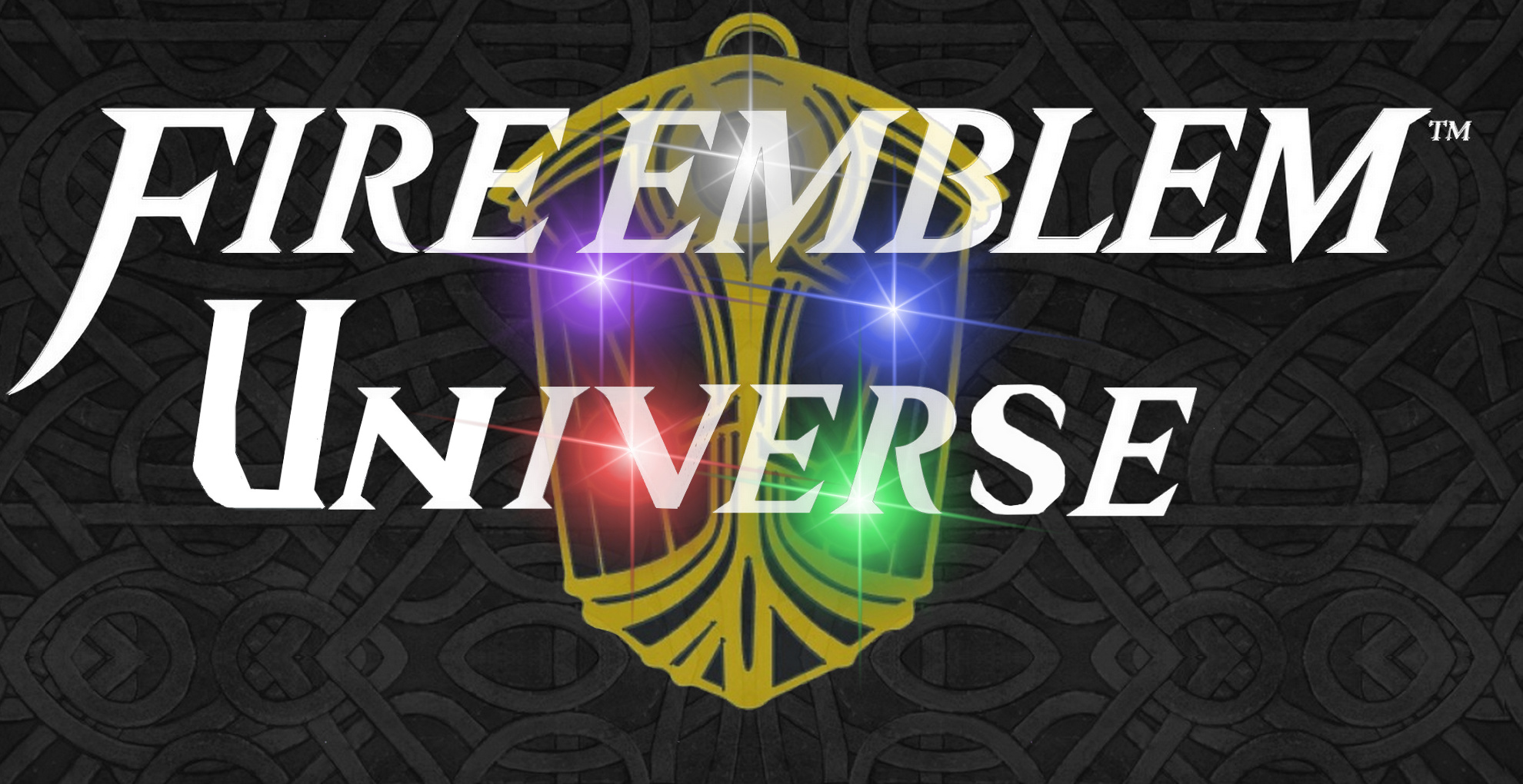
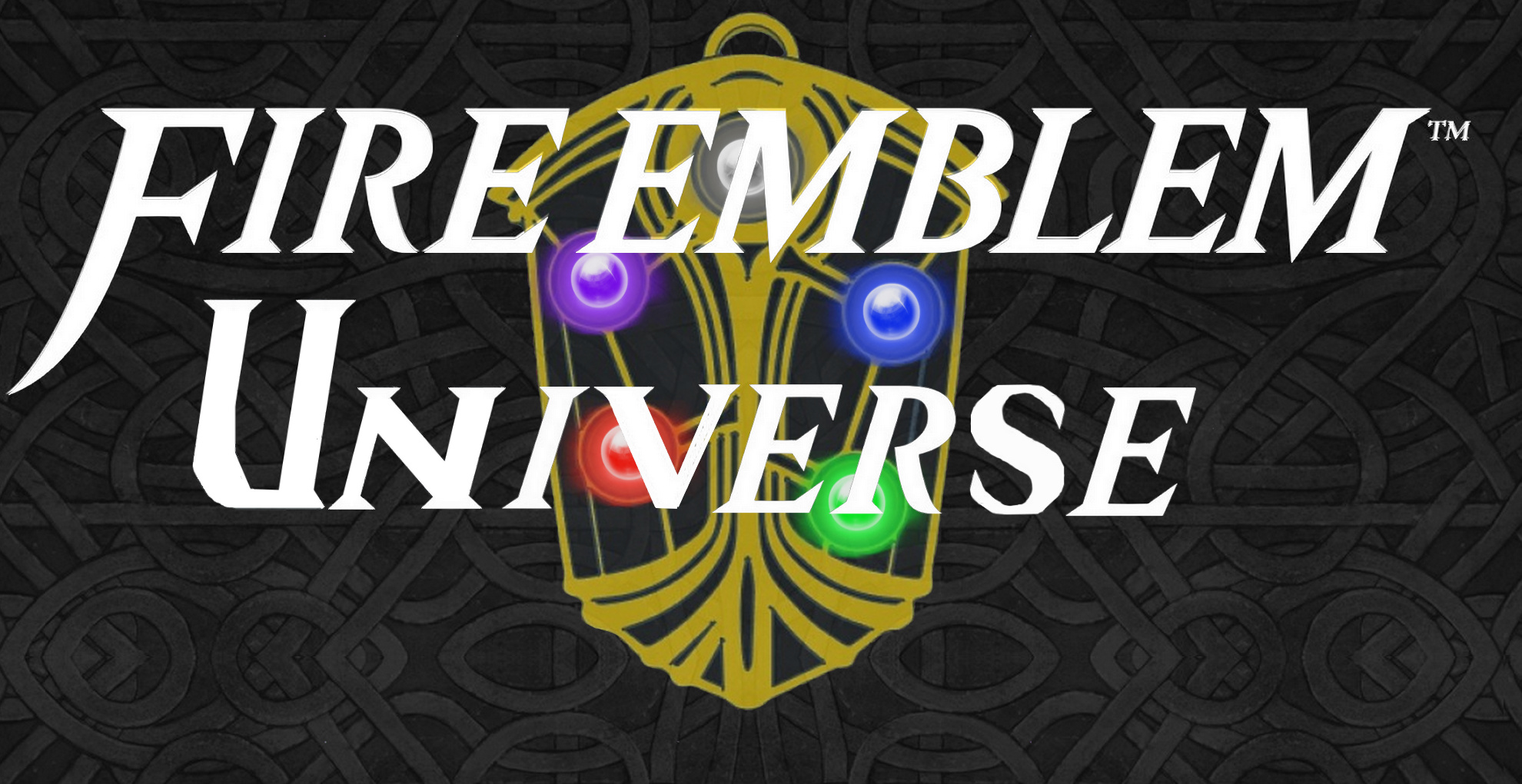
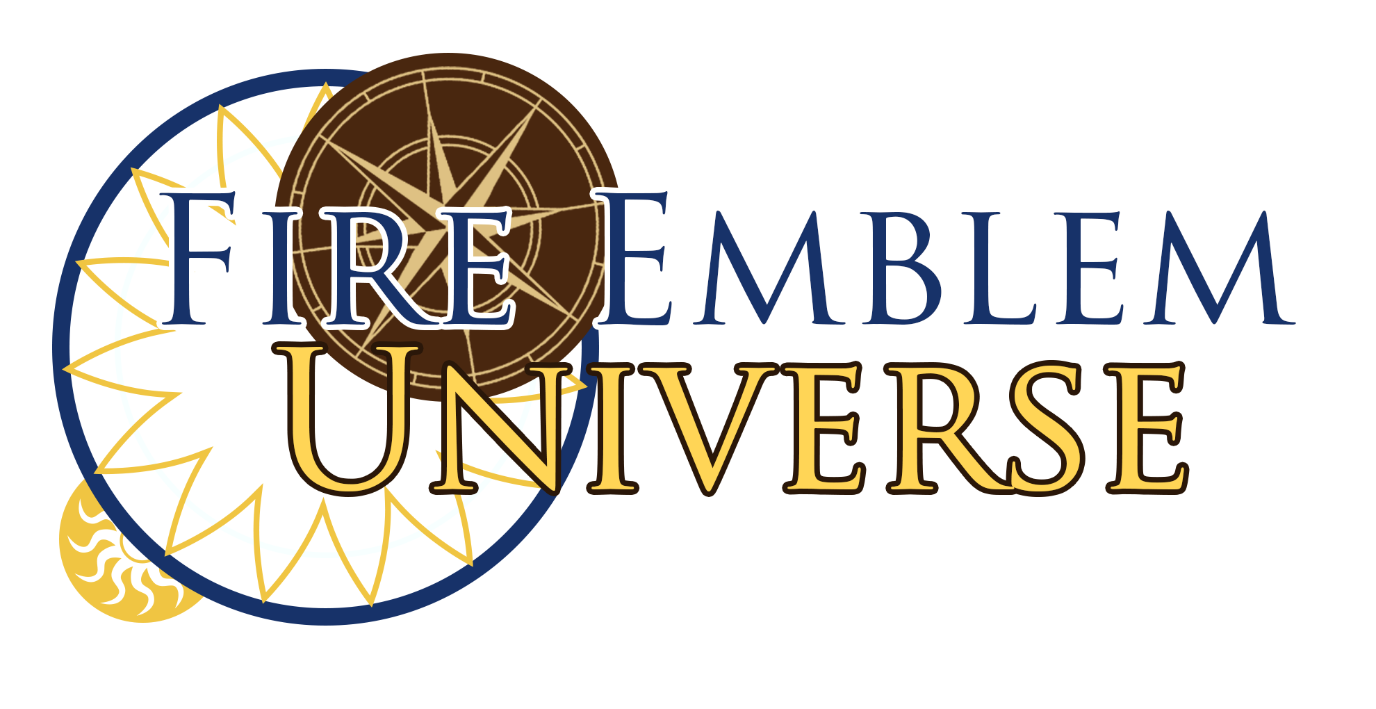
A word of advice from the master - try centering the Universe in the banner a bit better with the Fire Emblem up top.
Your fire emblem image (the physical object with the gemstones) also appears to have a dead pixel in the upper left. It’s present on all 4 logos posted.
My 2c: in the current design, the letters are difficult to see other than the U (esp as a colorblind person, but I’m guessing it’s probably the same regardless of ocular disabilities). A clean sans-serif (or lightly-serif) font and slightly more prominent borders would help a lot. It’d also be really cool if our new design looked sharp when shrunk all the way down to favicon size. Maybe that’s a separate contest that could be done later on, though.
+1 to implementing the actual fire emblem in the design, too, nice one @Leo_link
If you want any minor changes made, such as changes in the shading, positioning of letters, etc, feel free to message me and I can do it. Alternatively, you can download the .pdn file for each version, which will allow you to modify it yourself with layers, here: https://drive.google.com/drive/folders/17sf0gVXj6pMB77bE8dQKDw07pQ2Tybtp?usp=sharing
edit: I don’t know why FEU changed the embedded 1920x1080 version into a .jpeg. I uploaded a .png. If you want to download the original .png, just go to the google drive link because I uploaded it there.
Credits to AK for making the original Void art which we adapted.
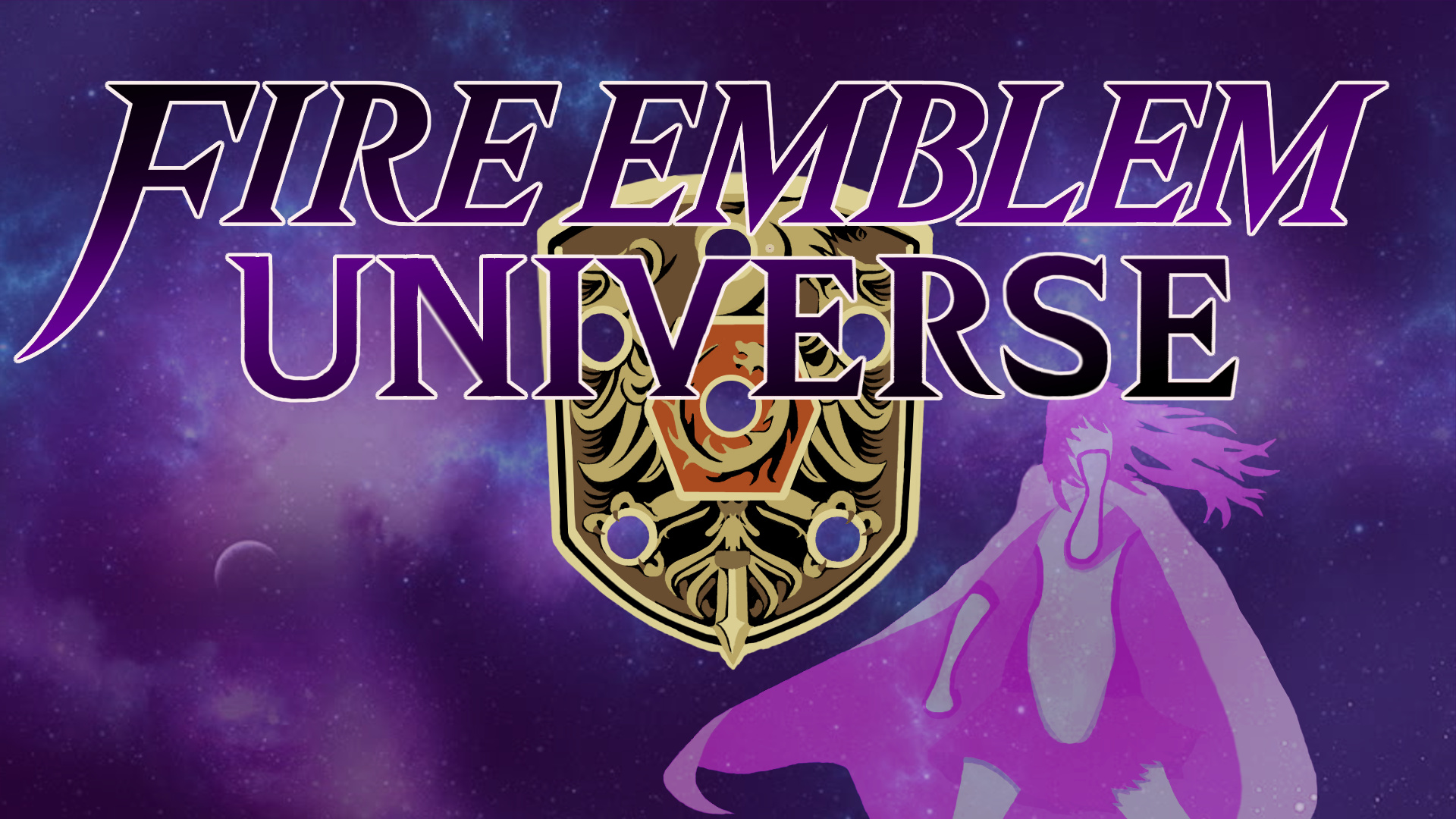
After much deliberation, here’s The House’s submission! These were made by Mystletainn, with Glaceo and myself giving our questionable opinion here and there.
We still have original file so the design is still plenty flexible! If there’s any way you feel it needs changing for purpose, we’d be more than happy to do so.
(An alternate banner and .gif version of the small logo are available in the Google Drive!)
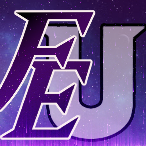
Omg this logo has a jojo pose, best logo ever !
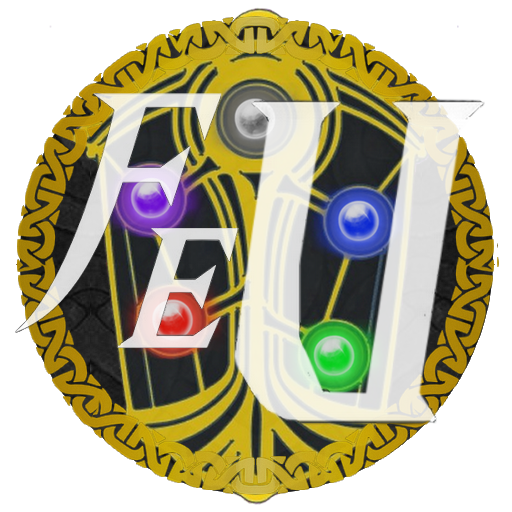
And I like the focus on the universe aspect, well done imo, also your fire emblem, the shield looks cool, but I would have add the gemstones. Anyway That logo is really rad. (Yeah as you can notice I like giving some feedback that is just my opinion though)