Oh, now I get it. Well I just made the picture with a programm. It isn’t from FEBuilder itselfs. Everything for the Tileset is in the download link.
All I saw in the linked file was the compressed object image and the terrain data, not the 512x512 image. The compressed image is useless to me if I want to make a map using the tileset using Tiled/FE Map Creator.
Yes, you were right. Now it should have the Size to work on tiled/FE Map Creator. Sorry for that
1 Like
Also, you may remember I was working on a Black Knight animation.
I was in the process of Editing the armor to look less like Zelgius’ and more like BK’s, but during that time my computer crapped out. I lost the files, so I’m not going to finish making it. If someone else wants to finish it using the gif, be my guest.
20 Likes
Hey, that looks pretty good.
2 Likes
I like Super Robot Taisen so much. That is a very good!
Animation is cool, but I have to ask.
Why do the wings come out of the character’s hips?
Edit: I just realized it was a pegasi. I thought it was a flying angel of some sort. Carry on.
Edit2: Damn, such a great, smooth animation. Very well done! I watched it several times and I love it!
2 Likes
Flying Tethys. That’s pretty cool.
I did notice the sword crit doesn’t actually create the critical flash, was that intentional?
Thanks a lot bro, it means a lot coming from the animation hoarder himself, lol. But there comes a lot of the credit to Ayr too, since he made the original
1 Like
nope…I think I have to fix it
1 Like
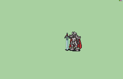
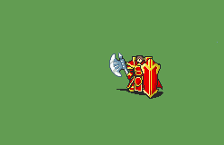
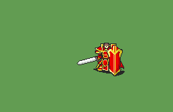
Hi, so this is my first post on FEU (lol) and I looked through the repo on Emblem Anims and I just decided to make a Marshall sprite. It’s not finished yet but I have the unarmed animation done and I am looking for feedback. Its actually based off of Nuramon/Leo_link/Iscaneus’s Baron Cape+Weapons anim.
Edit:
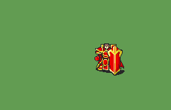
I also have stills of the axe, sword, and lance for it:
Edit2:
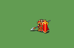
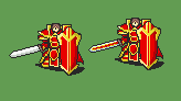
I have an alt of the sword and I would like advice on which one looks better. Here it is: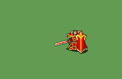
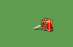
Here is a second alt as well:
16 Likes
Finally someone made a f2u one
If i have any advice it would be to try and distance yourself from the general a bit more. Not using the spear/axe, but something more distinct for those. (Especially the axe doesn’t look angled quite right.) And maybe reshape the upper bit of the pauldrons a little to give them more of a distinct shape.
Also since he has a shield, maybe the dodge could be putting the forward foot back and holding up the shield? I mean you can’t properly “block” in gbafe, but it bugs me a bit when characters have shields and just ignore them in the dodge.
Both new swords feel jaggier than the first one since they use dark black all around and don’t have anything softening them. Try aliasing them a little.
I’d say the fanciest one is probably more appropriate for a high-level promoted unit?
3 Likes

My biggest criticism falls on the brightness of the colors. I think you’ve used far too bright reds and yellows for the design. Maybe go for colors that are more muted, like the existing Zelgius?

Does it matter? You’re going to change the palette to match the character anyway if you’re using it.
4 Likes
Well, yeah, it does. That’s like asking if polish really matters for a Bethesda game if everyone is just going to mod it. While this may be true, there’s no reason not to make the source better if you can.
Especially as, in this case, it would also serve as a learning experience for this aspiring spriter. Everyone starts off using pure black and white, blood-red and neon yellow. It’s good to learn to use GBA colors early on.
4 Likes
I prefer the original sword to the new ones, both new ones just feel like beta Durandal and aren’t as sharp. The first one could be more sharp as well, though, especially at the tip. I agree with Vilk that the lance and axe could be more original, they’re too similar to vanilla general.
The colors seem too bright, like Klok said. I would also like to add that the contrast of the colors is too little, making the details of the shading and armor hard to notice. Armor pretty much requires high contrast colors due to the way metal reflects.
Does it matter? You’re going to change the palette to match the character anyway if you’re using it.
It does, to some extent. Sure, character palettes are going to be new, but it’s nice to have colors to base them off of. Here, my issue is more with the way the colors are contrasted. Palette makers will likely either follow the original colors, or make new, higher contrast ones that may look off from the original sprite.
It may also be more convenient to have fitting colors for players and enemies, keeping these colors may mean that hackers will have to change the colors themselves if they want something that looks more appealing. Most animations account for faction colors in their palettes so that people using the animations don’t have to.
3 Likes
Hi vilk,
Do you mean like the hero’s dodge animation? Also, this is my first animation literally ever so don’t expect anything great from it lol. I appreciate the criticism though.
I could certainly try, but this uses pretty much all the object space already, so I wouldn’t be able to put in e.g. the wood or cobblestone floors, yurts, village fences etc. I have maybe 4 of the 8x8 tiles left, so if there’s a feature in there that you think is most critical, I can cram it into the object file.