Drawing Credits CGs for The Morrow's Golden Country
This post will be discussing assets I’ve made for Fire Emblem: The Morrow’s Golden Country. That hack was, of course, developed by Retina—I’ll just be talking about the process that went into the CGs I drew for it.
So! Back in the beginning of February 2025, I offered to do some CGs for Retina’s projects since—hey, FE:TMGC got me back into Fire Emblem, also got me back into making fanart, and is very dear to me because of that. When this took place, TMGC had the following CGs for the credits sequence: Elcorian, Blair fighting Lazarus, and Blair with Apex Valkyrie Arin. There’s also the Blair CG with falling flowers, but that one isn’t something most players will see due to its requirements.
Lots of Blair, and that makes sense; main girl and main lord.
As a result of this, though, CGs were needed for the other two lords: Zeke and Viridian.
…A fact that is perhaps immediately noticeable to anyone that’s spoken to me about FE:TMGC for longer than a minute, though: I love Viridian. Why wouldn’t I? They’re green, bow/staff, and are in-general one of my favorite character archetypes. Perfect recipe for a favorite character right there.
I love Zeke’s design a ton as well, and he was one of my favorite units to use in lategame; needless to say, I was pretty damn excited to make art of these two.
There were also a number of things to keep in mind while planning the CGs. First and foremost was that they would be compressed upon being inserted; second, of course, was that the GBA has inherent color limitations. While the gallery can use 220 colors, the actual credits that most people would see would use only 64. This meant that whatever I had planned had to have legible posing, colors, and as a personal goal, conveys the characters’ arcs and endings. These are the credit CGs, after all!
…But because of that, this entire post will have spoilers for the entirety of FE:TMGC. Appropriate spoilers are hidden, of course, but just keep that in mind.
General setup
Initially, there wasn’t a lot of cohesion between Viridian and Zeke’s CGs. At first, I was going to depict scenes from the game, kind of like the Blair vs. Lazarus CG.
Viridian’s would either be them at the campfire during CHV4x, or their final salute before the battle of CHV5. My friend Dragz pretty immediately advised against these, as these would both involve too many characters and also caused me to realize that this would eat up color space, so it was back to the drawing board for that.
Then, I remembered LuminescentBlade’s Blair CG; the very same that you see right at the download page for TMGC. I am a known nerd for botany and floriography, so I realized I could have the other two lords’ CGs incorporate foliage to give them all some cohesion.
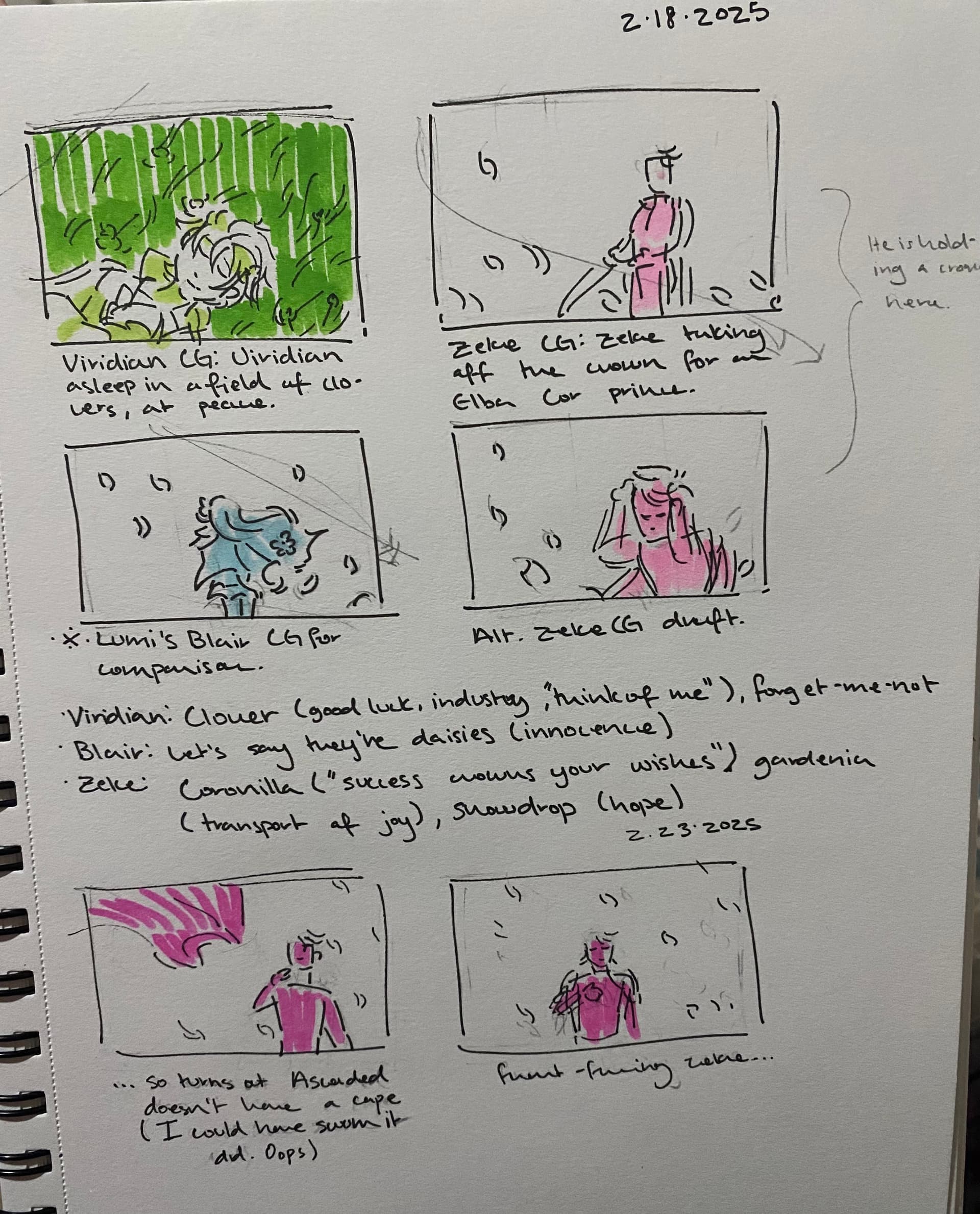
So, some initial concept art for the composition:
As a note, I have become quite the sketchbook fiend in the beginning of 2025. “It’s only March, Hiraya,” you say. Yep. Still applies. You can thank some gifts I received last holiday season for that. Anyway, because of that, a lot of the concept art you’ll see here will be traditional.
For Viridian
Viridian’s CG came pretty immediately: them asleep in a field of grass and clovers, finally at peace. I also wanted their hands to be in view, clasped over their hat atop their chest like one would see at a funeral.
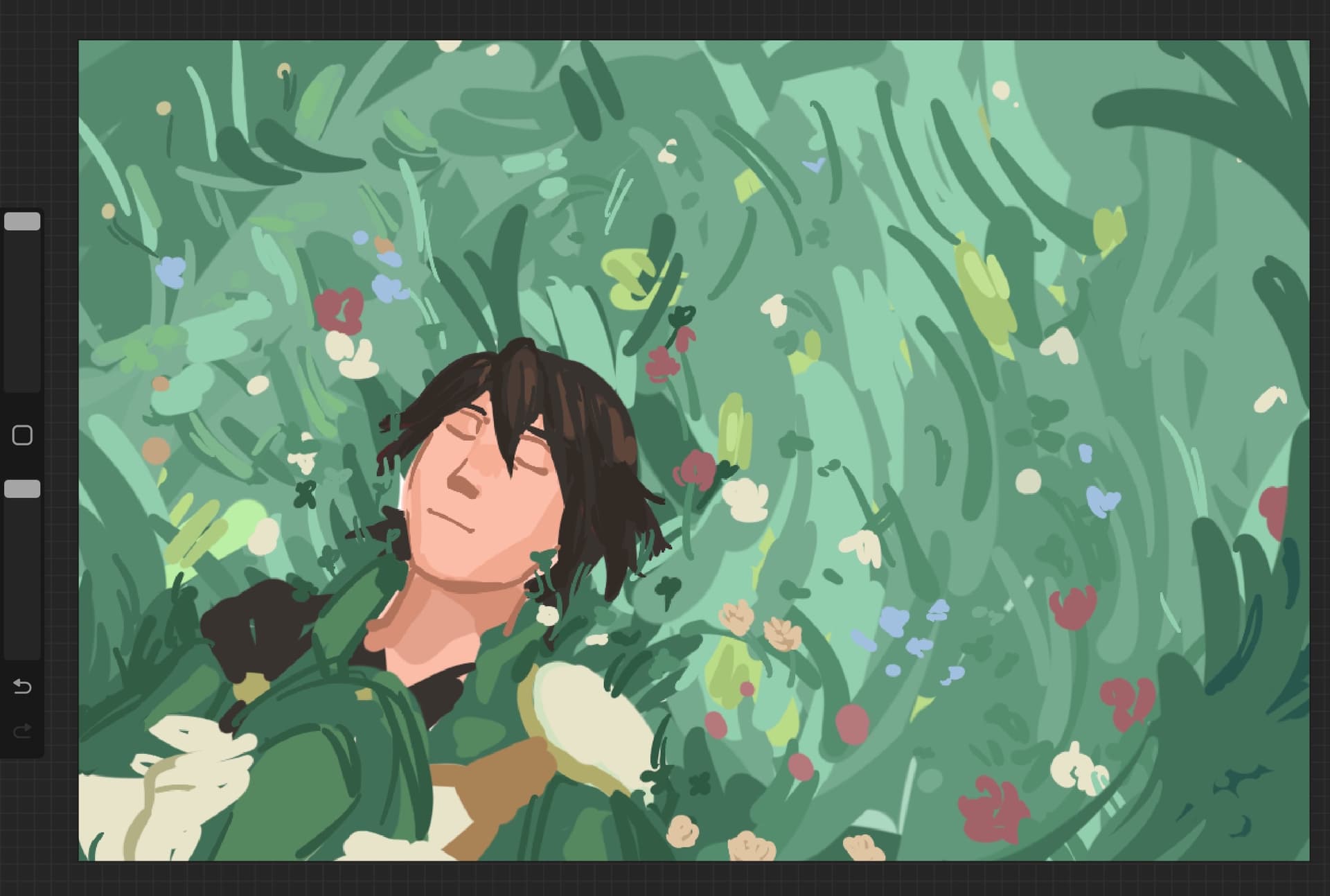
This in mind, I cracked open my plant books and searched for fitting flowers: besides clovers (good luck, industry, “think of me”), I knew that I wanted to include forget-me-nots (“forget me not”), and snowdrops (hope in adversity). Later on, I incorporated white locust flowers (affection beyond the grave, platonic love) and rosemary (remembrance).
I also wanted to include marigold flowers because of their significance to Dia de los Muertos and All Souls’ Day, but then saw that 1. marigolds mean cruelty and jealousy in flower language and 2. unfortunately, including them messed up color compression a lot. As in, the in-game result made Viridian look like they were frowning. That obviously couldn’t stand, so I nixed those last-minute.
Inspirations: Frieren: Beyond Journey's End and Octopath Traveler II
Now, in terms of just… vibes, there were two other works that came to mind for inspiration. I adore Frieren: Beyond Journey’s End for a lot of reasons, and if there was anything that would help keep the gears turning, it would be keeping in mind this series’ composition, colors, and how those are used to set the mood. I remember I had a lot of fun gathering fanart for vibes reference.
For OT2, this was mostly for… abstract reasons? Just keeping in mind how this game conveyed remembrance and grief, specifically with Castti and Malaya. I remember I looped the former’s theme a lot.
Step 2: Paint the rest of the Viridian
The actual process of painting the Viridian CG was, uh… a lot of grass. Initially I tried to put a lot of detail into it, but then I realized it wouldn’t look great compressed, so I painted over almost all of it… Looking over the speedpaint footage made me cringe only a little when it got to that part.
I also had to get my sister to take a reference photo of me lying down so I’d know how to position Viridian’s fingers. I don’t own a hat quite like theirs, but we do own a cowboy hat so that was a fine enough substitute.
Viridian was undoubtedly the easiest part of this. Not only do I draw them often as is, but this was also only a little after CYL Viridian was finished, so I was already super familiar with their design. When giving feedback on Levin’s new mug for Viridian, I remember Gold mentioned she gave Viridian eyebags in their previous look, so I made sure to include them. It also adds to the “finally resting” vibe I was going for.
Oh, and I also ended up accidentally (“accidentally”) making the flowers trans colored, so that’s a win.
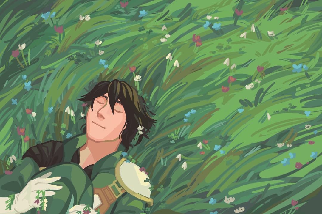
The Hero Rests
Rest well, Viridian.
For Zeke
With Zeke, I wanted to focus on him abdicating the throne and his title as a prince. From the start, I wanted his CG to foil the Blair one Lumi did: rather than have his back to the audience like Blair, Zeke’s face would be visible; similarly, to contrast Viridian, Zeke would be facing the opposite direction, to the right.
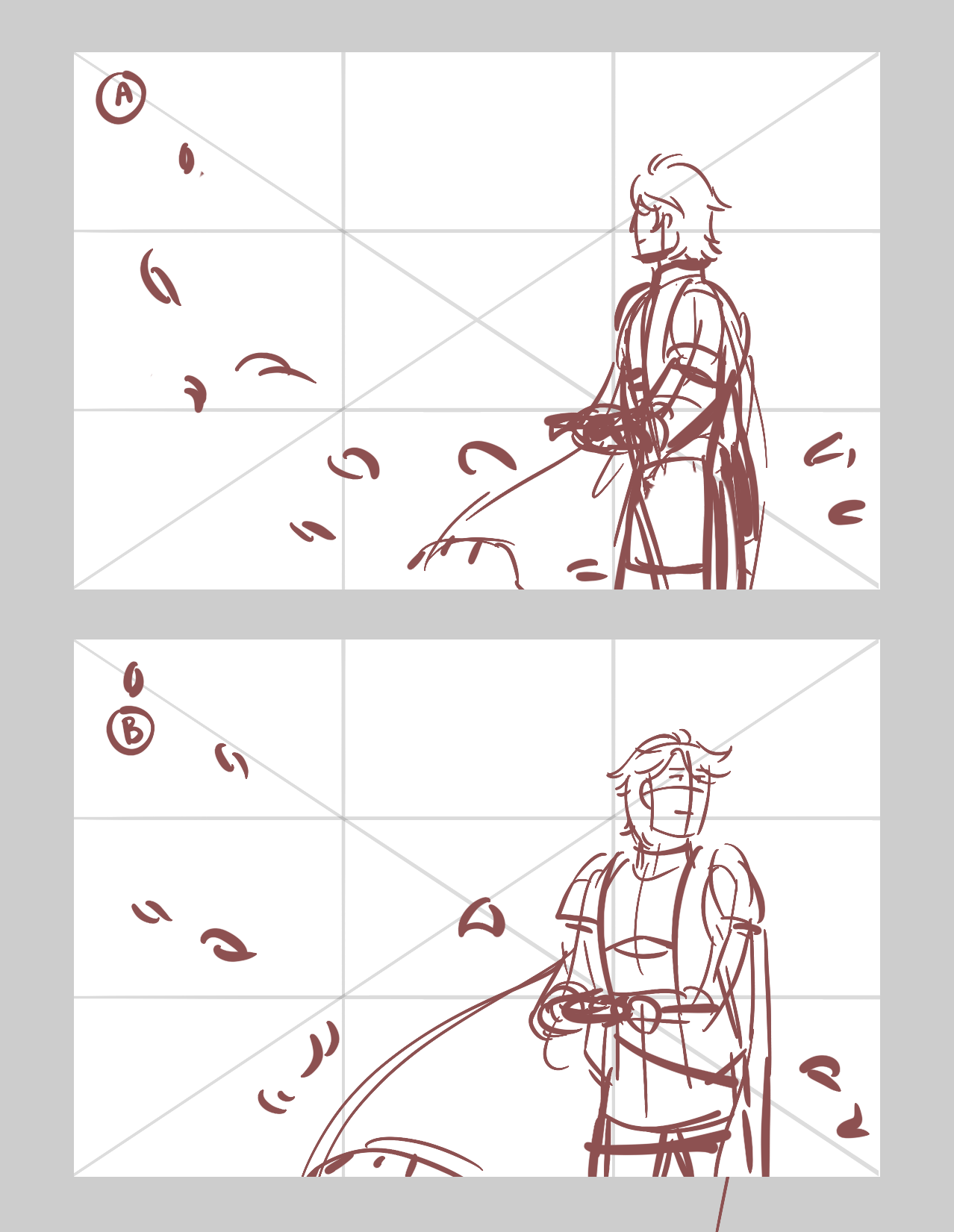
Initially, he was just going to be seen taking off his crown and looking off into the distance, flower petals flying in the wind. Though, even with the flower petals this still felt too… static for me? I also didn’t like his face looking to the right, it just didn’t fit. Similarly, when he was looking to the left, I think I was worried about people misinterpreting this as Zeke focusing on his past mistakes.
So it was back to the drawing board. I also wanted this to have more motion, so maybe another prop would help.
Inspiration: Revue Starlight: Gekijouban
Hey, so Revue Starlight is a really good anime. Downright gorgeous compositions on top of an amazing story. It also had a movie a few years ago, this time focusing on the main characters graduating and moving on from the narrative.
You may be wondering why I’m talking about this. The thing is, Revue Starlight loves its symbolism, especially Gekijouban. In the ending, the characters take off their capes—symbols of their status as performers and rivals, something they have to protect in duels—as a way to represent them graduating: moving on from this stage, and into the next stage of their lives.
This was perfect for Zeke. I could use his cape from his T1 design as a prop, have him be shown having thrown it off to demonstrate him abdicating while he holds his crown in his free hand. Having Zeke be in motion, mid-step as he walks off-screen, also conveys that he is looking to the future while not forgetting his past.
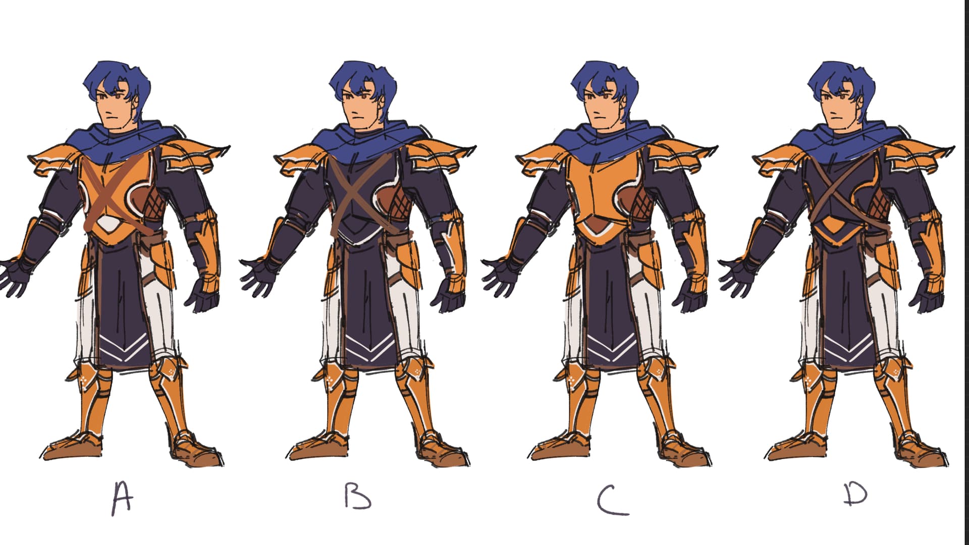
Full-body designs
One thing about doing CGs, though, is that these characters are usually only shown from the bust up. Because of this, I also had to design Zeke’s full outfit; technically, I had to do this for Viridian as well, but they didn’t need much beyond what their mug shows.
Lineup (Still spoilers!)
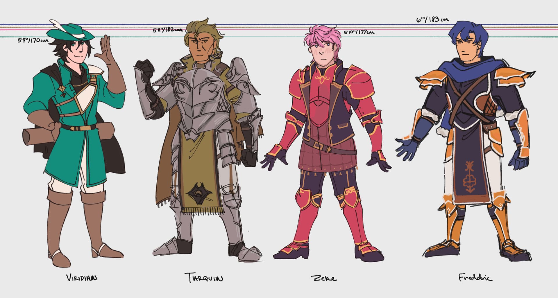
Note: Character heights depicted here are in accordance with their respective designers/editors.
Zeke’s design was heavily inspired by FE15’s character designs; namely, Celica and Clive’s. It added perfectly to the regal look I had to go for, and I added little tassels at the end of his cape to make it look more elaborate. This design got Gold’s approval, so with that, we were good to go.
Graduation
The background for Zeke’s CG was plain white, as it was supposed to foil Lumi’s Blair CG. Because of this, everything else was smooth sailing. Just had to make sure the values conveyed distance between Zeke and his cape, along with having good rhythm and spacing for the falling flower petals.
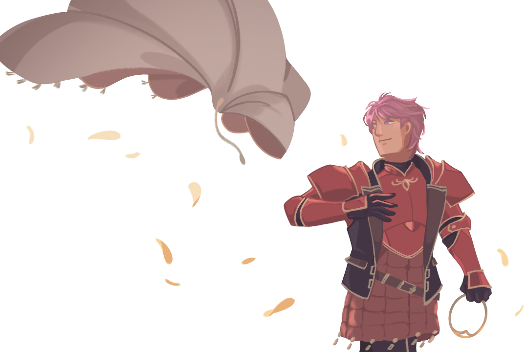
The Prince Departs
The yellow flowers in Zeke’s ending CG are coronilla: “Success shall crown your wishes.”
For Tomorrow
This is the part of the post that looks like a confidential government document.
Right, we got a third one. This CG was going to feature a major supporting character, and while talking about this, Retina mentioned two things: First, that there was a chance there would be an Ethyl CG. Second, that among the major supporting characters listed, Retina had mentioned Kenneth and Freddric. In other words, two of my favorite characters. Ethyl being brought up also made me realize that—counting the Elcorian, Lazarus, and upcoming Girard CG—Tarquin would be the only major antagonist that didn’t have a CG.
So I wanted to kill two birds with one stone: Have one of the two fight Tarquin. They both have boss dialogue with him, so it works out perfectly. Ultimately, though, as much as I love both of them I knew that who would get the CG would boil down to what would be easiest.
But uh, I really hate drawing foot units fighting flying units. It is a certified pain in the butt to figure out positioning for that. So, I was already leaning towards Freddric with composition ideas in mind, but was still worried about committing to him since he is a Viridian Mercenary. As a result, I was concerned about canonizing one of the scout choices, even when I knew this idea I had—that is, Freddric fighting Tarquin with the Soulbow—would be amazing to try.
Luckily, Retina reassured me with how the Blair and Arin CG isn’t necessarily canon either; not everyone would have Blair romance Arin, and not everyone would get Arin’s secret promotion. …Including me, oops.
Retina also said it’d be funny since this would be the only in-game hint Freddric could use the Soulbow. So true.
Also while fretting about who to pick, this happened:
The one time rolling a d20 has treated me well

I joked to friends about this. “Viridian seeing me fret over what to draw giving me a Nat 20 like, ‘dude just commit at that point’”, lol.
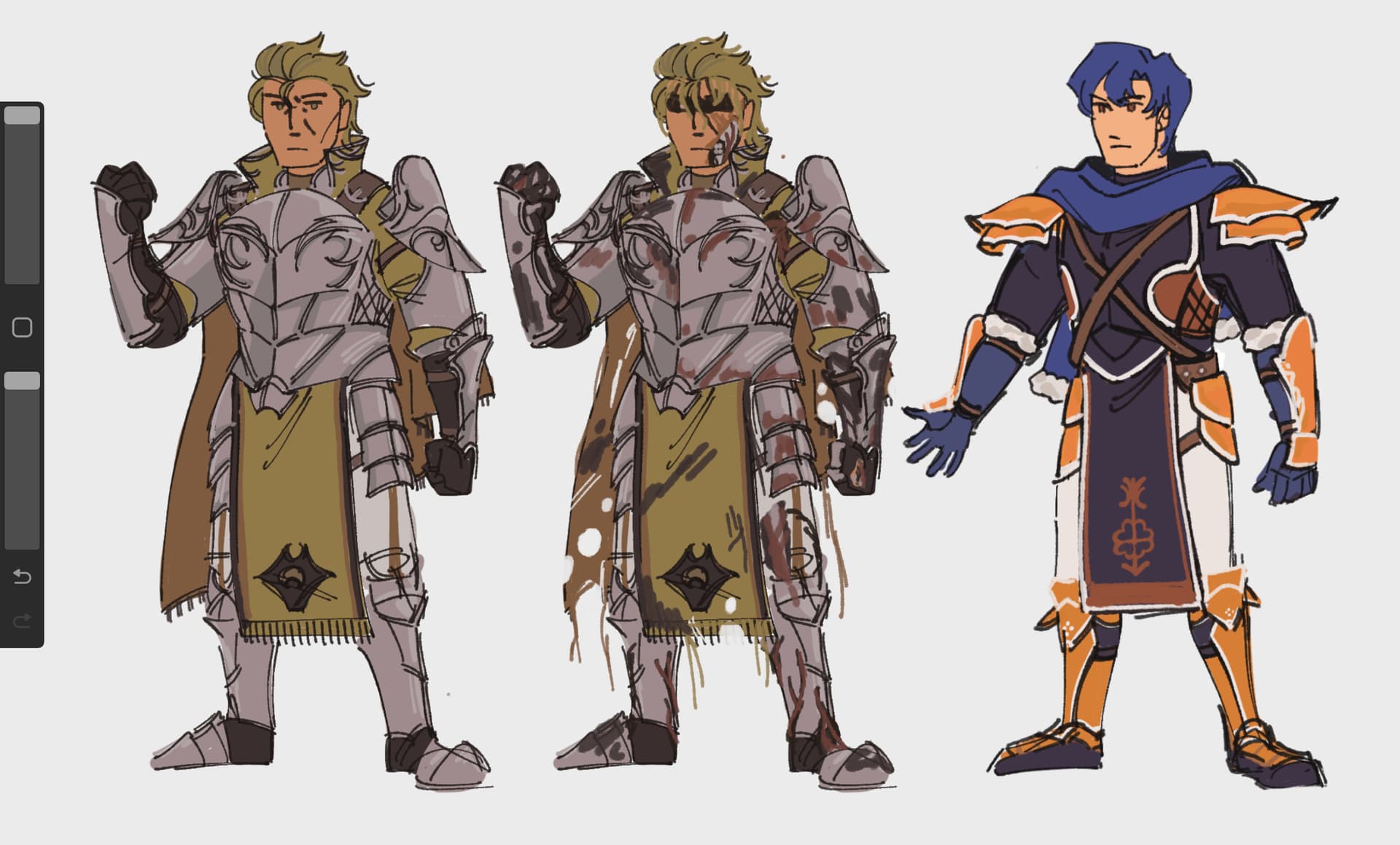
Full-body designs, pt. 2
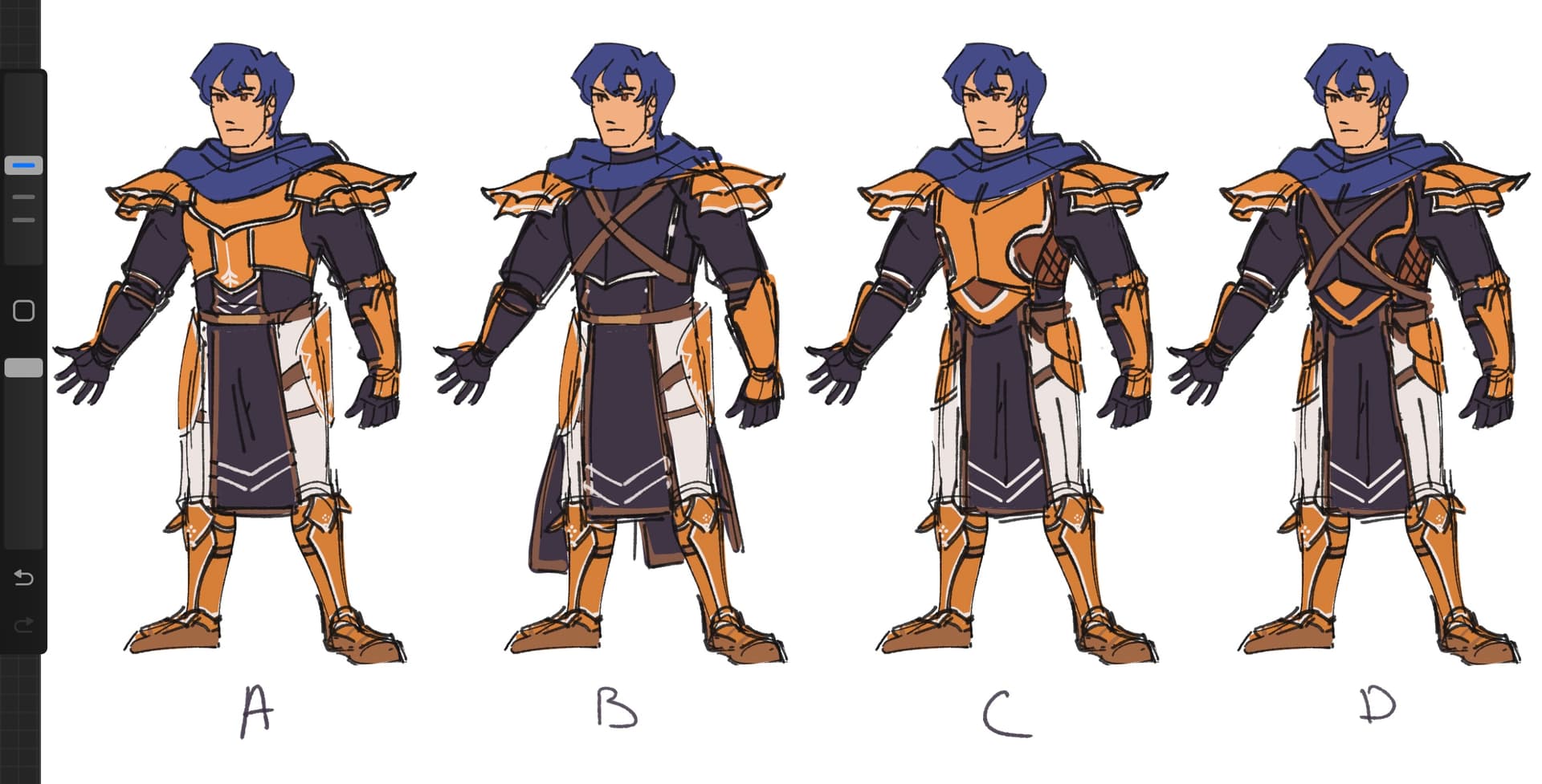
Freddric was designed by Gold, while Tarquin was a F2E mug touched up by Levin, so whatever full-body designs I cooked would be shown to them for approval. Tarquin was easy enough, mostly just needed to expand on his design while using some colors/motifs from Kenneth’s sprites.
Freddric, though.
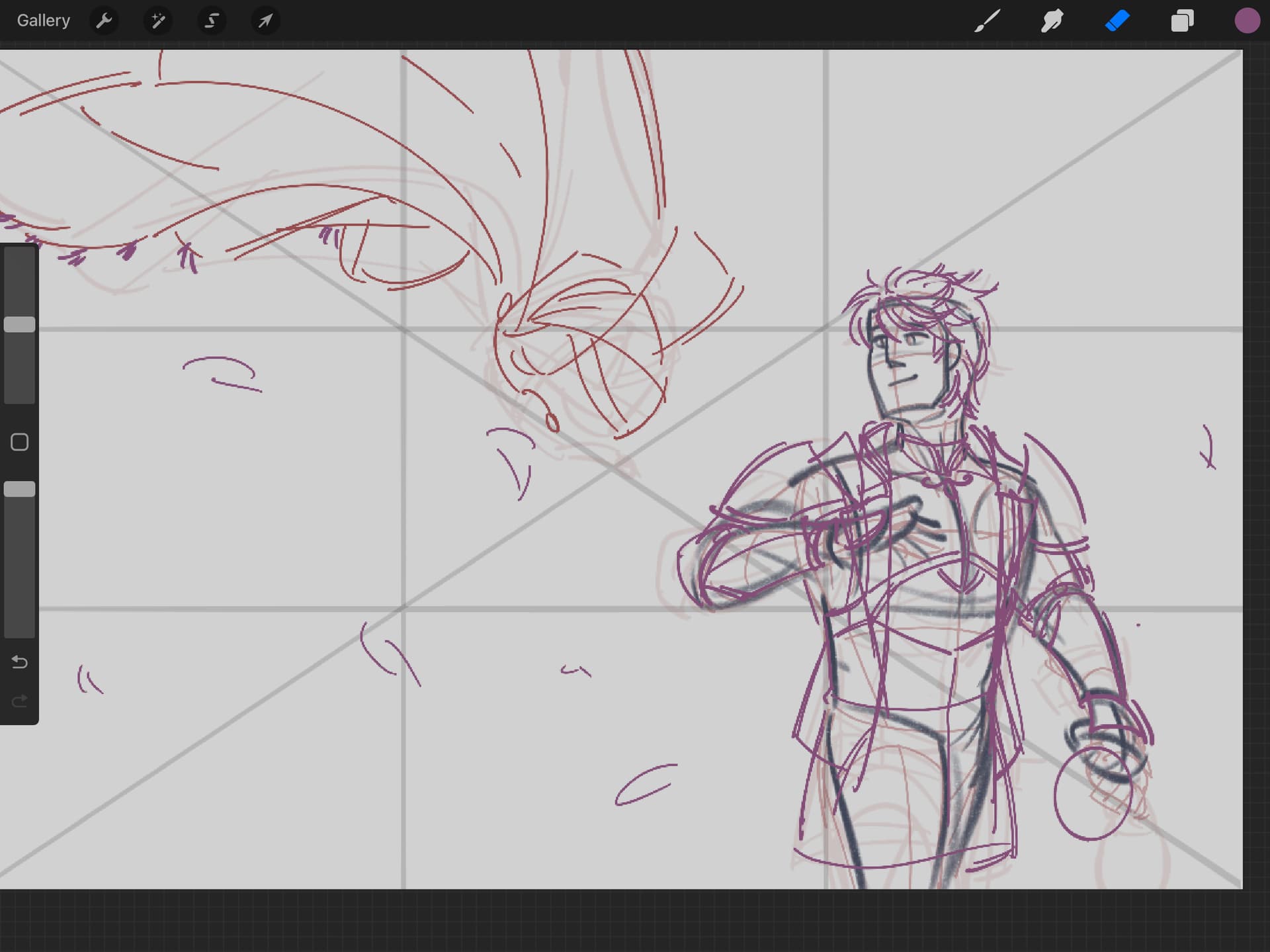
[REDACTED] concept art and design process
Freddric took—and I kid you not—three rounds of design iterations. When I draw Freddric for fanart, I usually take from his in-combat sprite; but for his CG, I would have to (of course) keep to elements in his main design, that for his mug.
In the end, Freddric’s full-body design mostly took from Gerome (FE13) when it came to his breastplate; but for the rest of his fit, I actually took most from Conrad (FE15). Yoinked how a lot of his outfit was visibly also made to withstand the cold and added fur trim to Freddric’s blue gloves. Later on, I made the ends of his scarf visible to show a fur trim for good measure.
So, these are our designs:
Tarquin got a second design as a deadlord/simulacrum, based on some feedback from Zappy. A lot of this didn’t make it into the final CG, though—because uh, I was worried about his design still looking legible once the color compression hit and didn’t want to add more main colors than I was already using.
I did keep the zombie eyes, though, along with adding some tears to his cape. In the concept art, the idea was that a lot of his armor would be burnt to imply Kenneth had killed the original Tarquin.
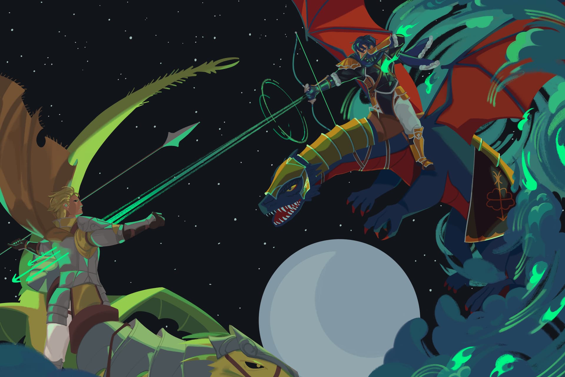
Wyverns are really difficult
Oh yeah, this CG technically has four characters: Freddric, Tarquin, and their wyverns. For the sake of shorthand, Freddric’s wyvern will be referred to as Beryl (her canon name, see: Postgame Tales), and Tarquin’s will be referred to as Cypselus. Cypselus is not a canon name, I want to make that clear—I literally just needed to name his wyvern anything so I didn’t keep writing “Tarquin’s Wyvern” all over my notes.
Anyway, while preparing to draw the CG, I drew… a lot of dragons. This included just studying how Switch FE modeled them, watching HTTYD (you know, super important and vital research), and doing studies of dinosaurs and GoT/HotD dragons as well.
It… really did not make much of a difference in the end, but I did jot down ideas for how the two wyverns differed build-wise. Again, strictly non-canon, but mostly for flavor to show that these characters are both from different countries and under different affiliations. This was also back when I thought I would be drawing the CG more zoomed out.
That’s the thing about drawing wyverns. You have to account for so many references, or at least I do: when drawing combat, I reference horseback combat videos; when drawing their bodies and heads, I reference dinosaurs or crocodiles; when drawing their wings, I look at bats; and in initial composition sketches, I looked at photos of hawks or eagles fighting each other in mid-air.
Anyway, Beryl was designed to be larger and more lithe than Cypselus. Her wings were designed to have a higher AR for longer flight duration, while Cypselus was designed to be bulkier, with wings that had a lower AR for navigating crowded spaces.
Their armor was easy to design; again, just expanding on their respective masters’ armor shapes. However, both Beryl and Cypselus also wear banners on their flanks to depict their respective affiliations: the Viridian Mercenaries and Dalst. …Cypselus’ didn’t make it in, but still.
Wyvern concept art
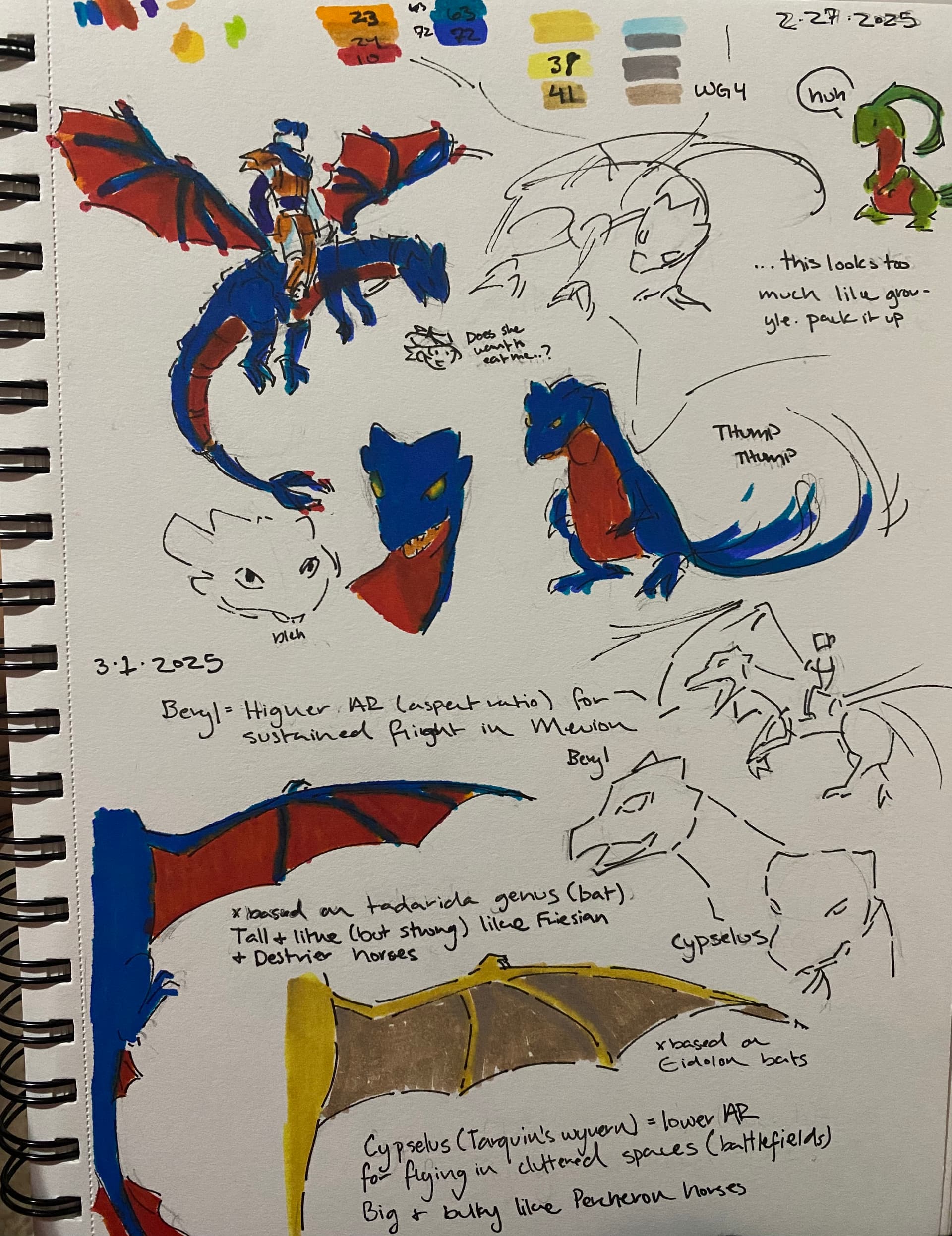
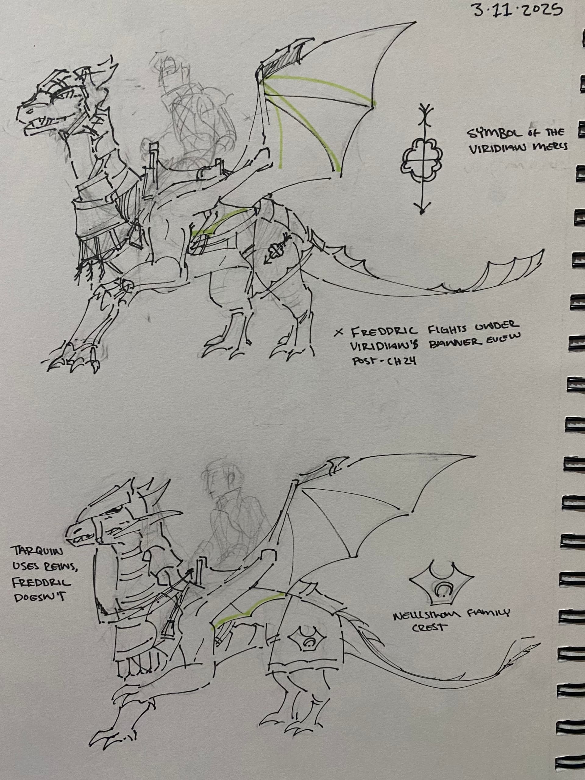
The little symbols on them are also seen in Freddric and Tarquin’s designs. The Viridian Mercenaries’ banner is a clover with an arrow through it, while Dalst’s was supposed to be a moon.
One more thing about the wyverns, though, is that they have different ways to be ‘steered’. For flavor. Cypselus uses reins, but Beryl doesn’t. It felt fitting, especially given Postgame Tales stuff, that Freddric just has that level of trust and understanding with his wyvern. …I almost forgot to include this in the final render, super glad I didn’t.
Weapon design
yeah this one just needs an entire spoiler section
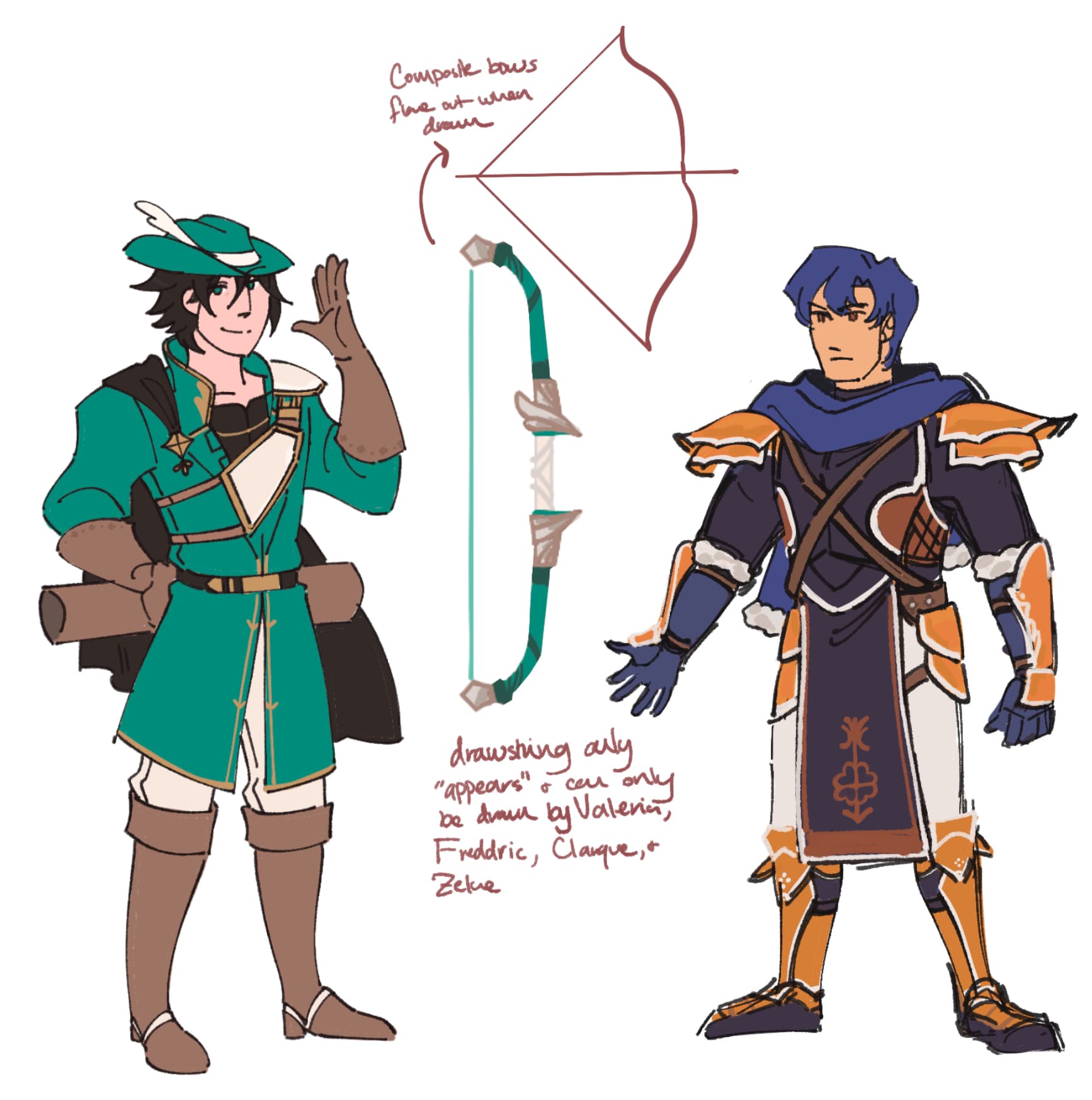
I also did a design for the Soulbow! I’m a sucker for magical bows, and the way that FE14 animated the Fujin Yumi is still very beautiful to me. Again, this is for flavor—so, this is not canon—but I had it so that the magical drawstring on the Soulbow only manifests for those who can wield it: Zeke, Valeria, Clarque, and of course, Freddric.
Seasoning and Flavor
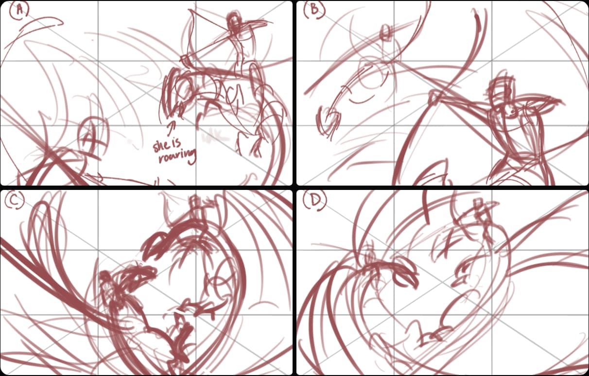
While the scene depicted in the final CG was more… “grounded” than Viridian and Zeke’s, I still had worked in quite a lot of symbolism, as I am often wont to do.
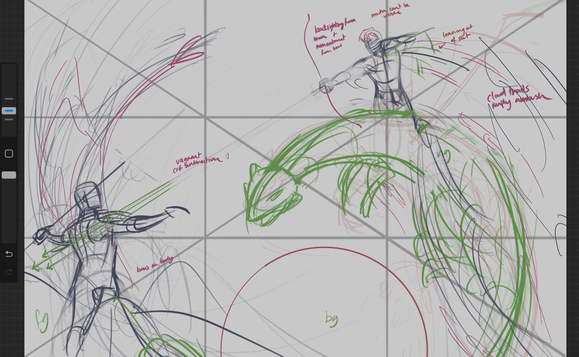
First of all, Freddric’s attack with the Soulbow. While his canon animation in-game is a simple flourish of the arrow, here, the arrows are manifested from the Soulbow itself—just as the drawstring is. I also wanted to make sure the CG showed Freddric winning the fight, not just attacking Tarquin.
Thus, enters one of my favorite ideas for the three CGs I did: reference Viridian’s critical hit animation. Have Freddric fire three arrows with unnatural speed and skill, and show them already having pierced Tarquin through his vitals.
I also wanted to convey a feeling of an ambush, and while looking stuff up I learned that when airplanes or animals fly through clouds, the shape of their wings combined with the speed of their flight causes wingtip vortices to form at the point of origin. That was perfect for what I was going for, so I made the clouds form a vortex around Freddric and Beryl to convey how swiftly they attacked Tarquin and Cypselus.
For the stars in the background, they are (vaguely, very vaguely) based on a star map of the Aquarius constellation because its two brightest stars, Sadalmelik and Sadalsuud, mean “the lucky stars of the king” and the “luck of lucks” in Arabic, respectively (Britannica).
You can also see some glowing wisps throughout the piece, some hidden in the clouds, but one right by Freddric’s chest. Ten of them, actually. These were to represent the ten fallen Viridian Mercenaries, as I couldn’t show who else lived or died in this scenario. Besides the light from the Soulbow, these wisps have the brightest values. I had also created a gradient map to be used on the credits version of the CG, both to consolidate colors a bit, and to ensure what I wanted to stand out, really stood out.
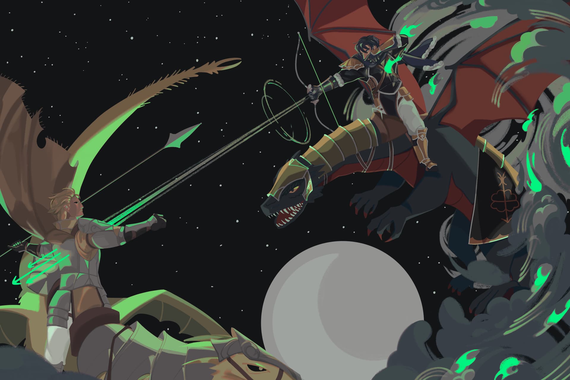
Freddric’s expression in the CG is conveyed only through his eyes. This was because I knew that whatever part of his mouth I drew, it wouldn’t be legible in-game, but also because I wanted how utterly vindictive Freddric feels right now to come across. The reference that I used for his hand also had the archer’s fingers in kind of a pointing position, something that I committed to because I felt like it really added to Freddric’s energy here.
The humans in this piece were undoubtedly the most rendered. The wyverns mostly had Multiply and Overlay layers used, since most people would not see the finer details—much less any funky painting stuff I pulled—in-game.
Now, because of the deeply spoilery nature of CG 3, the full version will also be hidden under a spoiler toggle.
The Freddric vs. Tarquin CG was undoubtedly the most complex, but I had tons of fun doing it. I’m also quite proud—and deservedly so, mind—of my composition and the sheer amount of characterization fit in.
Takeaways
- Don’t get too wrapped up in small details, that’s how you end up painting over lots of grass that’s gonna get compressed anyway.
- When you put love and effort into something, that WILL come across. I was so happy when people noticed little details and understood what I wanted to convey in my composition. I guarantee it that people will engage and notice stuff about the things you create.
- …For goodness’ sake, plan the main entities in a piece. A big reason why CG 3 went smoothly was because I had the foresight to plan everyone’s designs before jumping in, even if a lot of stuff didn’t make the final cut.
A big shoutout to Lumi for her guidance and advice on CG art, and of course, many thanks to Retina for having me! It was a joy to work on these CGs, and you should be able to see them in a future patch coming up soon. That being said, thank you for reading!