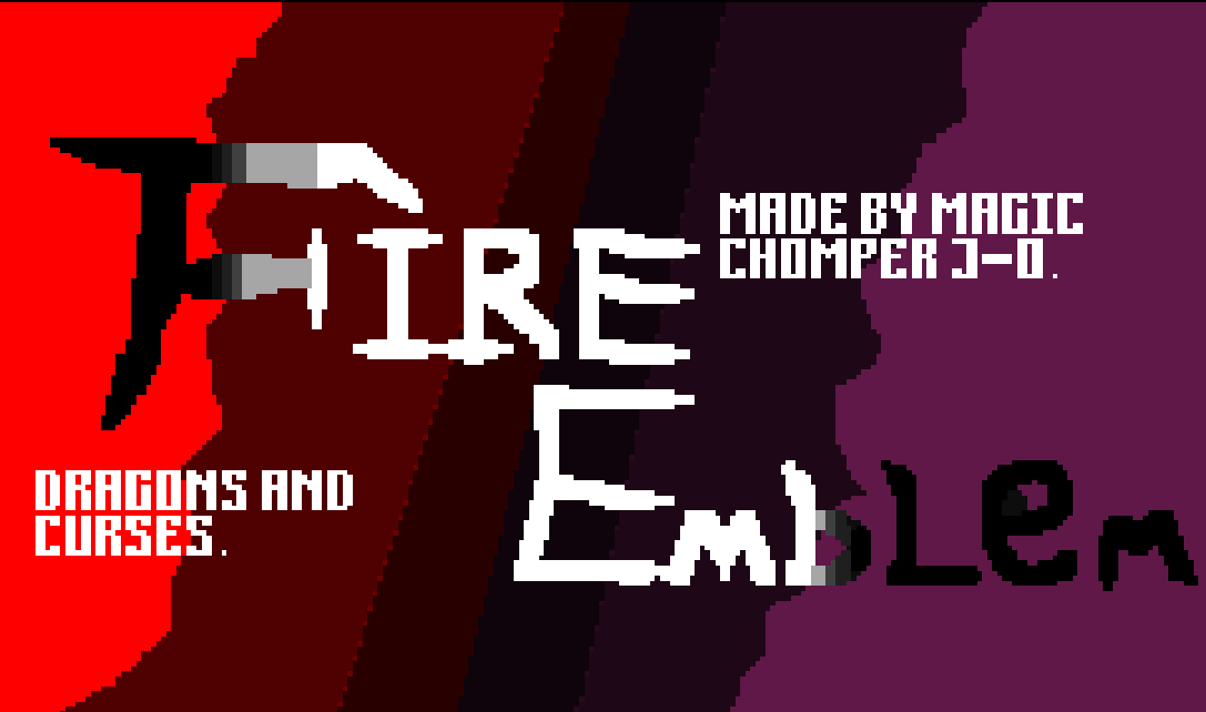
This is the title screen I just made for my mod.
I think it reflects what artistic talent I have on the computer.
Trust me I’ve made worse.
This is the title screen I just made for my mod.
I think it reflects what artistic talent I have on the computer.
Trust me I’ve made worse.
Hey it looks pretty good and I like the style you’re going for. I think it’d be improved if you capitalized all letters and made sure the heights are the same (besides the first letter of course). Also the positioning of the letters against the color gradient makes It a little hard to read, the ‘b’ in particular. I think it would make sense for the ‘F’ to only have 2 colors one for each background color it overlaps. The color to the far right doesn’t have enough contrast with the black text, hard to read that.
I think some dithering between the colors would improve it a lot, that way the colors dont suddenly hop from one to the other, if you get what i mean
Oh and maybe adding an outline around Fire Emblem would help it contrast against the background would help with readability