Accessibility: Darkening text windows in the GBA games

I’m a vision impaired FE fan. I really love that Echos, Shadows, and modern FE in general seems to be favoring black textboxes. I can mostly read the different windows in games that don’t have it,aside from the GBA trilogy. I know there’s a way to make the command UI gray, red, blue, or green, but even with filtering, I find it too bright.
So TLDR, is there a patch or value I can edit to make the GBA UI completely black?
In regards to specifics, the bright white of the text make it hard to read. I have a strong sensitivity to light, so darker background colors help a LOT. The gray color option is close.
@5, are those values I need to put into an editor, or hex code?

3 Likes

Editing the UI is pretty complicated (such that most hacks barely touch it, if at all). I don’t think there’s an easy way to make the game invert select colours in specific circumstances that would look acceptable.

There’s probably a way to do completely inverted colours, but that’s probably not what you want. Eg.

I know Huichelaar did a hue shift hack which lags the game and makes everything look like a disco.
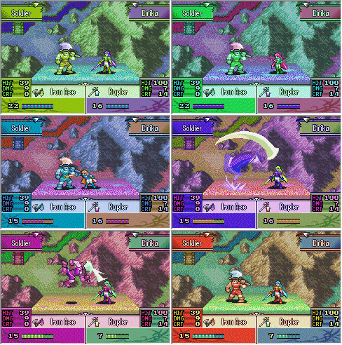
swag

You could also look into gba emulator settings / filters.

Sorry to disappoint you.
1 Like

I think they want a unit menu, battle screen, stat screen, and dialogue box palette swap. Is the palette data not readily accessible?

1 Like

In the case of GBAFE, the palette is broken down by location, so it is not possible to fix everything in one fell swoop.
However, it would be wonderful if such a patch could be created.
If people need that patch, they can install it and get an easier-to-read screen.

Can you give us some specific areas that are the most difficult to read?
Am I correct in understanding that the white background color of the dialogue is not good?

By default, the text of the dialogue in GBAFE is black with a white background.
When the demon king speaks, the text is inverted so that the text is white and the background is black.

The status and item fonts (Item font) have white text.
The background may be blue, reddish-black, or other colors, depending on the case.

How do you think it can be improved?

What about the status screen?
The status screen is one of the places that is customized for each work.
It is therefore difficult to determine which is easy to read and which is difficult to read.
Is the color scheme of the vanilla status screen easy to read?
Or is it hard to read?

Is there anything on the battle screen or on the map that is difficult to read?

I would appreciate it if you could give me some specific examples of how to make it easier to read.
I would like to know two examples, a bad one and a good one.

4 Likes

FE8U
Text Bubble BG: 0x9E84D4
Text Popup BG and Font: 0x59EF40
MMB BG: 0xA1738C

Item and glyph fonts: 0x59EF00
Serif text font: 0x59EF20

In the meantime, would changing these things help?