Yes : D
It took me awhile but i think I’ve completed it
The Manakete Version
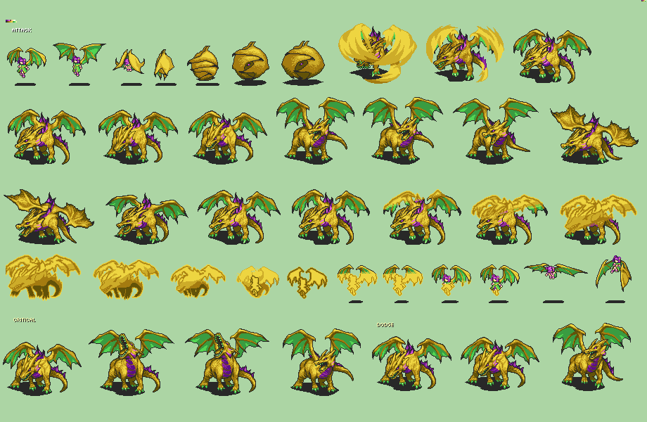
The Dragon only version
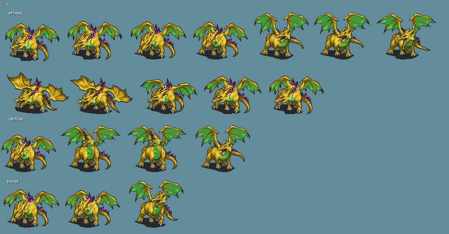
Is it good like this or does it still need improvement?
Yeah @teraspark that looks pretty awesome.
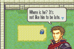
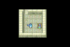
As for me, I started up a ROM hack in october and finally had enough to post a beta version in the projects section. I’ll leave a link to that plus a screenshot here.
Link to Forboding Dusk:
http://www.mediafire.com/download/xdnmug1n9rt62ep/Foreboding_Dusk_v1.1.zip
Some screenshots:
1 Like
I’m currently working on making maps for staff of ages. (Well, waiting for writers to give me something to work with anyway.) These are my personal favorites


I’m also doing portrait splices. Though, I don’t seem to have experience outside of making the cast of 7 into Eliwood.
It kind of seemed like you were looking for map feedback in the Staff of Ages thread. So, if you don’t mind, I’ll give some feedback on these ones you’ve posted.
The outdoor one has a lot of straight lines going on. The mountain is the most notable offender, but the rivers, cliffs, and light grass suffer from it, too. It gives the map a very artificial feel. References are your friend!
The indoor map suffers from two major problems: Height inconsistencies and linearity.
Take a look at the throne room. The stairs leading to it are 5 tiles in height, but so are the walls. That means units would actually be walking on the walls themselves, but the walls are casting a shadow onto the floor… If the walls and floor are the same height, walls can’t cast a shadow, nor does walls and floor being the same height make any sense.
In addition, the walls by the throne are 2 tiles higher than the floor, but somehow connect to the right wall that’s supposed to be as high as the floor.
There’s similar inconsistencies through the map, so remember to count your tile heights.
The linearity thing is a lot harder to tackle without a redesign. Plus, execution is a huge factor. So, I guess I’ll just bring it to your attention.
2 Likes
Thank you for the criticism. Those pictures are somewhat old ones (I posted this from my phone and didn’t have the latest on hand), but nevertheless I will work on them when I’m at a computer. I was wondering though. I’m pretty sure the outside one of can fix without reworking the whole thing, but would I need to scrap the inside one entirely to make it less linear?
I’m not saying scrap the indoor map. But, maybe consider massaging it a bit so that it can’t be reduced to a “really long hallway” type map.
1 Like

I know the top is kinda bland but this is the reworked one.
1 Like
That’s an awesome map, I really like its flow.
2 Likes
There seems to be too much redundant space in your map. I think you should build your map around the chapter goals. As of now, there doesn’t seem to be any incentive for the player to travel the various routes to the throne, assuming this is a seize throne map. I hope I’m making sense lol. Maybe try not having so many high walls as it makes your map really really huge. Usually the high walls are used to separate the outside from the inside.
I’m not the best at maps either so take my advice with a grain of salt lol. My maps are horrible and I’m still trying to re-work them. But these are some of the things I realize while working on my hack.
1 Like
The goal is Seize, yeah. I had talked it over with Zim who was putting it in, and we decided that the more direct path would have stronger enemies (a miniboss possibly), while the longer way would have some nice drops from the enemy. Also the boss has a ten use bolting, so I should perhaps add some columns to the long way? Any criticism is welcome.
@AlfredKamon thank you very much. It means a lot coming from you.
1 Like
boss has a bolting
I mean I was joking about that but I guess we can make that happen
1 Like
This is a solid improvement from the previous one!
I think you’re going to have to really think about how you’ll balance out the paths, though. The direct route is so much faster than the other two that they don’t hold a candle to it.
Maybe make the path challenging with powerful enemies? You could even set up some areas events on it. If the player seems to be traveling the short path, spawn some additional enemies to slow them down.
The pillar area in the lower left is a good place to have a recruitable NPC. Or, you could add a few chests. Make us want to explore the map!
I also second the idea of cutting down on wall height. Having such high walls makes you more prone to introducing height inconsistencies (compare the walls next to the throne with the walls by the immediately South.).
2 Likes

Alright so I wasn’t sure about the top left so we’re putting a MiniBoss there. He drops a nice sword.
For the short path there’ll be some insta reinforcements and stronger enemies. The middle path has stong enemies as well but you can avoid the boss and get an elfire (maybe, Zim will decide). The longer path has treasure and weaker enemies.
Outdoors one being updated
2 Likes
Nice to see this active again
Right now I’m messing around with the Eirika Lord animation;
This is what i have so far
![]()
3 Likes
So something that is resembling the artwork more? Color me interested.
After working on it some more i made another version of it
I’ll put them side by side for a comparison
![]()
Which one looks better?
I like the right one more
Right is more colour accurate, and the chest on the left is less readable. (The red lends itself much better to a larger less detailed surface, like the dress.)
Had to google to see which one was more accurate, this was the first google image response.
2 Likes
I want off this ride