It is her intended height, but it is mainly do to the Sophia Robes she is short. I agree that the robes are a bit flat and undetailed though, Thank you for the comment!!
1 Like
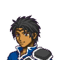
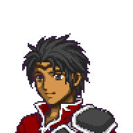
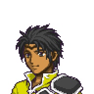
WIP ; )
10 Likes
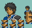
Been Awhile, but I made another one! : D
6 Likes
Any feedback is appreciated!
Immediately, the middle smiling frame is too far back, it should have as much in view as the others
3 Likes
is there a template for making the mouth flap sheets?
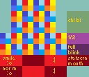
This is the one I usually use, I forgot who made it, but it’s in the repository I’m pretty sure.
3 Likes
ooh, neato. i downloaded that character portrait builder on a whim and i wanted to try my hand at making something that at least looks kind of nice
quick question what is the word that starts with S in the bottom right box?
It stands for “Statscreen mouth”, the mouth that will be displayed in the statscreen menu
As for the splice in itself, it’s a good one
I like the choice of colours and it is hard to tell to who belong the face originally
There a few things you might wanna correct:
Colours
-the number of colours exceed the limit,(19 colours instead)
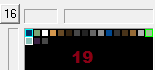
it’s probably a few stray pixel so you don’t have to worry that much about it,
I’d recommend using a program like usenti to make sure you don’t exceed the limit of colours
the outline is the black colour that separate your splice from the background.
Now the thing is, this splice has 2 differents outline colours: the one FE8 characters use (probably not all but the majority) and a darker one (you only need one)
Both can be used but I’d recommend the FE8 one, since it is easier
(probably one of the reasons why you have 19 colours)
Shading
overall, there is not much to fix, it is mostly nitpicking but you
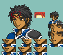
the transition between skin and hair (red circle) need more shading,
zeiss’s hair for reference
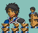
on the contrary, the neck has too much shading
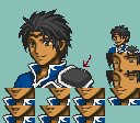
thoses two white pixels are not necessary
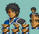
However you could put one white pixel in the left eye to improve it
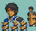
His eyebrows are probably not thick enough to have hair colour, it can work, but you’d have to make is other eyebrow thicker (I suggest removing the hair colour from the eyebrow)
Minimug and frames
I still strugle with that part so please take this with a grain of salt
The minimug is too small
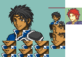
(the red line represent the height limit, and zeiss minimug for reference)
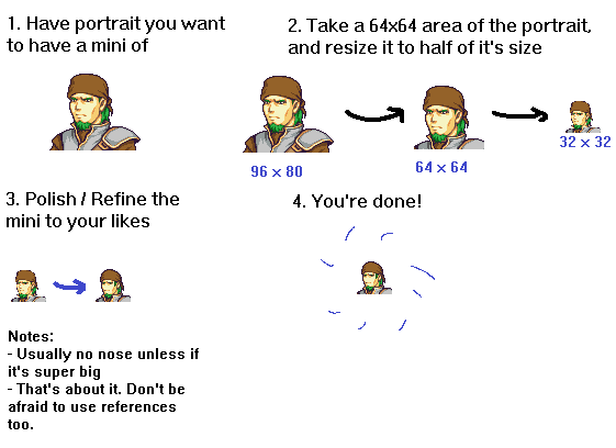
the max size is 32x32 so make sure you use the most of it
Your minimug also don’t have an outline which is important.
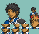
Finally, the halfway close frame have the eyes colours “outside” of the eye, I recommend putting a bit of shading just a pixel above to improve it
This might seem a lot but I truly believe this is a good splice.
Don’t forget the best place you can get feedback is the FEU discord
Please keep up the good work!
8 Likes
(post deleted by author)
3 Likes