I’m not going to even try past that pun, take art. I’m hoping to upload a laundry list of WIP gifs so that people can check back on this or whatever?????
Basically seeing process of people is something that I really live for and I’ve been trying to let people see my own for a while.
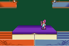
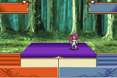
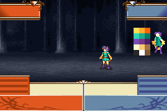
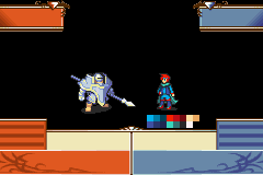
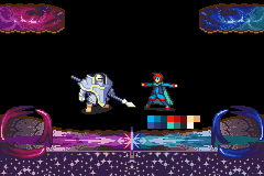
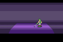
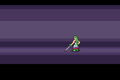
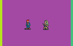
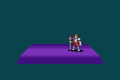
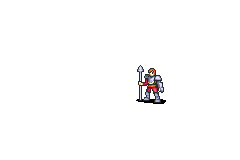
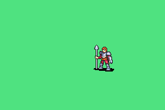
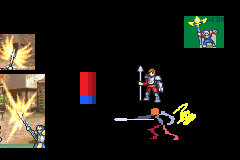
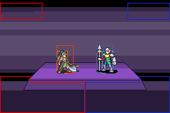
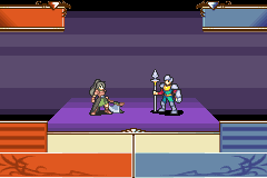
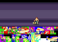
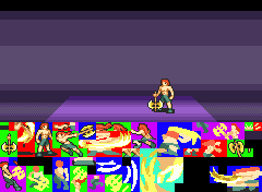
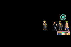
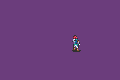
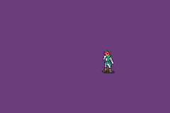
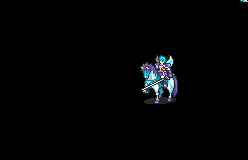
Tayhine Lustruv - Arcarius, Demoiselle

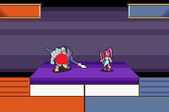
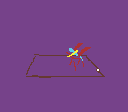
As one does with any horse edit, take horse and isolate horse. Leave in sword ranger for funny times.
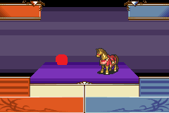
Then, to horse, append rider.
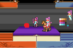


Have a little fun because oh my god this is such a good horsie you gotta give it some petting.
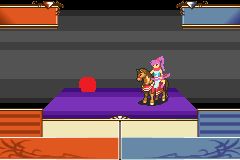
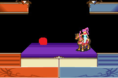
Continue laughing at horizflipped sword ranger. Test how elastic you want the bow to be after firing, as well as see how good Jugdral animation was. It would be sooo cool. But no. Of course not.
////
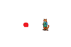
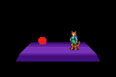
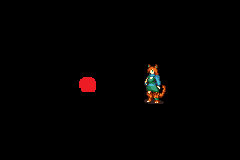
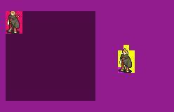
Lestra - Keeper
(This mug with many edits by Aeorys, Hoshihearts, Elise; I’m not good with mugs don’t mistakenly think that I am)
(This animation was helped along by BwdYeti giving me a sketch – I couldn’t figure out how to position her completely correctly since she wields Light and Elder magicks.)
///
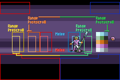
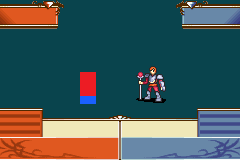
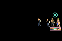
Eliwan - Lord, Erudite

////
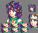
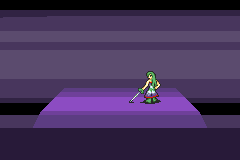
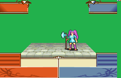
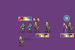
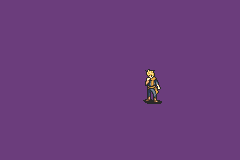
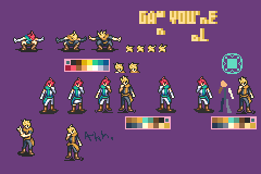
Lydiiav - Heiress, Freeblade, Wanderer
So, Heiress. The first animation I ever made that I stayed proud of.
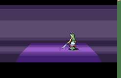
Look at how bad it is. I had to fix the problems here, but I just still like the animation. It works.
There were lots of little idosyncracies here that I needed to fix – First of all, I needed to make the palette better. Lyd’s dress is supposed to be a smooth gradient from green to white to purple, and I didn’t even have a true purple. Maybe I had learned enough tricks in the intervening years to smooth it out; was my hope.
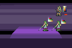
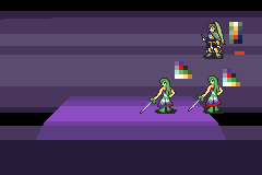
…Yes, I never put the dress on those last few frames. I’ll probably do that right after I make this post, now that it’s fresh in my mind and low-effort.
Oh, and there’s this thing. I’m not talking about it.

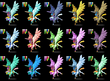
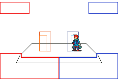
Going to awkwardly past this one in here – It’s my model ref for her colours across various weapons/outfits. My idea with this one is that, since she’s a lord, she can have her own custom palette for each of her animations; and thus not have to be worried about fitting all her animations into the same 16 colors – so I can afford to make each of her Prf weapons have an on-model appearance.
Which, because I am a nerd who cares about this, I will be.
Fencer by LordOfGabrielKnight. I just drew over half of it and spliced other ideas into a personalized critical. (Which is funny because Fencer itself was an animation splice between many different classes)
////
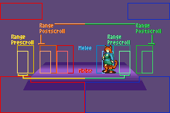
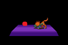
Wirym, Shapeshifter


///
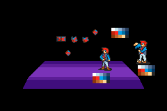
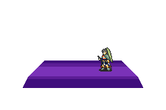
Tayhine Laostrier, Nymphomaniac
You’re not allowed to question her class name, why she dodges by jumping, or what was going through my brain with that heartpulse critical windup.
////
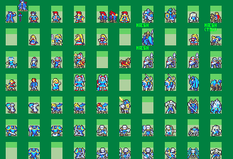
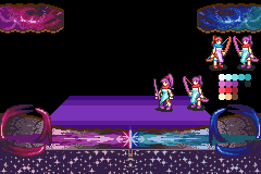
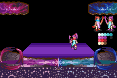
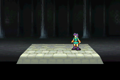
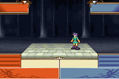
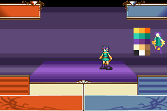
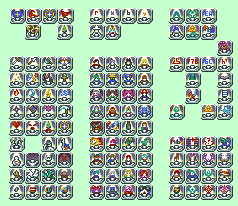
256 tile animation
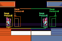
This is a contest that me and @Tsushi / @Tsushima constantly kept iterating through. The premise is rather basic – just make a full battle animation using only 256 graphic tiles (one sheet). Of course, this is exceptionally difficult, but there are a large number of tricks that would be possible if one could manually place animation tiles down the way that intsys’s system enabled. (For example, the Cavalier and Fighter put their weapons down on top of other graphics, thus making “layers”.)
256t - Caster
256t - Spear
This one, actually, was really embarassingly awful. Just… pathetic animation. I almost want to not upload it.
Like, so bad. This barely qualifies as content.
It’s also like 264 tiles or something, not 256.
Tsushi then actually made me a map sprite for this class – and it was really cool.
So I thought that I should probably just change gears, and make a cool animation instead of trying to squeeze it in – and then I realized “I should change the whole thing not just part of it”, so thus my Sentinel was started –
(Yes this is as far as this one’s gotten.)
256t - Axe
////
Mage Bandit (Generically positioned to be able to look right with both Anima and Elder magicks; Black Mage refined most of my keyframes and helped me splice together better inbetweens here)
Illusionist (Elder-wielding Thief)


And the finished one –


These were for reference and fun respectively – since the same-ish process happened for the girl, right down to needing to tell people they’re adorable.


Hussar (Sword Mounted Expert, Knight Lord edit - I didn’t save any WIPS of this one but since everything but the crit is just a straight redraw I think nothing was lost)
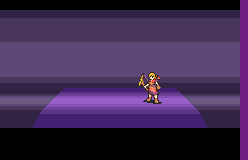
Militia (t0 archer)
This is old like four years old
![]()
But it’s still the same?
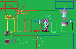
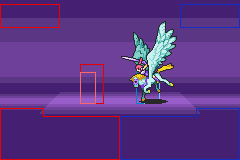
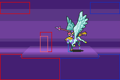
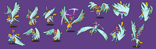
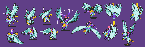
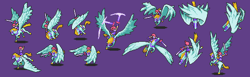
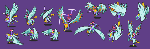
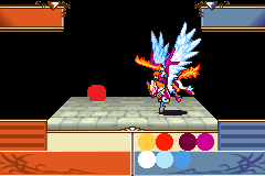
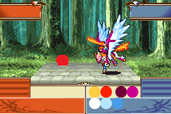
Astra (Light-Sword Pegasus)

///
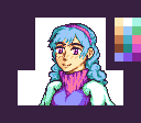
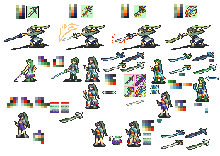
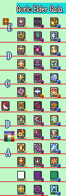
A mug that is actually mine that isn’t a total embarassment to the fact that I’ve been making FE sprites for a decade.
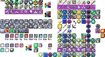
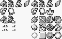
I have so many weapon icons to post that, uhhhh
![]()
![]()
![]()
![]()
![]()
![]()
![]()
![]()
![]()
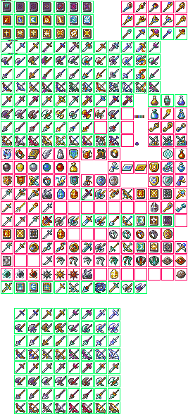
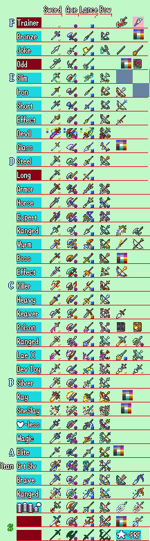
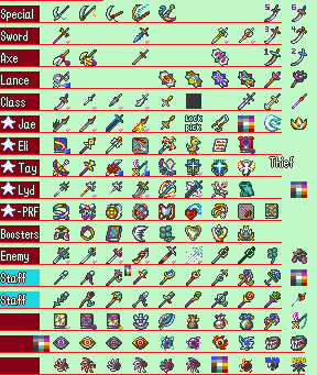
This is a tutorial in the sense that it walks step by step through how I draw weapon icons.
I don’t actually put the things on that divided background, but I keep it mentally in mind so it’s pretty much the same?
There’s someone to blame for all of these and only one of those persons is me.
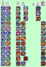
I could and should crop the icons away from their text but I have literally been typin this post for over an hour already so I just don’t feel like this.
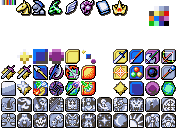
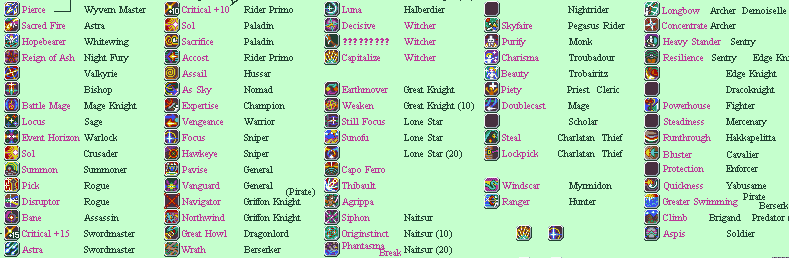
Type icons at the top are primarily drawn by Black Mage (Horse, Armor, Wing; as well as style help with Terror/Monster, Book/Mage, and the crown.)
Affinities at the bottom are the 22 Major Arcana and are drawn by @SEVA.
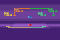
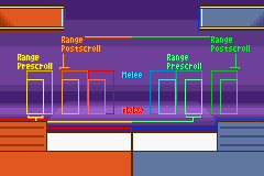
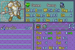
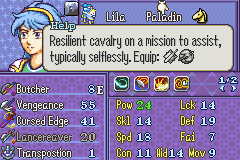
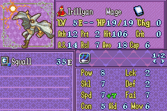
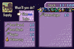
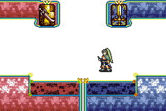
And hey, text font this time – speaking of text…
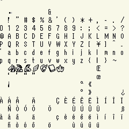
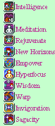
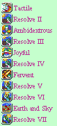
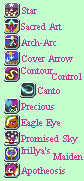
I gotta be space-efficient and make very very narrow things, right?
And practie my cursive a little I guess? Something like that.
But hey, super ultra tiny font… Where else could one take advantage of something like that?
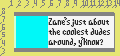
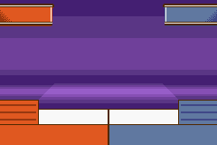
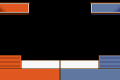
Why, these UI panes, of course. So I started seeking out nice ways to fill them up and this is my best attempt so far and I’m not actually that big of a fan of it.
////
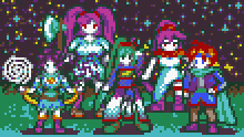
Starheart’s five lords all in a single unified place and color. I had tons of fun making these and all sorts of variants on it –
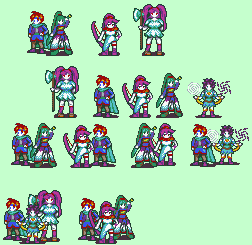

Nonstandard sprites are just enjoyable at a point because I don’t have to concern myself with any particular precident and can just do…whatever.