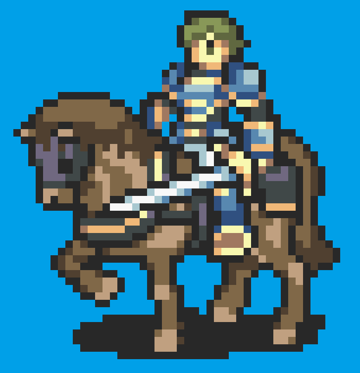
So I’ve been trying to change up the palletes of some of my units, and I realized that I have no idea on how to make a actually good palette. This is the palette I made:
 Look at it, it’s disgusting!
I’m trying to make her look like this portrait I got from the Ultimate Asset Repo: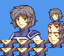
So, any hints or advice?
1 Like
You can go to Image Editors -> Battle Animations -> Generic color for reference, in case you need a reminder where in the palette each color is (such as where hair colors are), but generally speaking you don’t need to edit the first and last colors. The colors tend to go from lighter to darker, so you should maintain that order. Some image editing tools also allow you to select colors (on the portrait) and see what their RGB (Red, Green, Blue) values are. You can use those as reference when making a custom palette.
Edit: I fixed a typo.
2 Likes
Above is correct, I usually modify palettes in FEBuilder so I can see what I’m changing, and I can adjust the colors without saving to see which is which. Once I do that I just change the colors to the portrait.
1 Like
 I managed to make
the hair look good, but how do I change the color of the little strap thing she’s wearing without changing the color of the bow?
Palettes are limited and as such some parts share colors. I can’t remember on the top of my head if the strap and the bow share color(s), but if they do there’s not much you can do about it. If they don’t, see where in the palette are the colors for the strap and edit those.
2 Likes
They’re the same, but I think that this palette look pretty decent. I think I’ll keep it like this.
Thanks for the help!
For some advice, it’s important to keep the sprite’s contrast in mind, generally you just want to tweak it until it looks “official”, enough. In your case, the palette for your archer looks much better than before, but the first and second shade of hair look very different, and the clothes could use a little more red to match the mug’s armor being slightly tinted purple.
And yes, iirc for archer, strap and bow share color.
I’d make a palette as an example, but I couldn’t find the female archer on emblem-anims aside from DerTheVaporeon’s upgraded variants, which I don’t know if you’re using or not. I think they share the same color order, but I’m not certain.
My rule of thumb is to take the portrait colours, then make them brighter and more saturated and contrast a lot more. For example, consider Lyn’s portrait in which her hair and clothing are only slightly differing shades of muted cyan, but in her battle sprite they’re a very bright and clear green/blue, making the battle sprite “pop” a little more.
2 Likes
Yeah I’m using DerTheVaporeon’s archers.
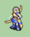
Okay, I made the palette way better now:
I think this looks perfect.
I also did the same to my cavalier:
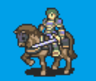
Not as good as the archer, but it does the job.
Adding on to what Alusq and serif said, I personally think the main point to consider is to make sure that each color ramp has enough contrast between the shades, otherwise the colors all muddy together into what appears to be an unshaded blob. (For example, in your Cavalier palette, the hair shades don’t have enough contrast between them - I would personally suggest making the darkest shade darker and maybe would want to boost the saturation on it some.)
For me, the colors don’t need to necessarily be bright and saturated, but they simply need to be not close in Hue/Saturation/Brightness so that you can clearly tell them apart. I’ll often use a color dropper on the mid-shade of a portrait (usually, but depends on what shade is most promient or how dark they are) or even a piece of official artwork and then manually adjust the HSB to make the lighter shade and the darker shade (assuming an average ramp of 3 colors).
It takes some trial and error to make sure the colors are separated apart enough, but it works for me as a method. (I tend to usually increase/decrease brightness by +/-10 to start and keep changing until there’s enough separation.)
Using Lyn as an example, I made this goofy mock-up ~3 years ago - it doesn’t pop as much as the FE7 Lord sprite (though that had to compensate for no backlight on the GBA), but you can still make it work for color ramps that aren’t as saturated:

2 Likes
I really didn’t understand most of what you said. While I’m pretty good at english, it isn’t my first language, could you explain it in smaller words? Sorry.
Also, my cav was way better before, I just forgot to save it like because I’m a idiot.
I tried fixing him, what do you think?
Assuming a 3-color group for a part of a battle sprite, you want the colors to be visibly distinct enough that they don’t blend together.
The mid-shades are the same, but the palette on the right only has the lightest color start 10 points brighter in brightness (0-255 scale) and the darkest color started 10 points darker (and then the RGB values were readjusted to be multiples of 8 for GBA use).
In this instance, the contrast between the shades isn’t high enough so you can’t see a change in shade easily between them. The lightest shade would need to be lighter and the darkest shade would need to be darker, as was the source palette on the left that was taken from the image of Lyn I posted.
Couple of problems here.
- When zoomed in, this is what the sprite that you posted looks like.
Notice how blurry and artifacted it is? It’s very hard to accurately judge when it’s not pixel-perfect. This is a zoomed in screencap of the SALVAGED Cavalier straight off of the repository website (minus the palette changes*):
It probably looks fine on your end and was just how you took the picture of it, but it helps to always take images at a regular 1:1 zoom (100% zoom) so that they look exactly as they should. We can always zoom in ourselves.

(*I changed the hair and cloth on the horse to be similar to what you posted. More on this below.)
- For the palette itself, you’ve got the armor/sword colors reversed (light shade where the dark shade should be and vice-versa). I applied the hair and cloth colors that you had (or as close to them as I could get) to the base sprite and tweaked them to give more contrast, as I was trying to explain up at the top. I made the darker shades a little darker so that the colors stand apart a little more (and then I lightened the lighter shade on the horse’s cloth). I did not change the armor in what I posted due to the colors being switched on your image.
3 Likes
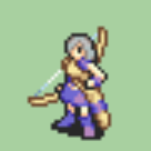
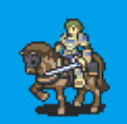
Ok, I once again tried to fix the armor, the hair and the horse’s cloth look good to me,
but my biggest problem is the armor.
Here’s what it looks like now:
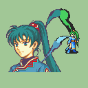
I’m trying to make him look like this portrait: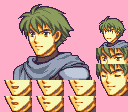
First and foremost, you’ve got the lightest and middle shades of the armor both being the same color. Secondly, I’d suggest making the color that’s currently the darkest shade of the armor be the middle shade instead and make new light and dark shades for it. The current middle/light shade is close for what I would make the new lightest shade, but I’d lighten it a little more.
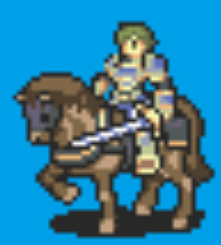
This is what I would do for it as a starting point:

I still honestly have no idea how this thing works, the palette is way too confusing to me,
no matter what I try to do, it ends up like a complete mess.
It’s not your fault, I just suck at this.
oh hey I did a salvcav palette for that exact sprite for another project
lemme see if I still have it
glenn’s points about palettes are spot on, I don’t have much else to add that he hasn’t already said
1 Like