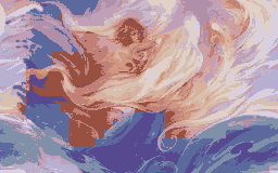
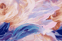
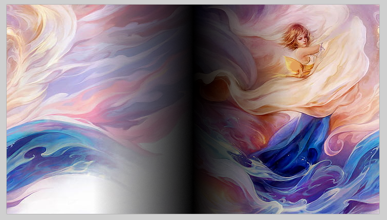
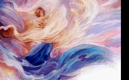
Here’s a colour and monochrome version, since keeping that much detail and colour with 16 colours is dicey. I don’t mean to do your work for you, but it was a fun exercise figuring out how to do this in Paint.nеt (this is not a url goldammit Discourse stop trying to make it a link).
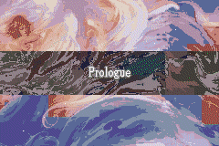
Slice the image in two and flip them so the left side is on the right. Put them on a new layer over a black background and set their blending to “additive” (meaning black=transparent). Add one more layer and put a black-to-transparent gradient so there’s a black bar in the middle of the images. Merge the non-background layers together so the black gradient is merged with the image. Select the right half of the image, cut, new layer, paste on top, and move to the left until it aligns neatly with the left half. Flatten, crop, and resize.
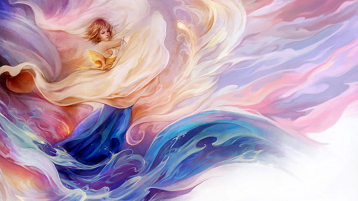
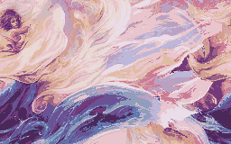
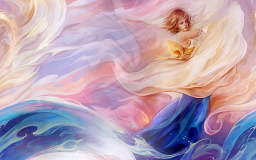
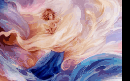
Maybe there’s some way you can get the image to display with 256 colours, but I assume 16 is your goal. It’s just not going to look great doing a straight colour crunch, so let’s convert it to black and white and do some crude painting!
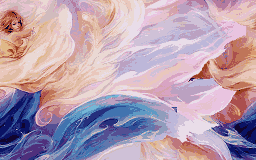
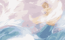
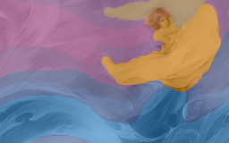
Now that I’ve got some primitive blobs down (with a partially transparent layer so I can see what I’m doing), it’s time to shield the world from my wonderful artistic talent and add effects.
I use the “crystallize” effect to make it look less like obvious paint brush blobs and “Gaussian blur” to smooth it over. After that, I switch the layer to use “overlay” blending before merging it with the black-and-white image underneath.
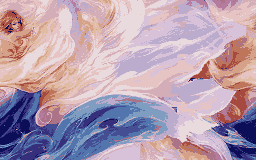
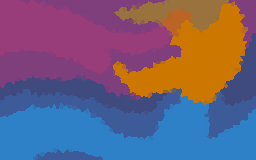
Reducing the colours: I use “posterize” to reduce the colours of both the top and bottom layer. It’s still not enough. I flatten and save the image and open it in Usenti, whose colour reduction is much more reliable, and use “requantize” to reduce it to 16 colours. I also did some fine tuning: desaturating the blues because the blue I used for painting was way too blue, getting rid of a weird obvious red colour that stuck out among the more muted ones, and cleaning up a few obvious blocky bits.
Oh wow. Thanks everyone for doing it much better than I would.
Alusq, I really appreciate the explanation. I thought gradients might be the way to do this, so I was on the right track! I’d tried, however, and it wouldn’t let me process/flatten an indexed image with gradients (of course, I spent a while applying a bunch of gradients to an image that wouldn’t let me use it). In retrospect it makes sense that you need to apply gradients on the non-indexed version and flatten it first. Still, though, I was having a lot of trouble making the gradient transition the two parts smoothly, so your instructions are very helpful.
Not a problem. Something like Photoshop could probably do it more straightforwardly, but I’m so used to working with PDN’s logic that making stuff like this is a fun puzzle.