Armo's Stuff

Hello Everyone, Armory here, I’ve some stuff here which is all F2U. If you wish to use these for a project, then go ahead, just remember to give credit. I mainly make these for fun so check them out, I feel I’ll improve as I make them.

This OP will be updated every so often with more stuff.

Anyway!

F2U Portraits

MurtaghRedhaired BanditMageSilver KnightRedCavalierGreenCavPirateXander NewOC 1ThiefgirlJasmineOC 2OC 4Splice1Splice2v3Evil guyKnight girl 2Merc-Brigand-FighterguyMyrmidon girlOrange Cav guyArcher girlArcher-Merc girlGreen Hair MonkKnight girl 1WyvernRiderguyAngelPeg Rider

F2U Maps

FEFields 1

FEfieldsmap2

FEFieldsmap3

None F2U Maps

Castle Map 1

Fort Map 1

F2U Tilesets

Tileset Palette FE8ArmoryPatch.GBA_Additional style (Ch20 River of Regrets)(05 06 06 05 00)

Tileset Palette FE8 Darkling Woods

Dropbox link for everything including map formats:
Armo’s Repo

Please give feedback!

17 Likes

They’re quite good, I’m not experienced at spriting so I can’t say more… sorry

2 Likes

Alright my friend, I don’t consider myself an expert at spriting, but I’ll do my best to give you something to walk home with. I’m going to seperate my critiques by character and any overall comments I have I’ll keep for the end.

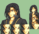
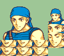
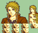
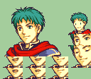
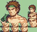
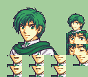
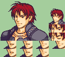
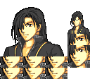
#1, The Dissaproving Bandit: I like the facial expression, dunno if that’s custom or not. I think the widow’s peak could be a bit lower, imo he looks a bit too bald at the moment. The outlining is pretty messy all around the face and eyes plus I don’t know why you have random different colors of outlines at the shirt outlines, but it looks very weird and making the outlines one color would solve that. He has potential, but needs a lot of cleaning up.

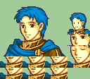
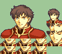
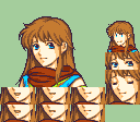
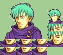
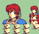
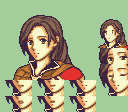
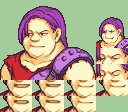
#2, Probably The Main Lord: It’s hard to tell, but I don’t think he has any eye color, which only makes the pitch black outlines more offputting. Speaking of, I don’t think the pitch black outlines works here, especially if you want him to be consistent with #1. And listen, I used pitch black outlines a lot myself so I know it’s tempting to do, but ultimately it makes the characters look out of place when put next to any vanilla GBA character… There’s also a lot of messy coloring around the edges of the jacket and the shirt inside the jacket. His head placement is a bit awkward, but it could probably work. His color palette is also kinda boring, a bland yellow with a frankly ugly brown. If you made his colors more lively (something that’d pop out to the viewer instead of something that is boring) and cleaned him up, I’d say you’d have something good there.

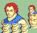
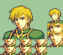
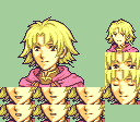
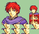
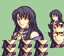
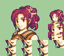
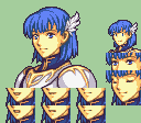
#3, The Certified Edgy Myrmidon: So I like the black and yellow color scheme, I think that works. On top of that, this one is the most clean out of all the ones you’ve shown here, that and with his strong facial expression, I’d almost wouldn’t believe that it wasn’t vanilla if it was in one of the vanilla GBA games… Almost. There’s some weird splotches of black outline all around the shirt and the grey around the edge of the shirt blends in a little too much with the black; That one is a simple fix, just make the grays a bit lighter so it contrasts better with the rest of the shirt. I also think there could be more yellow on the shirt (so like a bigger yellow design on the shirt) to make the yellow part of the black and yellow palette stand out more. The black looks a bit washed out as well, but I dunno if you could make that any lighter/darker without it blending in or standing out too much with the outline. I like this one a lot, it’s the best out of the three, but it could still use some work.

So, overall I’d recommend you use colors from the vanilla GBA palette, or at least colors that are more lively than what you have now. I understand some people are slaves to vanilla coloring and they don’t get that sometimes the vanilla colors just don’t work, so I can get why you’d want to experiment, but doing so should be looked at as a backup option if you can’t find a vanilla color palette that works with what you’re going for. They all need some cleaning up before you put on a hackbox, to put it bluntly; If the framework is fucked, everything else will be fucked by proxy. But in the end, I think you’ve got a strong start to these and I’m sure with some polishing they’ll look amazing!

4 Likes

Woah! Thanks for the very detailed reply.

#1, I actually used Jerme’s face, but yeah I can get why you think its custom haha, forgettable character and I thought it would suit well, I’m not sure what you mean by the widow’s peak, I think you mean the hair? The outlines on all of them are sorta pretty messy too so maybe I need to use outlines from Vanilla.

#2, Yeah I get what you mean with the eyes and outlines for this one, maybe I’ll go over it and change it up abit including the skin too maybe.

#3, I agree of the 3 this is the cleanest looking one, again with the face it is vanilla but I wont spoil which one it is haha, and again the outlines on this one I understand I think I may need to just give it more colour.

Thanks for the very detailed reply, I’ll keep reading over this when I rework them at somepoint the next few days.

3 Likes

I love the 3rd portrait ^v^ black long hair swordmaster with black coat ^v^

1 Like

Haha thanks, I think it’s probably my favourite one instead of the 2nd now, just need to fix up colouring on it when I get the chance.

Hello!

You can get the hackbox template here, there are also some tutorials that might be useful for you to start.
You can also ask for feedback on FEU Discord server, here’s the link to the thread for the server invite.

I think this has been said before, but I suggest sticking to vanilla palette to start. When you’re already comfortable with it, you can start experimenting with your color palette. Some guidelines:

  • always stick to 5 colors for the skin
  • clothes usually have 2-3 colors
  • always try to clean your splice after combining the parts

I wish you good luck for your spriting!

1 Like

Thanks for the reply, I’ve joined the Discord Server so at some point I may post my sprites here on there.

I’ll go over my sprites and use vanilla colours where I want them, thanks for those useful small tips.

1 Like

Worked on the ‘Certified Edgy Myrmidon’ as titled by @CranJam, changed skin colour and added shading, looks more finished now than it did. Should I work on it more? Probably not, I’m more or less happy as it is for now.

Swordmasterguy2v2

1 Like

Wow, I like him so much, will him be F2U?

Yes, everything that I make will be F2U, all they will need is hackboxes which I have yet to figure out how to do.

Just remember to give credit when you do use them.

2 Likes

I may try to do the hackboxes…

1 Like

Here I have one… It’s not perfect but I’m proud of It.

pixil-frame-0 (22)

2 Likes

Fixed his eyes:

pixil-frame-0 (23)

2 Likes

You’ve made a start at least, nice job on the minimug, I’m sat here figuring out how I would do that myself.

1 Like

Thanks! Even I didn’t do nothing but move pieces of the sprite, all the work is yours.

2 Likes

The next one will be the second portrait (this boy) Swordmasterguy1

1 Like

You don’t have to do that one just yet, I’m going to back over that one and change things after I’ve fixed up the bandit guy.

Ok, anyways, I don’t like that bandit, he looks like he has just ate your young brother

1 Like

Haha! Fair enough.