Apparently GPS and holograms is a medieval thing.
The people on this board would have made a better one.
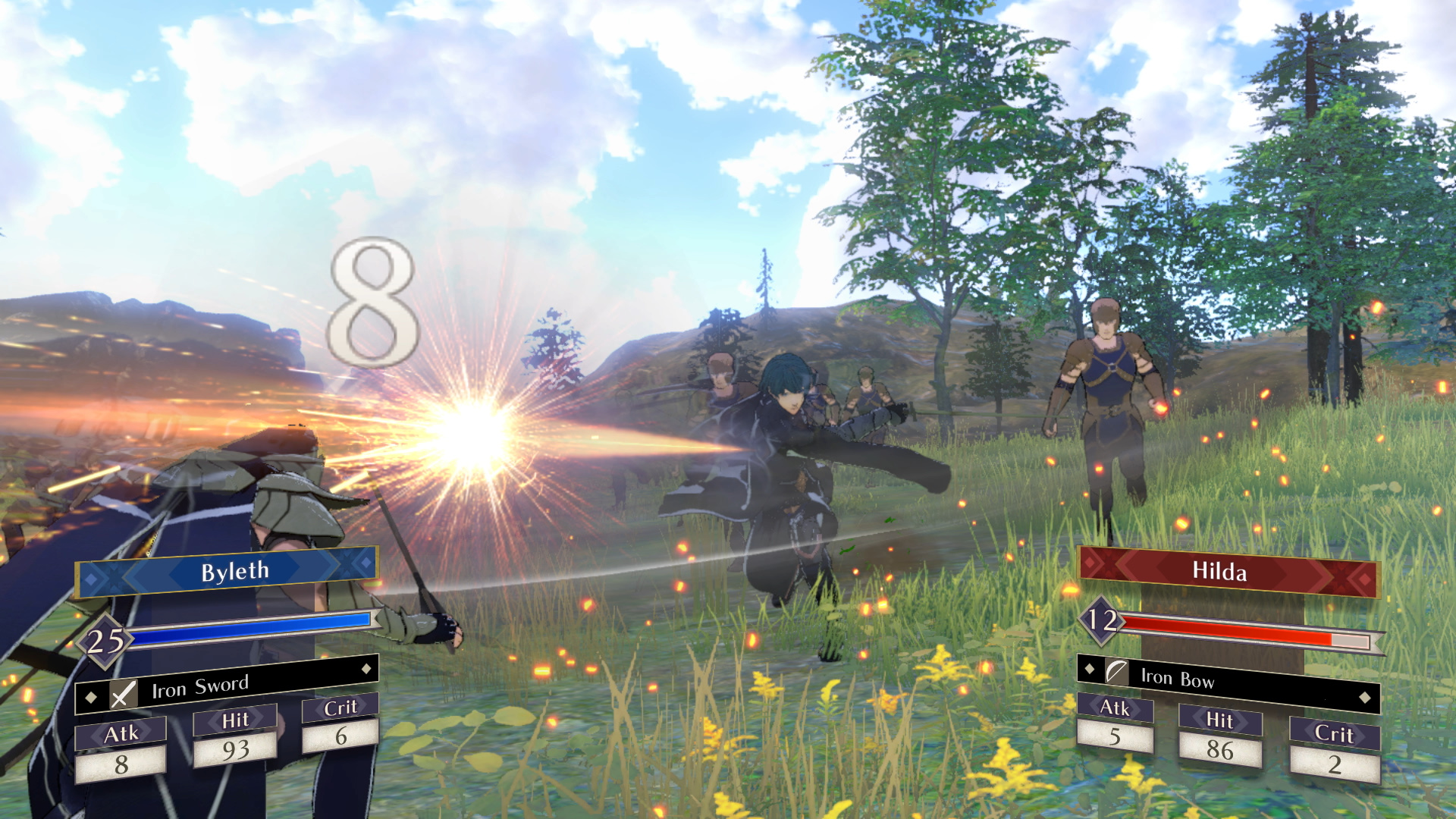
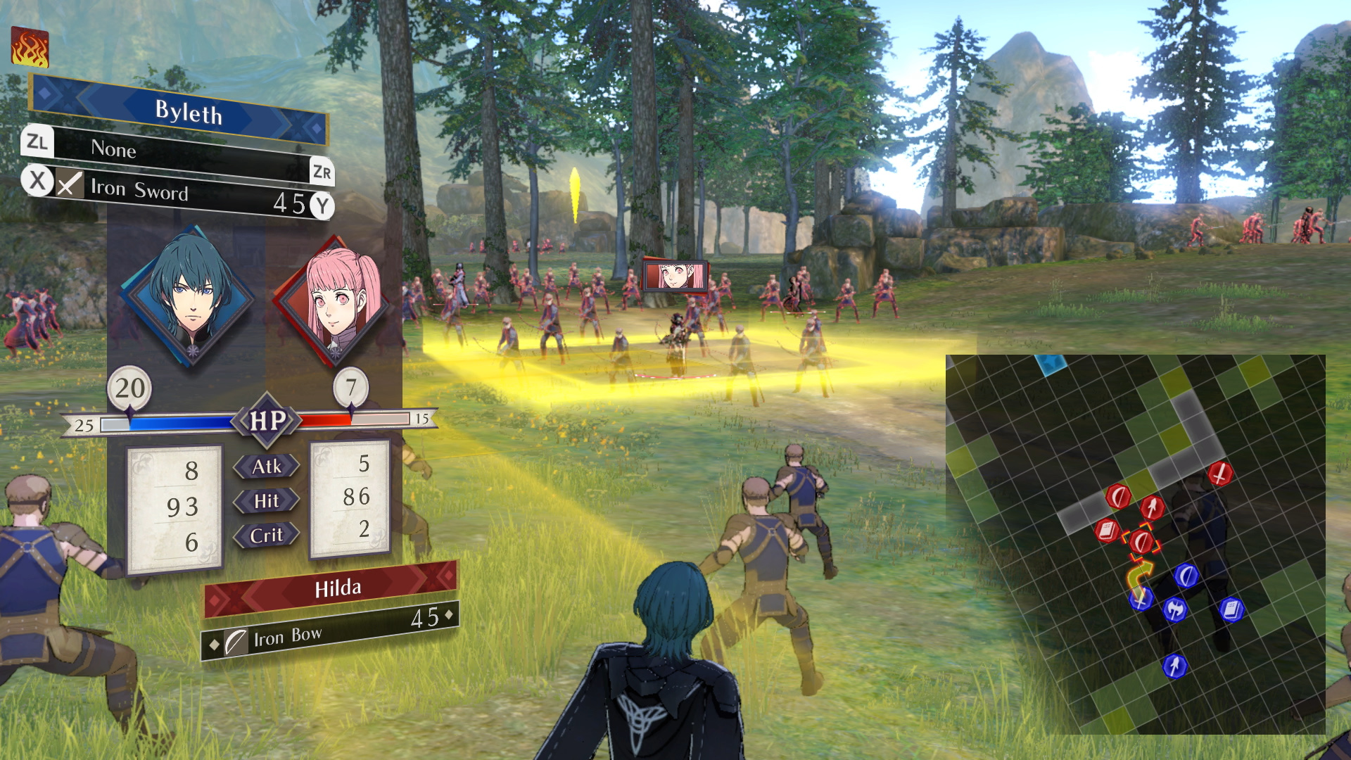
i’d say its not that bad in the screen shots you provided anyways, conveys most of everything ya need to know which is certainly the most important part of a UI and its not particularly cluttered. my only real question is about the squad formation system and how that’s indicated in the UI but id also like to learn more about that feature in general sooo… -shrug- not revolutionary but it seems to get the job done.
certainly seems to be borrowing the modern ui style in those shots though where things are slanted for no reason, but its hardly distracting.
2 Likes
I can’t say I know anything about looking like Sword Art Online due to never watching it, but I do agree that the minimalistic/simplistic design across the board does kinda bore me, given that I prefer unique visuals and UI elements (especially when designing them).
the sword art online ui is very simple and ‘stream lined’ looking all things considered (atleast at first glance, ya actually disect it as an interface and it becomes apparent that there is a lot of problems with it), actually the FE:Tree houses one is probably an improvement since it atleast has some colour to it.
but its big thing is ‘being part of the world’ and a sortta hovering screen tablet thingy. not unique to it now adays though.