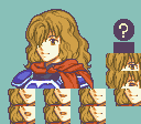
From a design perspective…
Pant’s waist should be more curved, angled to match the front of the body but also curved to match hips and rotated to fit with the posture.
Shirt should probably also hang over the pants unless tucked in, which if is the case should probably have a crease or two to show.
Her left index finger is a talon and the hands in general could use some work. The shoes lack definition and look mostly like splotches of colour.
Also the height and proportions looks slightly off, but that may just be me.
Remember, 7 heads.
From a spriting perspective, the jeans look like a palette crushed photo, which wouldn’t be so bad if it didn’t have big splotches of a single shade and yet massive texture in the creased bottoms and around the crotch.
The shirt and hair overall could use more anti-aliasing.
The fringe needs less outline colour and needs skin-aliasing.
The cleavage isn’t centered properly and gives the impression of wonky tits.
The lightsource in general is hard to truly pin-point, the general consensus of Fire Emblem is that the character is looking away from the lightsource. So for example, the light source essentially exists in the top right and top left of the GBA screen in conversations, with mugs on left adhering to top left and right to top right. This is more a general gist of getting a central and single lightsource and isn’t “law” and is probably even broken by the games themselves, definitely when mugs are flipped in convos and moved to other sides of the screen, creating inconsistencies. But it’s sprites, what can ya’ do.
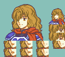
Thanks, dude! Working on it atm (trying to figure out what to do for that bright splotch on the jeans… that’s how my actual jeans look, so I’ve got no idea)
And yeah, it was about 30 pixels off from 7 heads… meh, let’s just say she’s short xP
You use a lot of pure black in your outlines, which clashes with the rest of your colours especially when you splice it with the original purple outlines. As a rule of thumb, Pure Black is too dark to fit most palettes, and you should go with dark grey/blue/whatever instead.
Depends if you want to continue using FE colours and styles.
FE uses a border colour of 11,08,09 in Usenti. (For FE7, I believe FE6’s is slightly different whilst FE8 has a more saturated(?) one.)
You could probably look through the Sprites-Resource and palette jack from another game that uses a darker outline until you get used to making your own.
Hey dudes, long time no see! Anyways, it’s summer where I’m at, so I’ve got about 3 months to start drawing again. Hopefully, I can improve with y’all’s help
Anyways, with all the Overwatch hype, decided to draw my main Reinhardt. Pls critique as much as you like
You know NICKT, I normally just manually draw them, and at first I was like "I’m going to just do it my way, and then I stopped and was like : wait, this person is better than I am. I should actually follow their advice and try it out… And what do you know, I think I got it!
Dang dude, really like it! Tried my attempt to make a chibi in art class today (first time I actually did art in art class, lol), but I like yours a lot better
I think the face may need some work (looks a bit generic), but everything else is pretty spot on. I particularly like how you made the textures look on her right sleeve. The pattern makes it look 3D and it creates a cool effect.


