Fire Emblem: Dust to Dust

Not gonna lie, I preferred the original spliced mugs to these. The faces are smushed together.

I do like Weiss somewhat. She could be a lot better with some touchups, but the rest need some heavy quality control.

Edit: Oh holy shit, Qrow, how did I miss that? That is a solid mug.

1 Like

I think more context would be helpful in answering your question. you can PM me if you like

1 Like

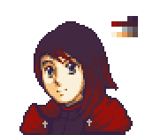
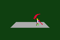
Maybe it’s because they have RWBY proportions rather than FE proportions? Or maybe I just suck at 3/4 angle.
Still, most of the old versions were more like edits than splices. Splicing would imply that I used more than 1 sprite as a base.

@ghast Basically I have an early game Defend Throne map, and as a side objective you have to keep the NPC alive to recruit him. I want the player to hate him, so he’s trying to suicide on the enemy while also stealing exp. The player should have 2 cavs and a peg, so rescue chaining shouldn’t be a problem as long as you don’t mind tying up 1-2 of your mounted units every turn.

1 Like

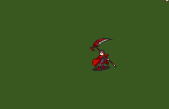
I’m with @Klokinator here; the sprites just need a lot of clean up. They have a clumpy look to them and are messy in the face. They all seem like WIPS. Its not the style that’s giving you the issues, its the attempts at full customing.

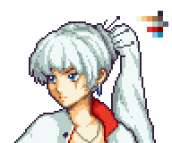
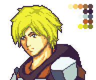
Qrow and Weiss are your best in that post though.

chapter goal sounds… interesting I guess hahaha. Sounds like a wild goose chase

1 Like

Clumpy and messy are fine, just takes time to clean up. I spent more time on Qrow and Weiss, therefore they look better. But if the facial proportions are off I want to know before I polish.

1 Like

I think for the most part everyone’s heads look fairly small. Qrow looks great and so does Weiss. Oxpin sprite is at a strange angle.

1 Like

Been a while, huh. Actual Game Progress is on hold while Volume 3 is airing, because I’m probably going to have to rewrite based on the new plot/backstory that’s coming out.

Meantime, sprites are better than nothing


1 Like

Lately I’ve been more interested in hacking than in hacking, if you know what I mean. Still, I got some stuff done.

Slightly improved stat screen. The icons in the top right are flashing, which I rather like.

Menus are now semitransparent, pretty cool huh?

And finally I made a custom battle frame because I’m a masochist or something, jesus

1 Like

are the cell-phone like icons on the top right another homage to the source material?

1 Like

Yeah, it’s supposed to resemble these:

4 Likes

Stat screens that look like scrolls, amazing.

2 Likes

The details you pay attention to blow me away. I’d probably never have noticed them if you hadn’t mentioned them, in the show or the screenshots.

1 Like

Trying out a new animation style

5 Likes

Oooh, that’s slick. What did you use to make that animation?

1 Like

Blender:

3 Likes

Dope sheet? Lol.

1 Like

#YES

#NO

5 Likes

its too fucking smooth that’s why

if youre still having trouble i can take a look

3 Likes

Removed a couple frames that had 1 duration, now it’s fine.

10 Likes

i cant
nope
i cant get over how fucking amazing that is

3 Likes